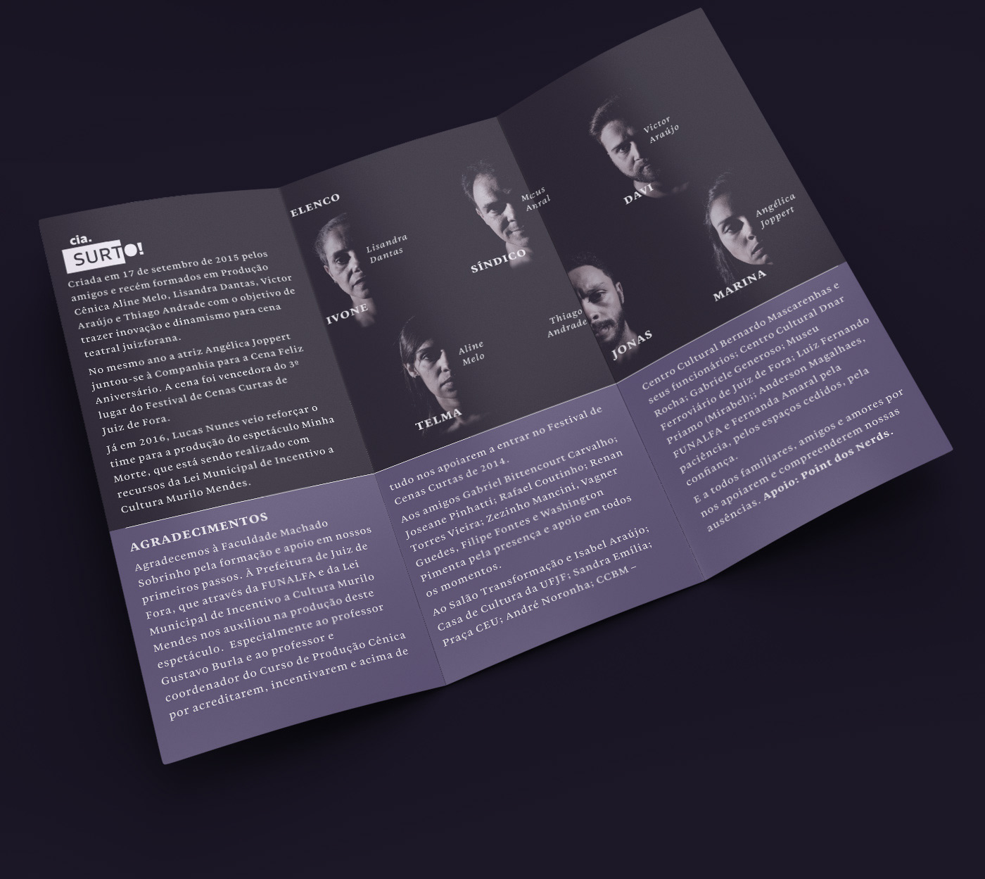
Cia Surto started in a theater school when a few friends gathered to put up some plays for the course tasks, which led to after graduation plays such as Minha Morte. They wanted to build something that would bring all kinds of emotions on spectators and brings up the most energic reactions. 
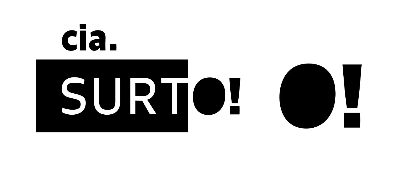
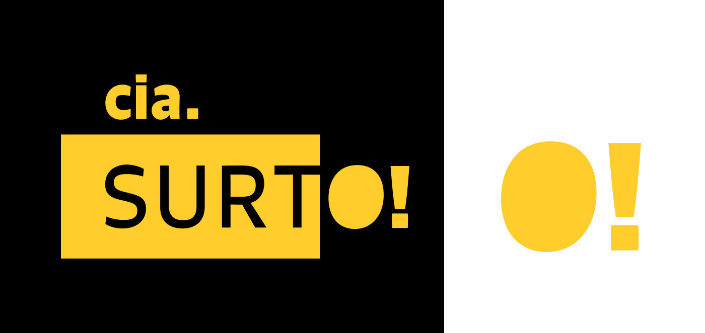
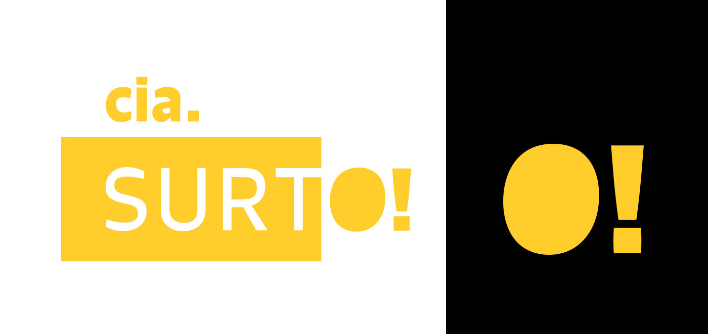
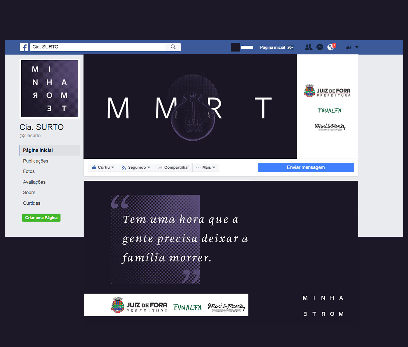
To put some of that into their logo, the weirdness of inverted contrast type was put into action, combined with some elements for further applications. 

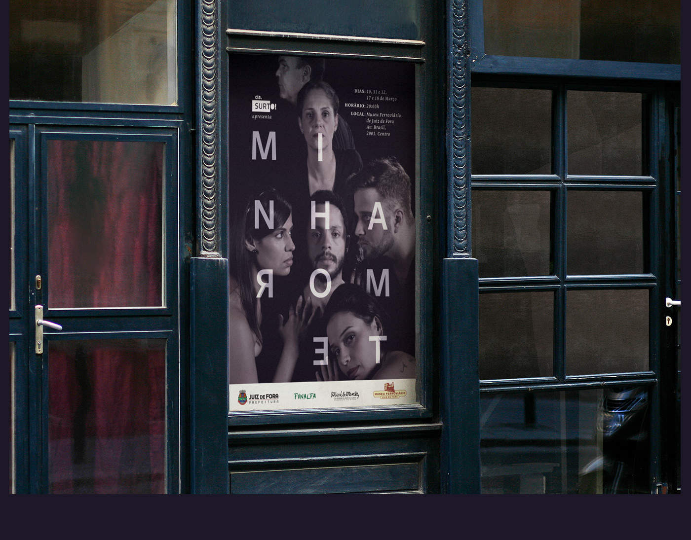
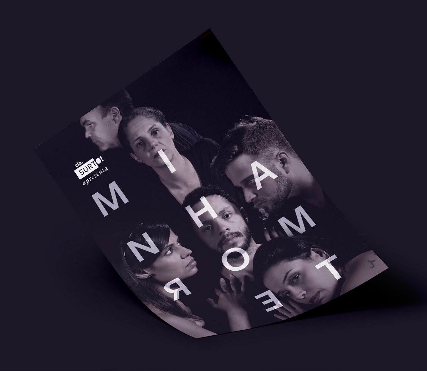
Right after the company`s logo, my first task was to make a logotype and art direction for the communication of their first play out of school, Minha Morte (My Death). 
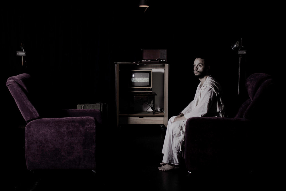
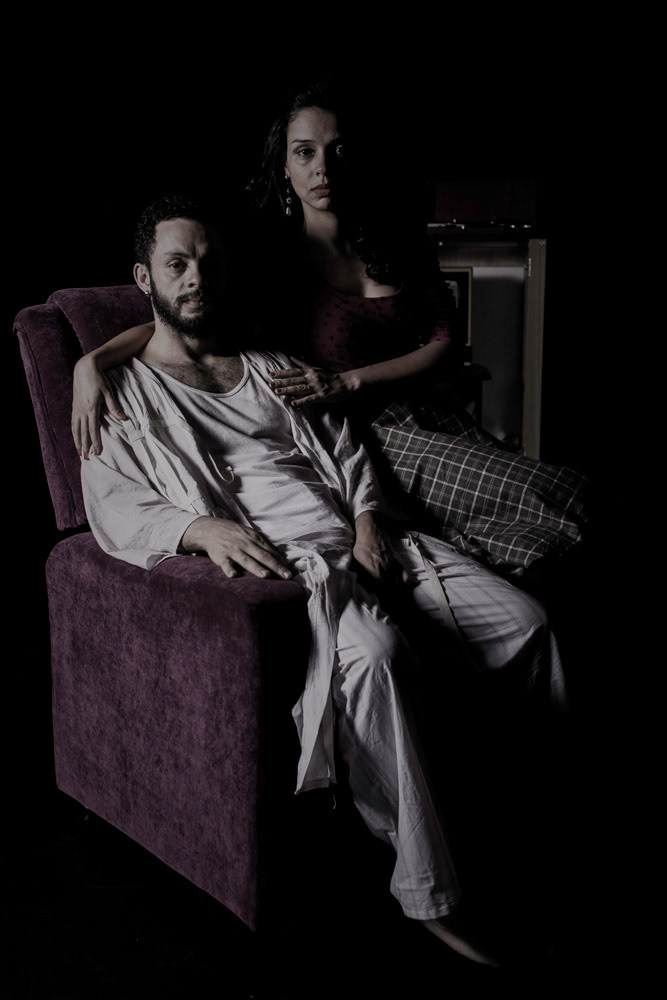
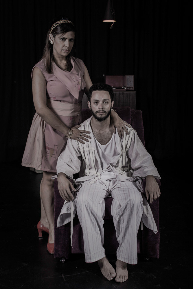
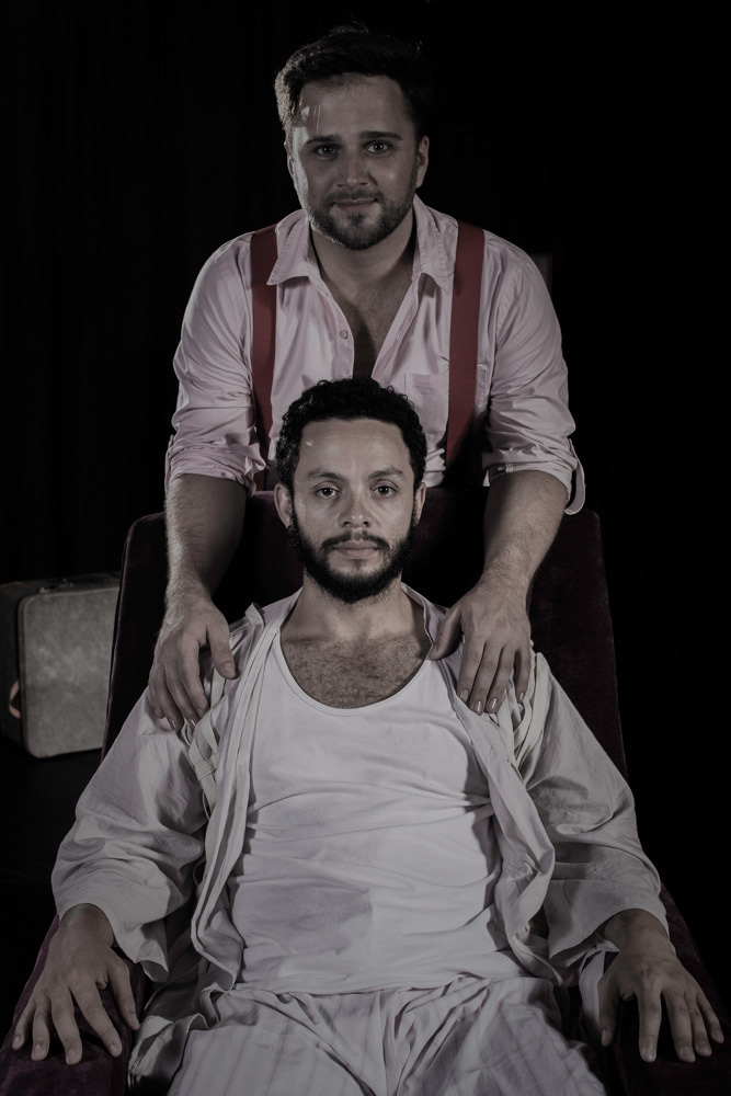
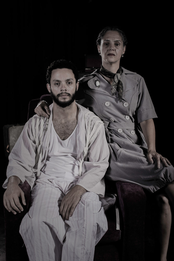
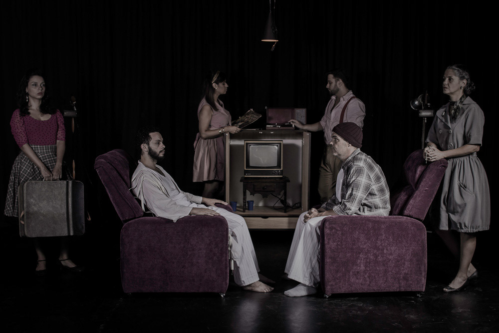
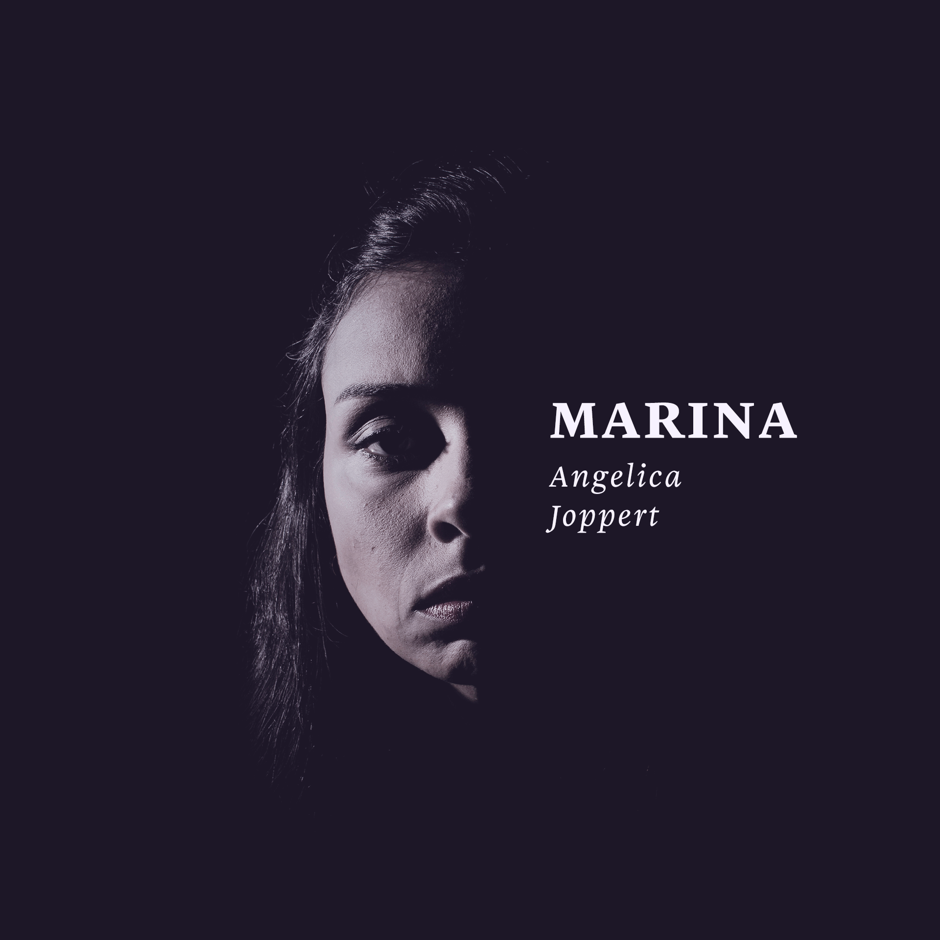
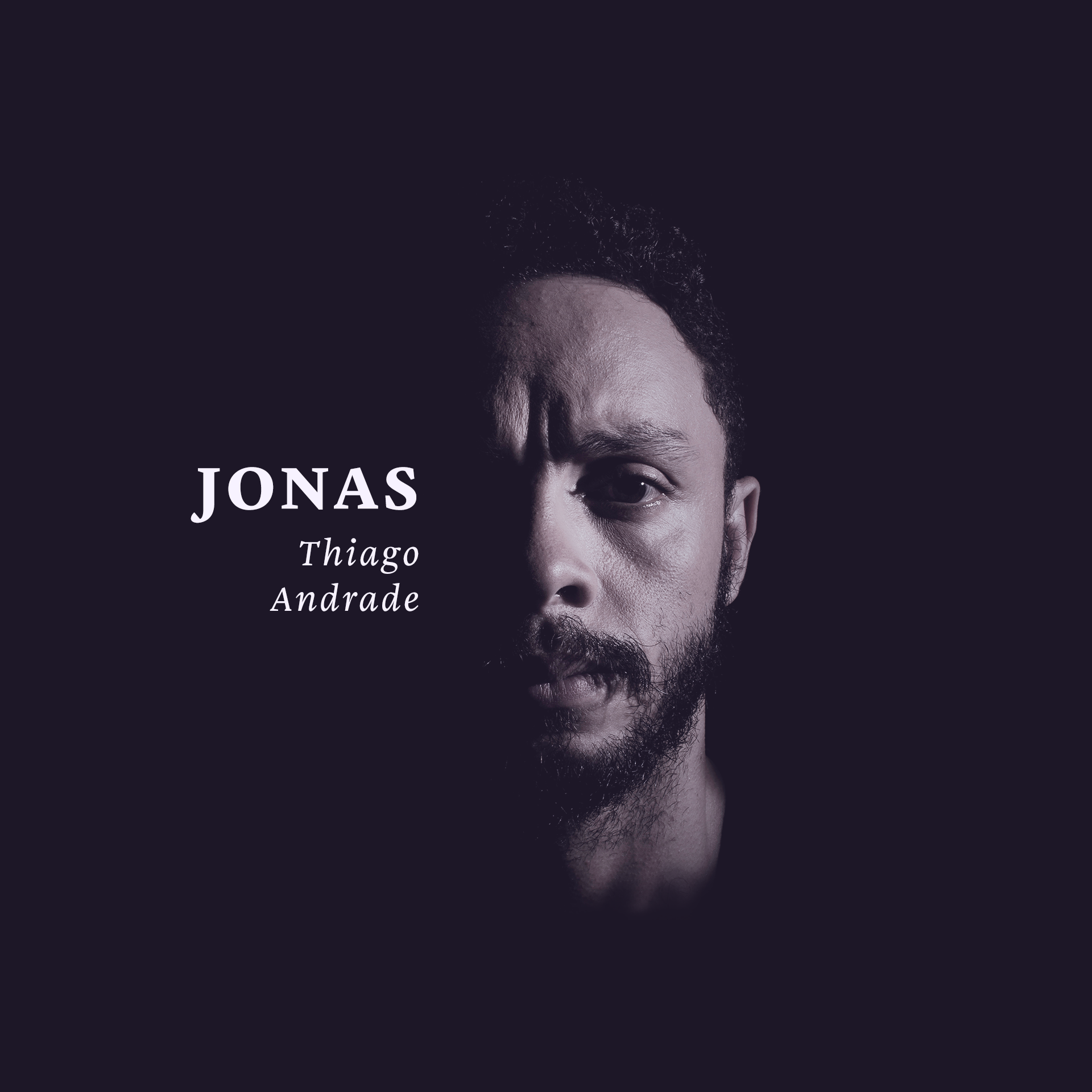
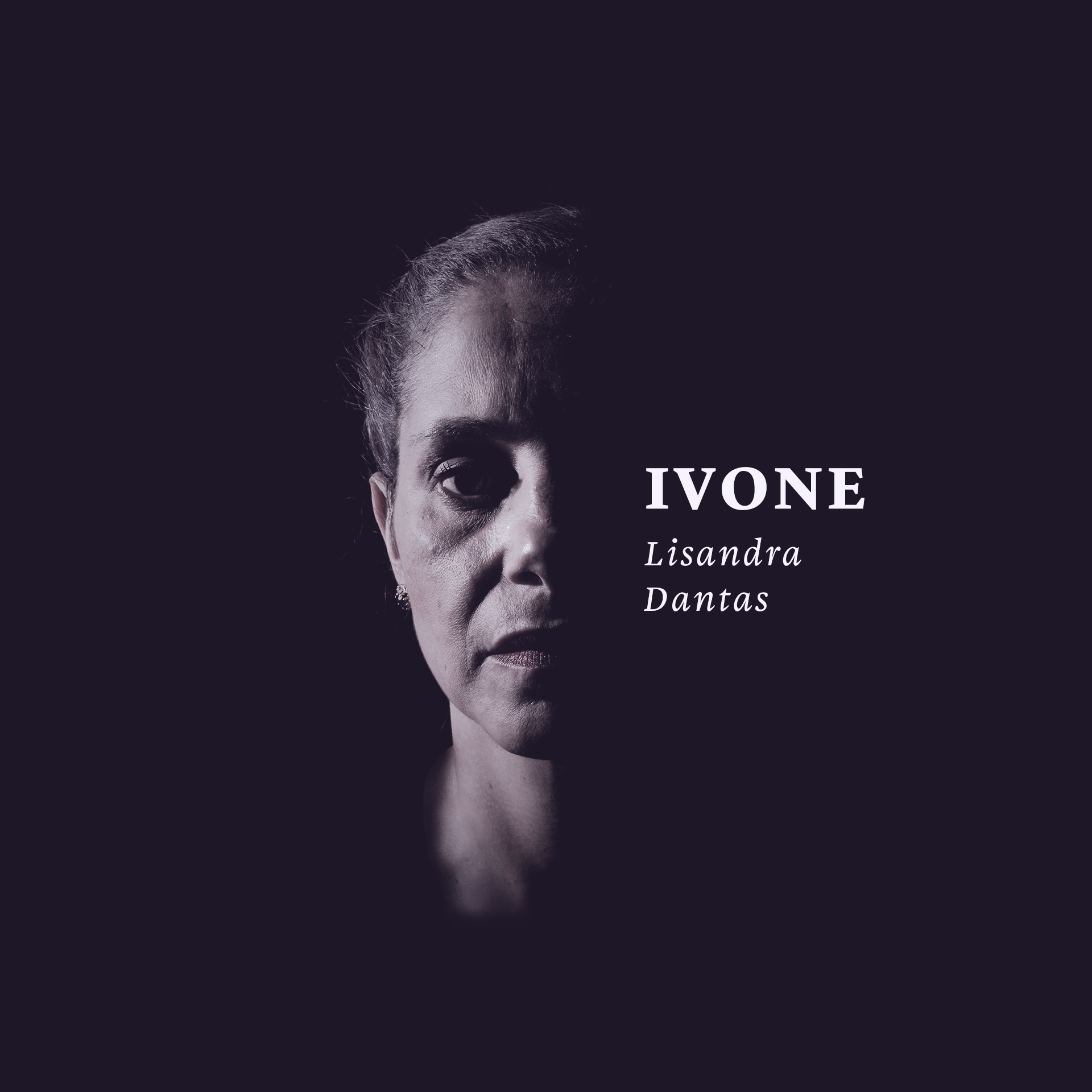
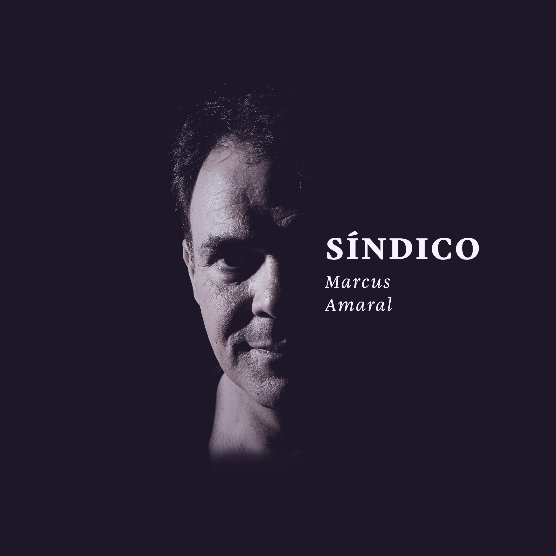
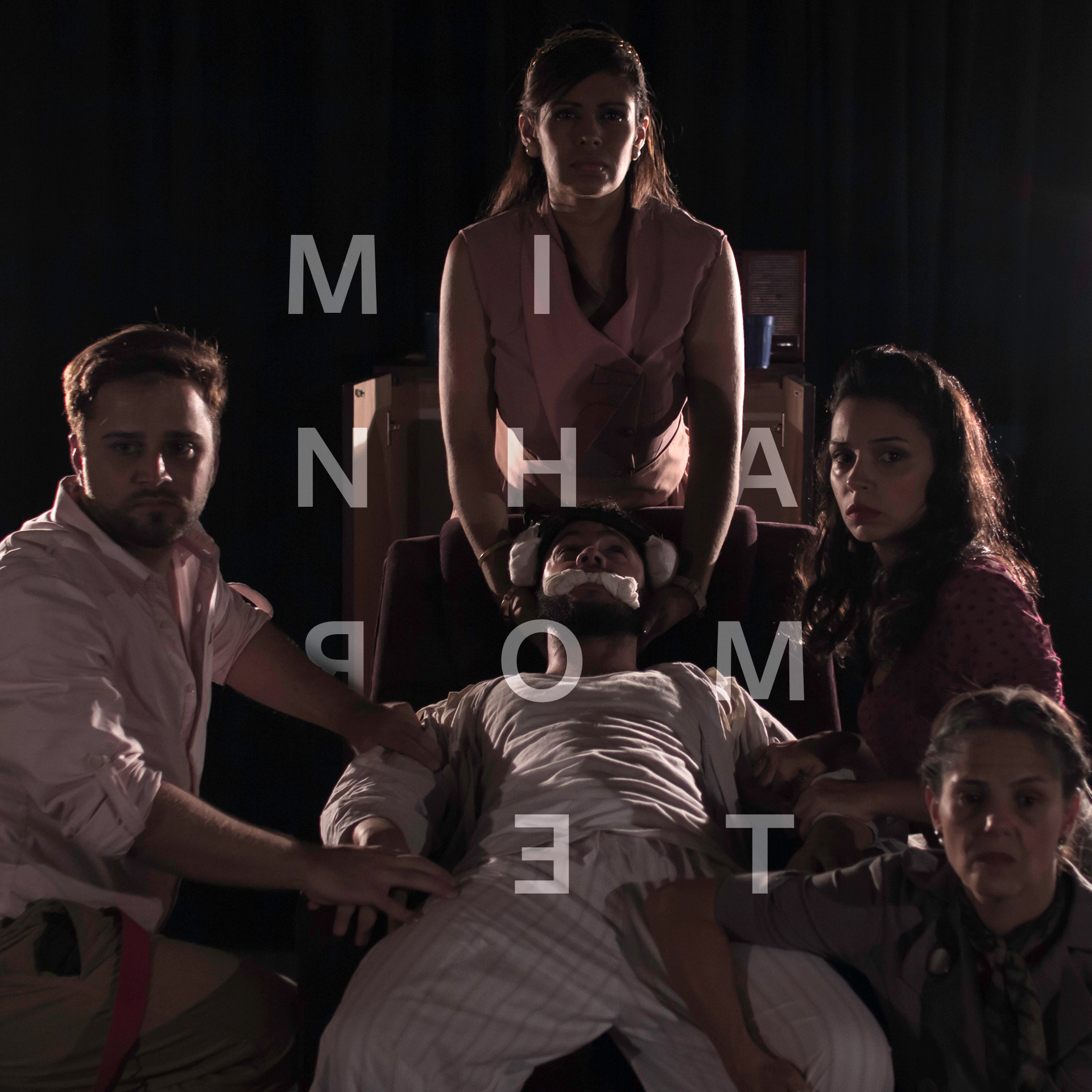
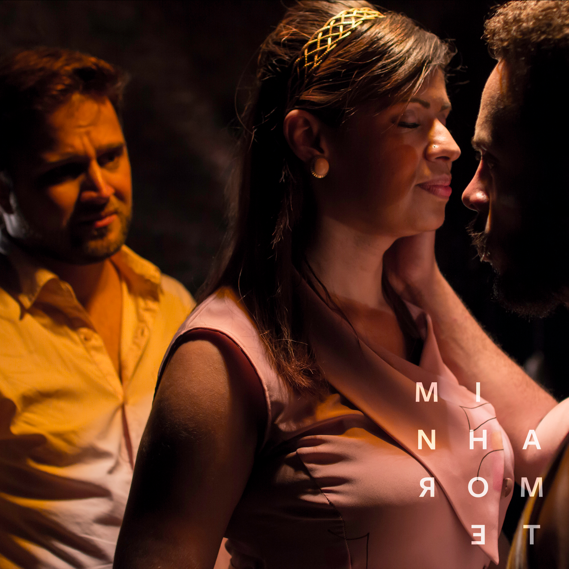
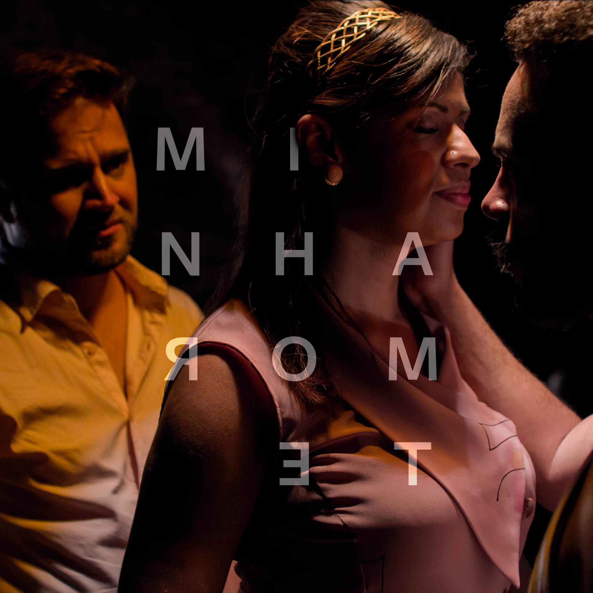
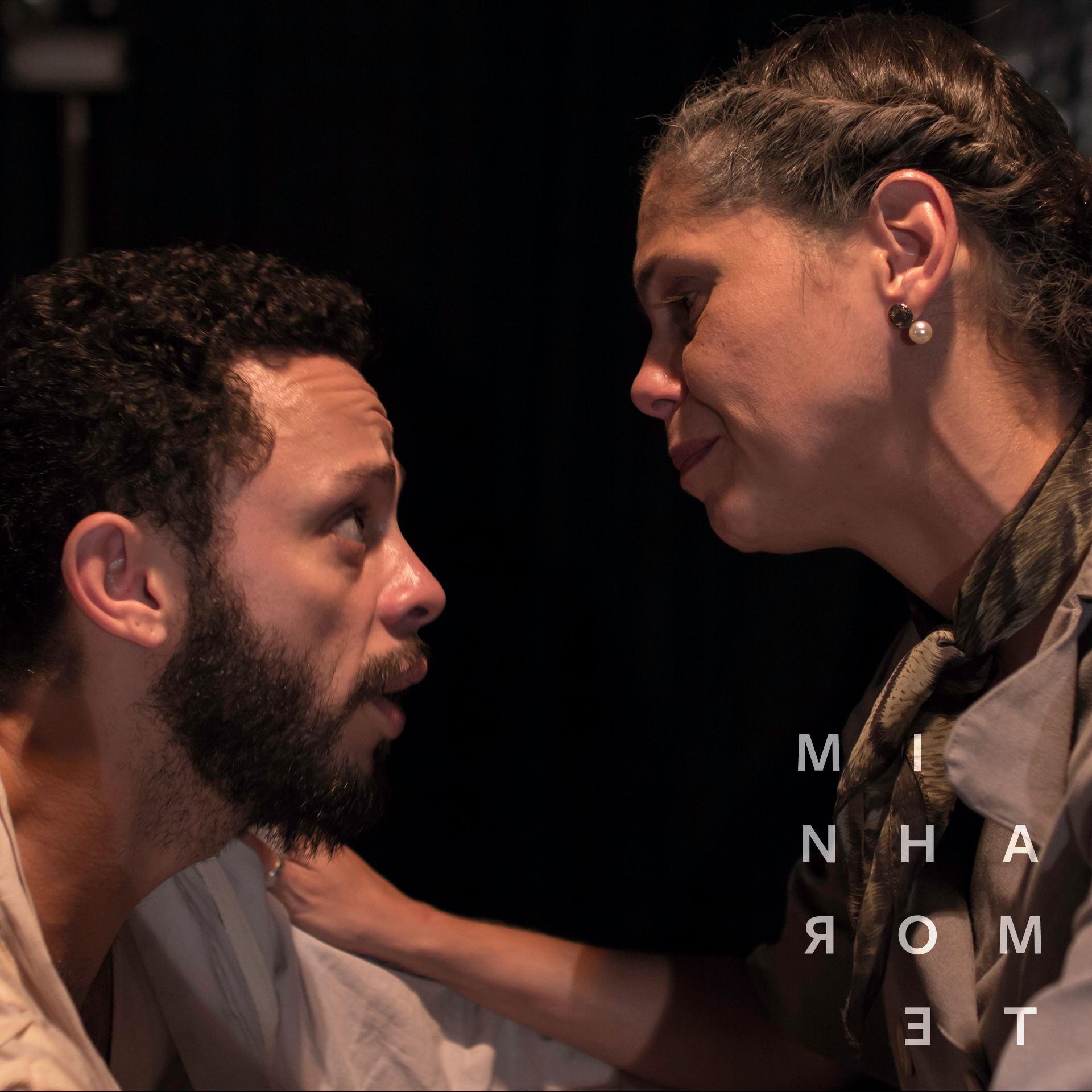
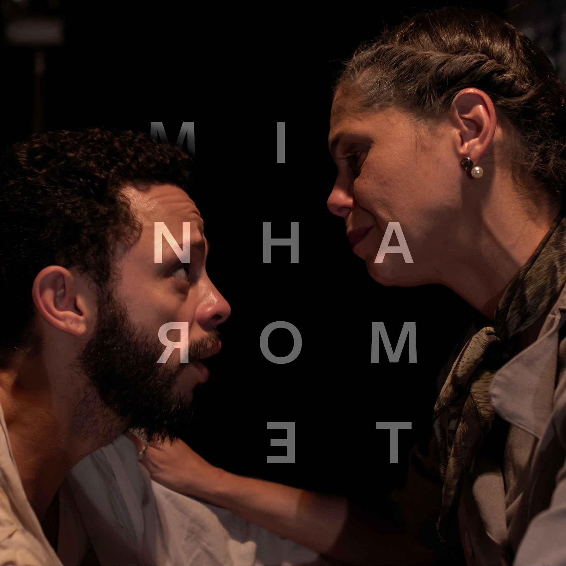
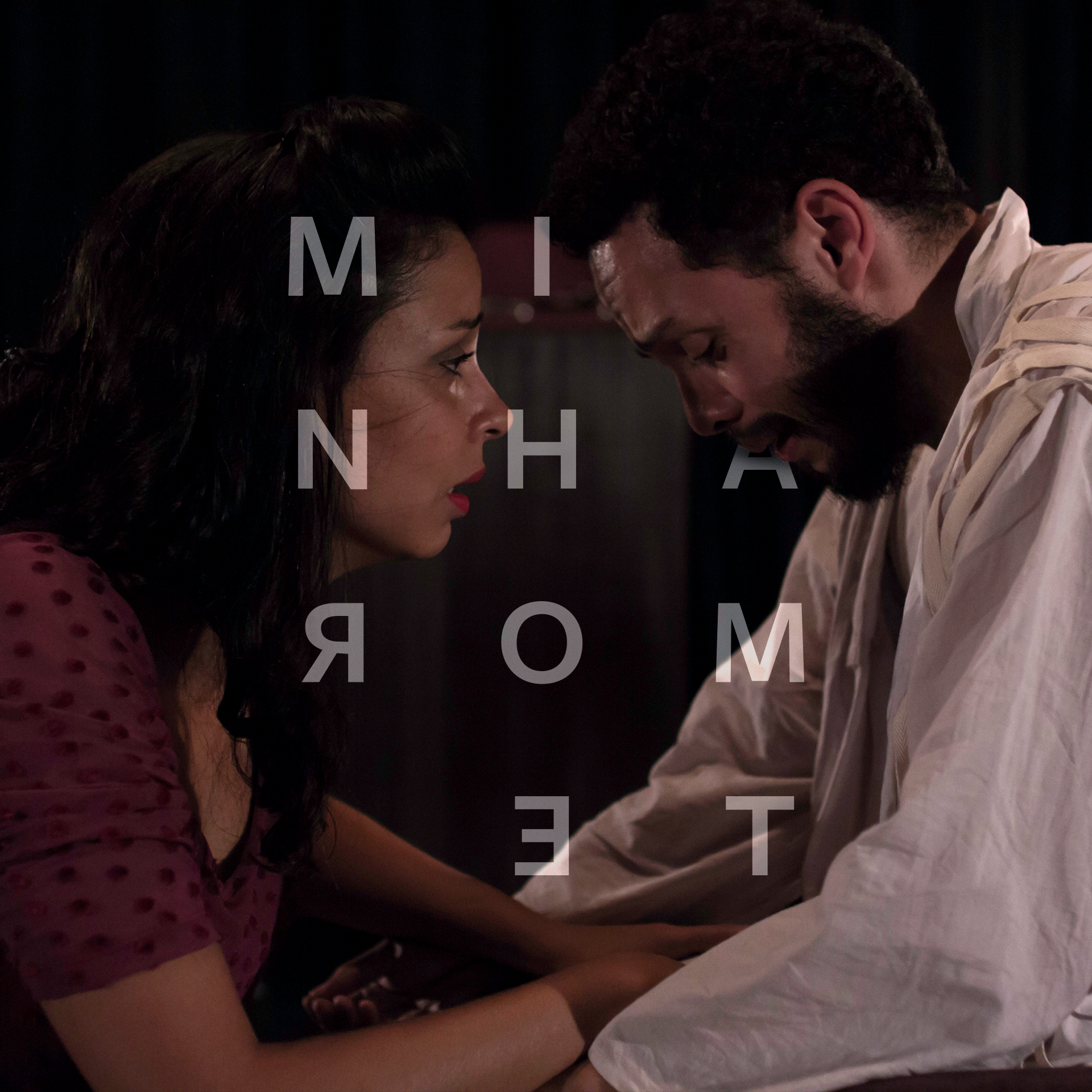
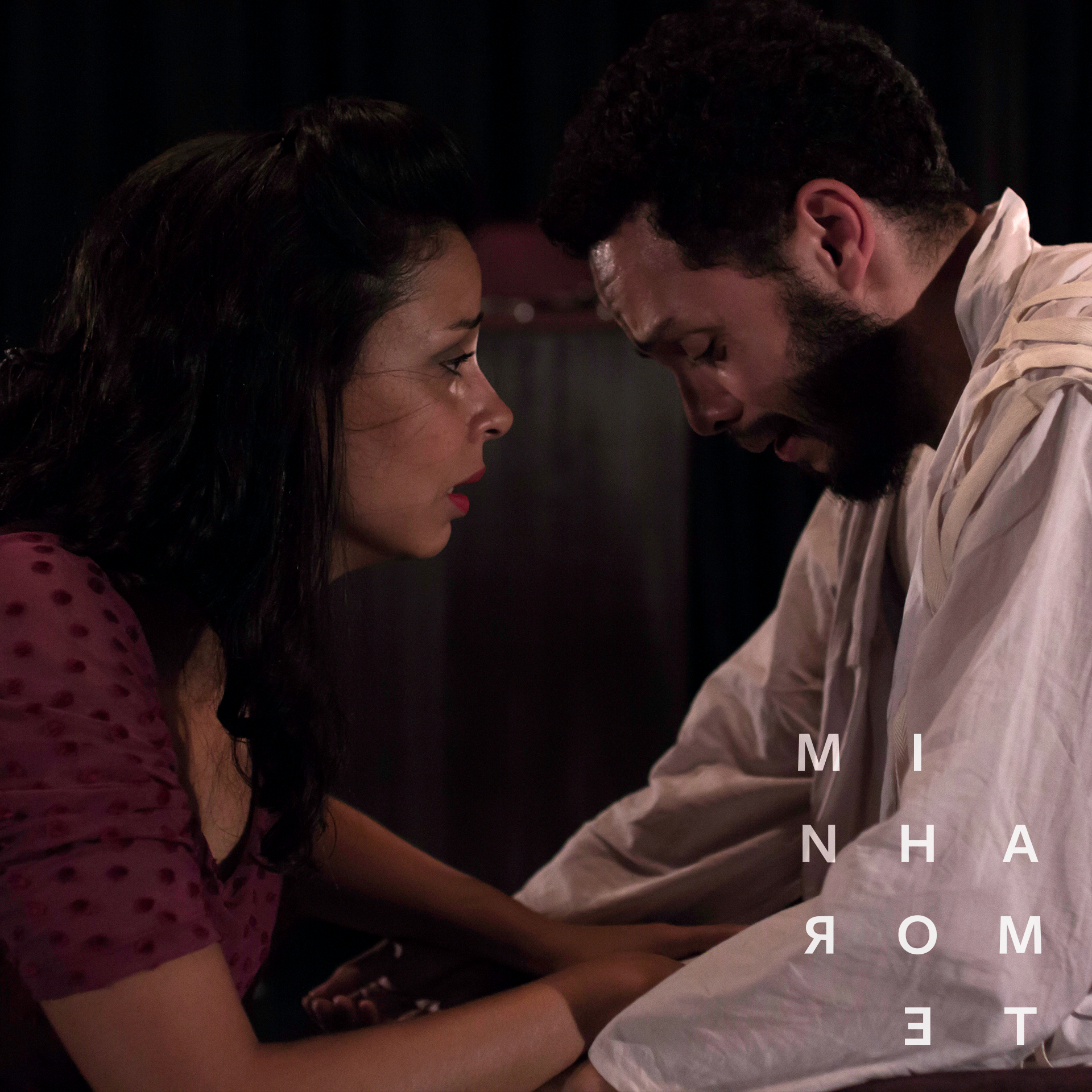
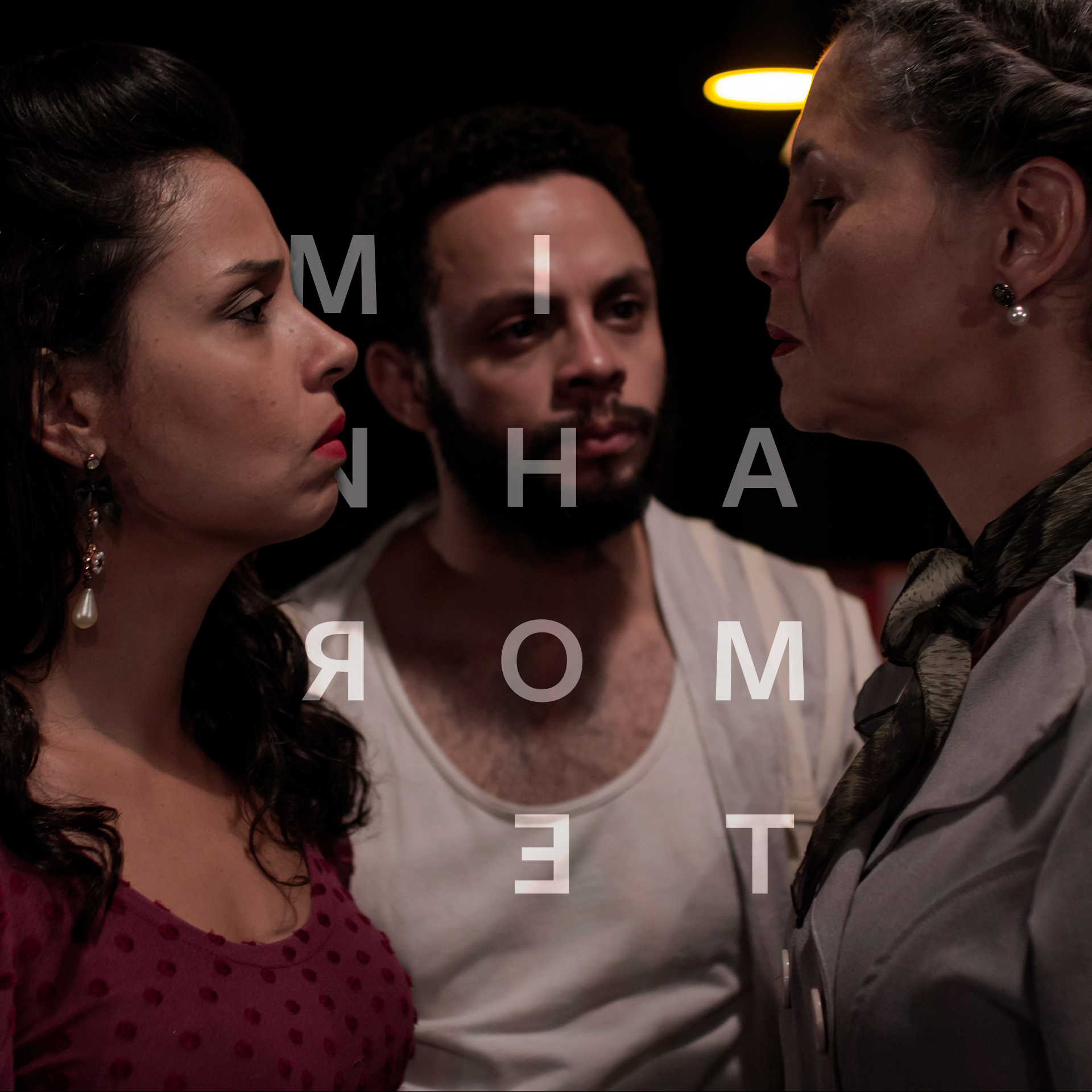
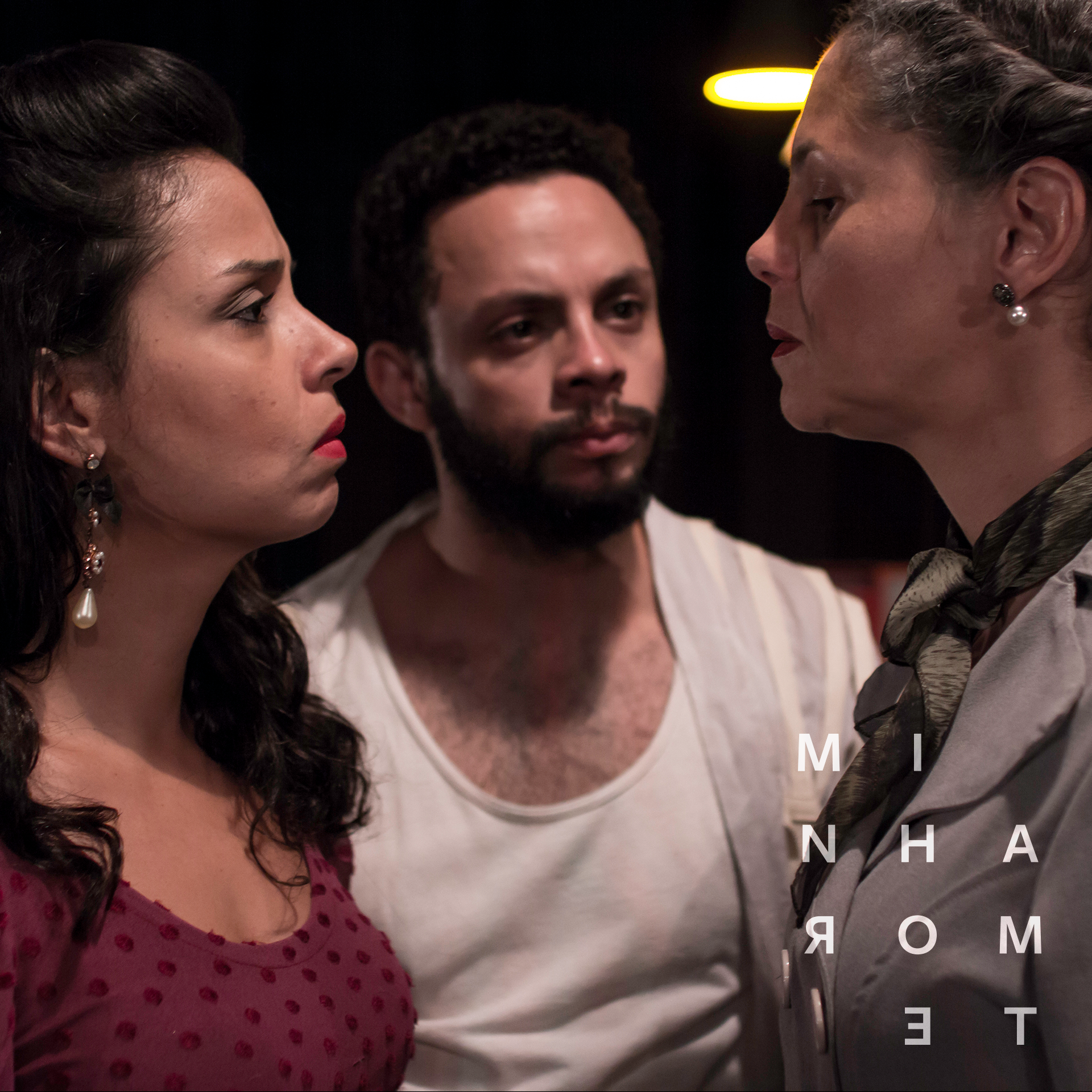
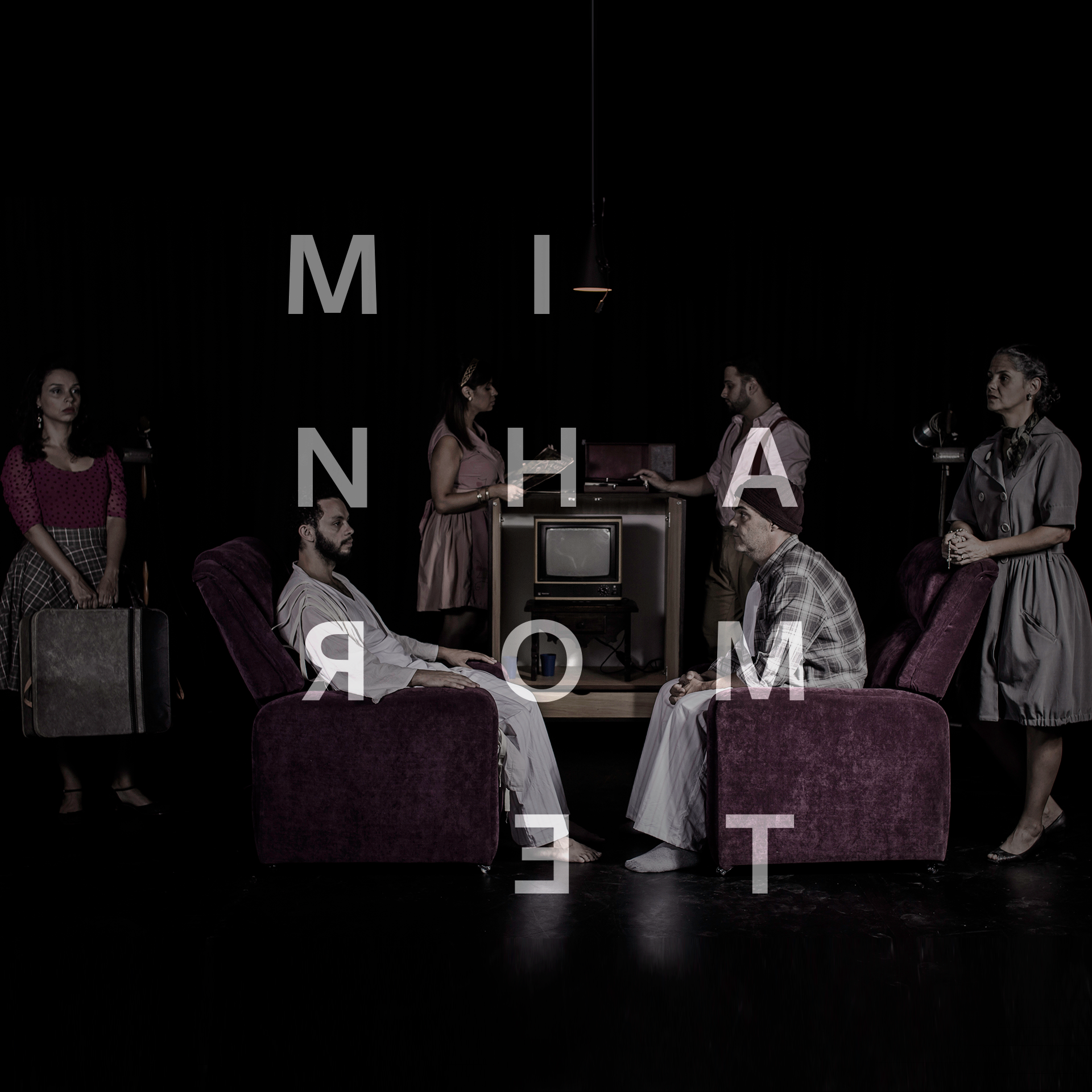
Minha Morte is about human desires, and relationships. It provokes a great deal of self examination on the viewers using as a central character, Jonas, a young man facing great changes that come with adult life. His issues involving family, work and sexuality are very relatable, when it talks about things as prejudice, authority, selfishness and many other human fragilities.

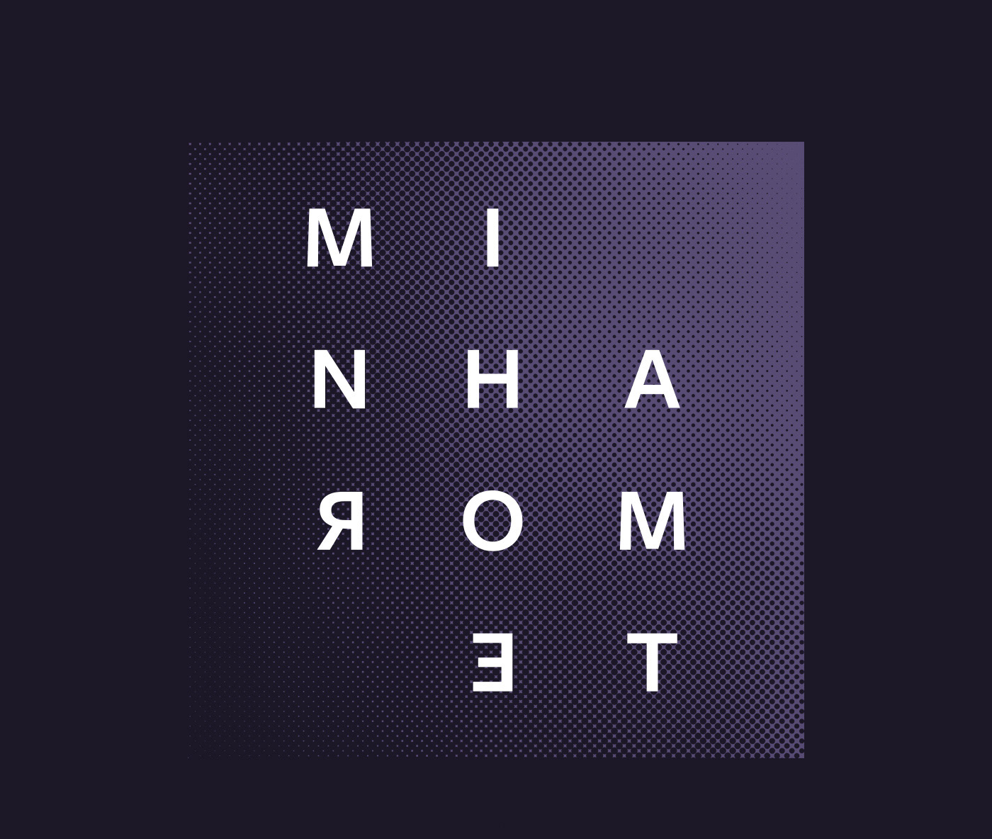
The idea behind the logotype was to give subtle visual clues about the estate of great pressure, confusion, and disorientation that the main character faces and the audience experiences throughout the whole play. 
The mirrored type plays with elements of the script which don`t make it very clear if the main character achieved his suicide, or if he is delusional after its atempt, and also, and maybe more important, it is about the many situations when the viewers can see themselves in the places of any of the characters.​​​​​​​

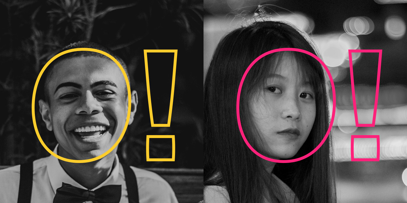
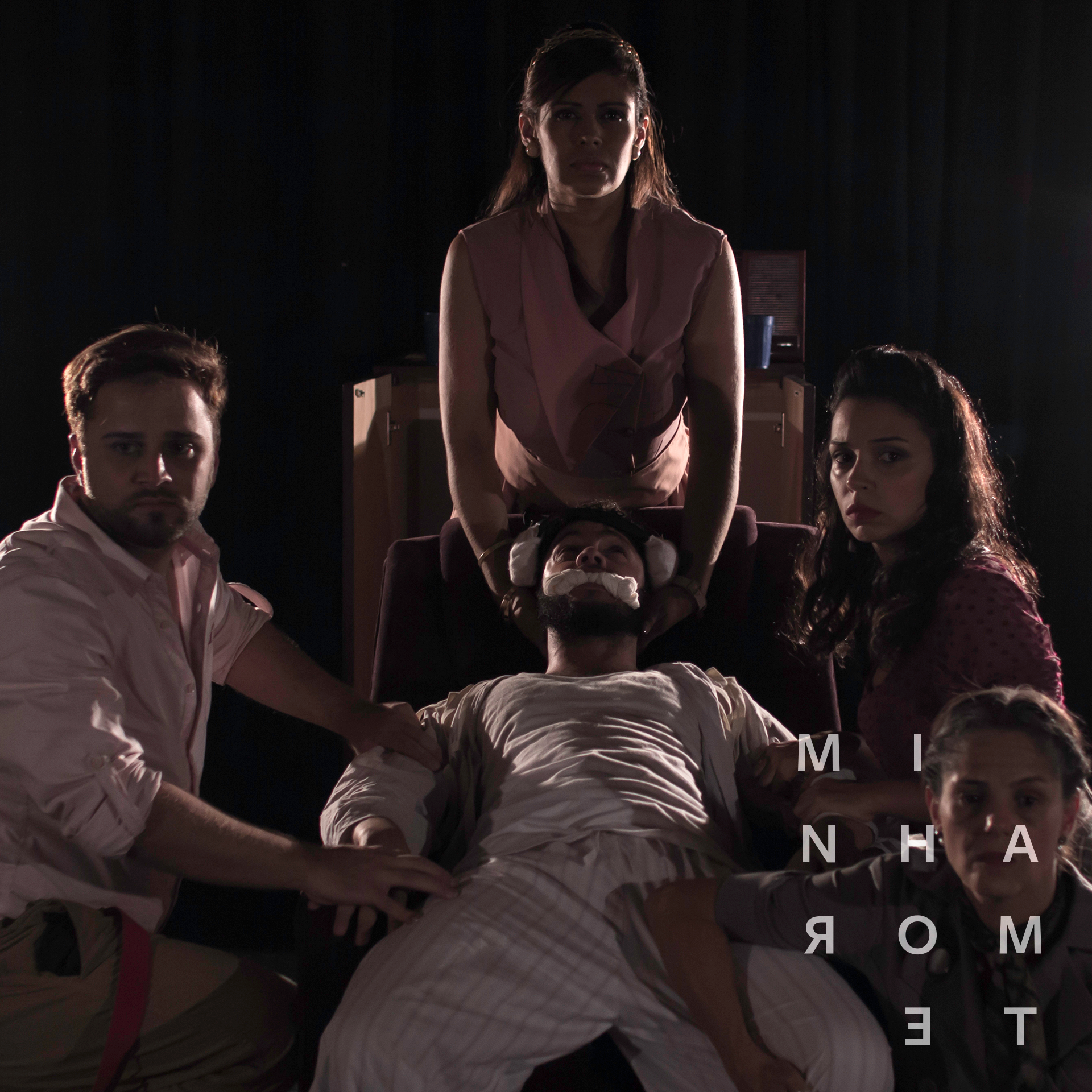
Before we had the photoshoots done, we started making visual pieces all based on the element of a light bulb. It is a very strong presence on the work, as during the play the light is obscure, never revealing much of the whole ambience, contributing a lot to the tension that the script brings up. This first step led to the use of the element of light as it happens during the play also in the photos.​​​​​​​

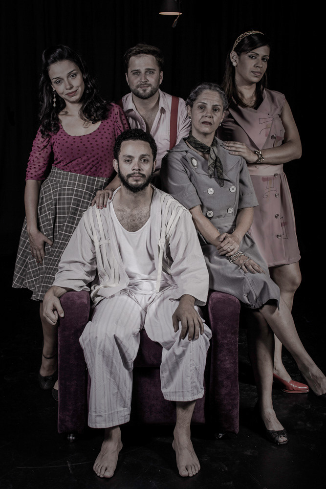
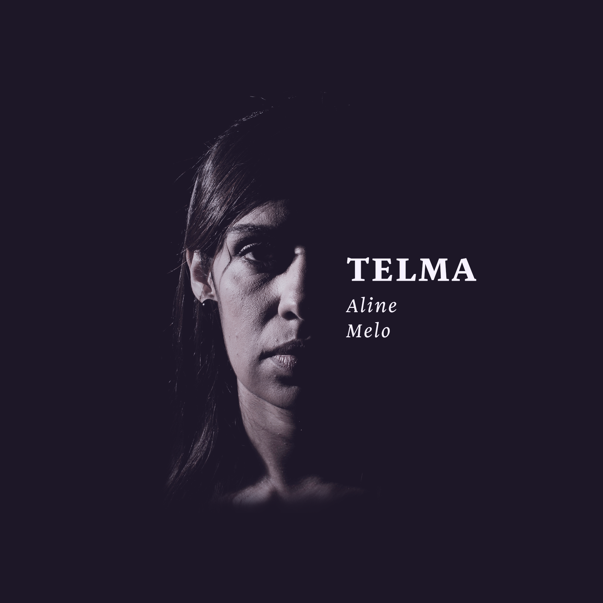
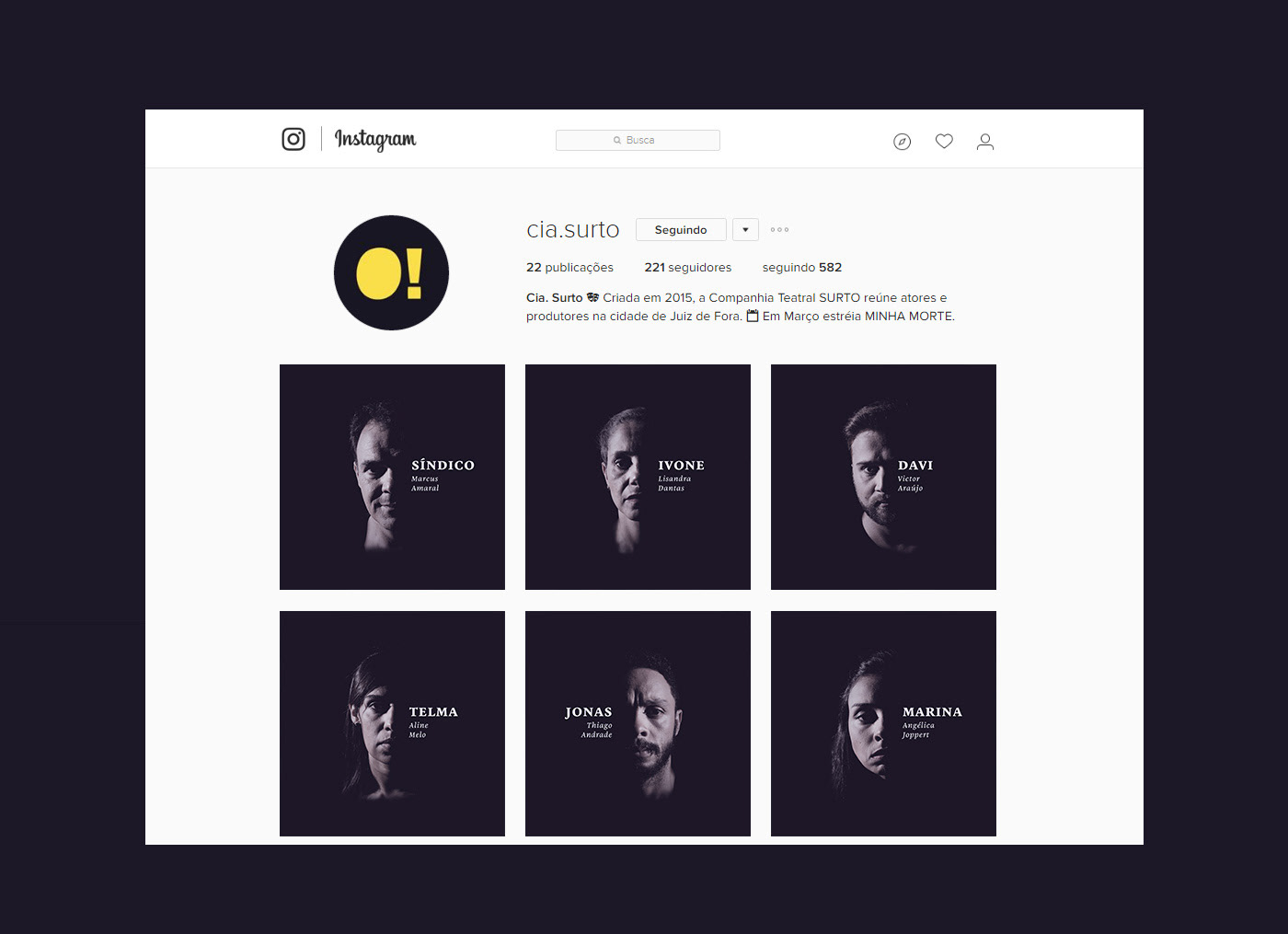
The photoshoot was based on a main picture with all characters together, which was meant to compose the poster and most communication materials. Single photos of the characters were made to present them and their respective actors, and many others, all of them using an all around penumbra, which came from the first concept.​​​​​​​
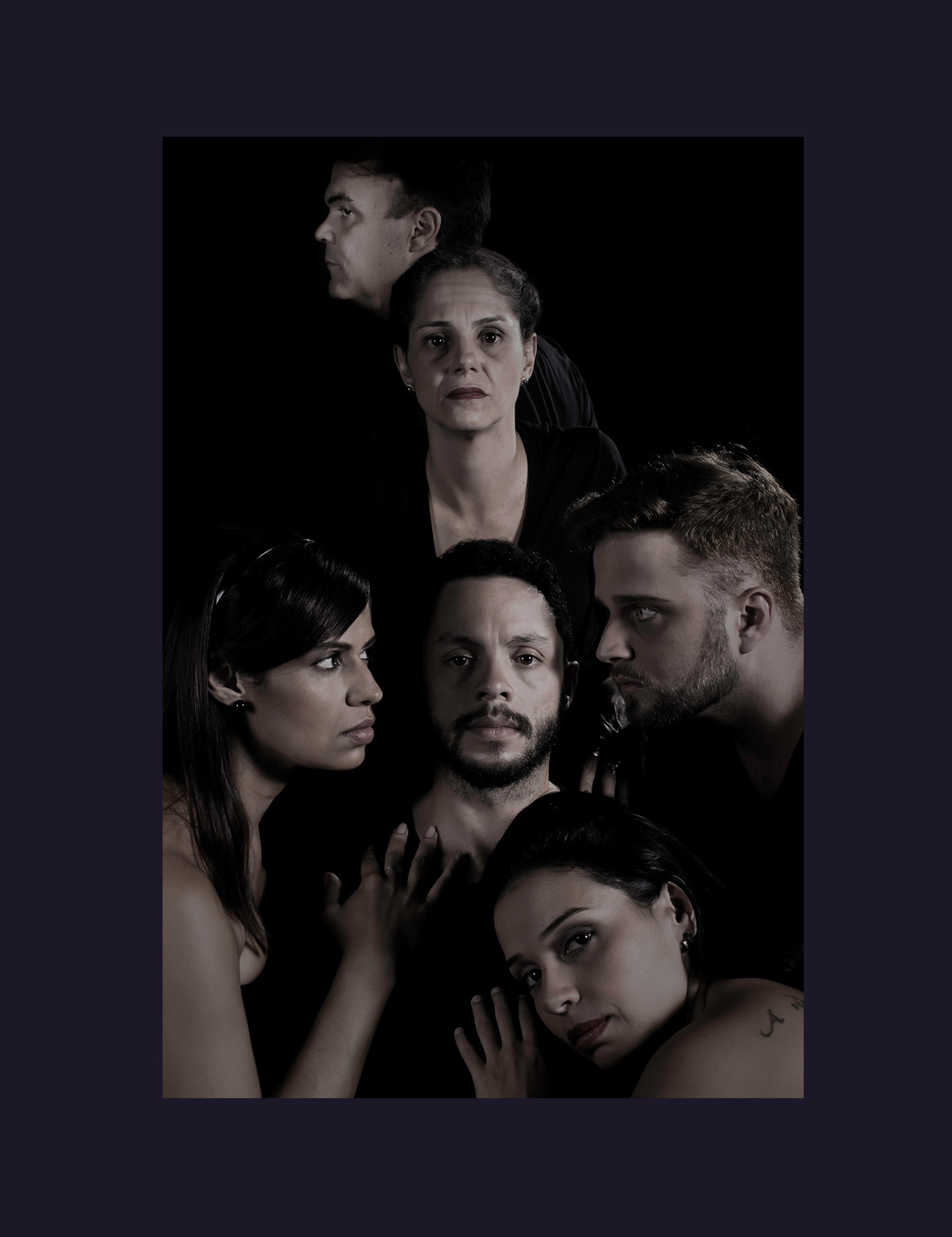
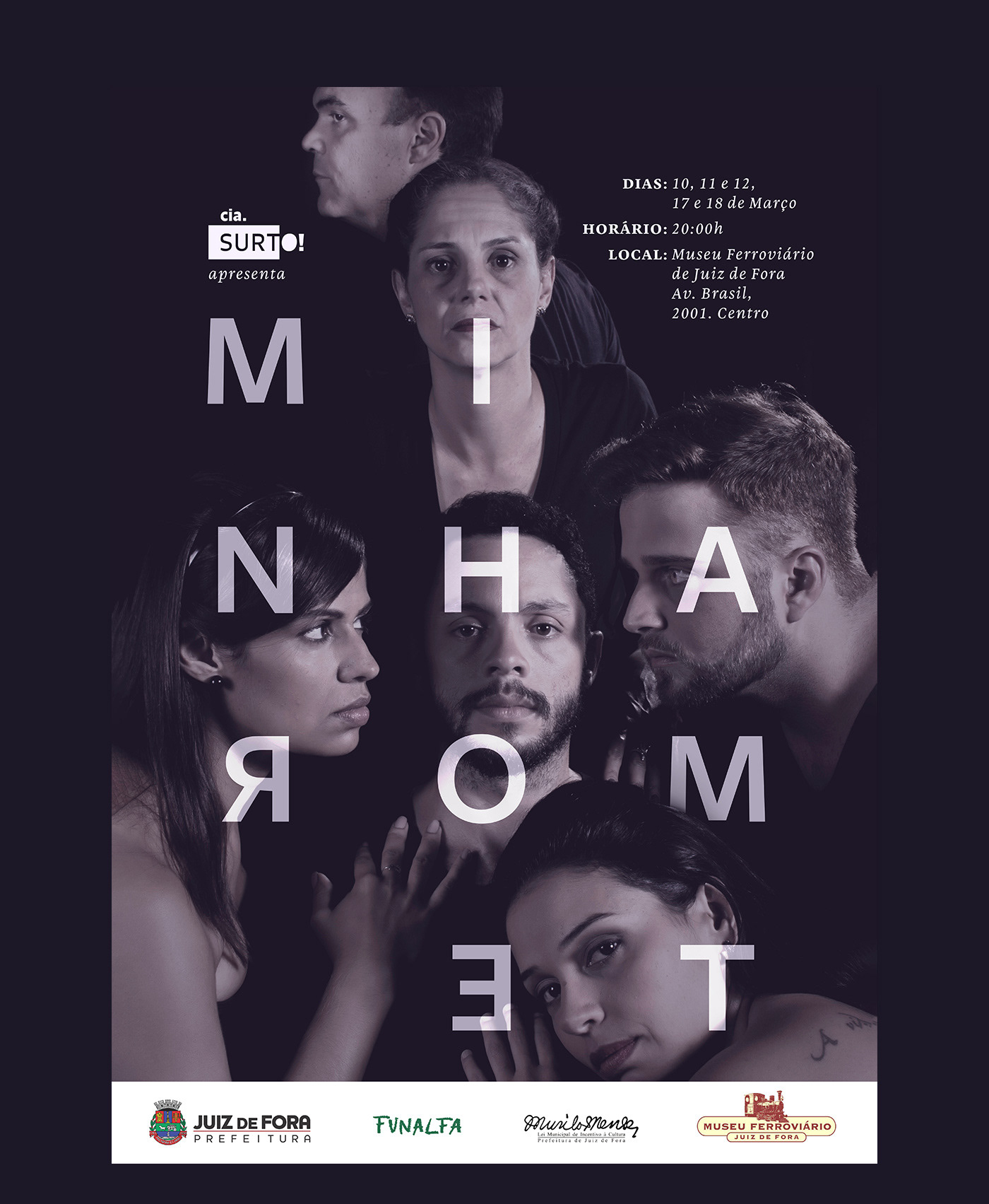
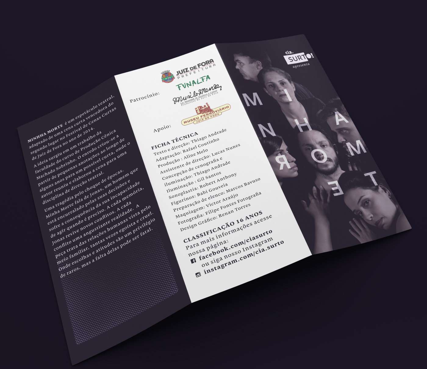
photos and photo manipulation: Luis Filipe Fontes 


You may also like

T-SHIRT PRINTS | Rn Torres
2018
T- shirt illustrations made for my stores at chicorei.com and also threadless. This first collection aimed mostly at type, and calligraphy references and use, including some pop culture elements.
CALLIGRAPHY SKETCHBOOK 01 | Renan Torres
2019
omecei a treinar caligrafia como um exercício de fundamentos para o desenho de lettering e design de tipos, agora tenho como objetivo achar uma expressão artística na própria prática. Este é o primeiro de uma série de sketchbooks de caligrafia que pretendo fazer para buscar novas formas de criar letras à mão.
LOGOTYPE | Tiago Sarmento
2018
This is a custom lettering logotype, it was made for a musician from Brazil. The style of the letters war conceived to convey the artist'sboho folk style.
VISUAL IDENTITY | Galanga
2018
Logotype and visual identity developed for the 10th aniversary party of the brazilian creative company, Chico Rei (www.chicorei.com).
BRAND ID | Organizar & Fluir
2018
Logotype and visual identity developed for "Organizar & Fluir" a Belo Horizonte based company that works with organization for residences, companies, files and documents. They also do home staging and sell products. The process to create the visual universe of the brand relied on common looks of organized and fluid homes, where everythings is found in its place and plants give a harmonious atmosphere to the place.
BRAND ID | Estúdio Curió
2022
36 DAYS OF TYPE - 2015
2016
In 2015 as a part of the project 36 Days of Type, I decided to design each letter of the alphabet, all the 10 numbers and the ampersand in a lot of manners, so I could try different technics, ranging from the pure diital, to the mix of analogic items to add a special look to letters. Some of them use external elements to the letter, and some are very foccused in constructing a nice shape.
Chico Rei Coasters
2017
This is a series of coasters illustrations using the company`s logo in different fun contexts. The coasters are traditionally used as information tags that go with the t-shirts.
ILLUSTRATION | BumpSide Brasil
2020
BumpSide Brasil is a group of Ford Trucks aficionados.  They gather in events to talk about this cars that many of them collect, restore or just love to be around. They have invited me to make two illustrations for their t-shirts, the following images show a bit of process and the results of digital illustrations portraying ford trucks and exclusive lettering as well as a representation of Mr. Clint Eastwood. For this job I used both vector and photoshop brushes. The final results are two artworks for t-shirts.
NAMING & BRANDING - From Flow
2015
A FROM, para alguns, e FLOW, para outros, é uma empresa que tem o objetivo de resignificar o mercado de eventos no Brasil. Valorizamos a criação de sensações e as interações fluídas em todas as etapas do projeto, transformando pessoas a partir de novas e incríveis experiências. Trabalhamos com flexibilidade e complementaridade. Achamos sim que eventos tem que ser cool, diferentes e inusitados, mas acreditamos também em processos, métricas e resultados.