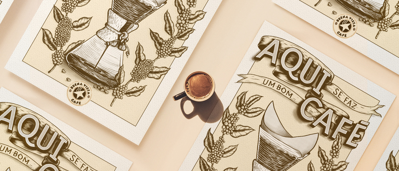
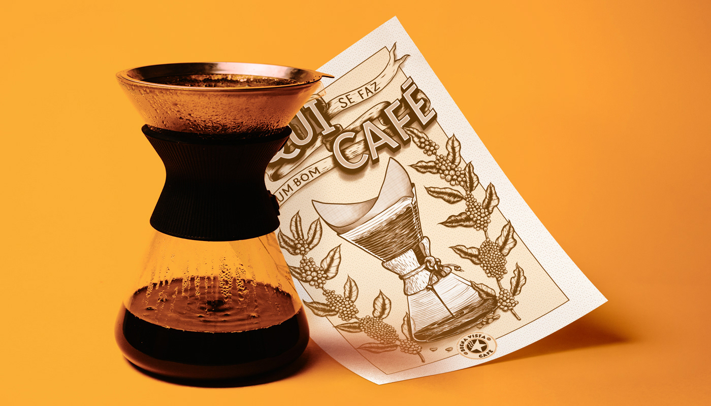
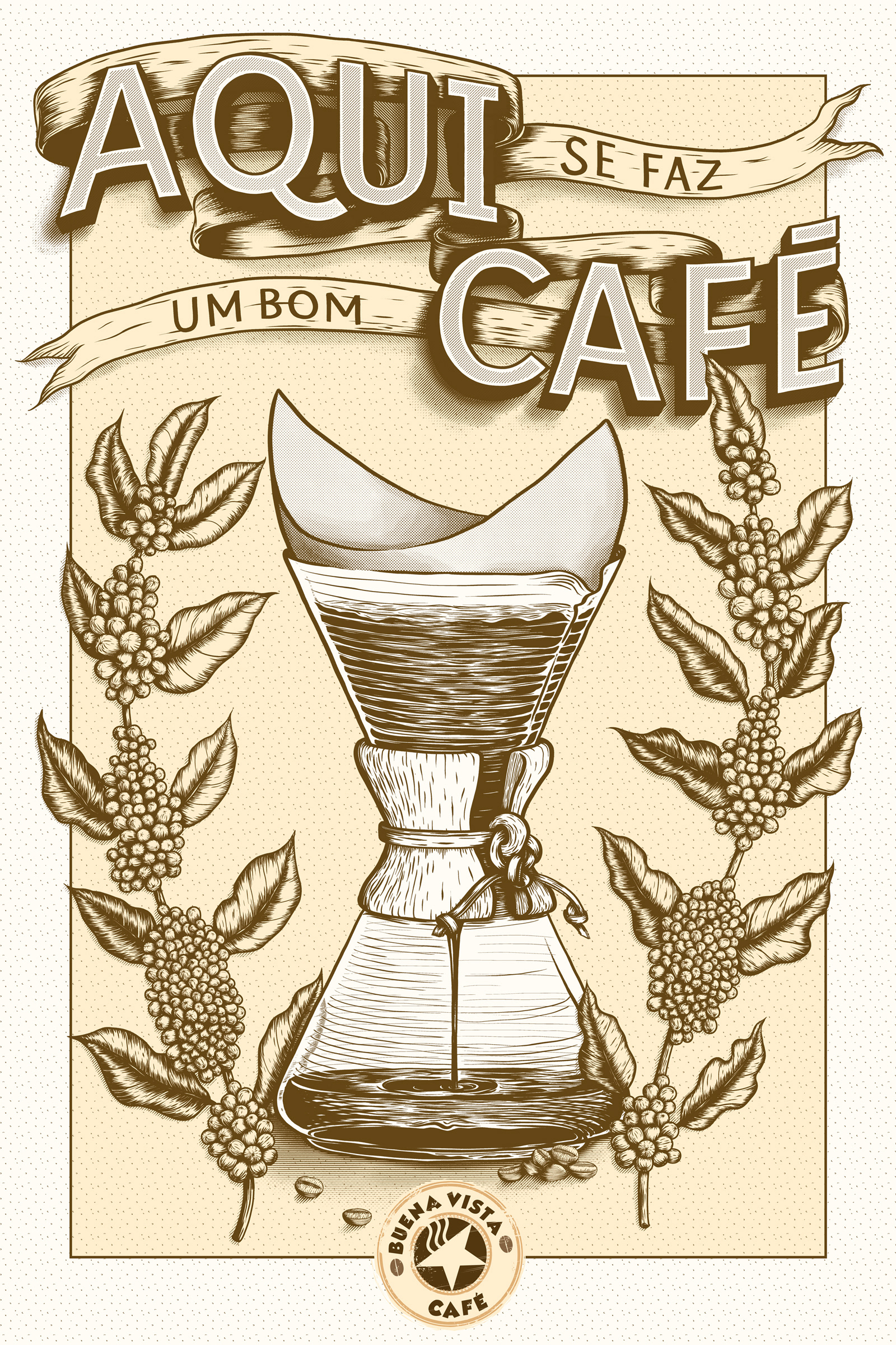
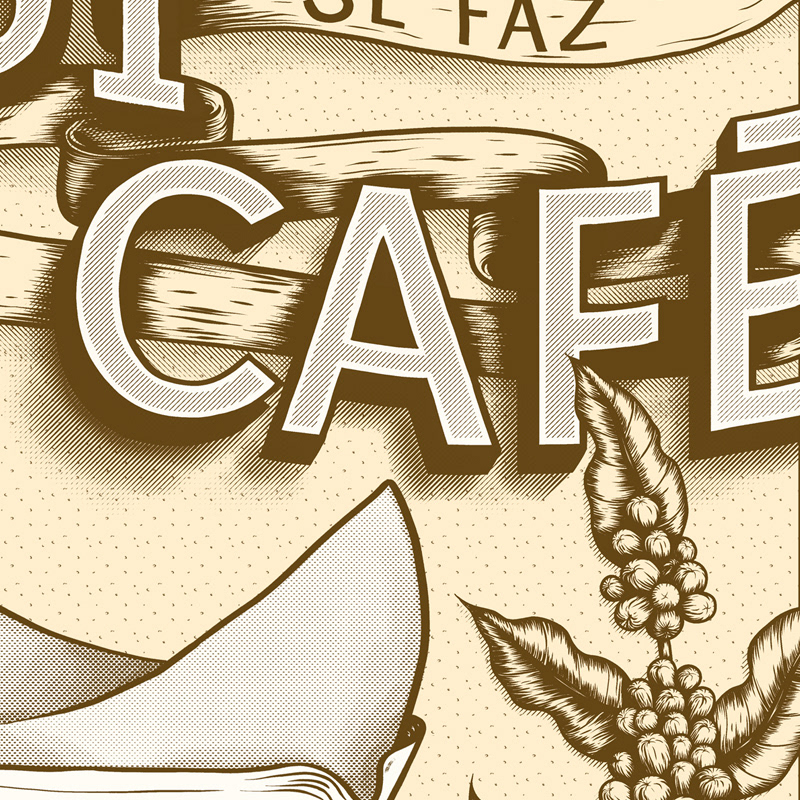
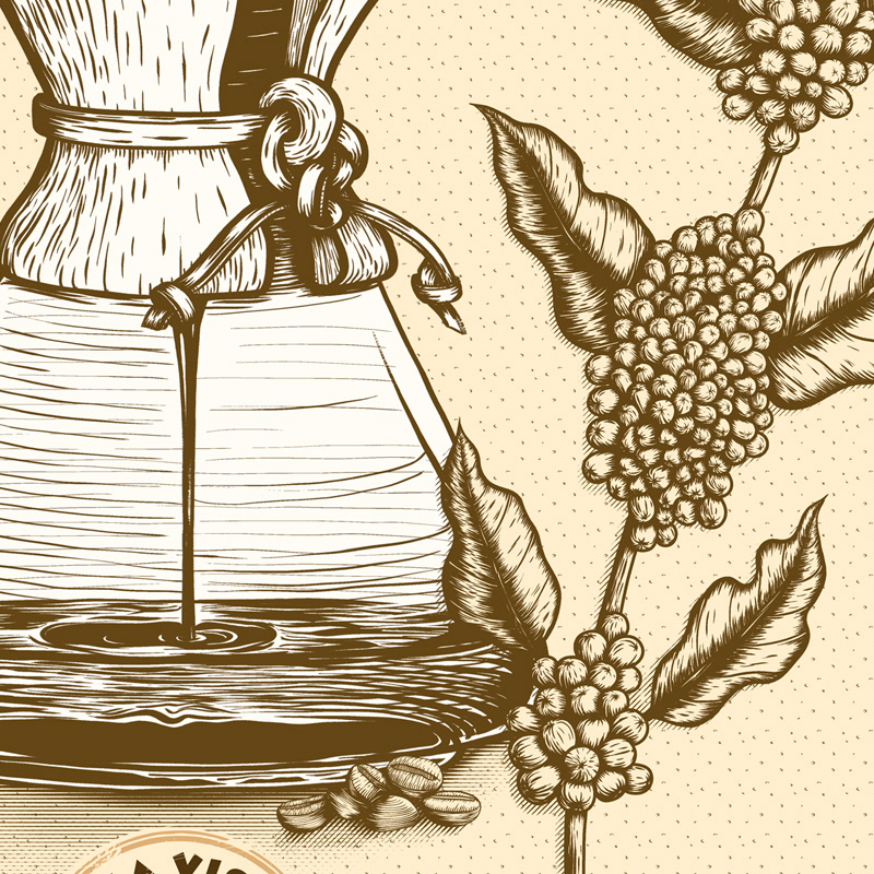
Illustration and lettering poster made as a comission for Buena Vista Café, a small company that works with roasting of special coffees, courses, consulting and training.
The illustration displays a composition of a coffee maker and 2 branches of the plant.


Photos used for mockups:

Cover and header: Jakub Dziubak
Orange background: Tamas Pap
Package: Skylar Michael
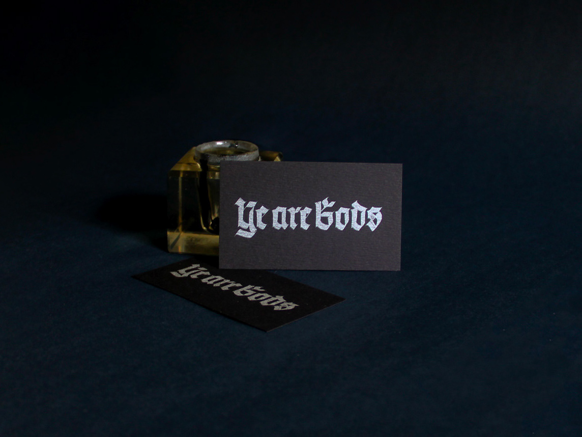
Cards: Avery Evans

 on Unsplash

You may also like

ALBUM COVER | Chora, Princesa!
2020
O álbum “Chora, Princesa! – Um Painel do Choro Contemporâneo de Juiz de Fora” é, sobretudo, um documento que registra, entre 1997 e 2019, um pouco do que se tem feito de Choro na cidade. Para a capa e seus desdobramentos, buscamos usar elementos reconhecidos como parte da identidade de Juiz de Fora. A paleta de cores é uma adaptação das cores da bandeira, e a ilustração faz referência ao estilo predominante em suas construções históricas, o Art Decó, além de representar partes desses prédios e até as luminárias de uma das principais ruas do centro.
ID ILUSTRAÇÃO | Caetano Brasil - romani
2019
Este projeto consiste da identidade visual para o single “romani” lançado pelo artista mineiro Caetano Brasil. O conceito foi baseado em suas inspirações para a composição, o povo cigano, ou romani. A partir delas foram definidos o lettering e a ilustração como base para todo o projeto.
BRAND ID | Organizar & Fluir
2018
Logotype and visual identity developed for "Organizar & Fluir" a Belo Horizonte based company that works with organization for residences, companies, files and documents. They also do home staging and sell products. The process to create the visual universe of the brand relied on common looks of organized and fluid homes, where everythings is found in its place and plants give a harmonious atmosphere to the place.
LETTERING | Ye are Gods
2018
vector and scan lettering for the project Ye are Gods. It is the name of Frederico Rabelo's second season of tattoo works.
Chico Rei Coasters
2017
This is a series of coasters illustrations using the company`s logo in different fun contexts. The coasters are traditionally used as information tags that go with the t-shirts.
DESIGN - ART DIRECTION | Minha Morte
2018
This project shows the development of a logotype for the theater company SURTO, and its first play MINHA MORTE (My Death). The work was all based on logotype, use of type, art direction and photography. The results you can check on the images.
CALLIGRAPHY & LETTERING | O quase último Aum
2022
T-SHIRT PRINTS | Rn Torres
2018
T- shirt illustrations made for my stores at chicorei.com and also threadless. This first collection aimed mostly at type, and calligraphy references and use, including some pop culture elements.
BRAND ID | Chicoreizin
2018
Logotype, a fontface derived from its forms and a brand visual identity system. Those were the deliverables in this project. It was made to represent a kid`s line for a t-shirts company (Chico Rei) as their work is all based on creativity and fun stories, the aim here was to take a little of this culture to the communication.
LOGOTYPE | Casa da Gelada
2020
Casa da Gelada is a small neighborhood gocery store that specializes in alcooholic beverages delivery, its style comes mostly from what was given by the looks of the house itself. With the brick walls and rough wood doors, we thought it would be well represented by an old distilery look With that in mind I did some researching and sketching to create the custom type logo, and a few pieces we needed to get the business going. I also did the hand painted logos and number on the walls.