NAMING & BRANDING - From Flow
A FROM, para alguns, e FLOW, para outros, é uma empresa que tem o objetivo de resignificar o mercado de eventos no Brasil. Valorizamos a criação de sensações e as interações fluídas em todas as etapas do projeto, transformando pessoas a partir de novas e incríveis experiências. Trabalhamos com flexibilidade e complementaridade. Achamos sim que eventos tem que ser cool, diferentes e inusitados, mas acreditamos também em processos, métricas e resultados.
You may also like
36 DAYS OF TYPE - 2018
2019
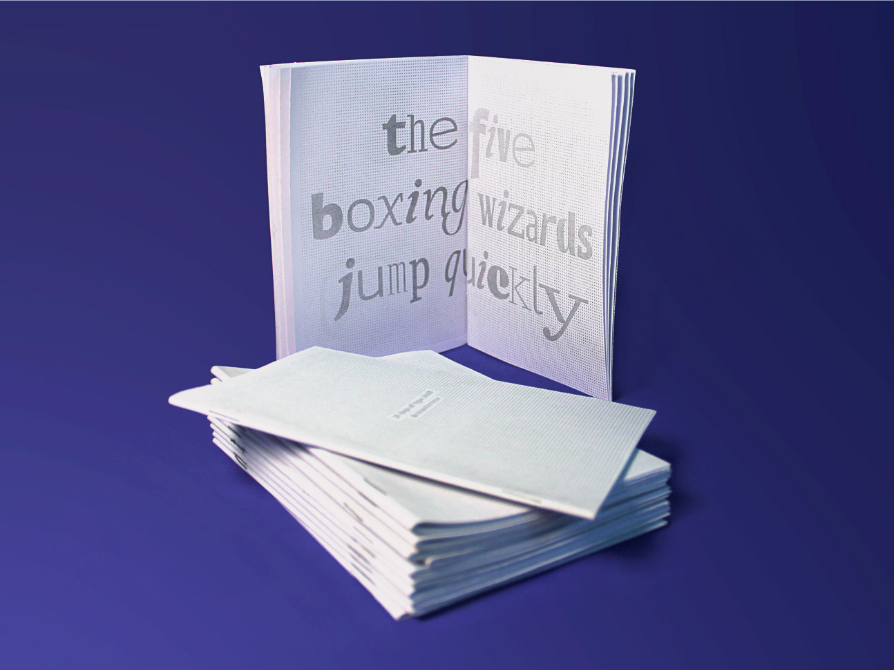
36 days of type 2018. For this edition I focused on training more of a general type design process.
ID ILUSTRAÇÃO | Caetano Brasil - romani
2019
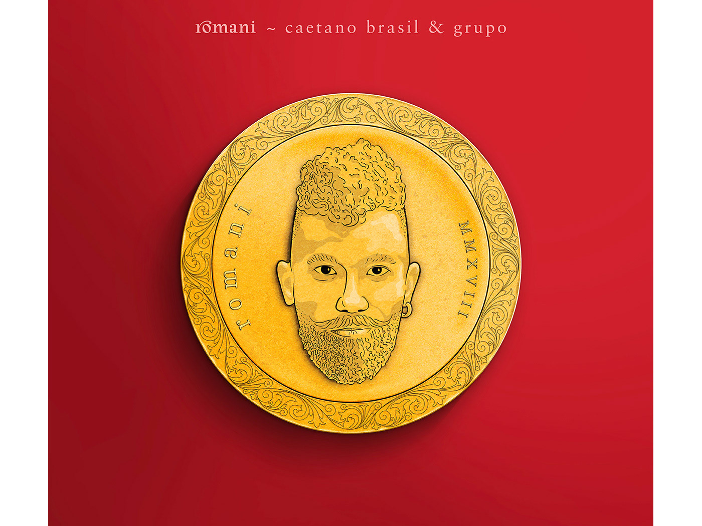
Este projeto consiste da identidade visual para o single “romani” lançado pelo artista mineiro Caetano Brasil. O conceito foi baseado em suas inspirações para a composição, o povo cigano, ou romani. A partir delas foram definidos o lettering e a ilustração como base para todo o projeto.
T-SHIRT PRINTS | Rn Torres
2018
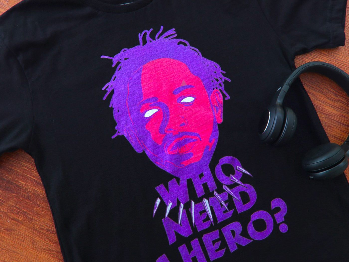
T- shirt illustrations made for my stores at chicorei.com and also threadless. This first collection aimed mostly at type, and calligraphy references and use, including some pop culture elements.
36 DAYS OF TYPE - 2015
2016
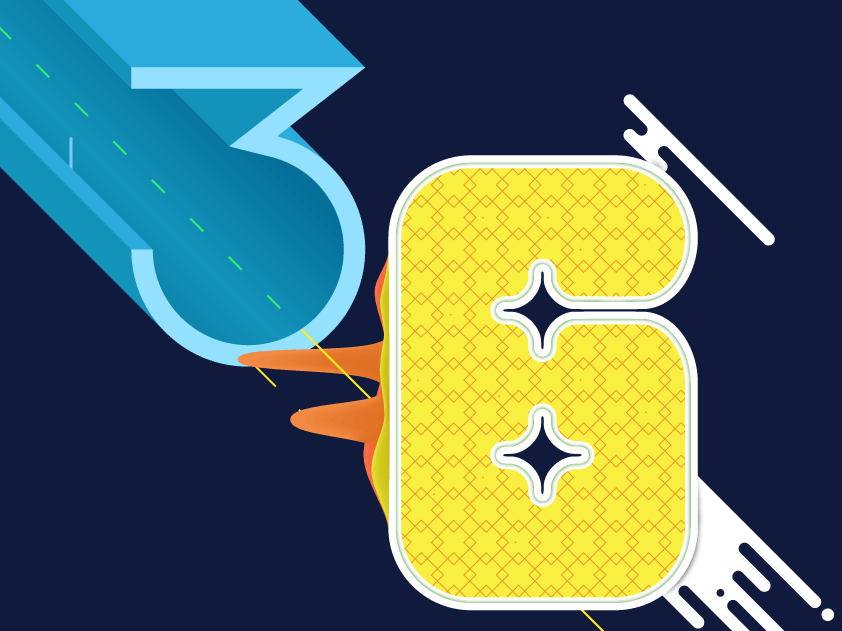
In 2015 as a part of the project 36 Days of Type, I decided to design each letter of the alphabet, all the 10 numbers and the ampersand in a lot of manners, so I could try different technics, ranging from the pure diital, to the mix of analogic items to add a special look to letters. Some of them use external elements to the letter, and some are very foccused in constructing a nice shape.

CALLIGRAPHY & LETTERING | Collection
2023
POSTER | Chicundum
2020
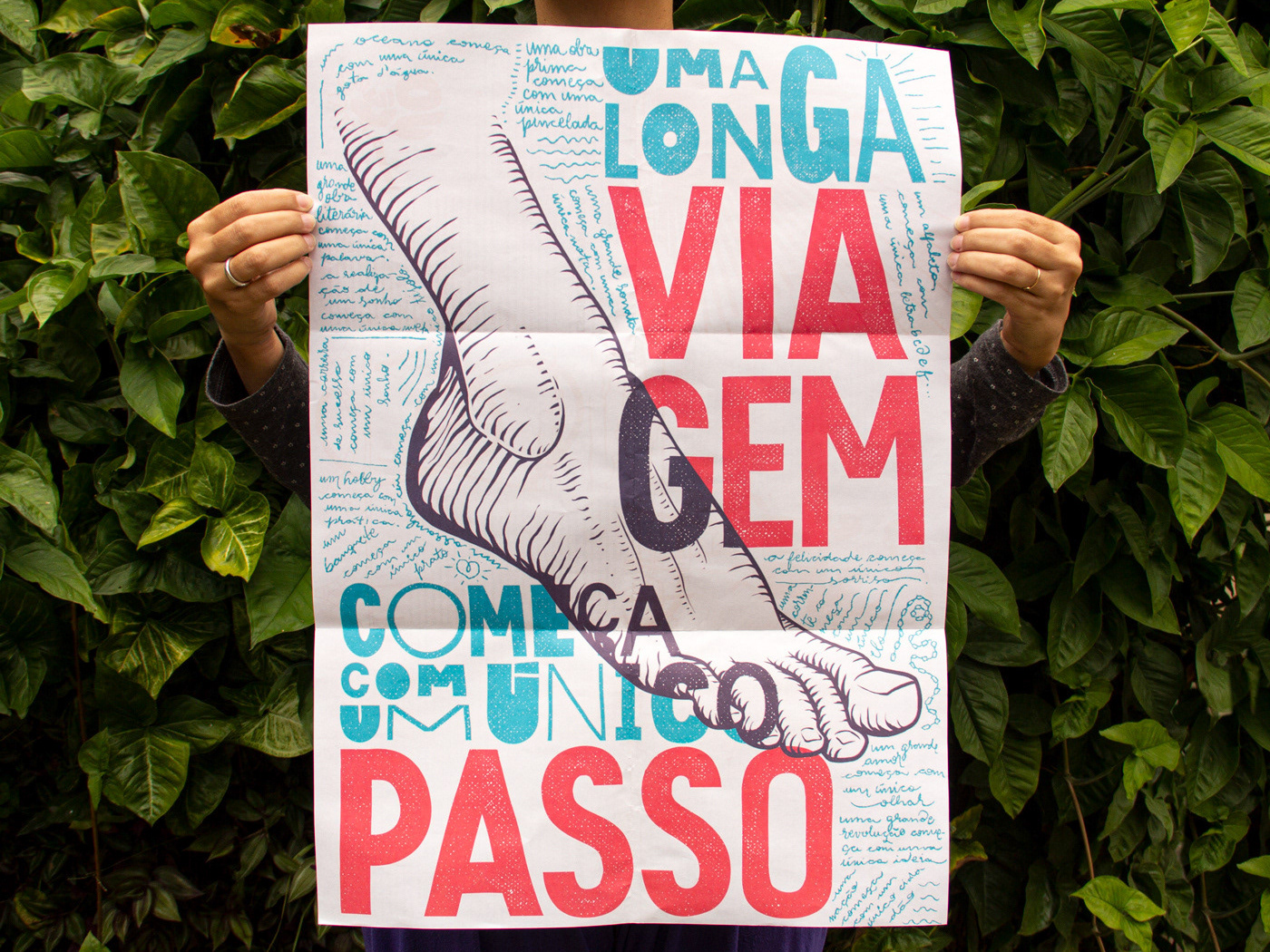
Chicundum is a poster/magazine, made by the clothing online store Chico Rei. The content is varied, always created by different writers with fresh perspectives about life and the possibilities of this amazing world we live in. For this edition, that focused a lot on personal journeys, projects and traveling, I was invited to created a poster and the illustrations that go with the content.
The quote in the poster says “A journey of a thousand miles begins with a single step”, and the small letters are variations of it, as “A successful career starts with a single dream”.

BRAND ID | Basic clothing Chico Rei
2019
Chico Rei is a brazilian t-shirt company specialized in creative artwork segment.
This project had as an objective to make their basic products an inside brand, for that, as a part of their in-house communication team at the time we created the texts, and concept based on bauhaus/clean design. Raw materials where photographed and used as visual elements, And then the graphics came in to play giving it some unity.

BRAND ID | Alinhavado no Papel
2023
DESIGN - ART DIRECTION | Minha Morte
2018
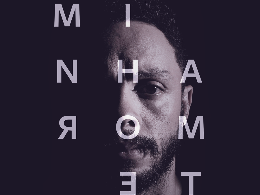
This project shows the development of a logotype for the theater company SURTO, and its first play MINHA MORTE (My Death).
The work was all based on logotype, use of type, art direction and photography. The results you can check on the images.
BRAND ID | Estúdio Curió
2022
