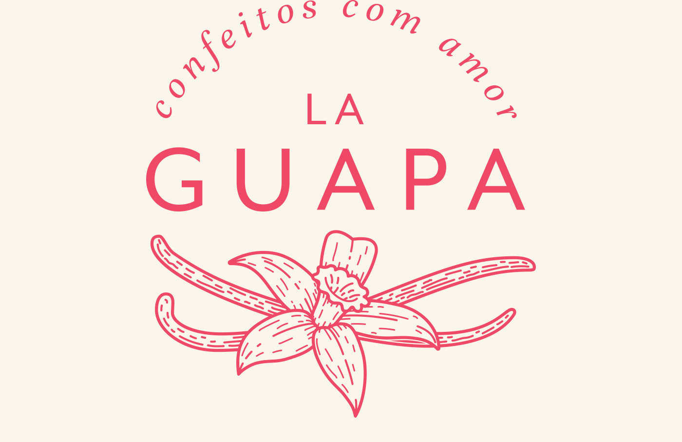
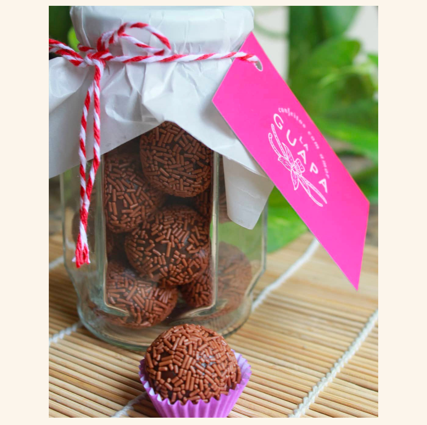
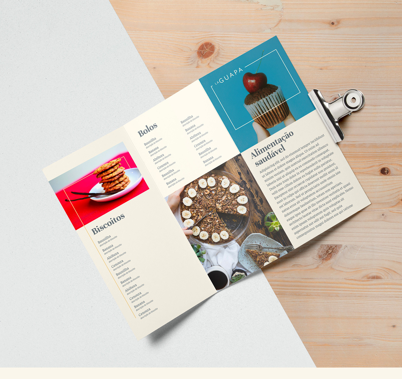
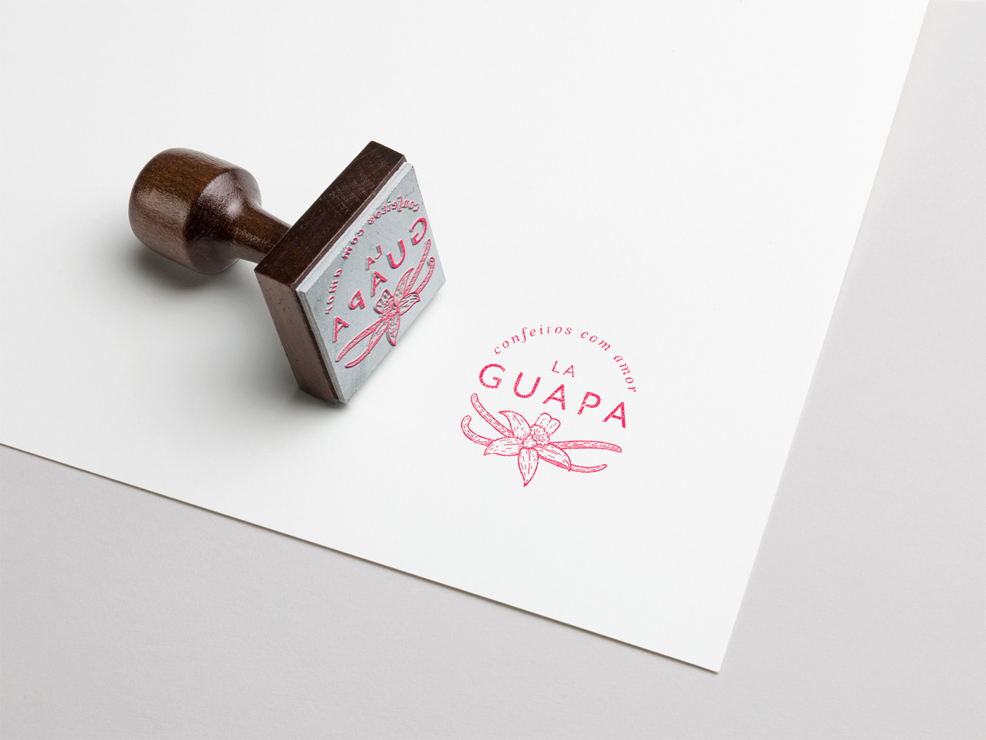
La Guapa prizes for comfit made with high quality ingredients, turning the final product into something to eat with ease and pleasure, no guilty. Also, one of the company's focuses is its vegan product line.
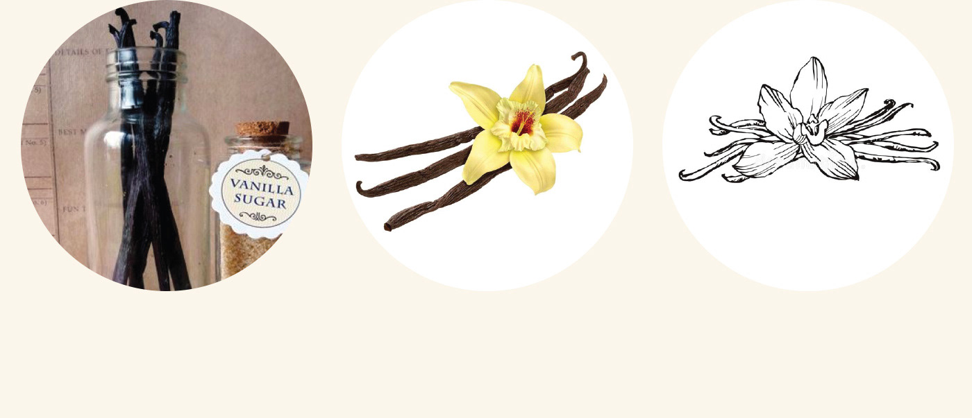
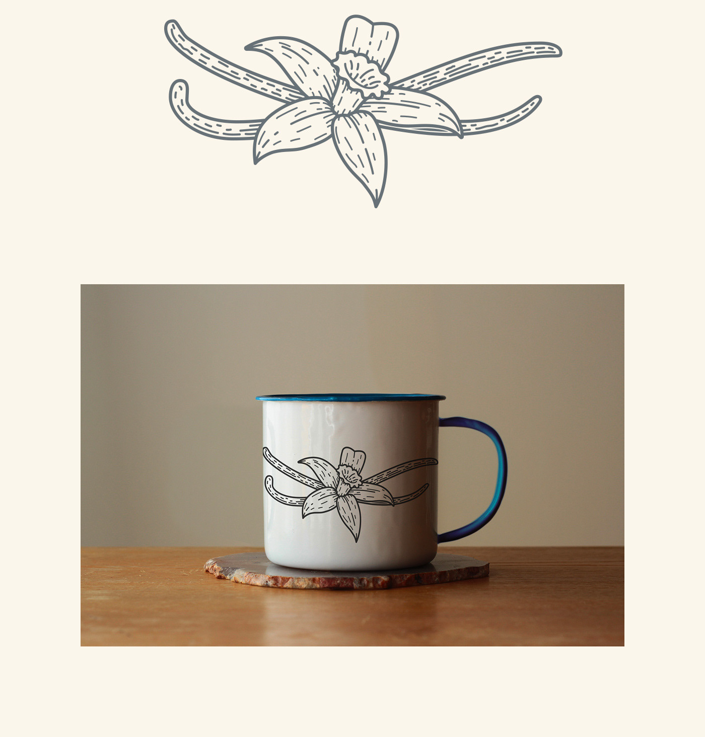
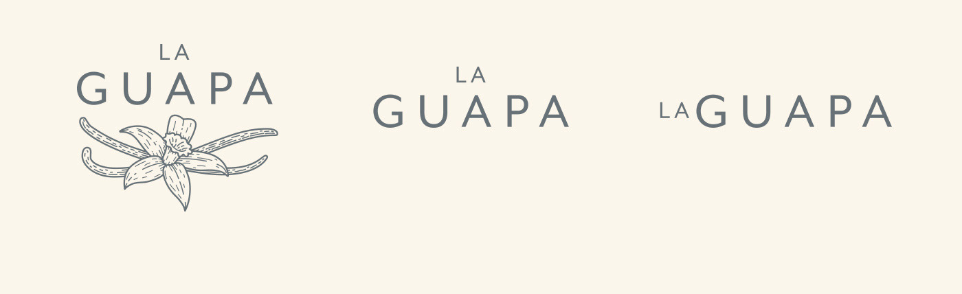
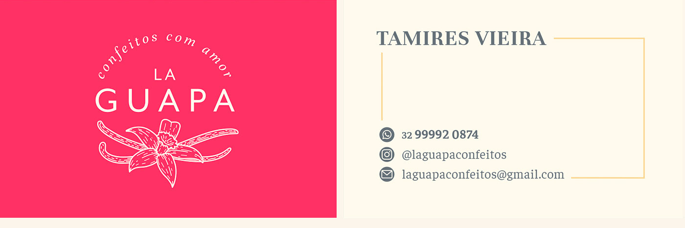
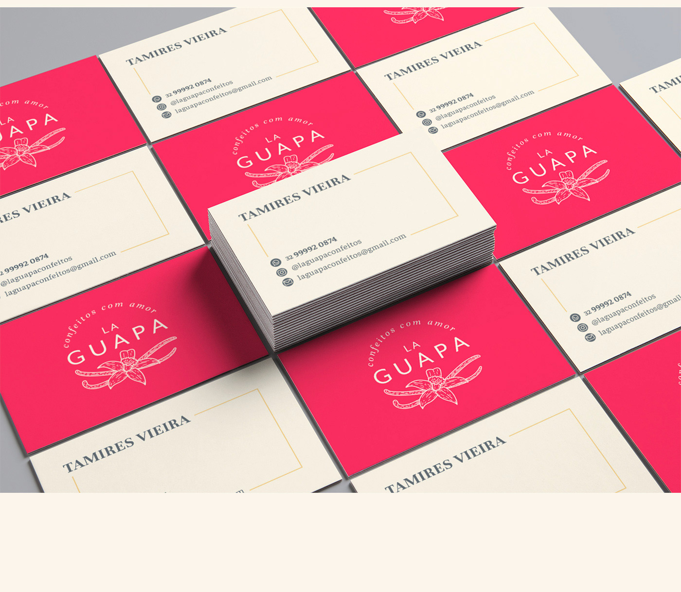
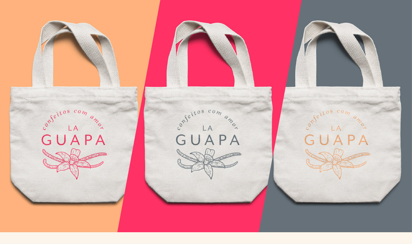
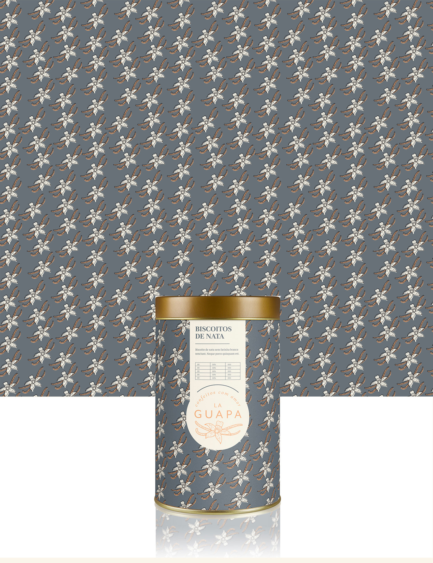
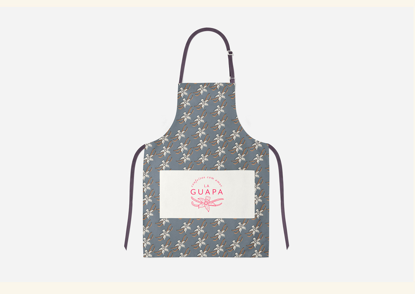
With all that, and having in mind that in comfit making, the vanilla essence is a very common element, which in this case is handmade by the owner Tamires, the combs and the flower of the plant were chosen for the creation of the logo of the brand.
​​​​​​​

You may also like

BRAND ID | Estúdio Curió
2022
VISUAL IDENTITY | Galanga
2018
Logotype and visual identity developed for the 10th aniversary party of the brazilian creative company, Chico Rei (www.chicorei.com).
36 DAYS OF TYPE - 2015
2016
In 2015 as a part of the project 36 Days of Type, I decided to design each letter of the alphabet, all the 10 numbers and the ampersand in a lot of manners, so I could try different technics, ranging from the pure diital, to the mix of analogic items to add a special look to letters. Some of them use external elements to the letter, and some are very foccused in constructing a nice shape.
NAMING & BRANDING - From Flow
2015
A FROM, para alguns, e FLOW, para outros, é uma empresa que tem o objetivo de resignificar o mercado de eventos no Brasil. Valorizamos a criação de sensações e as interações fluídas em todas as etapas do projeto, transformando pessoas a partir de novas e incríveis experiências. Trabalhamos com flexibilidade e complementaridade. Achamos sim que eventos tem que ser cool, diferentes e inusitados, mas acreditamos também em processos, métricas e resultados.
CALLIGRAPHY & LETTERING | Collection
2023
ILLUSTRATION | BumpSide Brasil
2020
BumpSide Brasil is a group of Ford Trucks aficionados.  They gather in events to talk about this cars that many of them collect, restore or just love to be around. They have invited me to make two illustrations for their t-shirts, the following images show a bit of process and the results of digital illustrations portraying ford trucks and exclusive lettering as well as a representation of Mr. Clint Eastwood. For this job I used both vector and photoshop brushes. The final results are two artworks for t-shirts.
CALLIGRAPHY SKETCHBOOK 01 | Renan Torres
2019
omecei a treinar caligrafia como um exercício de fundamentos para o desenho de lettering e design de tipos, agora tenho como objetivo achar uma expressão artística na própria prática. Este é o primeiro de uma série de sketchbooks de caligrafia que pretendo fazer para buscar novas formas de criar letras à mão.
ALBUM COVER | Chora, Princesa!
2020
O álbum “Chora, Princesa! – Um Painel do Choro Contemporâneo de Juiz de Fora” é, sobretudo, um documento que registra, entre 1997 e 2019, um pouco do que se tem feito de Choro na cidade. Para a capa e seus desdobramentos, buscamos usar elementos reconhecidos como parte da identidade de Juiz de Fora. A paleta de cores é uma adaptação das cores da bandeira, e a ilustração faz referência ao estilo predominante em suas construções históricas, o Art Decó, além de representar partes desses prédios e até as luminárias de uma das principais ruas do centro.
T-SHIRT PRINTS | Rn Torres
2018
T- shirt illustrations made for my stores at chicorei.com and also threadless. This first collection aimed mostly at type, and calligraphy references and use, including some pop culture elements.
LABEL | LOGOTYPE - Seiva da Mata
2017
This job required the creation of all 4 illustrations for the different kinds of beer. They had selected a free font to use as their logo. I offered this solution of a custom lettering and it was well appreciated by the client. Seiva da Mata is an artisanal brewery based in Minas Gerais, Brazil, that seeks to give its beers the freshness of life close to nature, which is common to the country side of the state. In order to communicate this, images have been chosen that refer to the worker of the field and his quiet in moments of the day when contemplation is like a reward for his work.