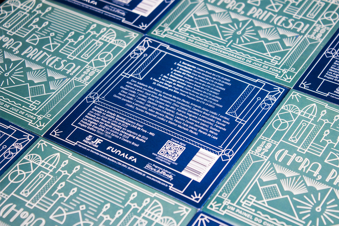
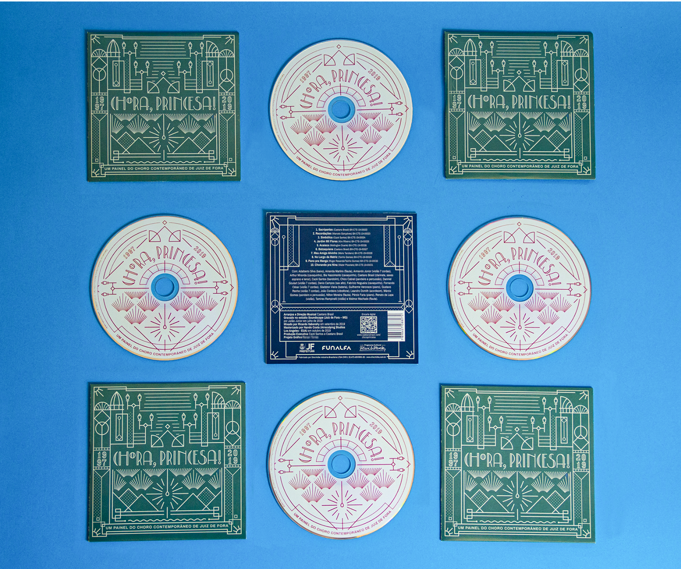
The album “Chora, Princesa! -  Um Painel do Choro Contemporâneo de Juiz de Fora” is, above all, a document that registers a little of what has been done about Choro in the city of Juiz de Fora (Brazil) between 1997 and 2019. 
For the cover and other artwork, we used elements that are part of the identity of Juiz de Fora. The color palette is an adaptation of the flag's colours, and the illustration refers to the predominant style in its historic buildings, Art Decó, in addition to representing parts of these buildings and even the lamps on one of the main streets downtown.​​​​​​​

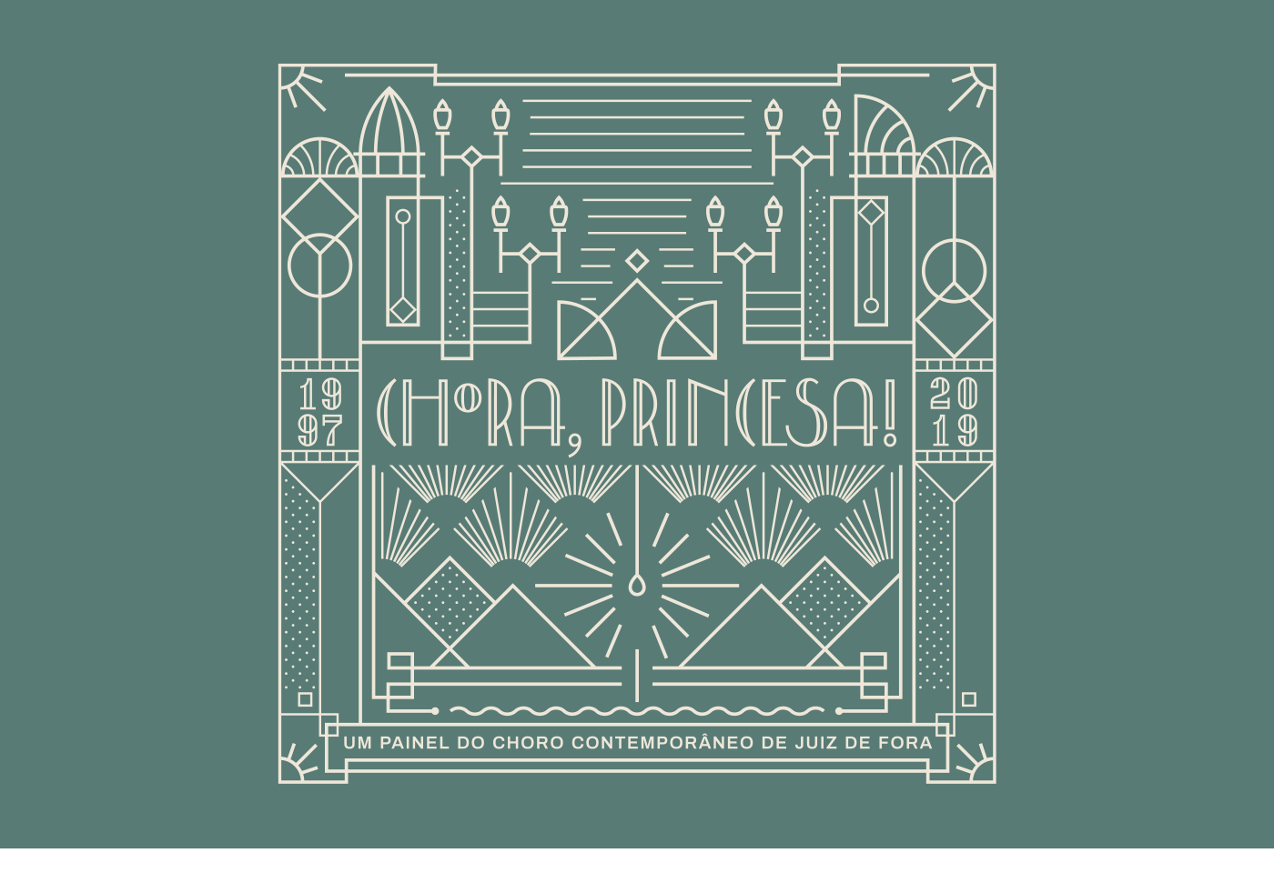
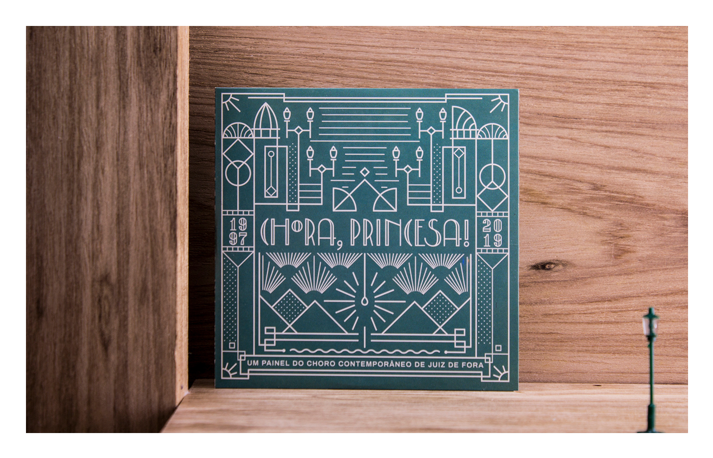
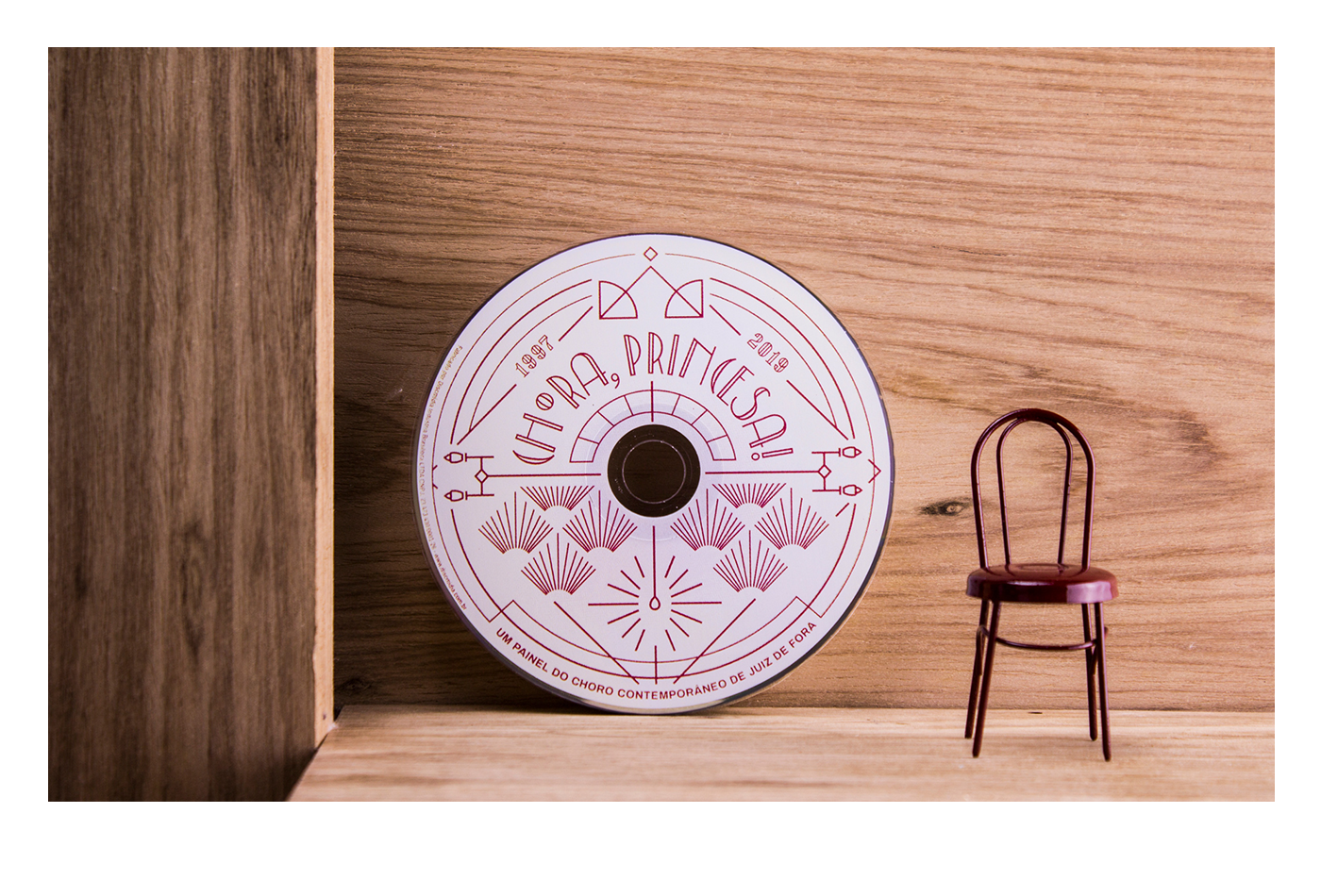
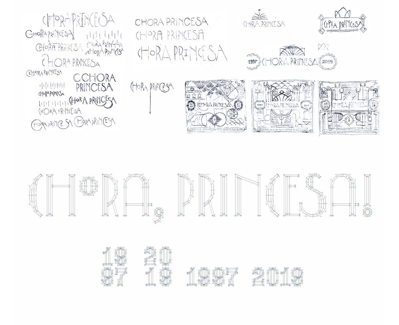
CUSTOM LETTERING FOR THE TITLE AND DATES

All of the text in the cover was drawn especially for this project and exported as a font file for better flexibility on adapting the artwork to different formats such as the round disc.


Fotografia por @danielcampos.ard

You may also like

BOOK CONCEPT - The Metamorphosis
2015
Proposta de criação de um projeto completo de livro. O principal desafio foi a representação gráfica desta história sem recorrer às formas de barata. Proposal of a complete book project. The main challenge was to graphically represent this sttory without references to the cockroach forms.
DESIGN - ART DIRECTION | Minha Morte
2018
This project shows the development of a logotype for the theater company SURTO, and its first play MINHA MORTE (My Death). The work was all based on logotype, use of type, art direction and photography. The results you can check on the images.
T-SHIRT PRINTS | Rn Torres
2018
T- shirt illustrations made for my stores at chicorei.com and also threadless. This first collection aimed mostly at type, and calligraphy references and use, including some pop culture elements.
BRAND ID | Basic clothing Chico Rei
2019
Chico Rei is a brazilian t-shirt company specialized in creative artwork segment. This project had as an objective to make their basic products an inside brand, for that, as a part of their in-house communication team at the time we created the texts, and concept based on bauhaus/clean design. Raw materials where photographed and used as visual elements, And then the graphics came in to play giving it some unity.
36 DAYS OF TYPE - 2015
2016
In 2015 as a part of the project 36 Days of Type, I decided to design each letter of the alphabet, all the 10 numbers and the ampersand in a lot of manners, so I could try different technics, ranging from the pure diital, to the mix of analogic items to add a special look to letters. Some of them use external elements to the letter, and some are very foccused in constructing a nice shape.
CALLIGRAPHY & LETTERING | Collection
2023
NAMING & BRANDING - From Flow
2015
A FROM, para alguns, e FLOW, para outros, é uma empresa que tem o objetivo de resignificar o mercado de eventos no Brasil. Valorizamos a criação de sensações e as interações fluídas em todas as etapas do projeto, transformando pessoas a partir de novas e incríveis experiências. Trabalhamos com flexibilidade e complementaridade. Achamos sim que eventos tem que ser cool, diferentes e inusitados, mas acreditamos também em processos, métricas e resultados.
LABEL | LOGOTYPE - Seiva da Mata
2017
This job required the creation of all 4 illustrations for the different kinds of beer. They had selected a free font to use as their logo. I offered this solution of a custom lettering and it was well appreciated by the client. Seiva da Mata is an artisanal brewery based in Minas Gerais, Brazil, that seeks to give its beers the freshness of life close to nature, which is common to the country side of the state. In order to communicate this, images have been chosen that refer to the worker of the field and his quiet in moments of the day when contemplation is like a reward for his work.
BRAND ID | Inpulse
2018
INPULSE is a Pilates and physiotherapy studio, it uses an ecletic aproach, presenting other services as aesthetic treatment, auricle acupuncture, kinesiology tape and Global Posture Re-education. The Brand Identity was imagined to follow the owner`s flexibility on work techniques and personal impact made possible by Dani`s natural talent for it, and a small studio environment.
LETTERING | Ye are Gods
2018
vector and scan lettering for the project Ye are Gods. It is the name of Frederico Rabelo's second season of tattoo works.