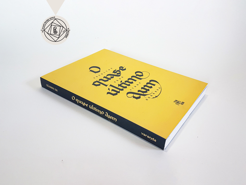
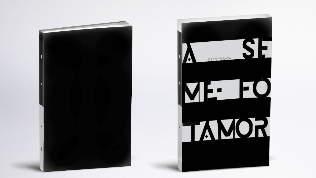
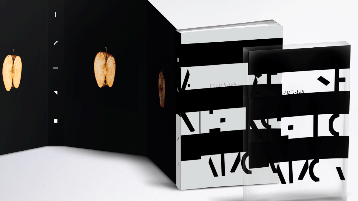
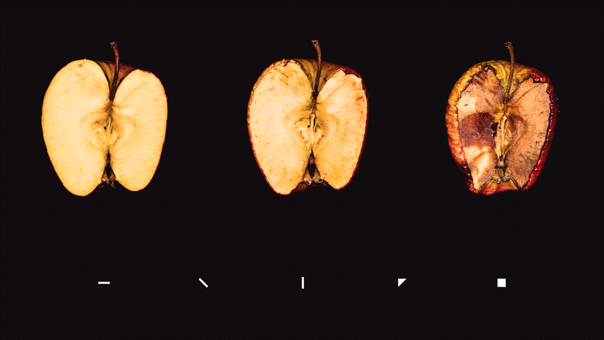
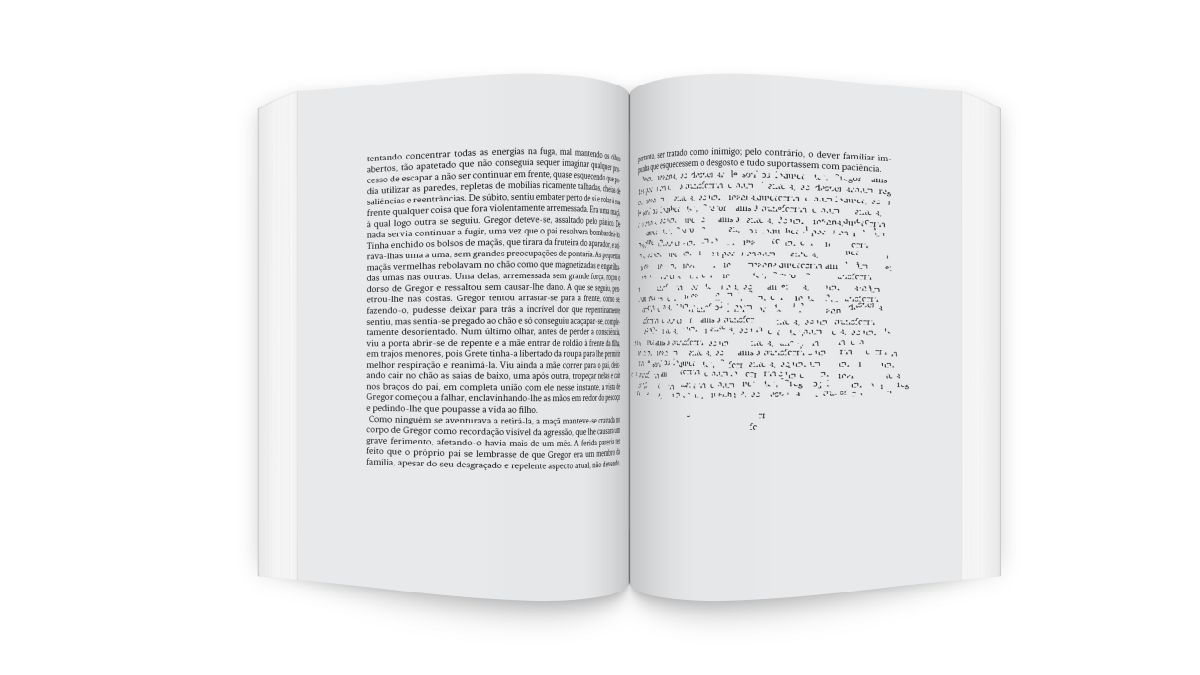
You may also like

Chico Rei Coasters
2017
This is a series of coasters illustrations using the company`s logo in different fun contexts. The coasters are traditionally used as information tags that go with the t-shirts.
CALLIGRAPHY & LETTERING | Collection
2023
36 DAYS OF TYPE - 2015
2016
In 2015 as a part of the project 36 Days of Type, I decided to design each letter of the alphabet, all the 10 numbers and the ampersand in a lot of manners, so I could try different technics, ranging from the pure diital, to the mix of analogic items to add a special look to letters. Some of them use external elements to the letter, and some are very foccused in constructing a nice shape.
CALLIGRAPHY & LETTERING | O quase último Aum
2022
BRAND ID | Chicoreizin
2018
Logotype, a fontface derived from its forms and a brand visual identity system. Those were the deliverables in this project. It was made to represent a kid`s line for a t-shirts company (Chico Rei) as their work is all based on creativity and fun stories, the aim here was to take a little of this culture to the communication.
LOGOTYPE | Casa da Gelada
2020
Casa da Gelada is a small neighborhood gocery store that specializes in alcooholic beverages delivery, its style comes mostly from what was given by the looks of the house itself. With the brick walls and rough wood doors, we thought it would be well represented by an old distilery look With that in mind I did some researching and sketching to create the custom type logo, and a few pieces we needed to get the business going. I also did the hand painted logos and number on the walls.
BRAND ID | Organizar & Fluir
2018
Logotype and visual identity developed for "Organizar & Fluir" a Belo Horizonte based company that works with organization for residences, companies, files and documents. They also do home staging and sell products. The process to create the visual universe of the brand relied on common looks of organized and fluid homes, where everythings is found in its place and plants give a harmonious atmosphere to the place.
VISUAL IDENTITY | Galanga
2018
Logotype and visual identity developed for the 10th aniversary party of the brazilian creative company, Chico Rei (www.chicorei.com).
ID ILUSTRAÇÃO | Caetano Brasil - romani
2019
Este projeto consiste da identidade visual para o single “romani” lançado pelo artista mineiro Caetano Brasil. O conceito foi baseado em suas inspirações para a composição, o povo cigano, ou romani. A partir delas foram definidos o lettering e a ilustração como base para todo o projeto.
T-SHIRT PRINTS | Rn Torres
2018
T- shirt illustrations made for my stores at chicorei.com and also threadless. This first collection aimed mostly at type, and calligraphy references and use, including some pop culture elements.