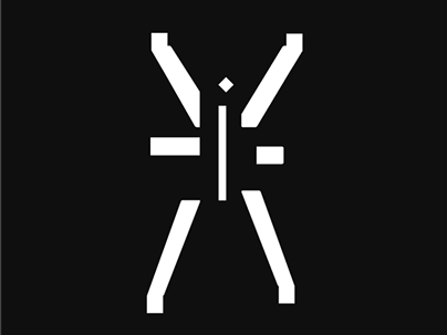
Esta é uma série de ilustrações de porta copos usando o logotipo da empresa em contextos divertidos. Eles são usados tradicionalmente como etiquetas que acompanham as camisetas.​​​​​​​
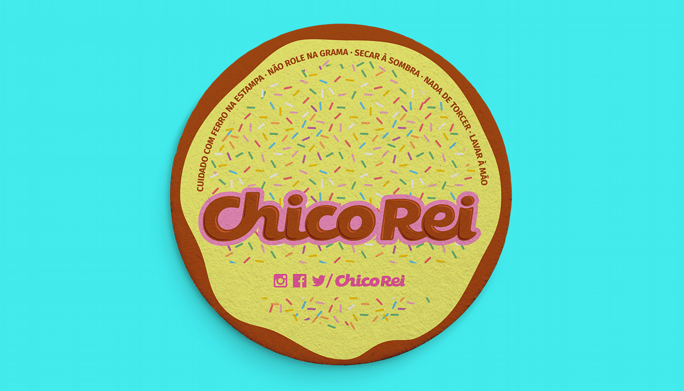
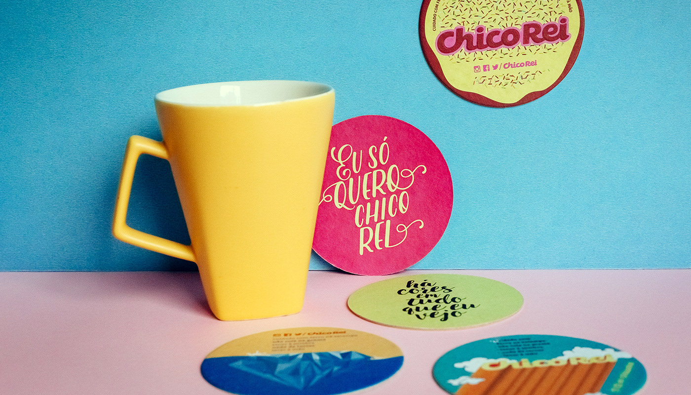
You may also like

ILLUSTRATION | Buena Vista Café
2020
BOOK CONCEPT - The Metamorphosis
2015
Proposta de criação de um projeto completo de livro. O principal desafio foi a representação gráfica desta história sem recorrer às formas de barata. Proposal of a complete book project. The main challenge was to graphically represent this sttory without references to the cockroach forms.
BRAND ID | Inpulse
2018
INPULSE is a Pilates and physiotherapy studio, it uses an ecletic aproach, presenting other services as aesthetic treatment, auricle acupuncture, kinesiology tape and Global Posture Re-education. The Brand Identity was imagined to follow the owner`s flexibility on work techniques and personal impact made possible by Dani`s natural talent for it, and a small studio environment.
LETTERING | Ye are Gods
2018
vector and scan lettering for the project Ye are Gods. It is the name of Frederico Rabelo's second season of tattoo works.
36 DAYS OF TYPE - 2018
2019
36 days of type 2018. For this edition I focused on training more of a general type design process.
BRAND ID | Estúdio Curió
2022
ILLUSTRATION | BumpSide Brasil
2020
BumpSide Brasil is a group of Ford Trucks aficionados.  They gather in events to talk about this cars that many of them collect, restore or just love to be around. They have invited me to make two illustrations for their t-shirts, the following images show a bit of process and the results of digital illustrations portraying ford trucks and exclusive lettering as well as a representation of Mr. Clint Eastwood. For this job I used both vector and photoshop brushes. The final results are two artworks for t-shirts.
POSTER | Chicundum
2020
Chicundum is a poster/magazine, made by the clothing online store Chico Rei. The content is varied, always created by different writers with fresh perspectives about life and the possibilities of this amazing world we live in. For this edition, that focused a lot on personal journeys, projects and traveling, I was invited to created a poster and the illustrations that go with the content. The quote in the poster says “A journey of a thousand miles begins with a single step”, and the small letters are variations of it, as “A successful career starts with a single dream”.
ALBUM COVER | Cartografias
2021
Cartografias é o segundo álbum completo do instrumentista e músico Caetano Brasil. A inspiração para as composições vem cada uma de um lugar diferente no mundo e, a cada faixa, características dessas culturas se misturam com a essência do Choro brasileiro, e as referências do artista. Fui convidado para criar a capa e algumas peças de divulgação online para este lançamento. A solução visual tenta espelhar o que foi feito musicalmente no álbum, busca referências das culturas que inspiraram cada música do álbum, como cerejeiras japonesas, moedas ciganas e coqueiros nas praias caribenhas. Tudo isso se mistura com o rosto do artista em uma colagem manual. Alguns elementos isolados foram usados para peças de redes sociais.
36 DAYS OF TYPE - 2015
2016
In 2015 as a part of the project 36 Days of Type, I decided to design each letter of the alphabet, all the 10 numbers and the ampersand in a lot of manners, so I could try different technics, ranging from the pure diital, to the mix of analogic items to add a special look to letters. Some of them use external elements to the letter, and some are very foccused in constructing a nice shape.