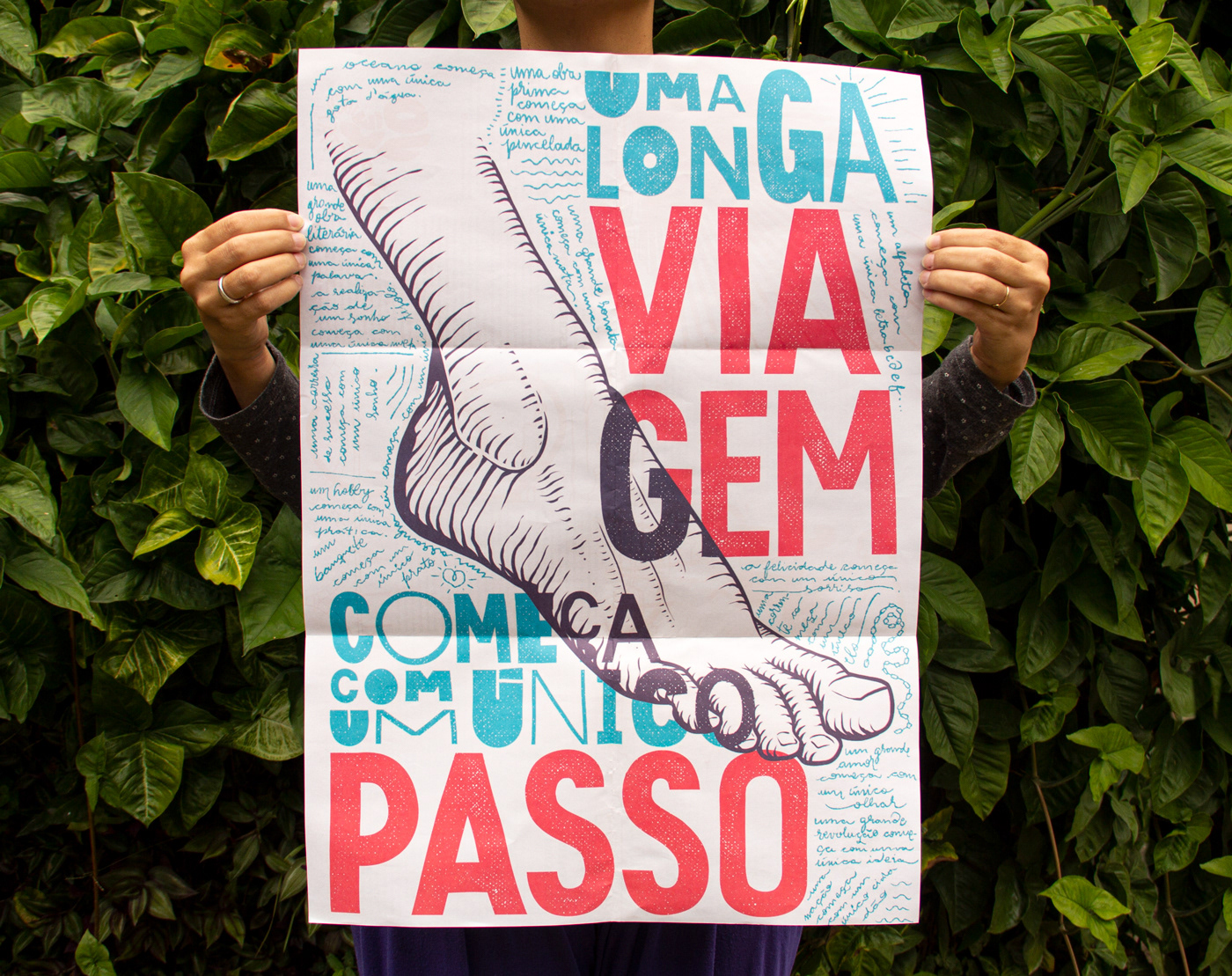
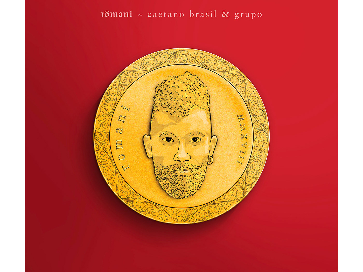
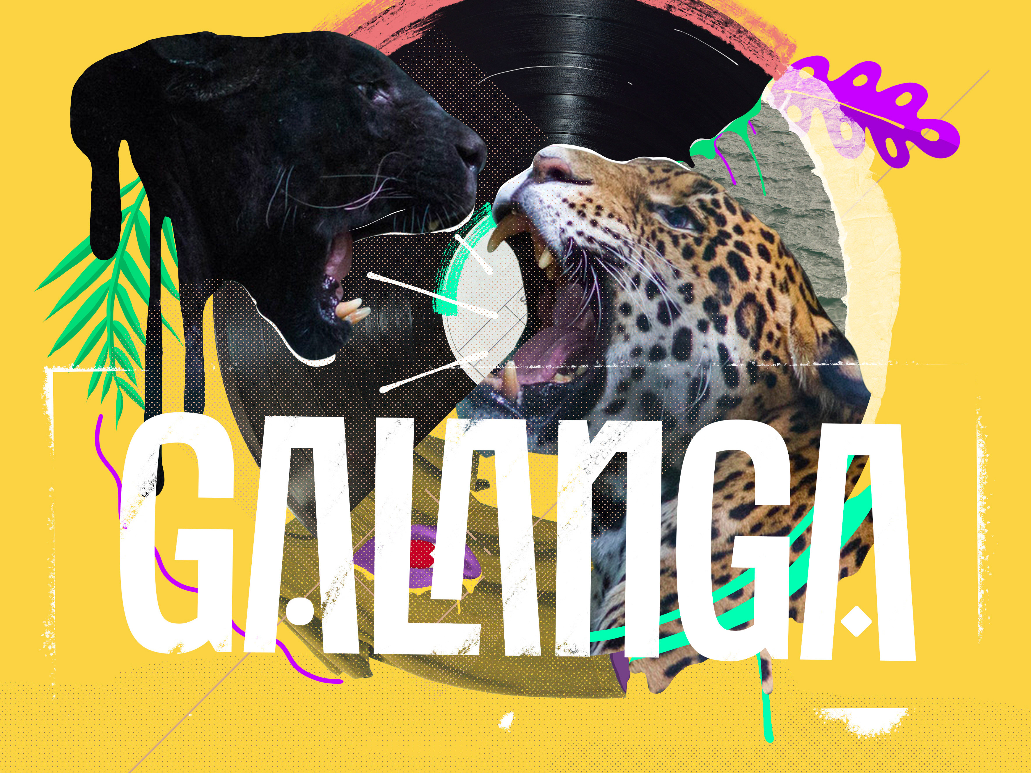
Chicundum é a revista pôster da Chico Rei. O conteúdo é variado, sempre criado por diferentes escritores, com perspectivas inspiradas sobre a vida e as possibilidades deste mundo incrível em que vivemos. Para esta edição, focada em jornadas pessoais, projetos e viagens, fui convidado a criar um pôster e as ilustrações que acompanham o conteúdo.

You may also like

BRAND ID | Organizar & Fluir
2018
Logotype and visual identity developed for "Organizar & Fluir" a Belo Horizonte based company that works with organization for residences, companies, files and documents. They also do home staging and sell products. The process to create the visual universe of the brand relied on common looks of organized and fluid homes, where everythings is found in its place and plants give a harmonious atmosphere to the place.
36 DAYS OF TYPE - 2018
2019
36 days of type 2018. For this edition I focused on training more of a general type design process.
BRAND ID | Alinhavado no Papel
2023
LOGOTYPE | Casa da Gelada
2020
Casa da Gelada is a small neighborhood gocery store that specializes in alcooholic beverages delivery, its style comes mostly from what was given by the looks of the house itself. With the brick walls and rough wood doors, we thought it would be well represented by an old distilery look With that in mind I did some researching and sketching to create the custom type logo, and a few pieces we needed to get the business going. I also did the hand painted logos and number on the walls.
36 DAYS OF TYPE - 2015
2016
In 2015 as a part of the project 36 Days of Type, I decided to design each letter of the alphabet, all the 10 numbers and the ampersand in a lot of manners, so I could try different technics, ranging from the pure diital, to the mix of analogic items to add a special look to letters. Some of them use external elements to the letter, and some are very foccused in constructing a nice shape.
ID ILUSTRAÇÃO | Caetano Brasil - romani
2019
Este projeto consiste da identidade visual para o single “romani” lançado pelo artista mineiro Caetano Brasil. O conceito foi baseado em suas inspirações para a composição, o povo cigano, ou romani. A partir delas foram definidos o lettering e a ilustração como base para todo o projeto.
VISUAL IDENTITY | Galanga
2018
Logotype and visual identity developed for the 10th aniversary party of the brazilian creative company, Chico Rei (www.chicorei.com).
LABEL | LOGOTYPE - Seiva da Mata
2017
This job required the creation of all 4 illustrations for the different kinds of beer. They had selected a free font to use as their logo. I offered this solution of a custom lettering and it was well appreciated by the client. Seiva da Mata is an artisanal brewery based in Minas Gerais, Brazil, that seeks to give its beers the freshness of life close to nature, which is common to the country side of the state. In order to communicate this, images have been chosen that refer to the worker of the field and his quiet in moments of the day when contemplation is like a reward for his work.
T-SHIRT PRINTS | Rn Torres
2018
T- shirt illustrations made for my stores at chicorei.com and also threadless. This first collection aimed mostly at type, and calligraphy references and use, including some pop culture elements.
LOGOTYPE | Tiago Sarmento
2018
This is a custom lettering logotype, it was made for a musician from Brazil. The style of the letters war conceived to convey the artist'sboho folk style.