You may also like

BRAND ID | La Guapa
2018
Tamires contacted me to make a logotype and a basic development of a brand for her to sell her home made comfit. All very healthy and tasty. For this job I made an illustrated brand icon, many applications of the logo, a color palete, and determined a set of typefaces to give the right tone for her identity.
T-SHIRT PRINTS | Rn Torres
2018
T- shirt illustrations made for my stores at chicorei.com and also threadless. This first collection aimed mostly at type, and calligraphy references and use, including some pop culture elements.
BRAND ID | Basic clothing Chico Rei
2019
Chico Rei is a brazilian t-shirt company specialized in creative artwork segment. This project had as an objective to make their basic products an inside brand, for that, as a part of their in-house communication team at the time we created the texts, and concept based on bauhaus/clean design. Raw materials where photographed and used as visual elements, And then the graphics came in to play giving it some unity.
BRAND ID | Estúdio Curió
2022
POSTER | Chicundum
2020
Chicundum is a poster/magazine, made by the clothing online store Chico Rei. The content is varied, always created by different writers with fresh perspectives about life and the possibilities of this amazing world we live in. For this edition, that focused a lot on personal journeys, projects and traveling, I was invited to created a poster and the illustrations that go with the content. The quote in the poster says “A journey of a thousand miles begins with a single step”, and the small letters are variations of it, as “A successful career starts with a single dream”.
36 DAYS OF TYPE - 2015
2016
In 2015 as a part of the project 36 Days of Type, I decided to design each letter of the alphabet, all the 10 numbers and the ampersand in a lot of manners, so I could try different technics, ranging from the pure diital, to the mix of analogic items to add a special look to letters. Some of them use external elements to the letter, and some are very foccused in constructing a nice shape.
LOGOTYPE | Tiago Sarmento
2018
This is a custom lettering logotype, it was made for a musician from Brazil. The style of the letters war conceived to convey the artist'sboho folk style.
BRAND ID | Organizar & Fluir
2018
Logotype and visual identity developed for "Organizar & Fluir" a Belo Horizonte based company that works with organization for residences, companies, files and documents. They also do home staging and sell products. The process to create the visual universe of the brand relied on common looks of organized and fluid homes, where everythings is found in its place and plants give a harmonious atmosphere to the place.
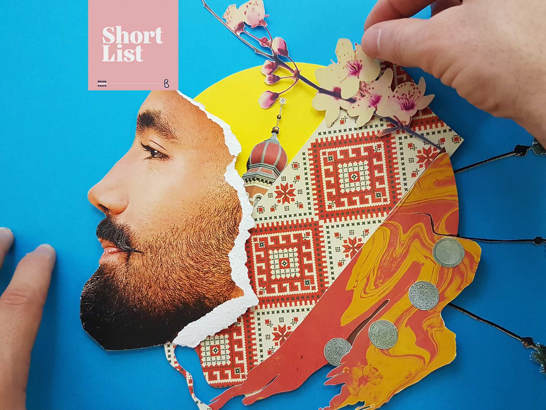
ALBUM COVER | Cartografias
2021
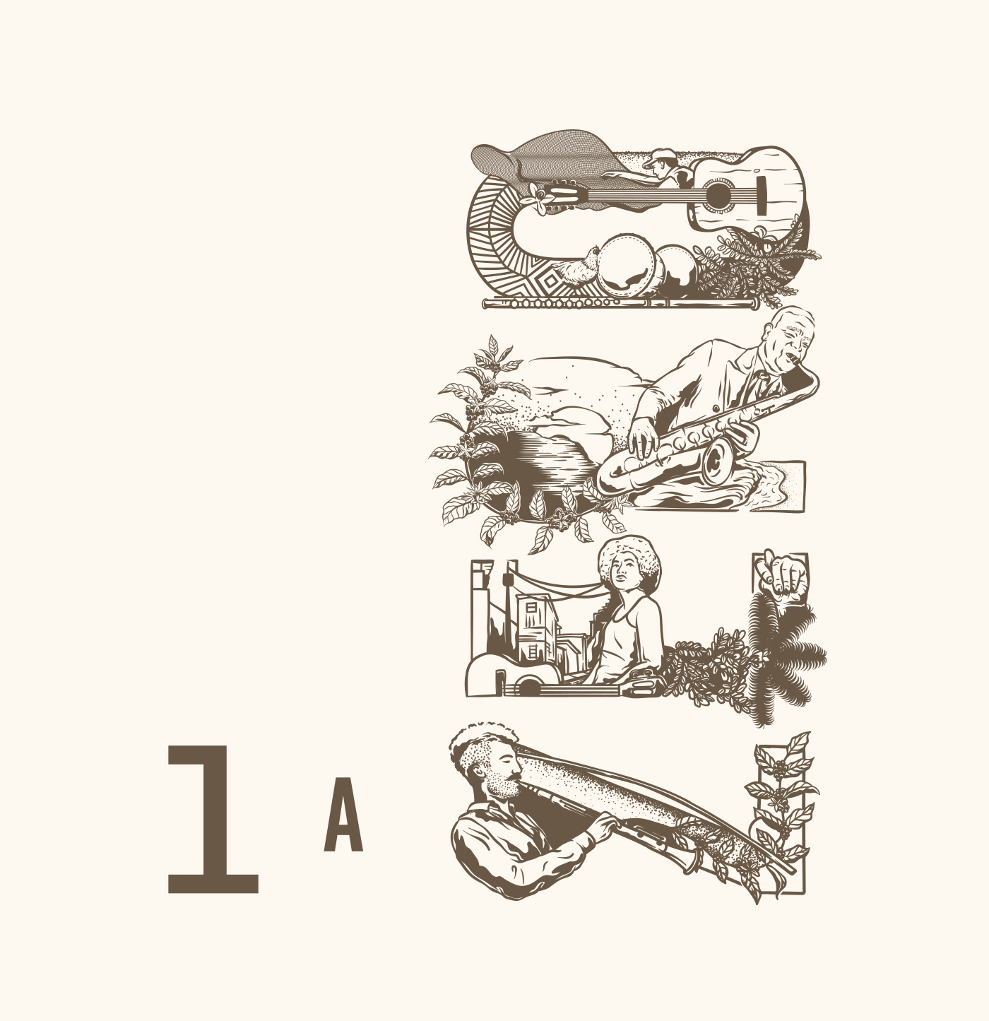
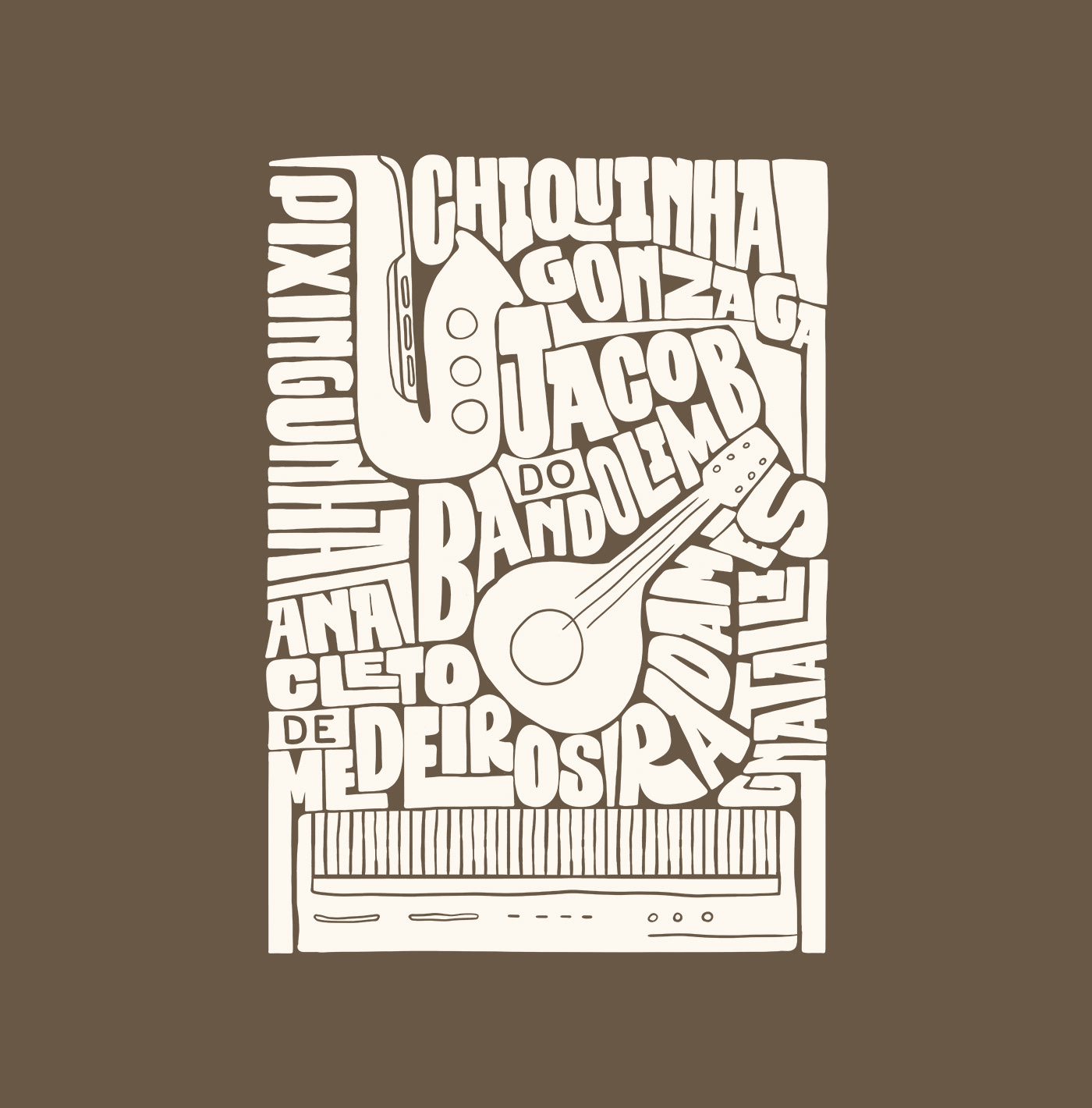
Cartografias é o segundo álbum completo do instrumentista e músico Caetano Brasil. A inspiração para as composições vem cada uma de um lugar diferente no mundo e, a cada faixa, características dessas culturas se misturam com a essência do Choro brasileiro, e as referências do artista. Fui convidado para criar a capa e algumas peças de divulgação online para este lançamento. A solução visual tenta espelhar o que foi feito musicalmente no álbum, busca referências das culturas que inspiraram cada música do álbum, como cerejeiras japonesas, moedas ciganas e coqueiros nas praias caribenhas. Tudo isso se mistura com o rosto do artista em uma colagem manual. Alguns elementos isolados foram usados para peças de redes sociais.
LETTERING | Ye are Gods
2018
vector and scan lettering for the project Ye are Gods. It is the name of Frederico Rabelo's second season of tattoo works.