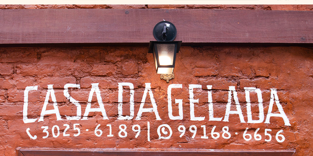
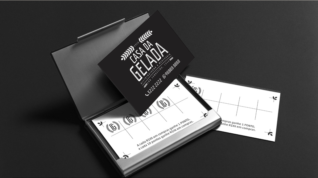
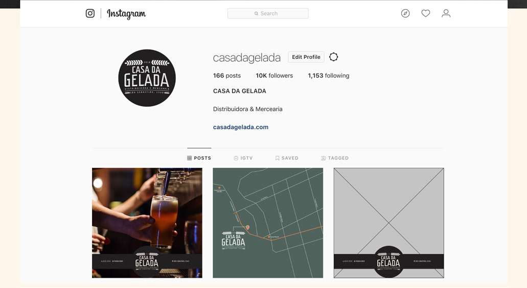
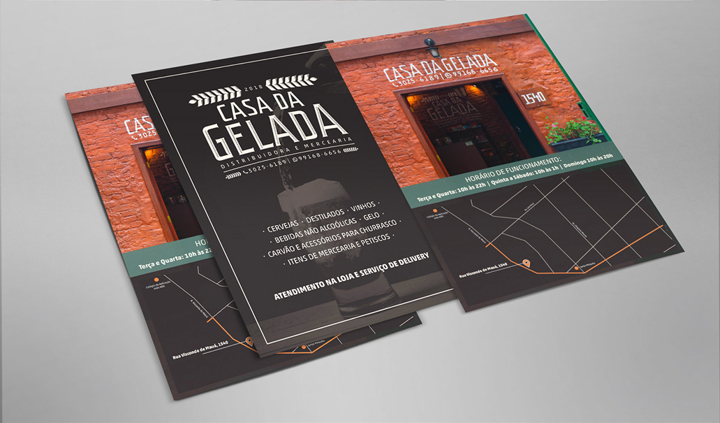
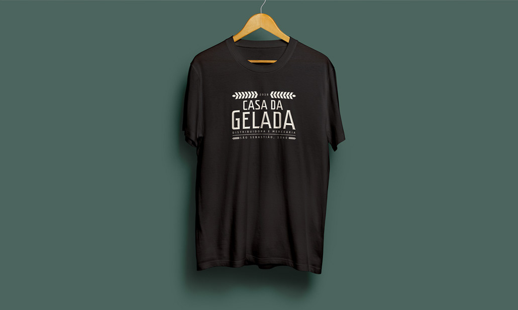
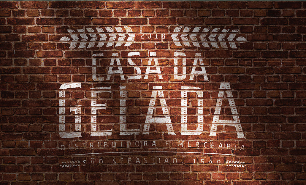
A Casa da Gelada é uma pequena mercearia do bairro e distribuidora de bebidas, seu estilo vem principalmente do que foi dado pela aparência da própria casa. Com as paredes de tijolos e as portas de madeira áspera, concluímos que uma pegada destilaria rústica cairia bem.
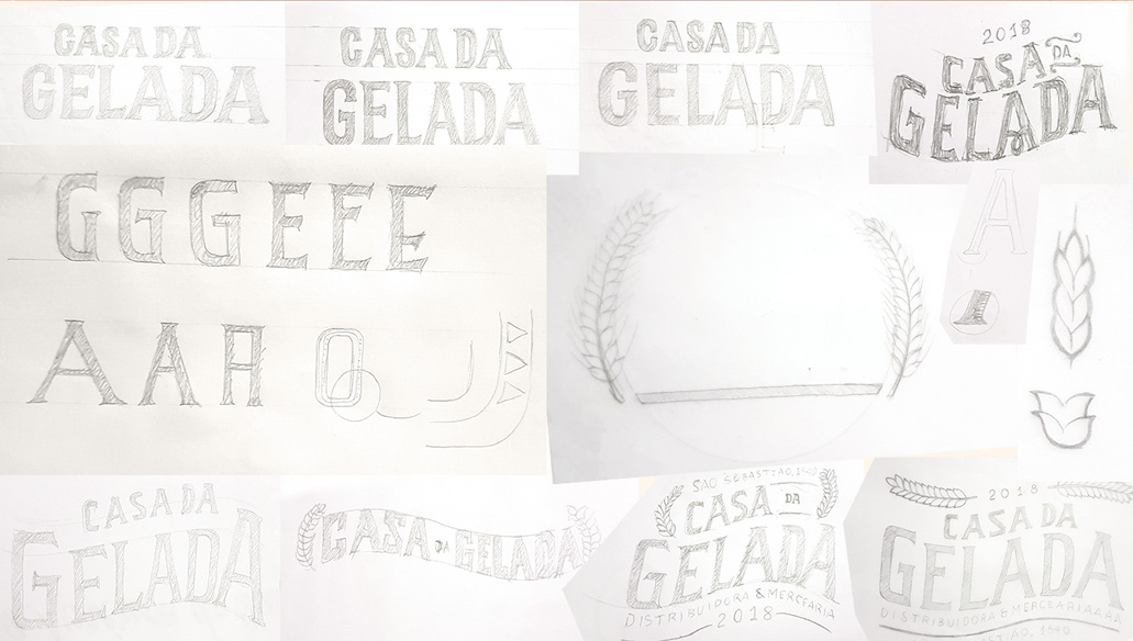
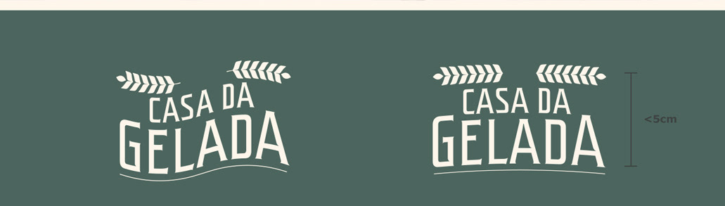
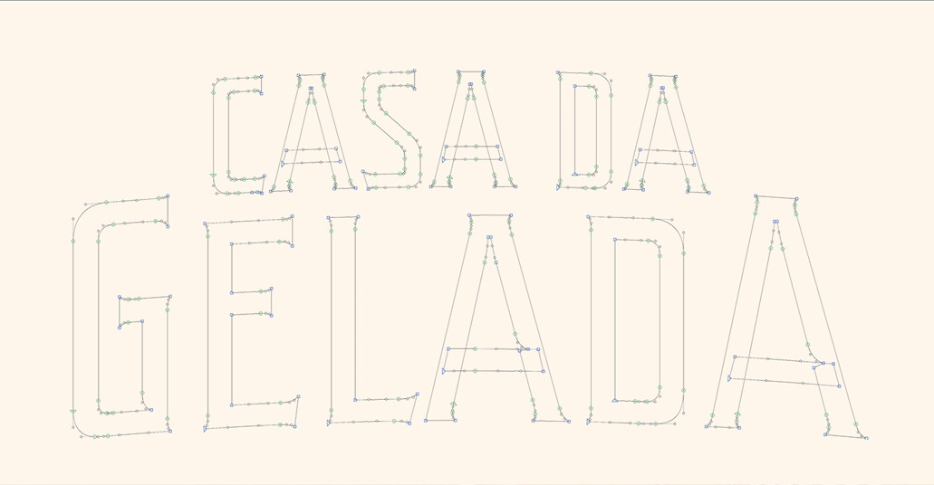
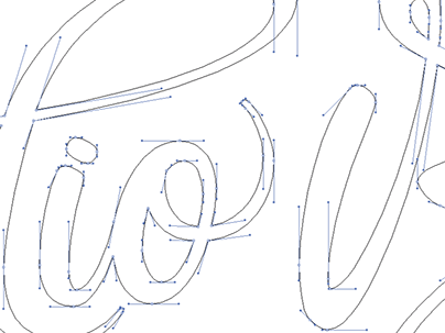
A partir disso fiz algumas pesquisas e esboços para criar o logo com tipografia personalizada e algumas peças necessários para iniciar o negócio.


You may also like

ILLUSTRATION | BumpSide Brasil
2020
BumpSide Brasil is a group of Ford Trucks aficionados.  They gather in events to talk about this cars that many of them collect, restore or just love to be around. They have invited me to make two illustrations for their t-shirts, the following images show a bit of process and the results of digital illustrations portraying ford trucks and exclusive lettering as well as a representation of Mr. Clint Eastwood. For this job I used both vector and photoshop brushes. The final results are two artworks for t-shirts.
BRAND ID | Alinhavado no Papel
2023
T-SHIRT PRINTS | Rn Torres
2018
T- shirt illustrations made for my stores at chicorei.com and also threadless. This first collection aimed mostly at type, and calligraphy references and use, including some pop culture elements.
BRAND ID | La Guapa
2018
Tamires contacted me to make a logotype and a basic development of a brand for her to sell her home made comfit. All very healthy and tasty. For this job I made an illustrated brand icon, many applications of the logo, a color palete, and determined a set of typefaces to give the right tone for her identity.
BRAND ID | Inpulse
2018
INPULSE is a Pilates and physiotherapy studio, it uses an ecletic aproach, presenting other services as aesthetic treatment, auricle acupuncture, kinesiology tape and Global Posture Re-education. The Brand Identity was imagined to follow the owner`s flexibility on work techniques and personal impact made possible by Dani`s natural talent for it, and a small studio environment.
LOGOTYPE | Tiago Sarmento
2018
This is a custom lettering logotype, it was made for a musician from Brazil. The style of the letters war conceived to convey the artist'sboho folk style.
DESIGN - ART DIRECTION | Minha Morte
2018
This project shows the development of a logotype for the theater company SURTO, and its first play MINHA MORTE (My Death). The work was all based on logotype, use of type, art direction and photography. The results you can check on the images.
ID ILUSTRAÇÃO | Caetano Brasil - romani
2019
Este projeto consiste da identidade visual para o single “romani” lançado pelo artista mineiro Caetano Brasil. O conceito foi baseado em suas inspirações para a composição, o povo cigano, ou romani. A partir delas foram definidos o lettering e a ilustração como base para todo o projeto.
CALLIGRAPHY SKETCHBOOK 01 | Renan Torres
2019
omecei a treinar caligrafia como um exercício de fundamentos para o desenho de lettering e design de tipos, agora tenho como objetivo achar uma expressão artística na própria prática. Este é o primeiro de uma série de sketchbooks de caligrafia que pretendo fazer para buscar novas formas de criar letras à mão.
BRAND ID | Chicoreizin
2018
Logotype, a fontface derived from its forms and a brand visual identity system. Those were the deliverables in this project. It was made to represent a kid`s line for a t-shirts company (Chico Rei) as their work is all based on creativity and fun stories, the aim here was to take a little of this culture to the communication.