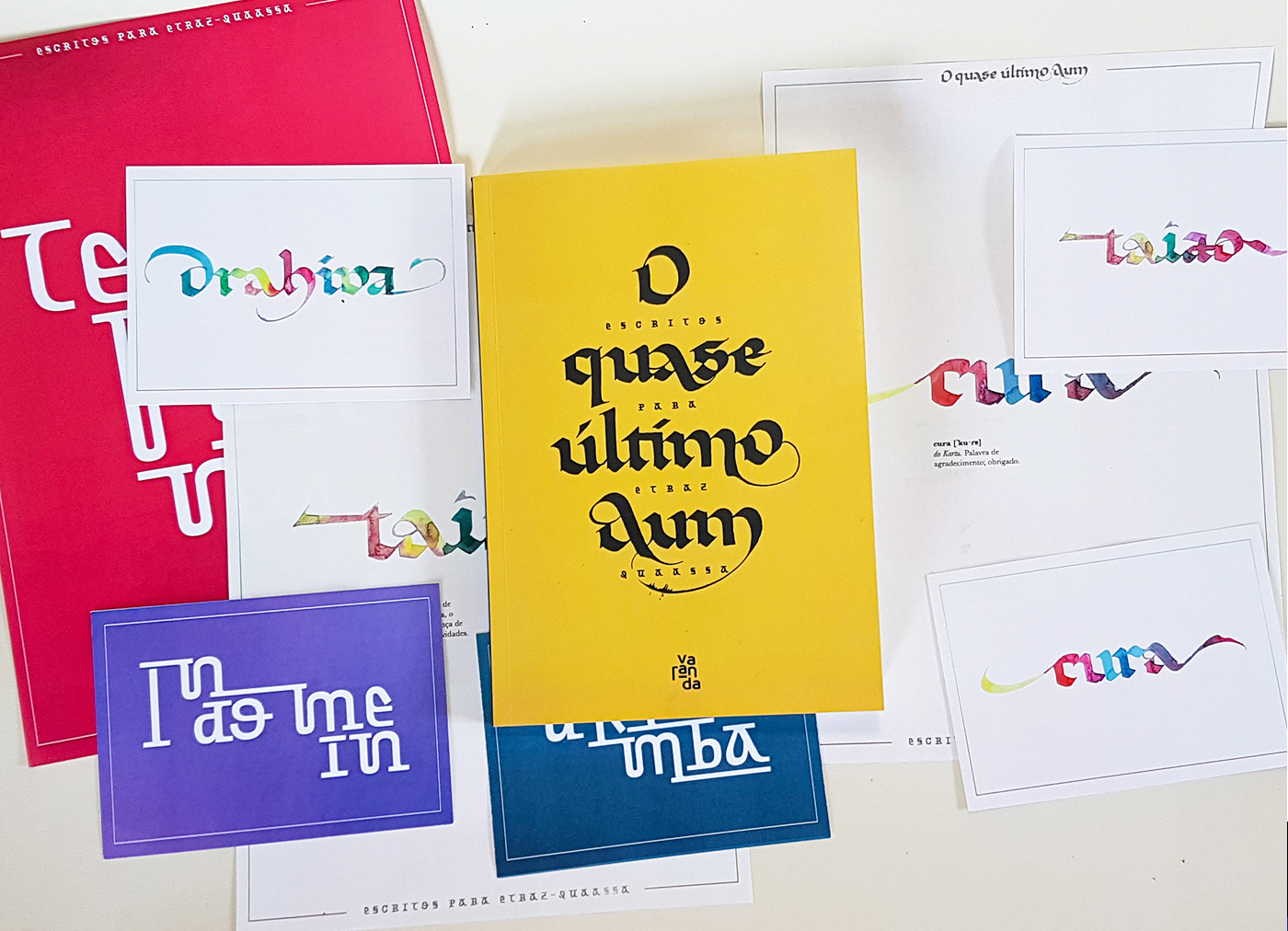
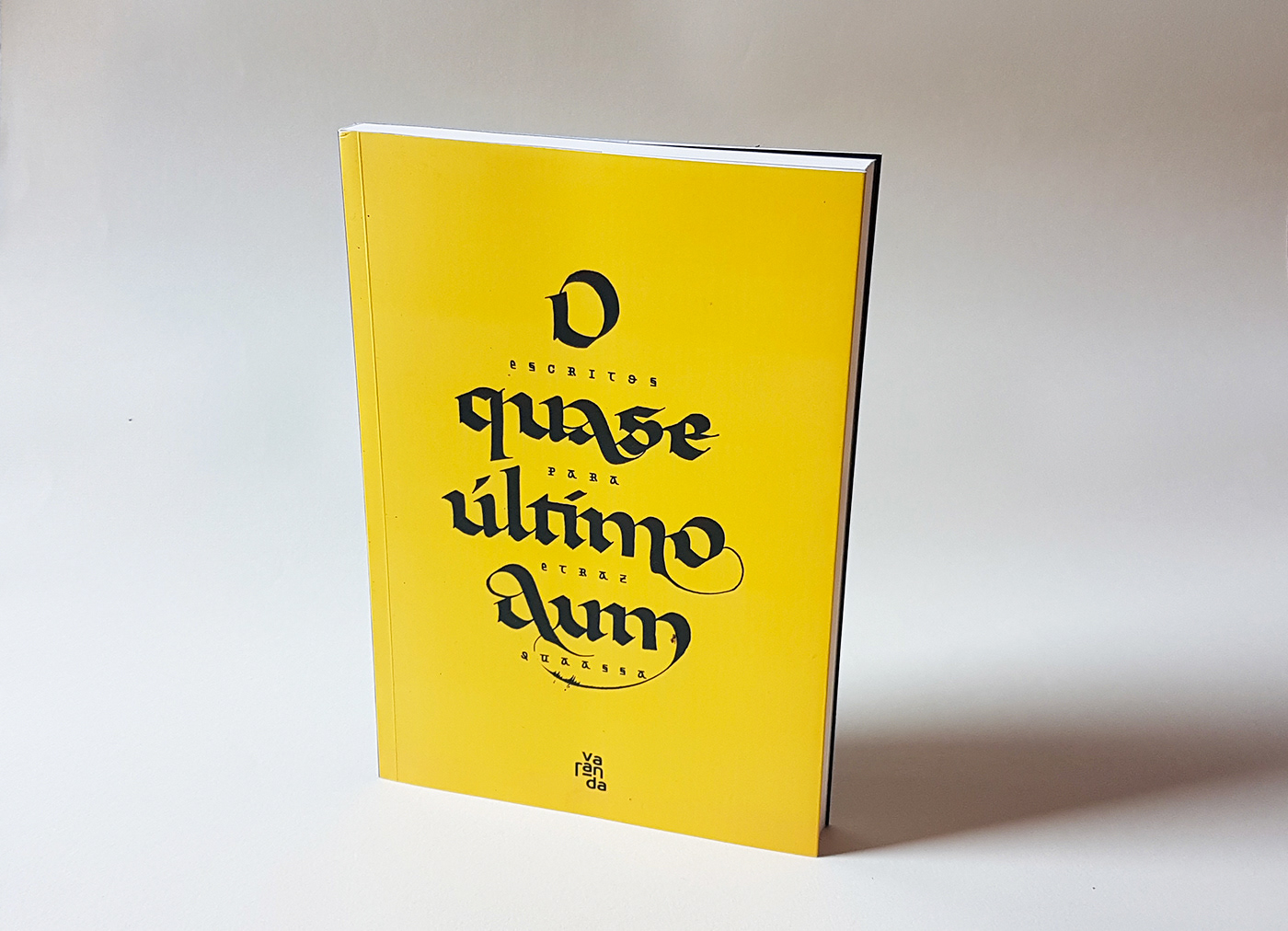
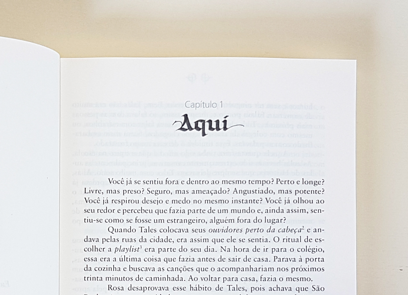
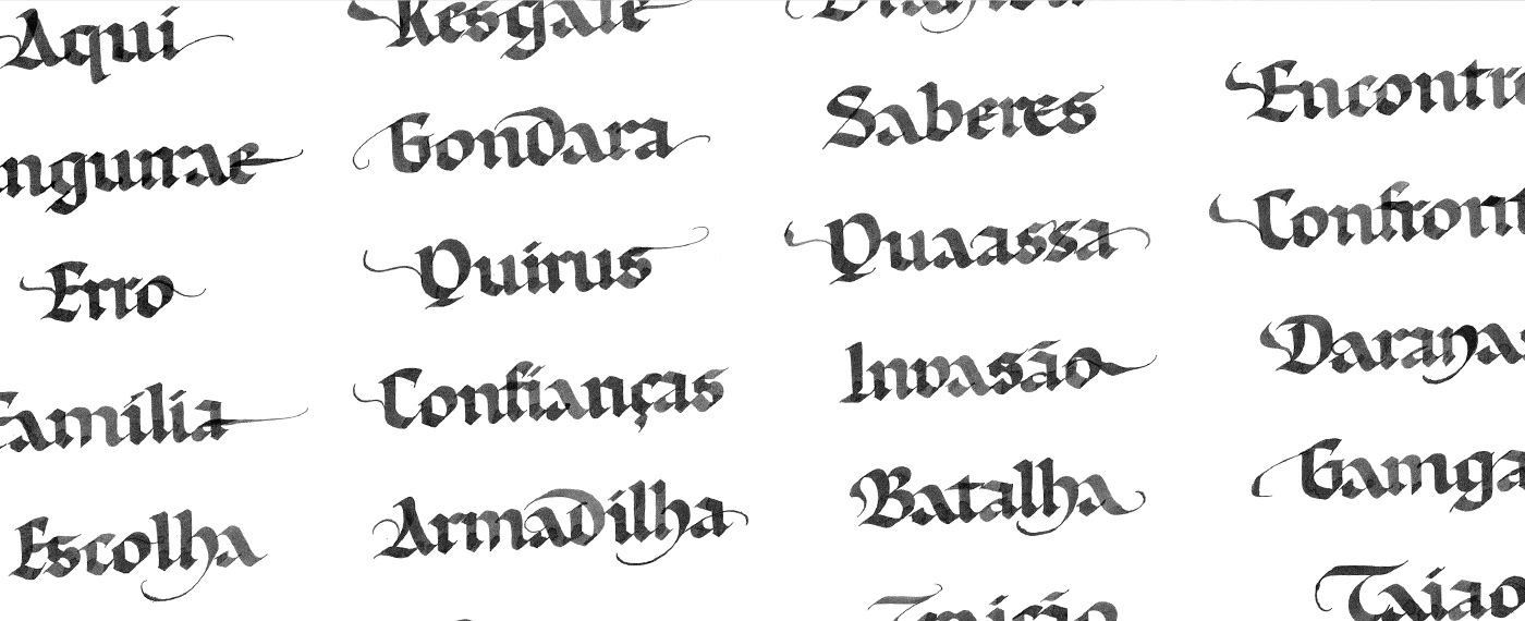
In “O Quase Último Aum”, author Ulisses Belleigoli gives central importance to the two fictional languages of the plot, “I decided that I wanted to make [this story] for teenagers, an audience that I wanted to reach. People are very convinced in adolescence of ways that are not peaceful. I thought of this saga, creating universes, vocabularies, systems, planets and powers, characteristics of fantastic literature, to talk about another possibility”. With this in ind, Ulisses contacted me to design some posters, but we ended up with two alphabets, one based in calligraphy, other in vector lettering, a book cover, and many elements for the editorial project.
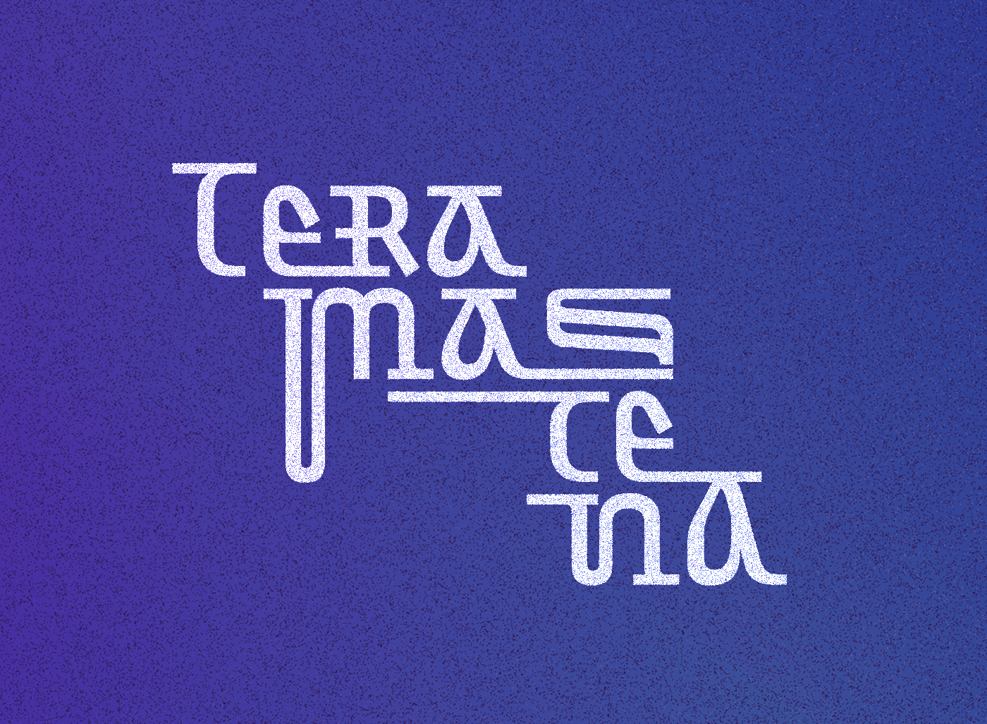
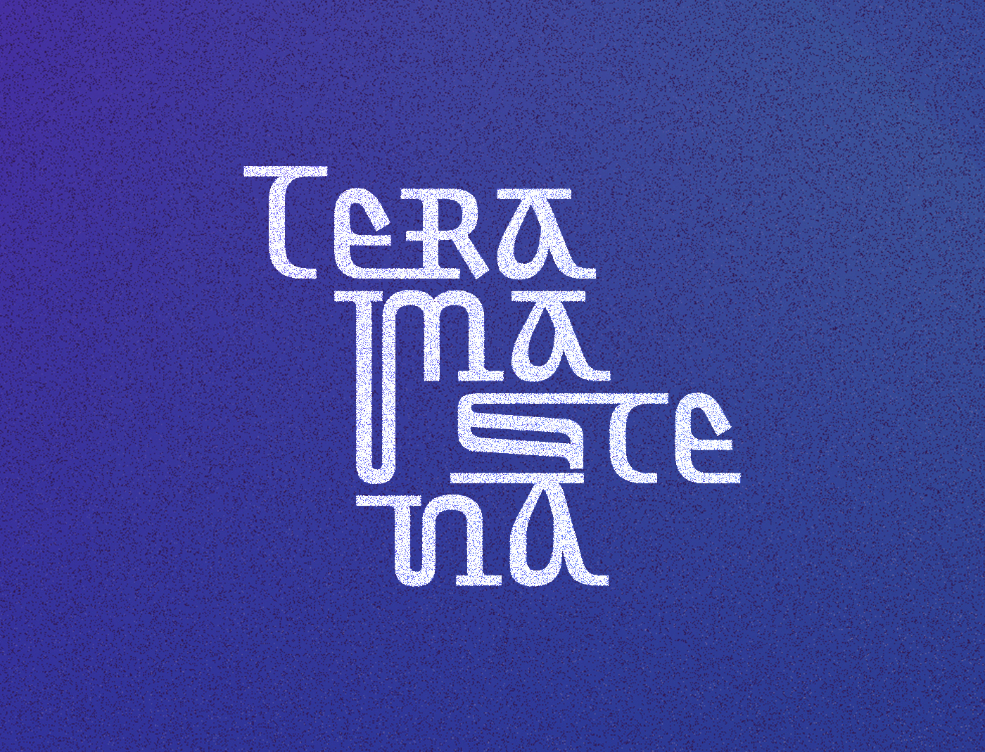
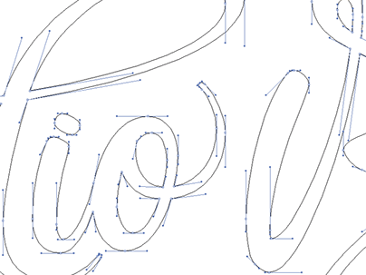
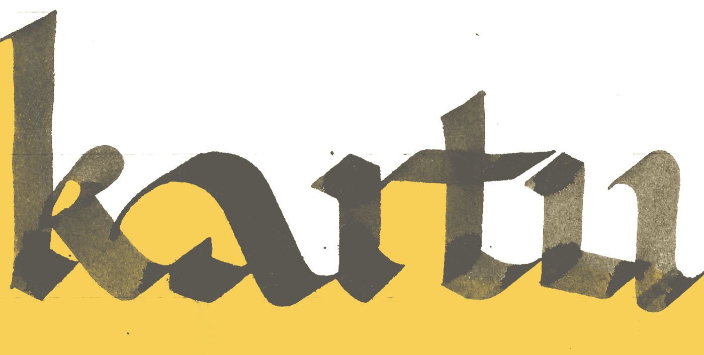
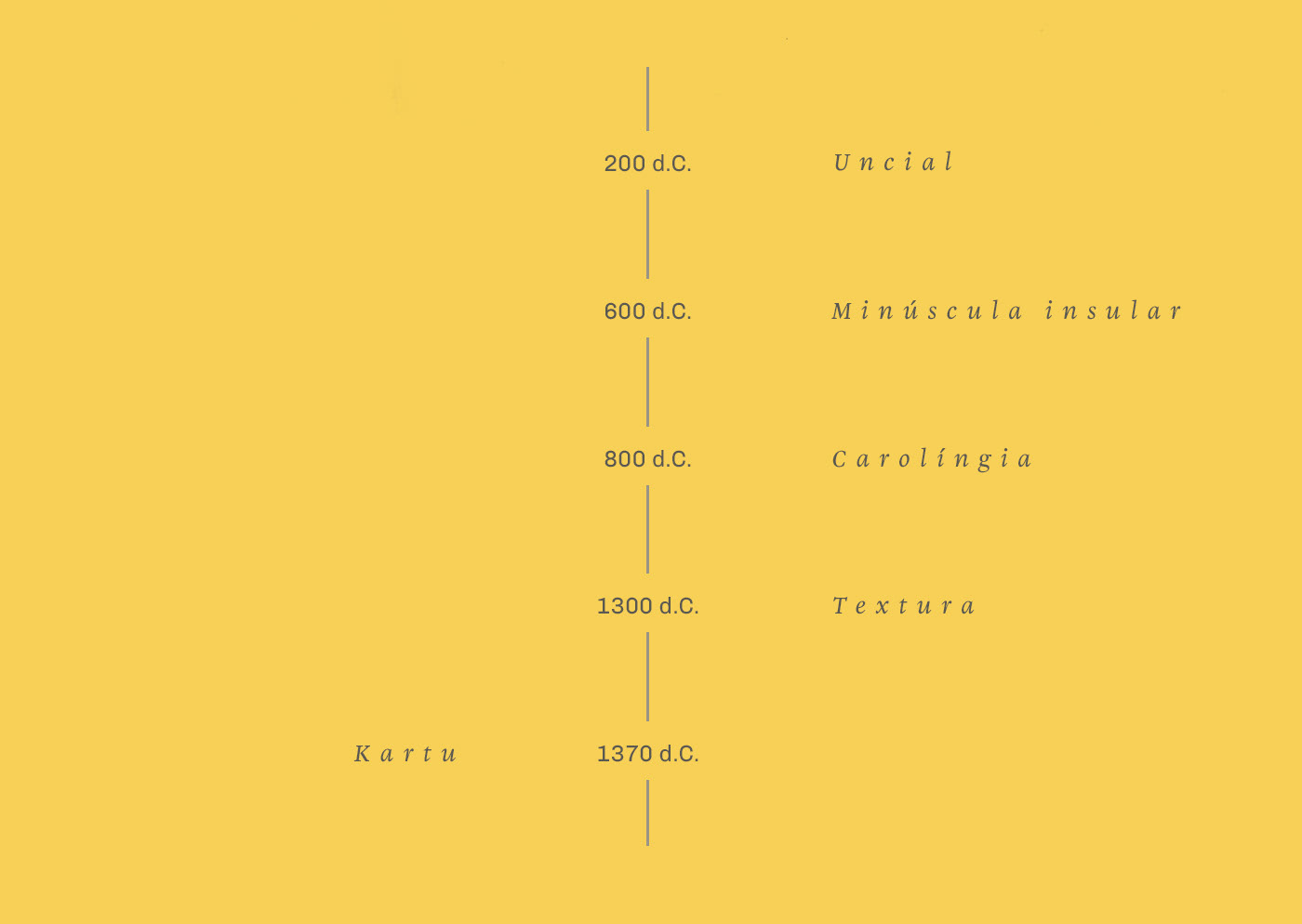
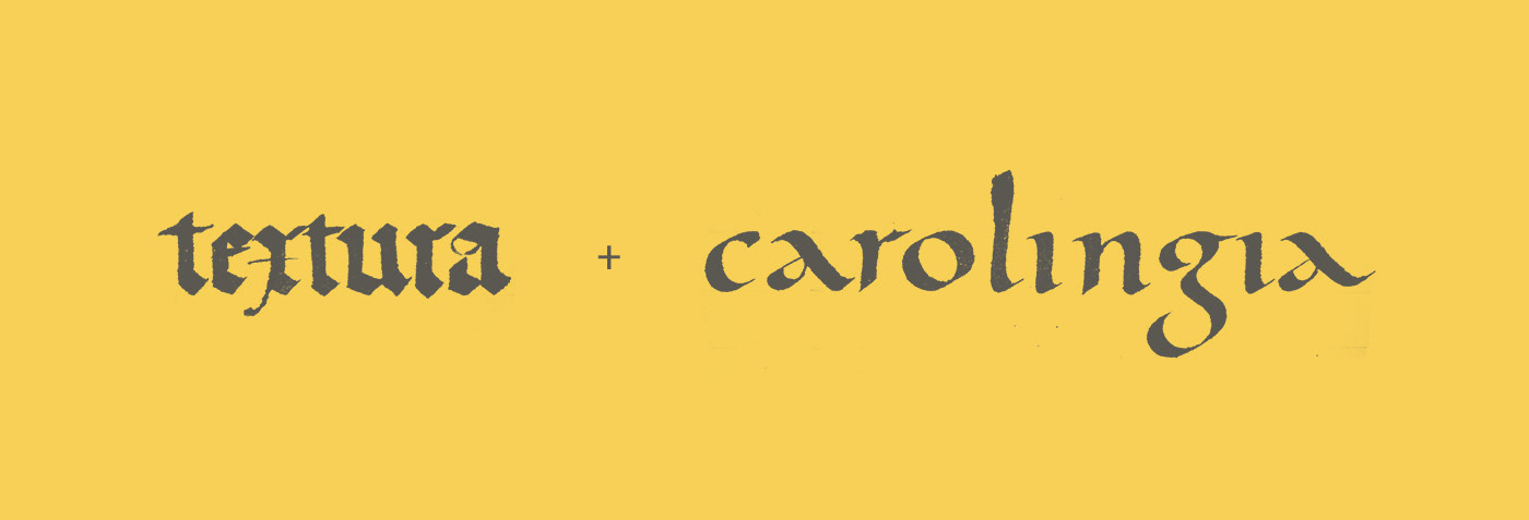
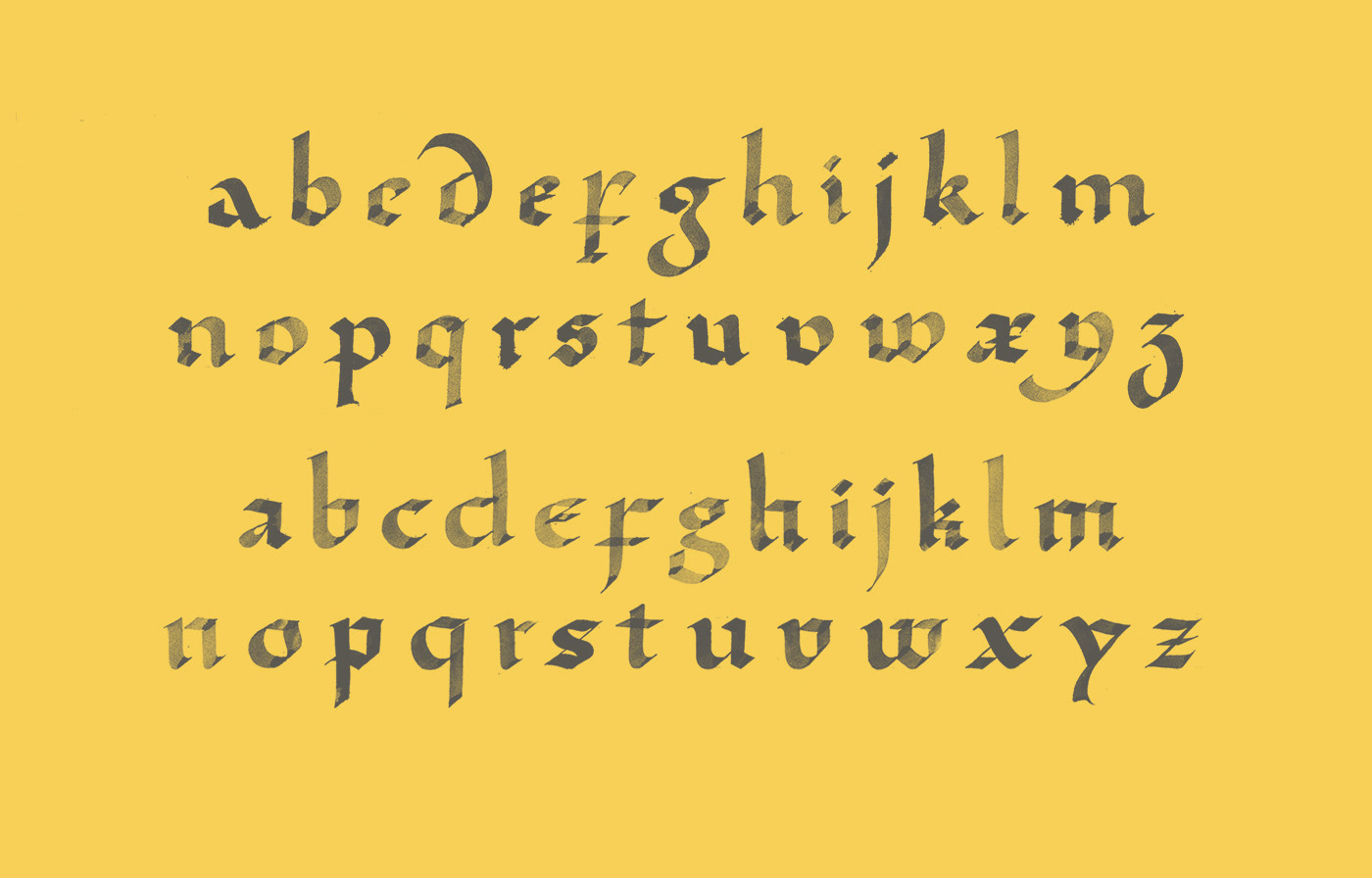
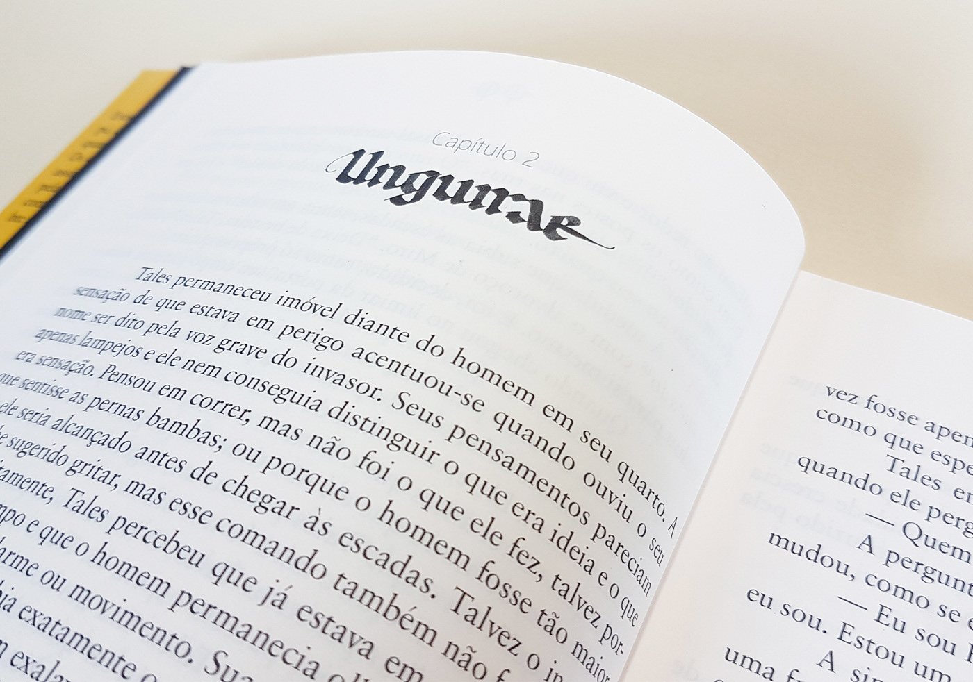
Kartu. A fictional language originating from the planet Ungurae, around the year 1370 AD. The creative process for the alphabet and calligraphy style representing the words in this language explores the parallel drawn between the fictional planet and planet Earth, in the book they are twin planets, with similarities in their geography, and position of the stars in the sky, each with its own peculiarities.
Another touch point the narrative is the fact that on the planet Ungurae, where Kartu is spoken, writing was prohibited for centuries, while on earth writing followed a linear evolution. The idea was to create rules for the construction of letters that refer to what we know, but generate strangeness, exactly like the feeling of getting to know the new planet for both the readers and the characters in the book.
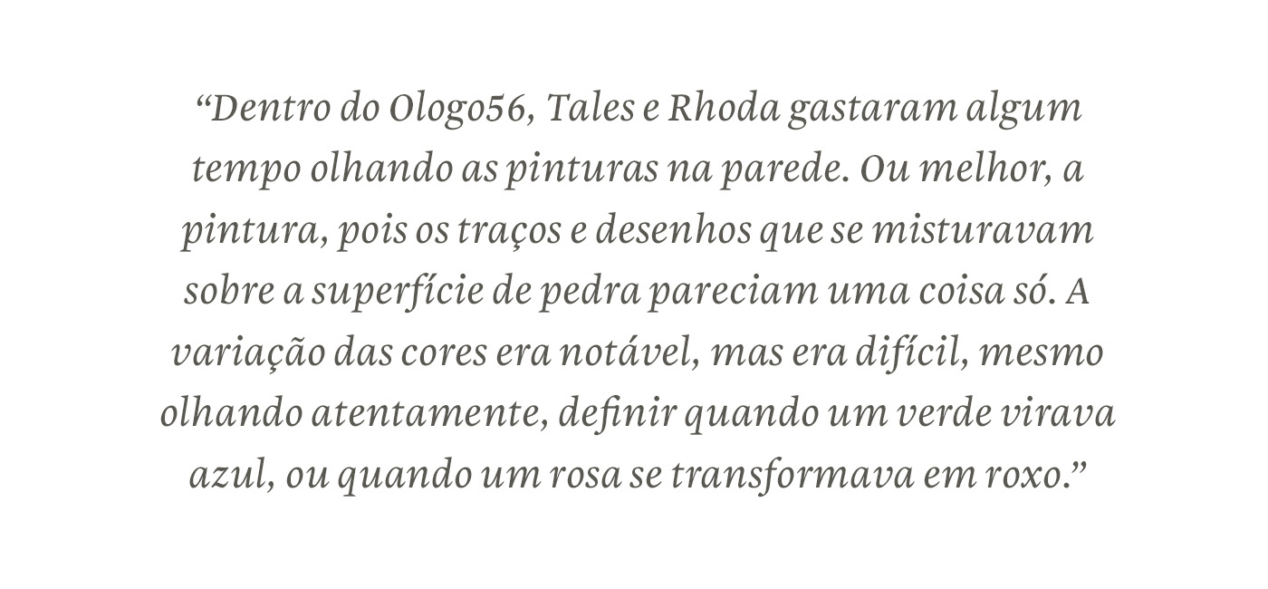
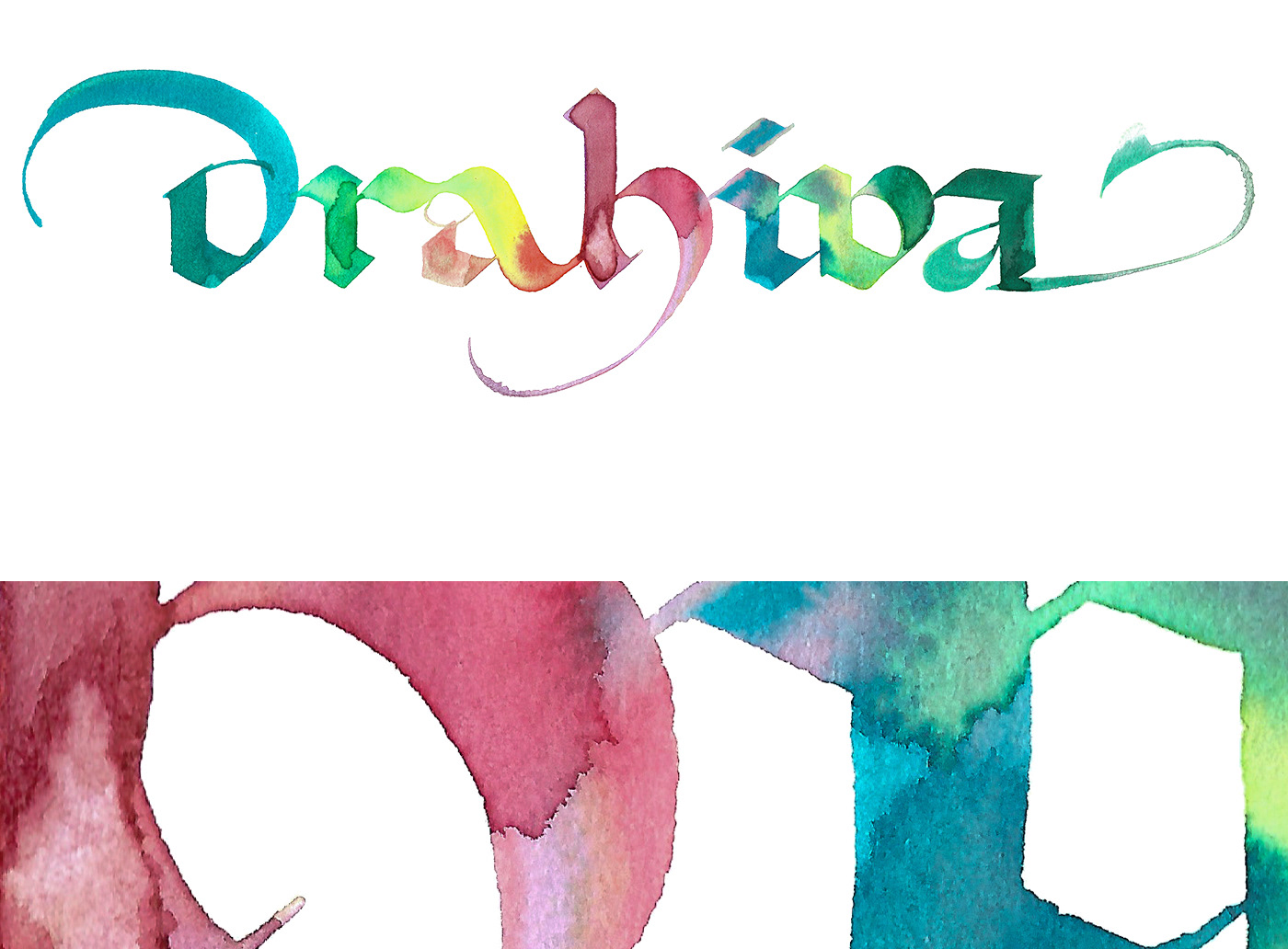
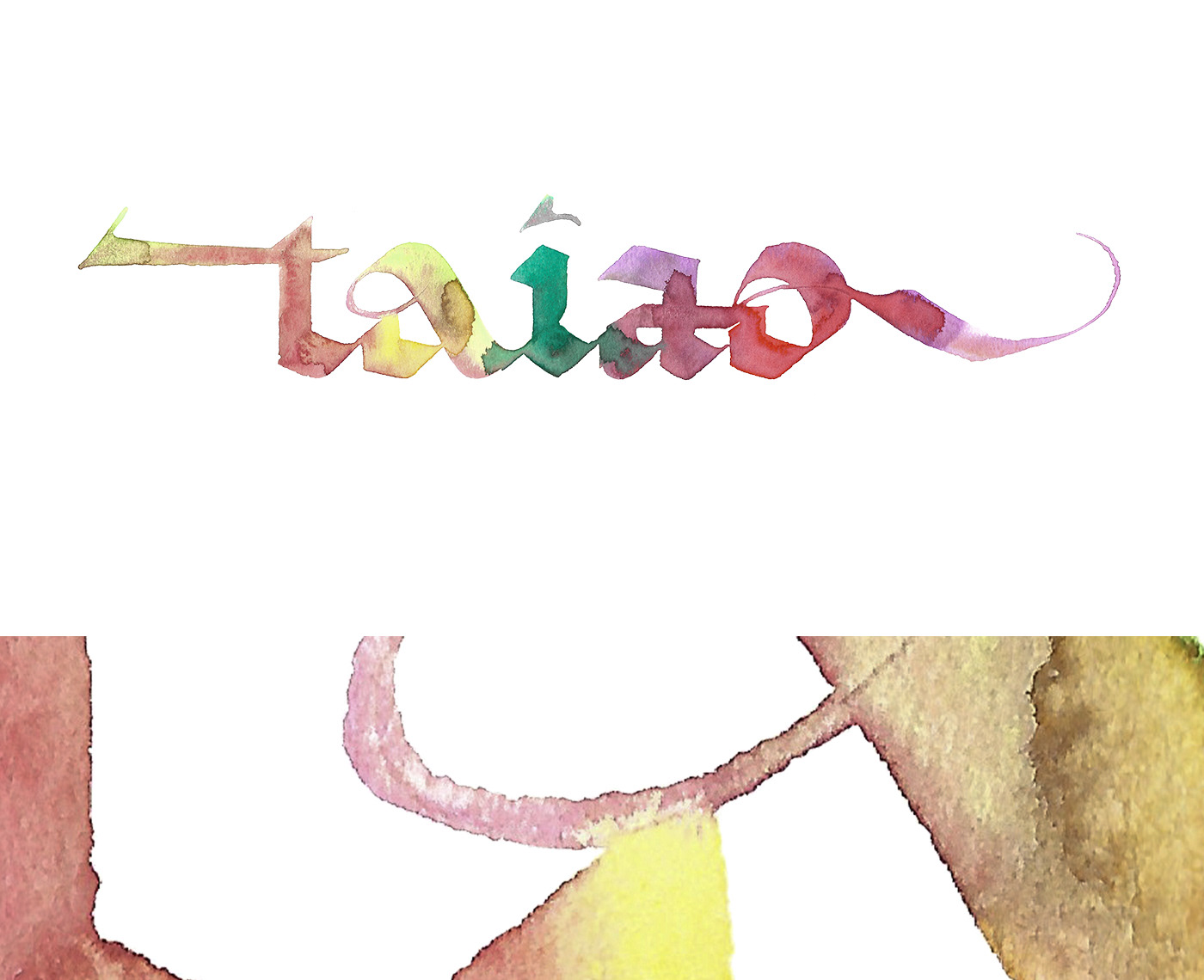
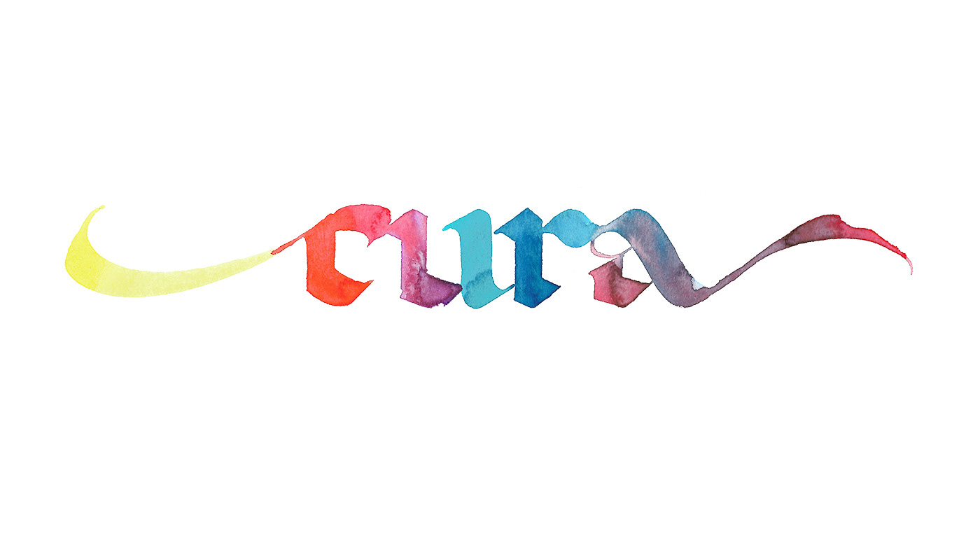
The final touch comes from the description of Ologo, a magical place in Ungurae that is presented with a rich description of a painting with fantastic colors on its walls, translated into calligraphy by mixing tones in watercolor.
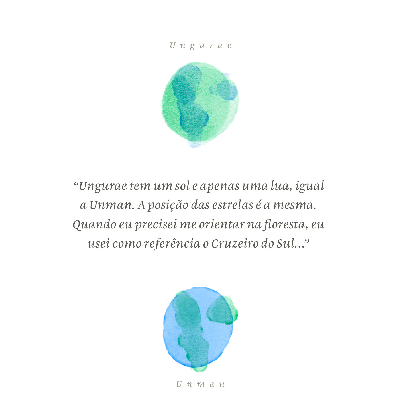
text. A quote from the book. "Ungurae has one sun and one moon, as well as Unman(earth). The stars are in the same position. When I needed to find myself in the woods, I used the crux as a reference..."

the rules.
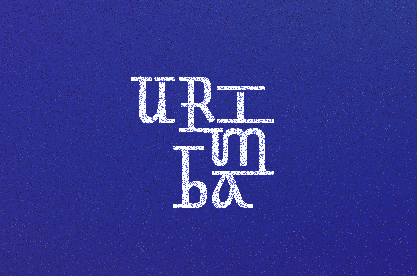
we have two styles of each characer. for everytime a letter repeats inside a word, we change styles.
when three or more vowels form a sequence inside a word, it calls for a stronger ligature as in "taiao".
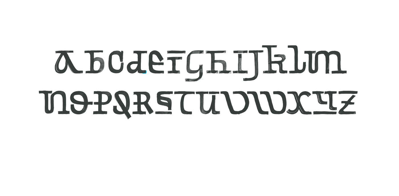
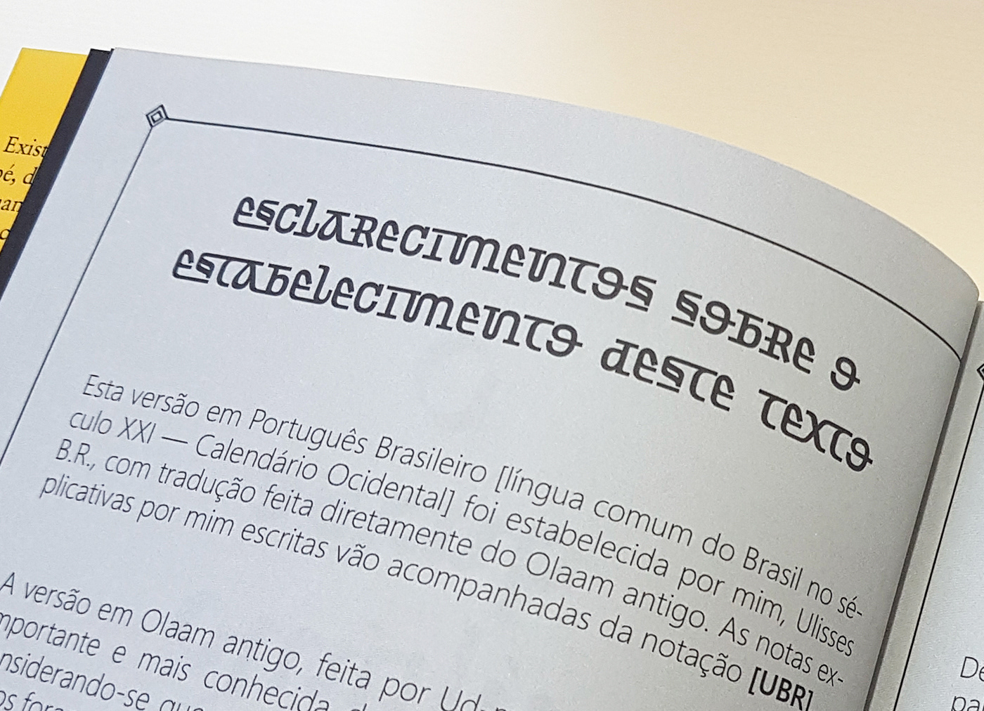
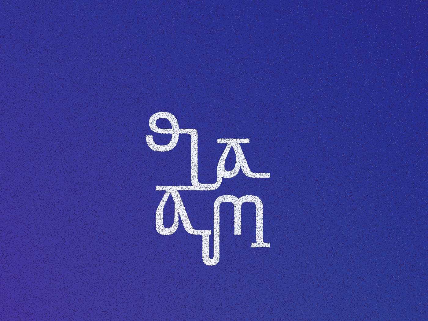
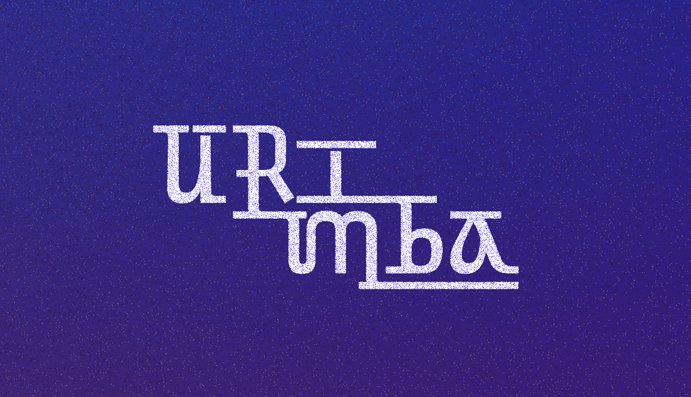
Olaam Antigo. Contrary to what its name sugests, it is a language from a very far away future brought to us by the author, and to represent this idea, we searched for something that brings us the futuristic feeling we are already used to see in science fiction, but also seeking unexpected elements, which may represent technological advancement that we are still not capable of even imagining.
To accomplish this, in addition to the visual references, we consulted narratives with similar approaches, and the movie Arrival, got us to a more organic and dynamic element then those in the first round of studies.

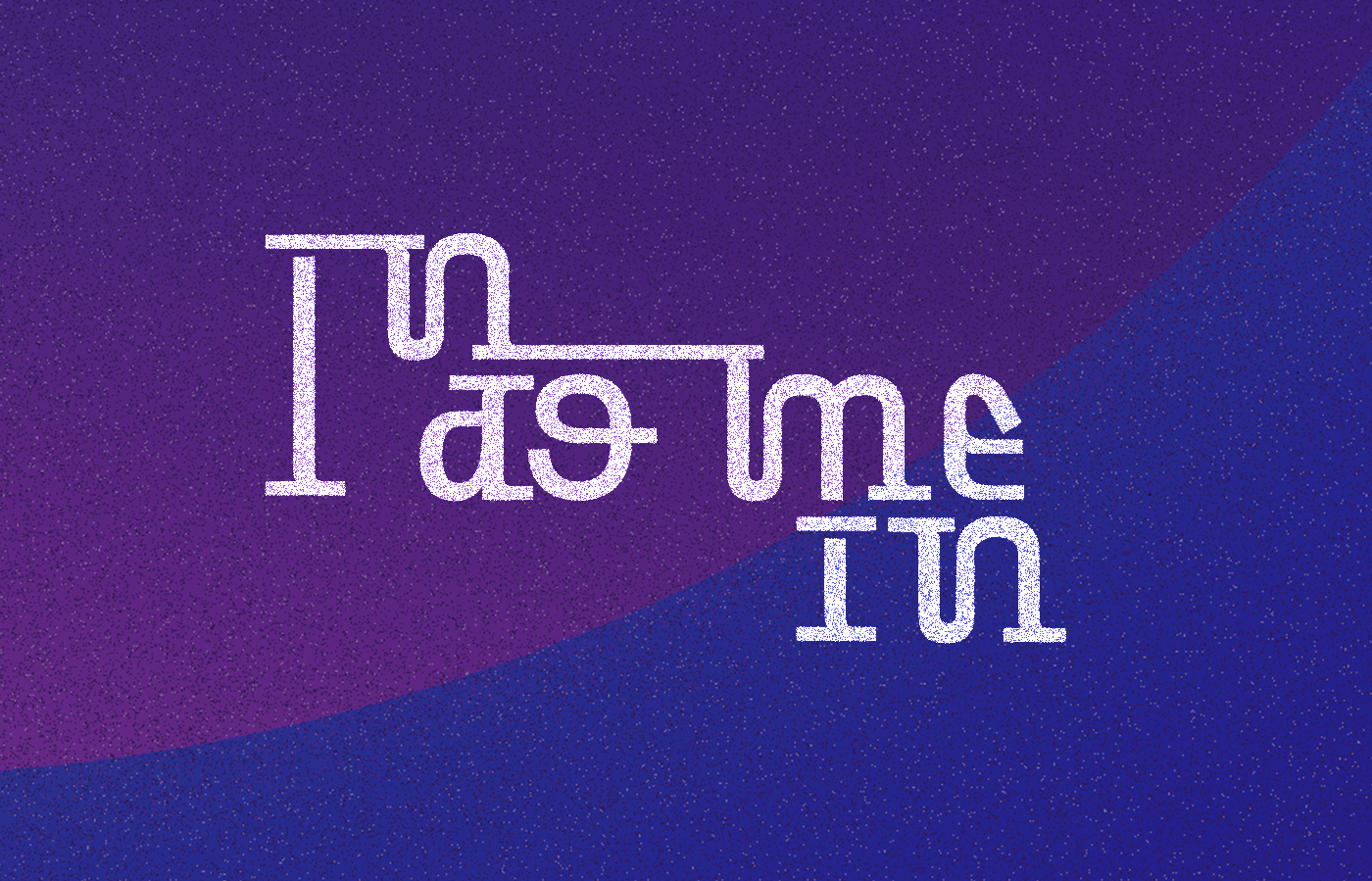
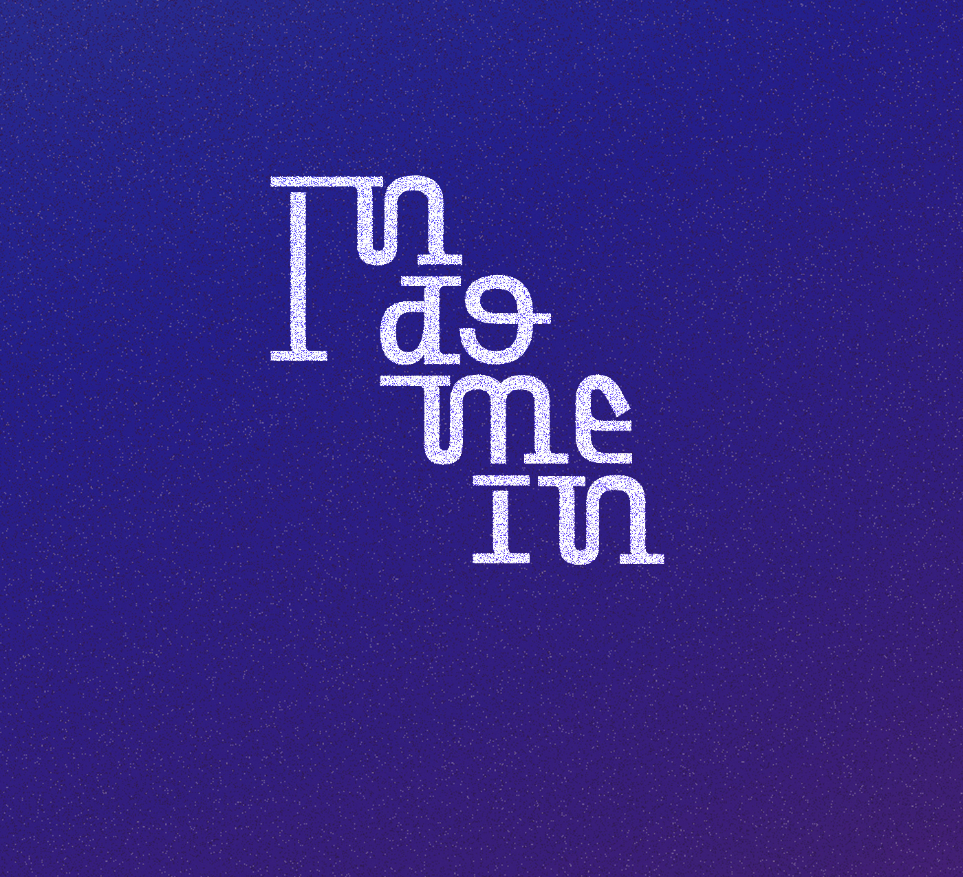
1. Current reference of future, straight lines and angles.
text. A future that is so far away that we may not have the references to represent it.
2. New ways of imagining this future, organic. The movie Arrivel.
text. A future that is so far away that we may not have the references to represent it.
2. New ways of imagining this future, organic. The movie Arrivel.