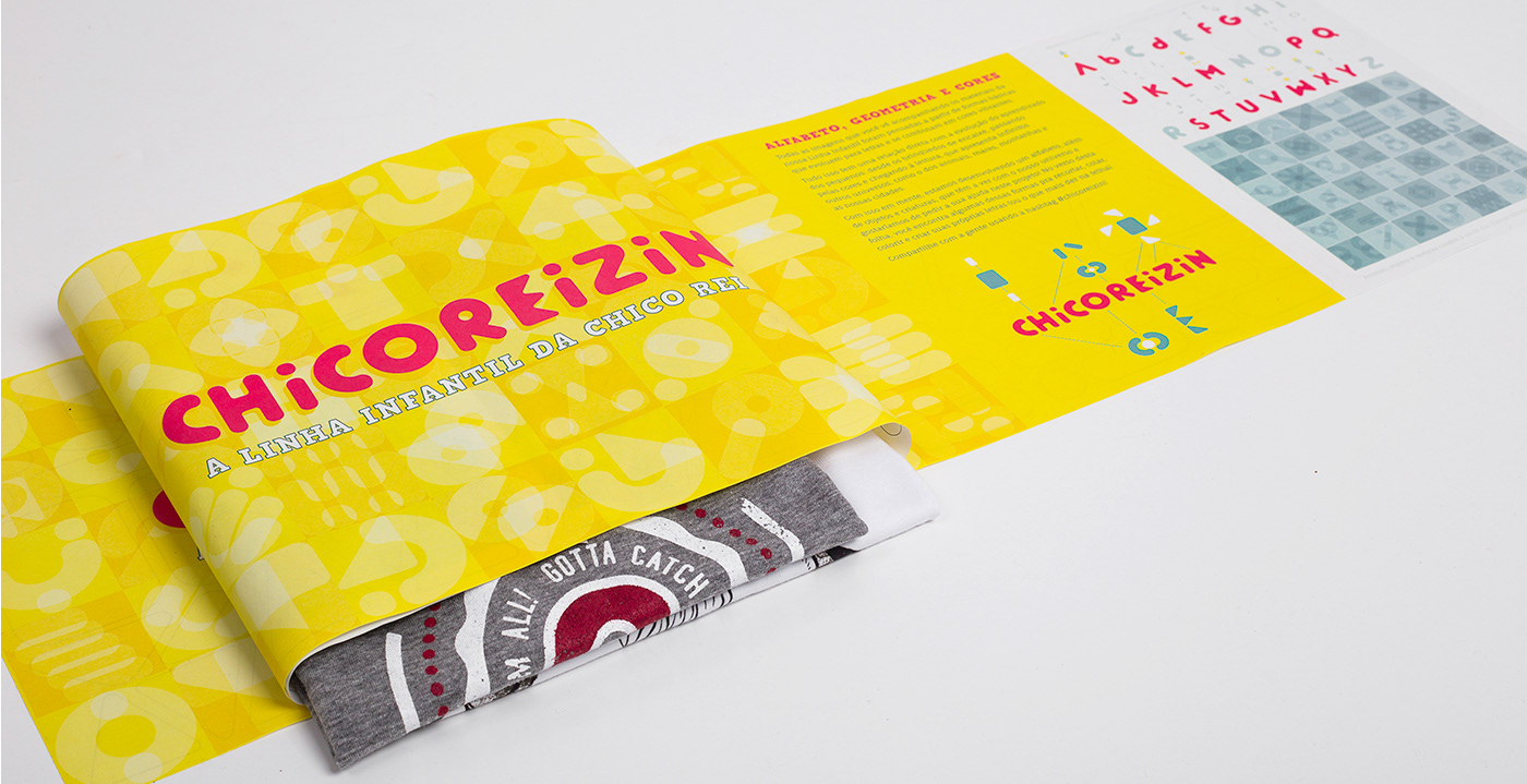
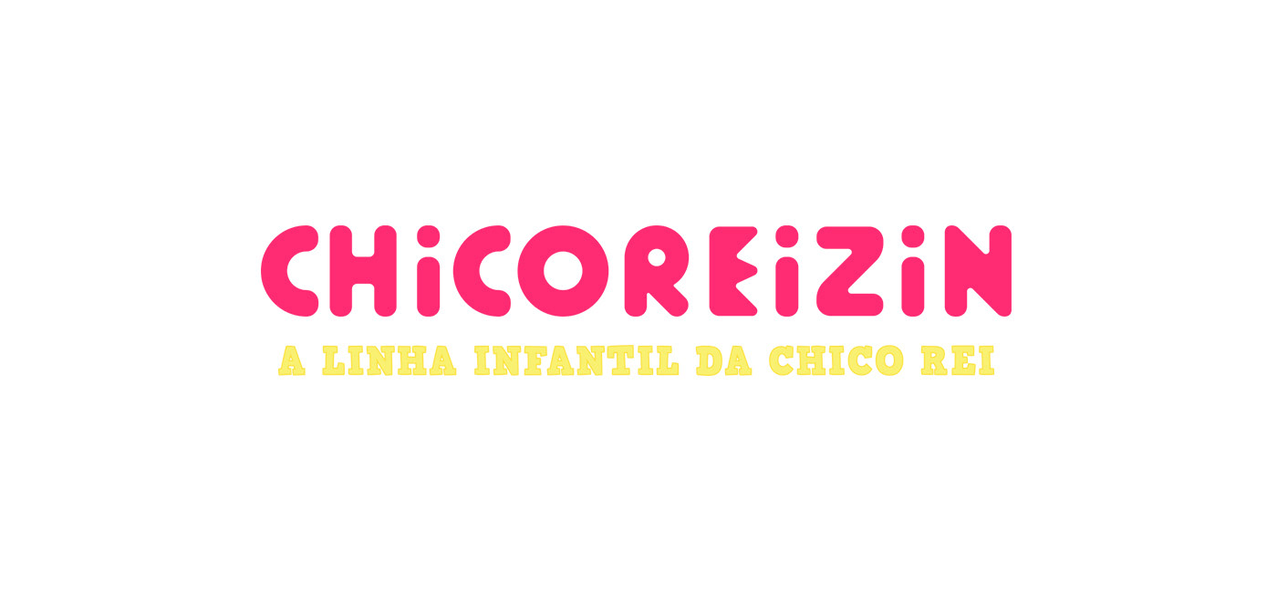
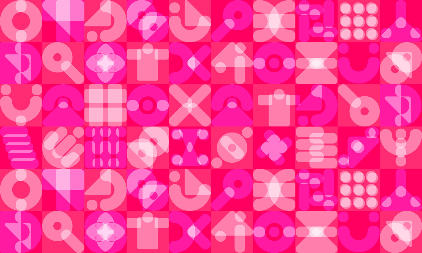
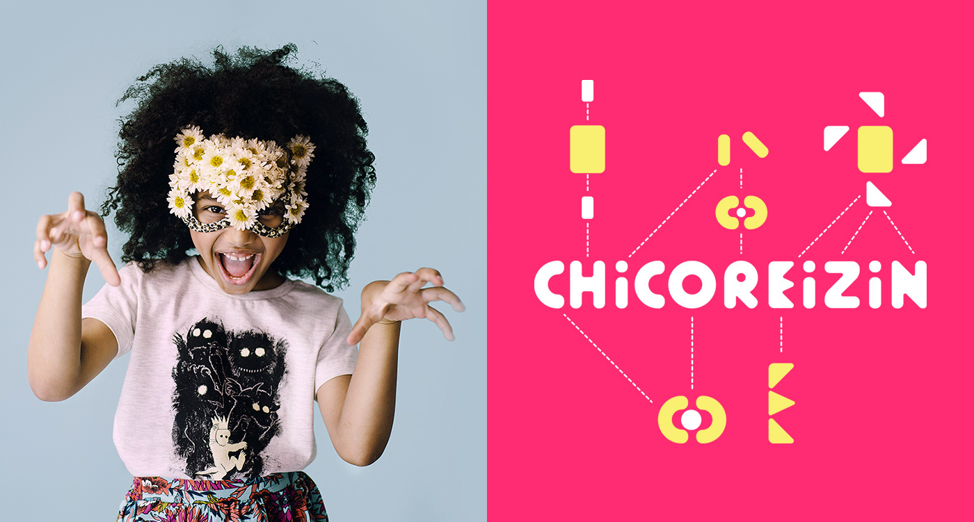
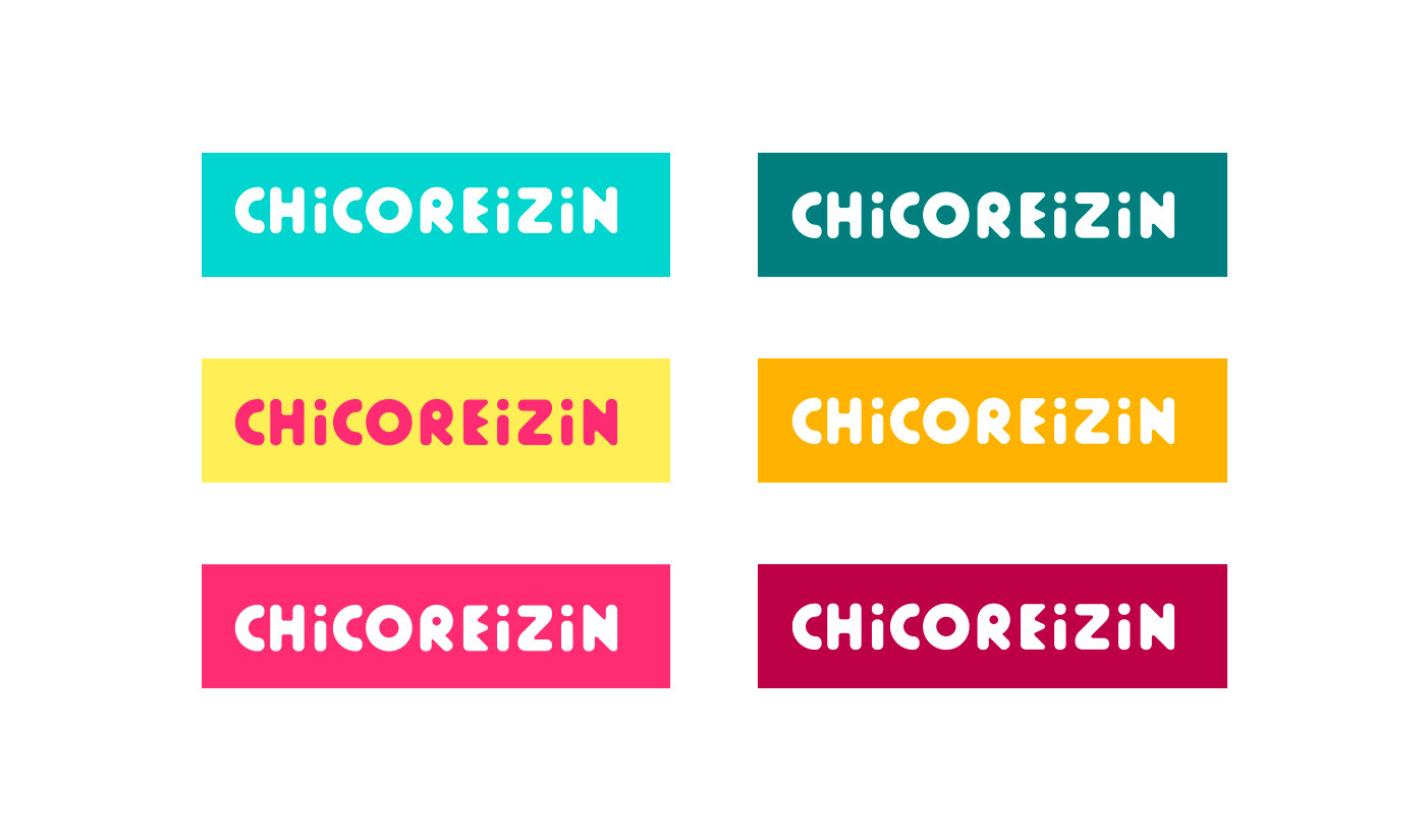
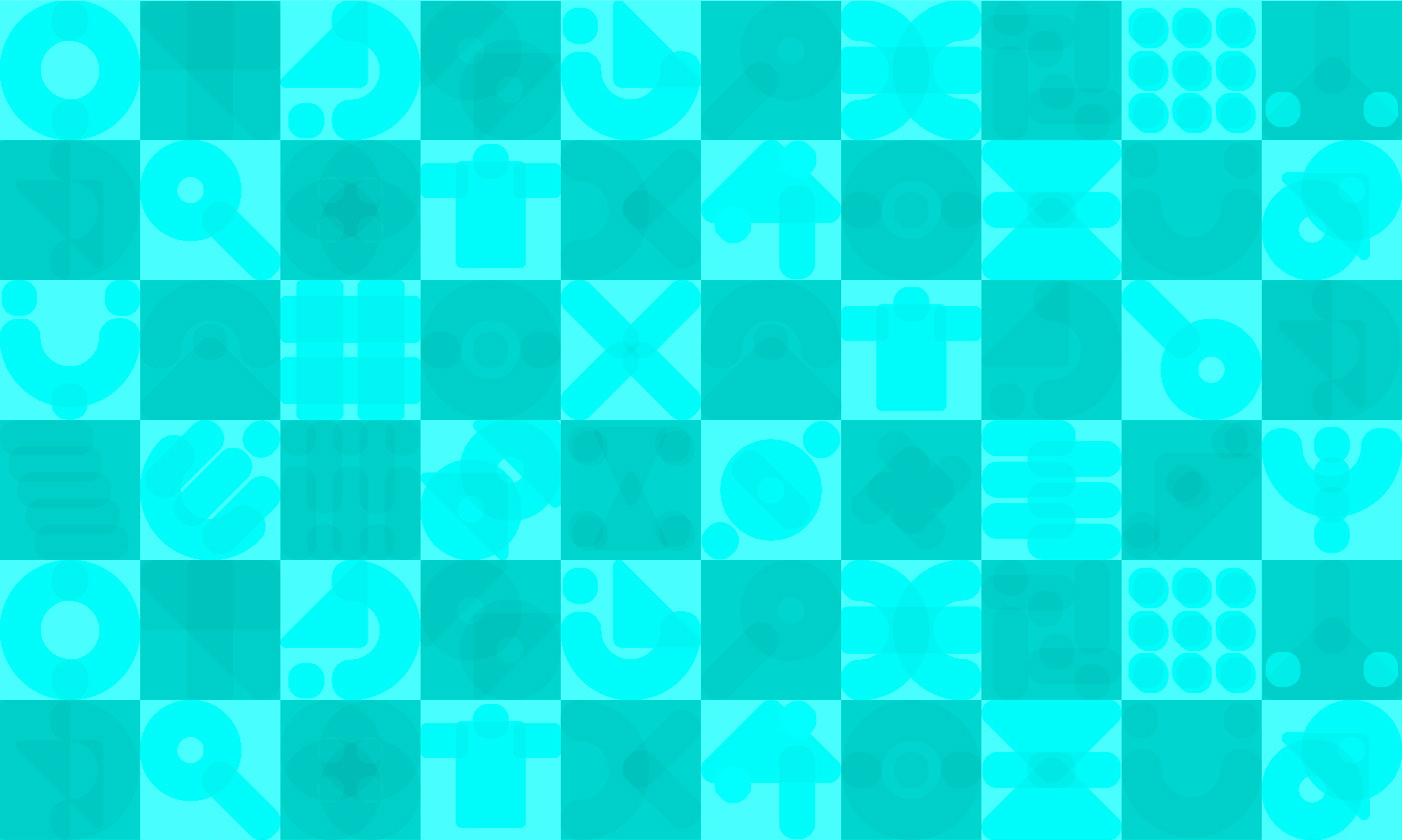
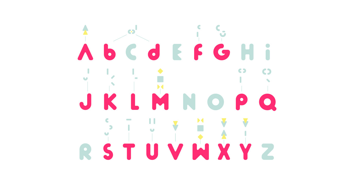
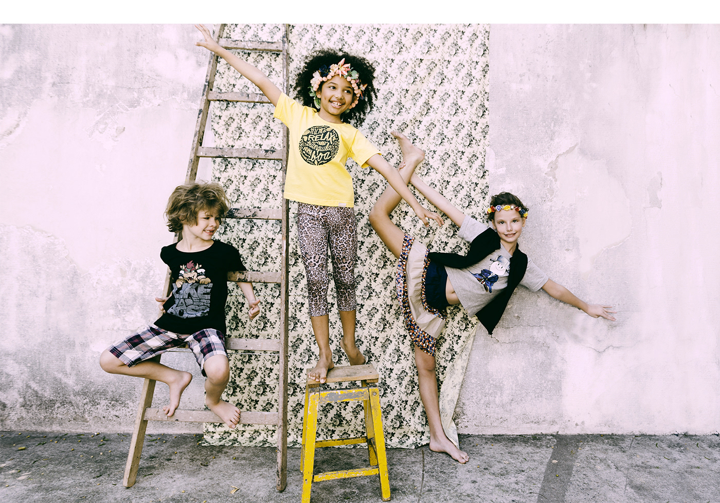
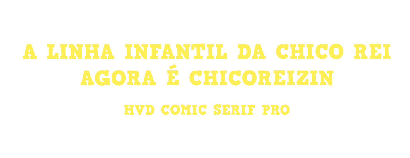
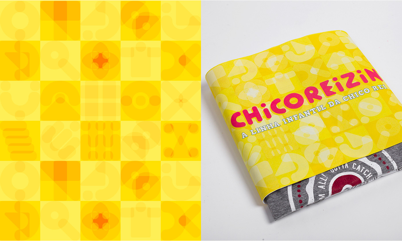
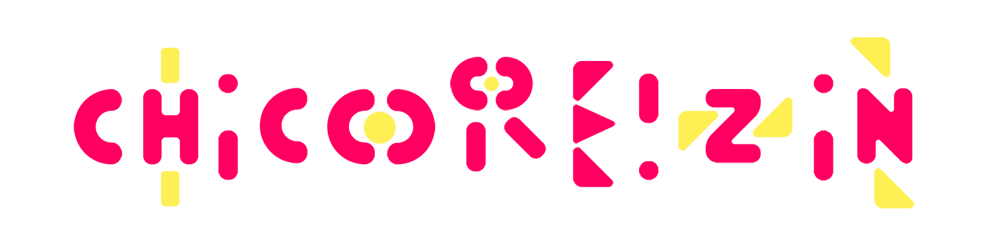
Every image created for the Chico Rei children's line branding were derived from basic shapes that evolve intoto letters mixing to each other in vibrant colors. This has a direct relationship with the evolution and learning of the little ones, combining learning shapes, colors and reading, it presents infinite other universes, like the one of the animals, seas, mountains and our cities in a whole new way to draw.


You may also like

DESIGN - ART DIRECTION | Minha Morte
2018
This project shows the development of a logotype for the theater company SURTO, and its first play MINHA MORTE (My Death). The work was all based on logotype, use of type, art direction and photography. The results you can check on the images.
BOOK CONCEPT - The Metamorphosis
2015
Proposta de criação de um projeto completo de livro. O principal desafio foi a representação gráfica desta história sem recorrer às formas de barata. Proposal of a complete book project. The main challenge was to graphically represent this sttory without references to the cockroach forms.
ID ILUSTRAÇÃO | Caetano Brasil - romani
2019
Este projeto consiste da identidade visual para o single “romani” lançado pelo artista mineiro Caetano Brasil. O conceito foi baseado em suas inspirações para a composição, o povo cigano, ou romani. A partir delas foram definidos o lettering e a ilustração como base para todo o projeto.
LABEL | LOGOTYPE - Seiva da Mata
2017
This job required the creation of all 4 illustrations for the different kinds of beer. They had selected a free font to use as their logo. I offered this solution of a custom lettering and it was well appreciated by the client. Seiva da Mata is an artisanal brewery based in Minas Gerais, Brazil, that seeks to give its beers the freshness of life close to nature, which is common to the country side of the state. In order to communicate this, images have been chosen that refer to the worker of the field and his quiet in moments of the day when contemplation is like a reward for his work.
BRAND ID | Organizar & Fluir
2018
Logotype and visual identity developed for "Organizar & Fluir" a Belo Horizonte based company that works with organization for residences, companies, files and documents. They also do home staging and sell products. The process to create the visual universe of the brand relied on common looks of organized and fluid homes, where everythings is found in its place and plants give a harmonious atmosphere to the place.
36 DAYS OF TYPE - 2018
2019
36 days of type 2018. For this edition I focused on training more of a general type design process.
BRAND ID | Inpulse
2018
INPULSE is a Pilates and physiotherapy studio, it uses an ecletic aproach, presenting other services as aesthetic treatment, auricle acupuncture, kinesiology tape and Global Posture Re-education. The Brand Identity was imagined to follow the owner`s flexibility on work techniques and personal impact made possible by Dani`s natural talent for it, and a small studio environment.
ALBUM COVER | Cartografias
2021
Cartografias é o segundo álbum completo do instrumentista e músico Caetano Brasil. A inspiração para as composições vem cada uma de um lugar diferente no mundo e, a cada faixa, características dessas culturas se misturam com a essência do Choro brasileiro, e as referências do artista. Fui convidado para criar a capa e algumas peças de divulgação online para este lançamento. A solução visual tenta espelhar o que foi feito musicalmente no álbum, busca referências das culturas que inspiraram cada música do álbum, como cerejeiras japonesas, moedas ciganas e coqueiros nas praias caribenhas. Tudo isso se mistura com o rosto do artista em uma colagem manual. Alguns elementos isolados foram usados para peças de redes sociais.
ILLUSTRATION | BumpSide Brasil
2020
BumpSide Brasil is a group of Ford Trucks aficionados.  They gather in events to talk about this cars that many of them collect, restore or just love to be around. They have invited me to make two illustrations for their t-shirts, the following images show a bit of process and the results of digital illustrations portraying ford trucks and exclusive lettering as well as a representation of Mr. Clint Eastwood. For this job I used both vector and photoshop brushes. The final results are two artworks for t-shirts.
VISUAL IDENTITY | Galanga
2018
Logotype and visual identity developed for the 10th aniversary party of the brazilian creative company, Chico Rei (www.chicorei.com).