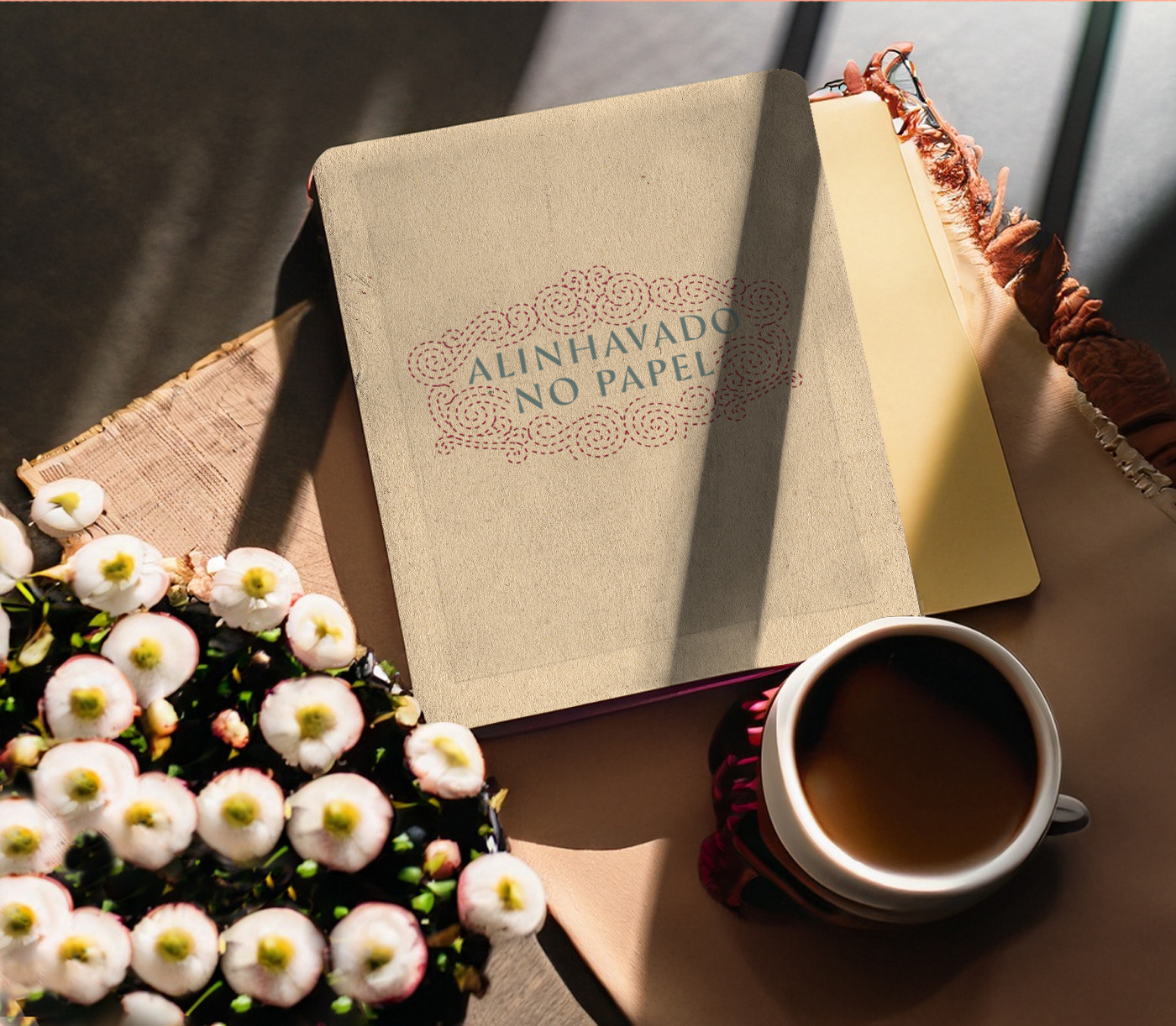
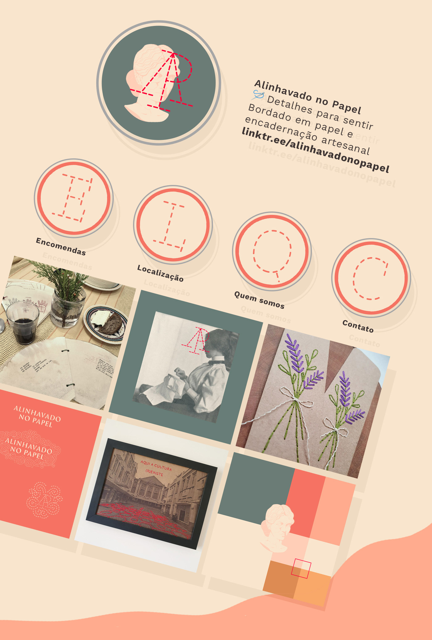
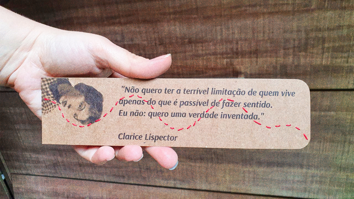
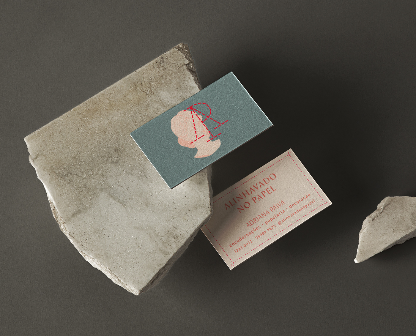
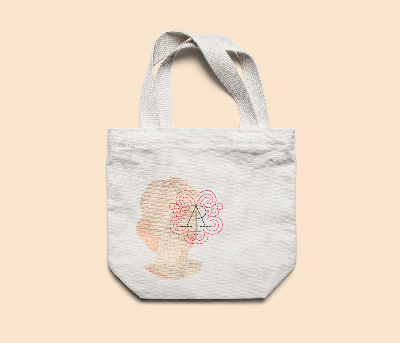
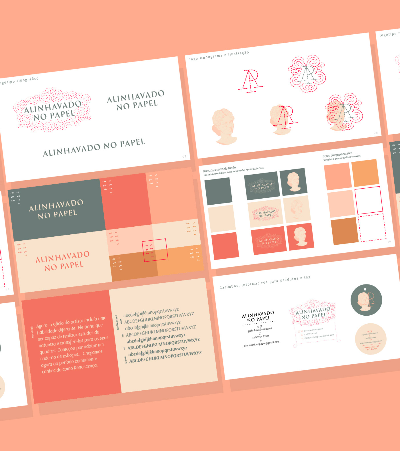
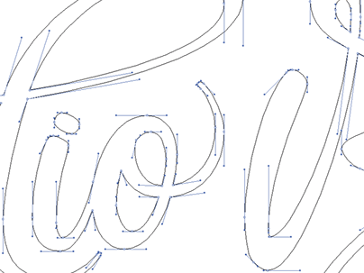
Alinhavado no Papel (Basted on Paper) is Adriana Paiva's brand to merchandise her basting work over sketchbooks, planners, and prints. The brand's concept is based on her main product, the sketchbook, and its way of dialing us back to an era where we used to do things by hand. 

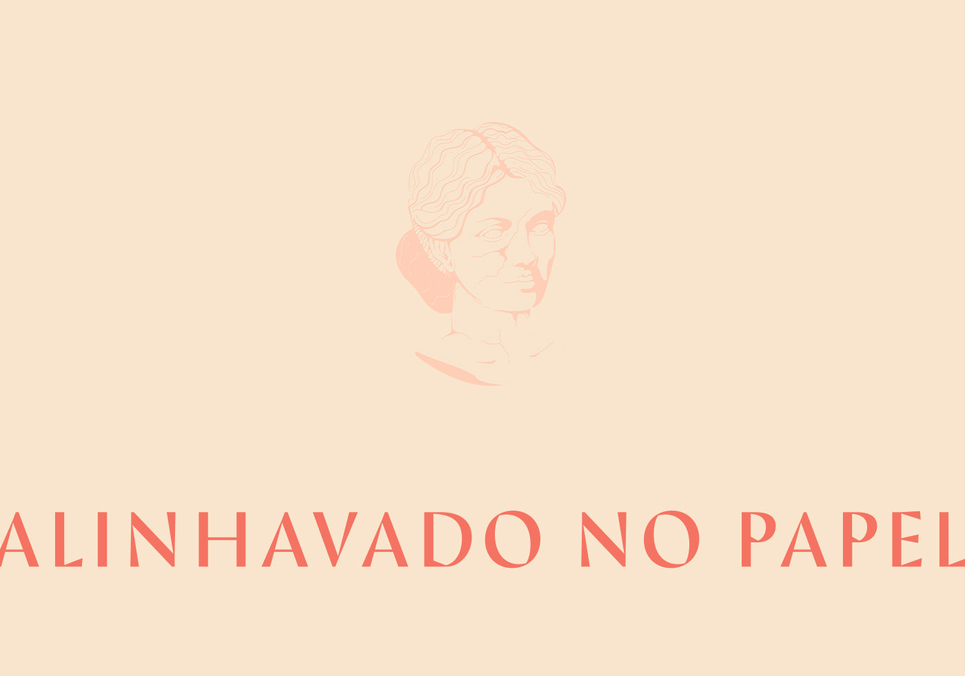
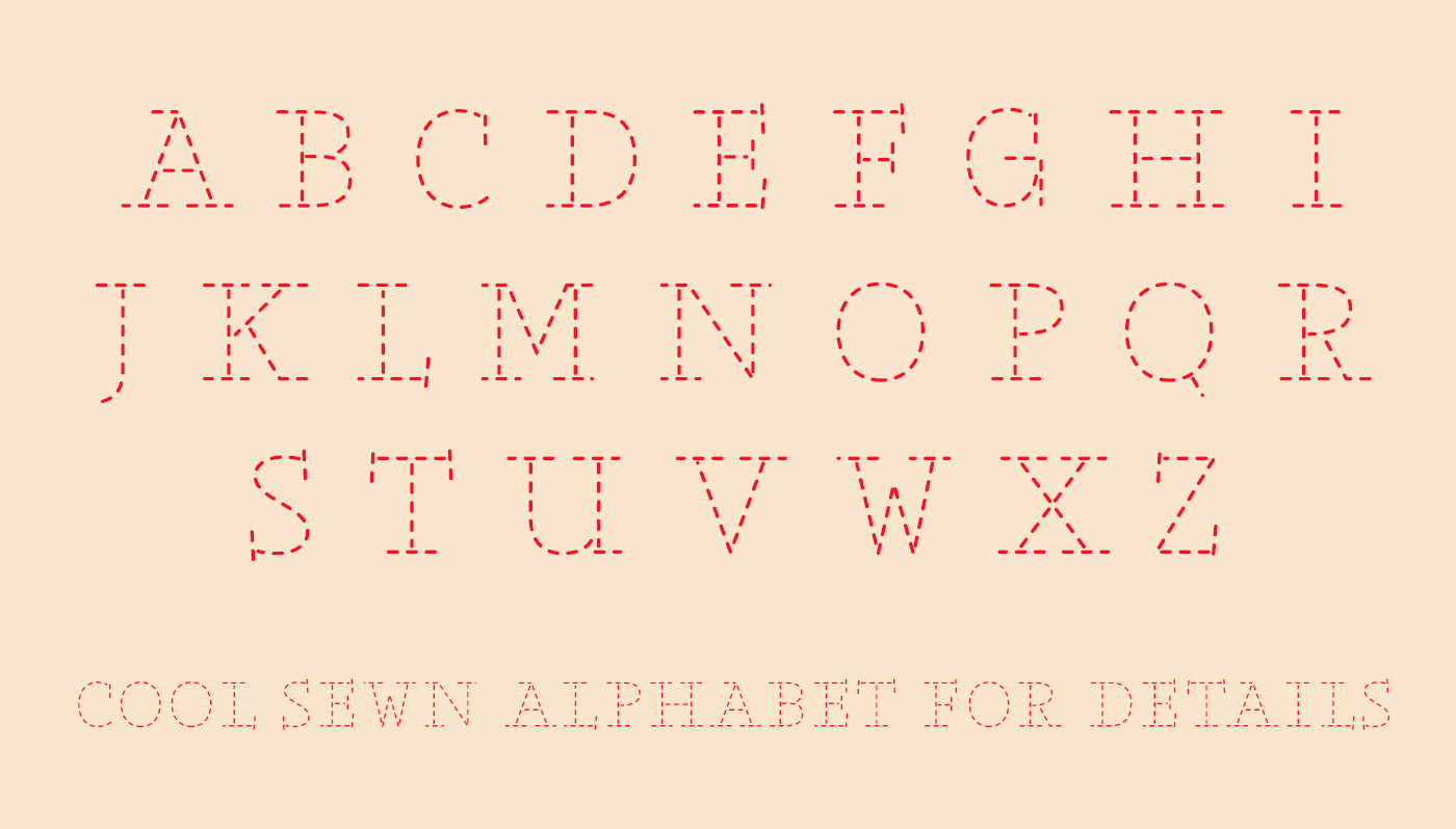
A great inspiration for the logo was the renaissance era, when the use of notepads was adopted by great artists, as a way of compiling their studies to later be able to apply them to their final work (E. H. Gombrich).

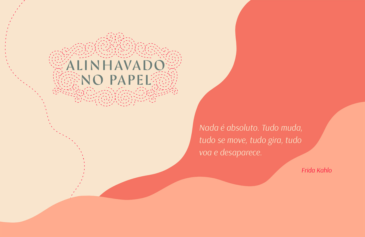
Our work consisted on brand strategy, visual identity and some print and social media layout.


You may also like

ID ILUSTRAÇÃO | Caetano Brasil - romani
2019
Este projeto consiste da identidade visual para o single “romani” lançado pelo artista mineiro Caetano Brasil. O conceito foi baseado em suas inspirações para a composição, o povo cigano, ou romani. A partir delas foram definidos o lettering e a ilustração como base para todo o projeto.
LOGOTYPE | Casa da Gelada
2020
Casa da Gelada is a small neighborhood gocery store that specializes in alcooholic beverages delivery, its style comes mostly from what was given by the looks of the house itself. With the brick walls and rough wood doors, we thought it would be well represented by an old distilery look With that in mind I did some researching and sketching to create the custom type logo, and a few pieces we needed to get the business going. I also did the hand painted logos and number on the walls.
CALLIGRAPHY & LETTERING | O quase último Aum
2022
BRAND ID | Inpulse
2018
INPULSE is a Pilates and physiotherapy studio, it uses an ecletic aproach, presenting other services as aesthetic treatment, auricle acupuncture, kinesiology tape and Global Posture Re-education. The Brand Identity was imagined to follow the owner`s flexibility on work techniques and personal impact made possible by Dani`s natural talent for it, and a small studio environment.
LETTERING | Ye are Gods
2018
vector and scan lettering for the project Ye are Gods. It is the name of Frederico Rabelo's second season of tattoo works.
CALLIGRAPHY SKETCHBOOK 01 | Renan Torres
2019
omecei a treinar caligrafia como um exercício de fundamentos para o desenho de lettering e design de tipos, agora tenho como objetivo achar uma expressão artística na própria prática. Este é o primeiro de uma série de sketchbooks de caligrafia que pretendo fazer para buscar novas formas de criar letras à mão.
ILLUSTRATION | BumpSide Brasil
2020
BumpSide Brasil is a group of Ford Trucks aficionados.  They gather in events to talk about this cars that many of them collect, restore or just love to be around. They have invited me to make two illustrations for their t-shirts, the following images show a bit of process and the results of digital illustrations portraying ford trucks and exclusive lettering as well as a representation of Mr. Clint Eastwood. For this job I used both vector and photoshop brushes. The final results are two artworks for t-shirts.
VISUAL IDENTITY | Galanga
2018
Logotype and visual identity developed for the 10th aniversary party of the brazilian creative company, Chico Rei (www.chicorei.com).
ALBUM COVER | Tiago Sarmento
2019
BOHO, a vocabulary abbreviation much in vogue lately,comes from the lifestyle of the gypsy culture, which French romantic artists very much admired, inspired and thus named their lifestyle of Bohemianism: nomadic, wandering, simple, passionate about life and unconventional. Extrapolating these words and finding their synonyms, we come to the vagabond, eccentric, exotic correlates; at last, free. This is all present in Tiago Sarmento's 20 years career as a musician, as a celebration, nothing better than his 5th studio album being named BOHO. Based on this information I was invited to create the album cover, with a research into the visual universe that involves the artist's creation we came up with an ornate lettering inspired by boho prints full of arabesques and floral patterns as the main element.
BRAND ID | Basic clothing Chico Rei
2019
Chico Rei is a brazilian t-shirt company specialized in creative artwork segment. This project had as an objective to make their basic products an inside brand, for that, as a part of their in-house communication team at the time we created the texts, and concept based on bauhaus/clean design. Raw materials where photographed and used as visual elements, And then the graphics came in to play giving it some unity.