You may also like

T-SHIRT PRINTS | Rn Torres
2018
T- shirt illustrations made for my stores at chicorei.com and also threadless. This first collection aimed mostly at type, and calligraphy references and use, including some pop culture elements.
CALLIGRAPHY & LETTERING | O quase último Aum
2022
BRAND ID | Inpulse
2018
INPULSE is a Pilates and physiotherapy studio, it uses an ecletic aproach, presenting other services as aesthetic treatment, auricle acupuncture, kinesiology tape and Global Posture Re-education. The Brand Identity was imagined to follow the owner`s flexibility on work techniques and personal impact made possible by Dani`s natural talent for it, and a small studio environment.
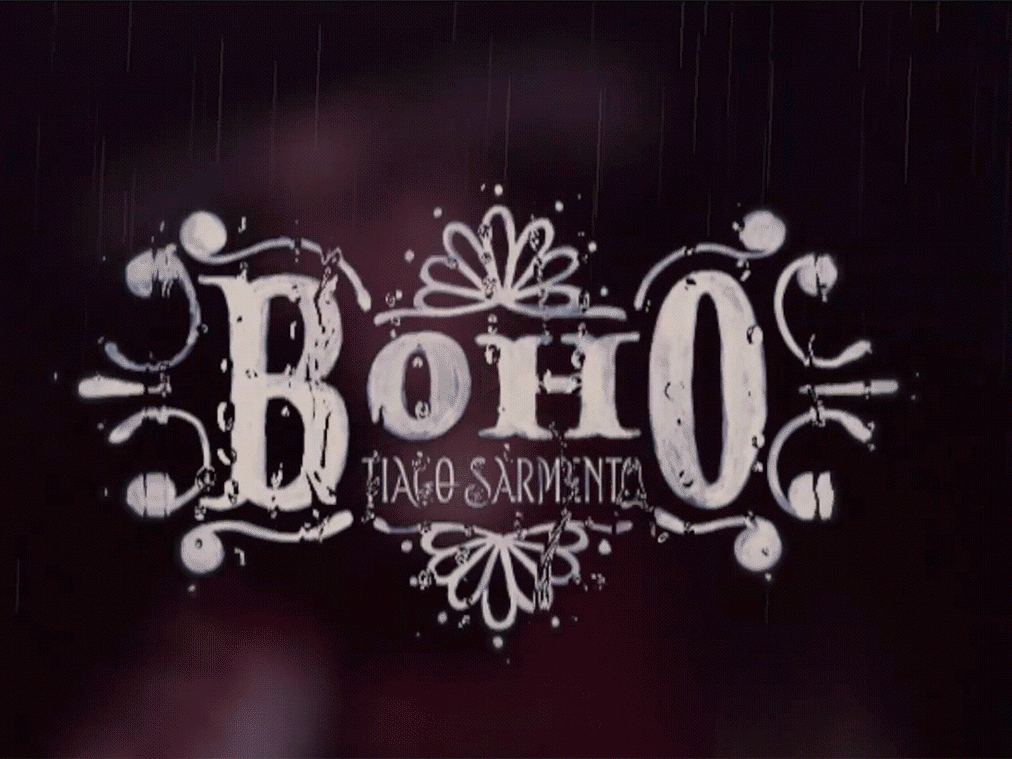
ALBUM COVER | Tiago Sarmento
2019
BOHO, a vocabulary abbreviation much in vogue lately,comes from the lifestyle of the gypsy culture, which French romantic artists very much admired, inspired and thus named their lifestyle of Bohemianism: nomadic, wandering, simple, passionate about life and unconventional. Extrapolating these words and finding their synonyms, we come to the vagabond, eccentric, exotic correlates; at last, free. This is all present in Tiago Sarmento's 20 years career as a musician, as a celebration, nothing better than his 5th studio album being named BOHO. 
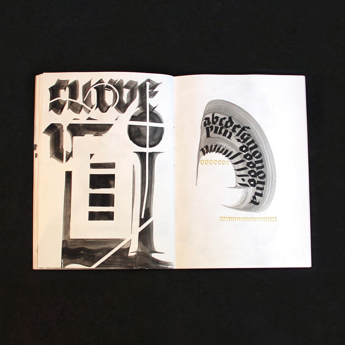
Based on this information I was invited to create the album cover, with a research into the visual universe that involves the artist's creation we came up with an ornate lettering inspired by boho prints full of arabesques and floral patterns as the main element.
BRAND ID | Chicoreizin
2018
Logotype, a fontface derived from its forms and a brand visual identity system. Those were the deliverables in this project. It was made to represent a kid`s line for a t-shirts company (Chico Rei) as their work is all based on creativity and fun stories, the aim here was to take a little of this culture to the communication.
Handlettered logotype-Studio Bardot
2013
2015 redesigned handlettered logotype for a local beauty salon inspired by the french former actress, Brigitte Bardot.
ALBUM COVER | Chora, Princesa!
2020
O álbum “Chora, Princesa! – Um Painel do Choro Contemporâneo de Juiz de Fora” é, sobretudo, um documento que registra, entre 1997 e 2019, um pouco do que se tem feito de Choro na cidade. Para a capa e seus desdobramentos, buscamos usar elementos reconhecidos como parte da identidade de Juiz de Fora. A paleta de cores é uma adaptação das cores da bandeira, e a ilustração faz referência ao estilo predominante em suas construções históricas, o Art Decó, além de representar partes desses prédios e até as luminárias de uma das principais ruas do centro.
LOGOTYPE | Tiago Sarmento
2018
This is a custom lettering logotype, it was made for a musician from Brazil. The style of the letters war conceived to convey the artist'sboho folk style.
ID ILUSTRAÇÃO | Caetano Brasil - romani
2019
Este projeto consiste da identidade visual para o single “romani” lançado pelo artista mineiro Caetano Brasil. O conceito foi baseado em suas inspirações para a composição, o povo cigano, ou romani. A partir delas foram definidos o lettering e a ilustração como base para todo o projeto.
BOOK CONCEPT - The Metamorphosis
2015
Proposta de criação de um projeto completo de livro. O principal desafio foi a representação gráfica desta história sem recorrer às formas de barata. Proposal of a complete book project. The main challenge was to graphically represent this sttory without references to the cockroach forms.