Ye are Gods is the second season of works based on a serious and deep research on subjects as Art History, Humankind Development and nature forms. All to support the tattoo work that the artist Frederico Rabelo puts out there. This is a very special project that I've worked between 2017 and 2018, helping with different kinds of stuff. This year Í got to do a piece of lettering which I finished both in brush strokes scan and vector to be used in all sorts of printed materials. This project shows a bit of the process and prints where the lettering got applied.
LETTERING | Ye are Gods
vector and scan lettering for the project Ye are Gods. It is the name of Frederico Rabelo's second season of tattoo works.
You may also like
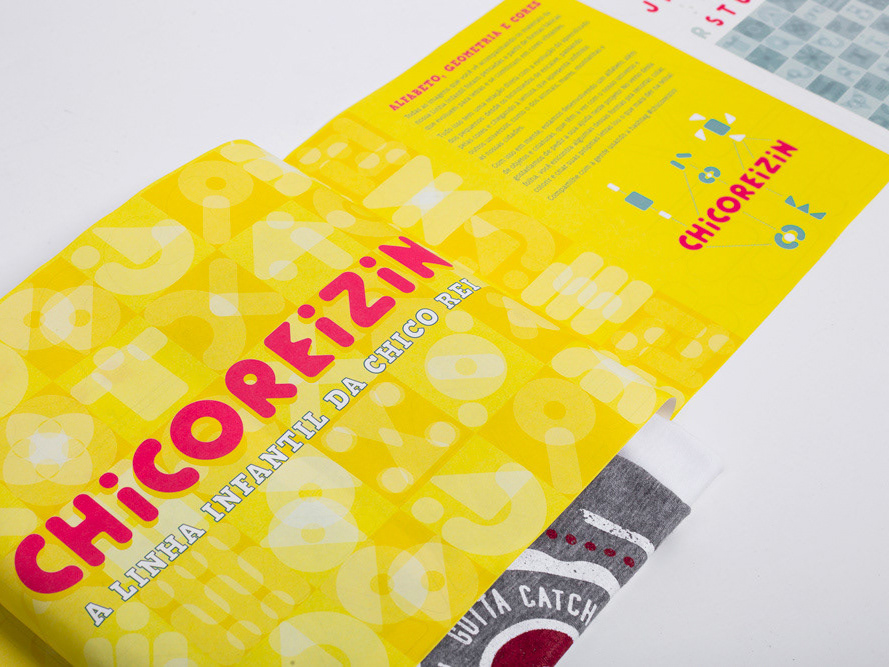
BRAND ID | Chicoreizin
2018
Logotype, a fontface derived from its forms and a brand visual identity system. Those were the deliverables in this project. It was made to represent a kid`s line for a t-shirts company (Chico Rei) as their work is all based on creativity and fun stories, the aim here was to take a little of this culture to the communication.
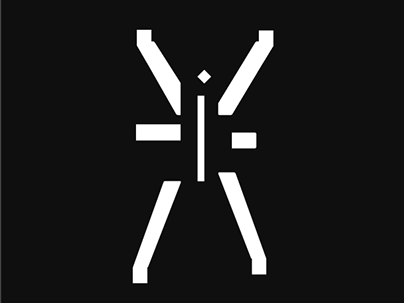
BOOK CONCEPT - The Metamorphosis
2015
Proposta de criação de um projeto completo de livro. O principal desafio foi a representação gráfica desta história sem recorrer às formas de barata.
Proposal of a complete book project. The main challenge was to graphically represent this sttory without references to the cockroach forms.
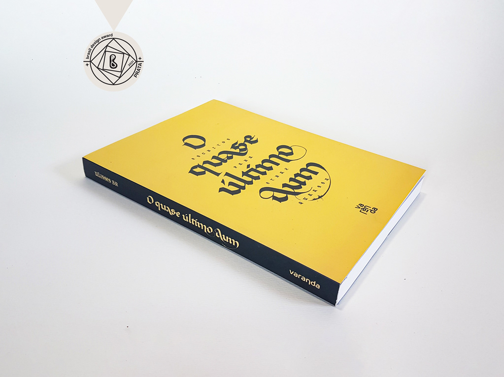
CALLIGRAPHY & LETTERING | O quase último Aum
2022
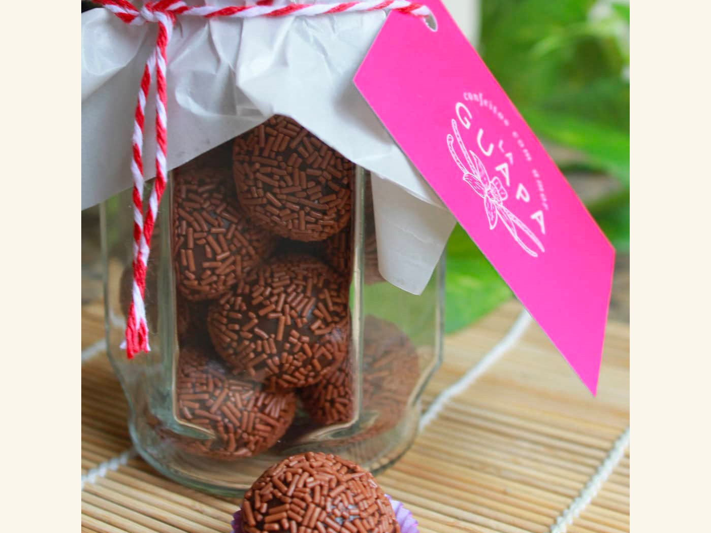
BRAND ID | La Guapa
2018
Tamires contacted me to make a logotype and a basic development of a brand for her to sell her home made comfit. All very healthy and tasty. For this job I made an illustrated brand icon, many applications of the logo, a color palete, and determined a set of typefaces to give the right tone for her identity.

LOGOTYPE | Tiago Sarmento
2018
This is a custom lettering logotype, it was made for a musician from Brazil. The style of the letters war conceived to convey the artist'sboho folk style.
POSTER | Chicundum
2020
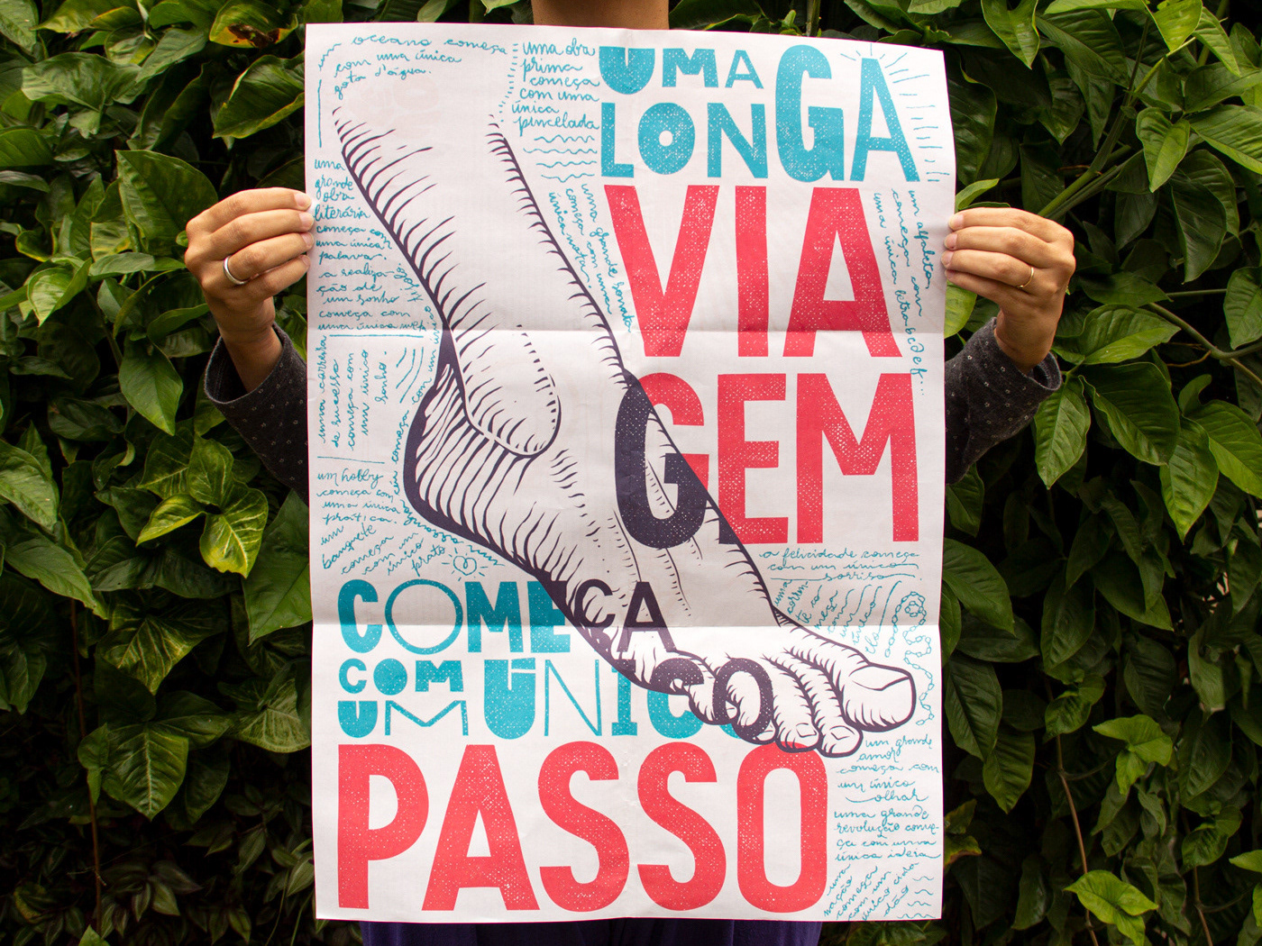
Chicundum is a poster/magazine, made by the clothing online store Chico Rei. The content is varied, always created by different writers with fresh perspectives about life and the possibilities of this amazing world we live in. For this edition, that focused a lot on personal journeys, projects and traveling, I was invited to created a poster and the illustrations that go with the content.
The quote in the poster says “A journey of a thousand miles begins with a single step”, and the small letters are variations of it, as “A successful career starts with a single dream”.
VISUAL IDENTITY | Galanga
2018
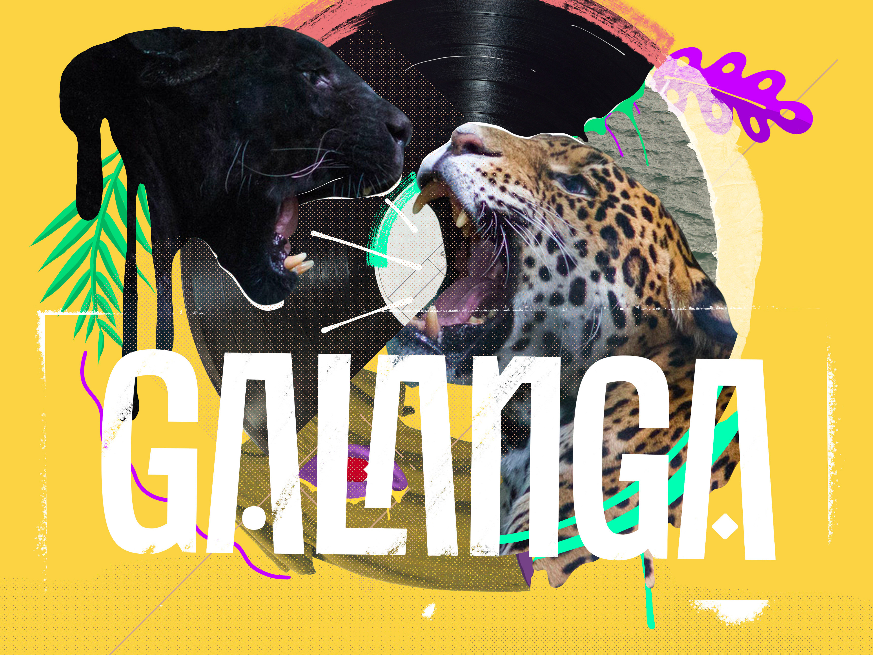
Logotype and visual identity developed for the 10th aniversary party of the brazilian creative company, Chico Rei (www.chicorei.com).
BRAND ID | Inpulse
2018
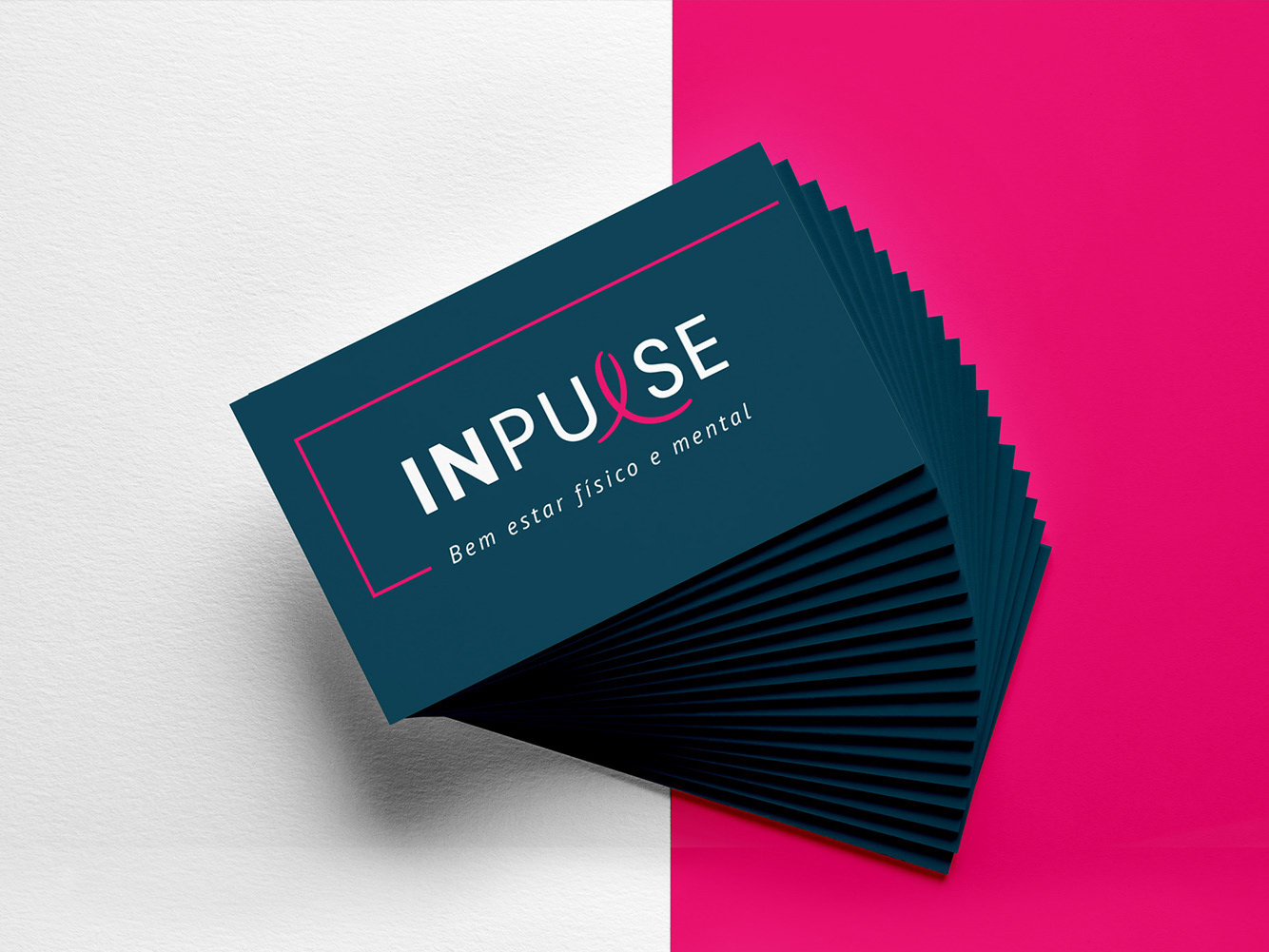
INPULSE is a Pilates and physiotherapy studio, it uses an ecletic aproach, presenting other services as aesthetic treatment, auricle acupuncture, kinesiology tape and Global Posture Re-education. The Brand Identity was imagined to follow the owner`s flexibility on work techniques and personal impact made possible by Dani`s natural talent for it, and a small studio environment.

CALLIGRAPHY & LETTERING | Collection
2023
BRAND ID | Organizar & Fluir
2018
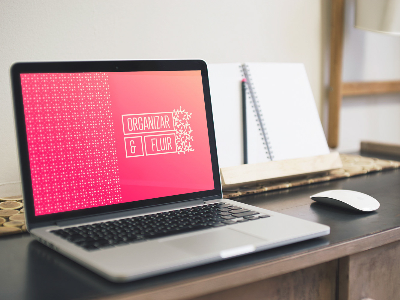
Logotype and visual identity developed for "Organizar & Fluir" a Belo Horizonte based company that works with organization for residences, companies, files and documents. They also do home staging and sell products.
The process to create the visual universe of the brand relied on common looks of organized and fluid homes, where everythings is found in its place and plants give a harmonious atmosphere to the place.
