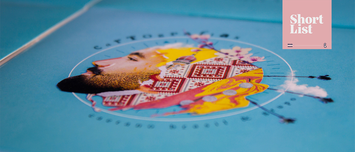
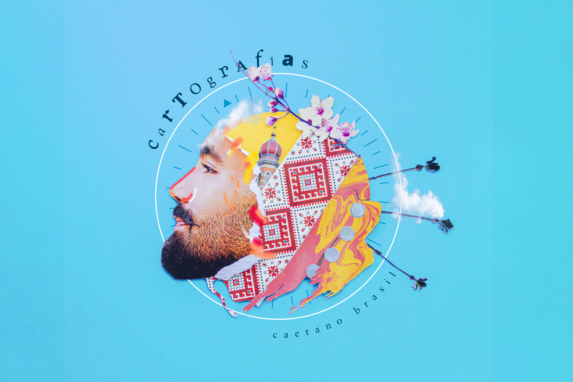
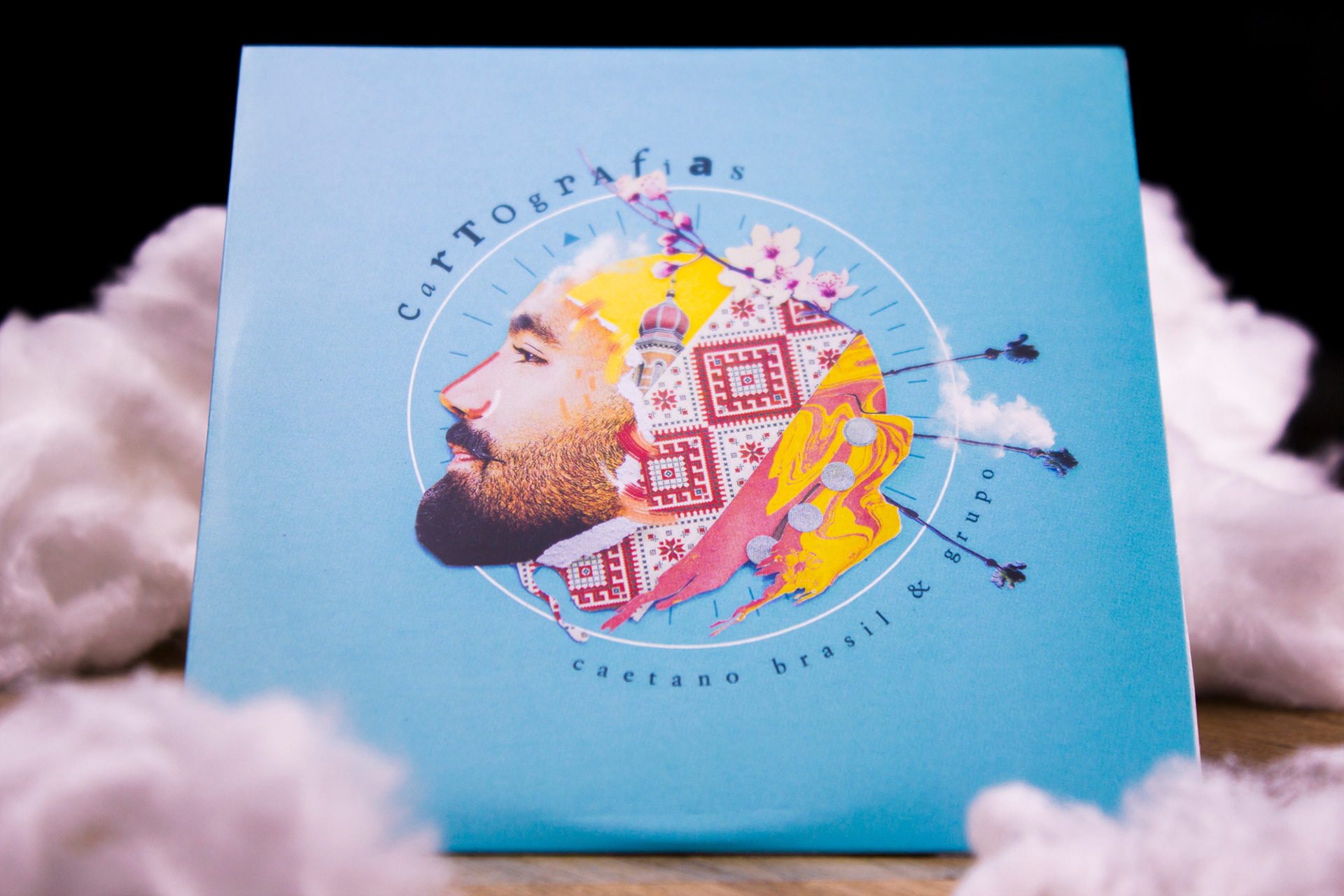
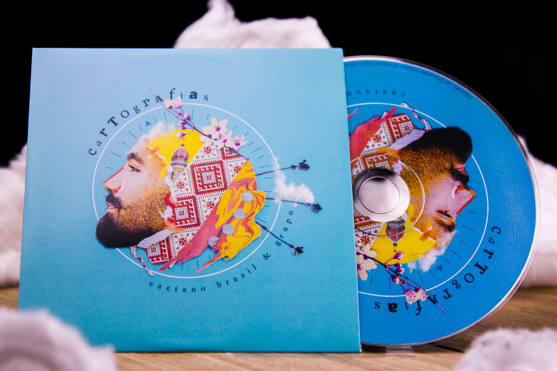
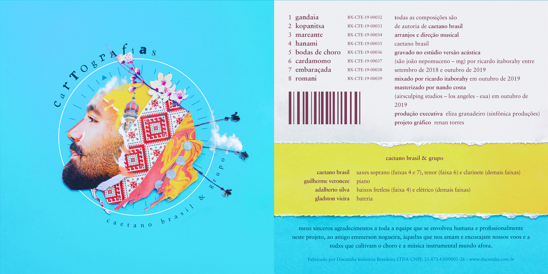
Caetano Brasil is an instrumentalist and musician, Cartografias (Cartographies) is his second full album. The inspiration for the compositions comes each from a different place in the world, and in each track, characteristics of these cultures mix with the essence of Brazilian Choro music, and with the artist's references.
I was invited to create the cover and some pieces for online marketing for this release.

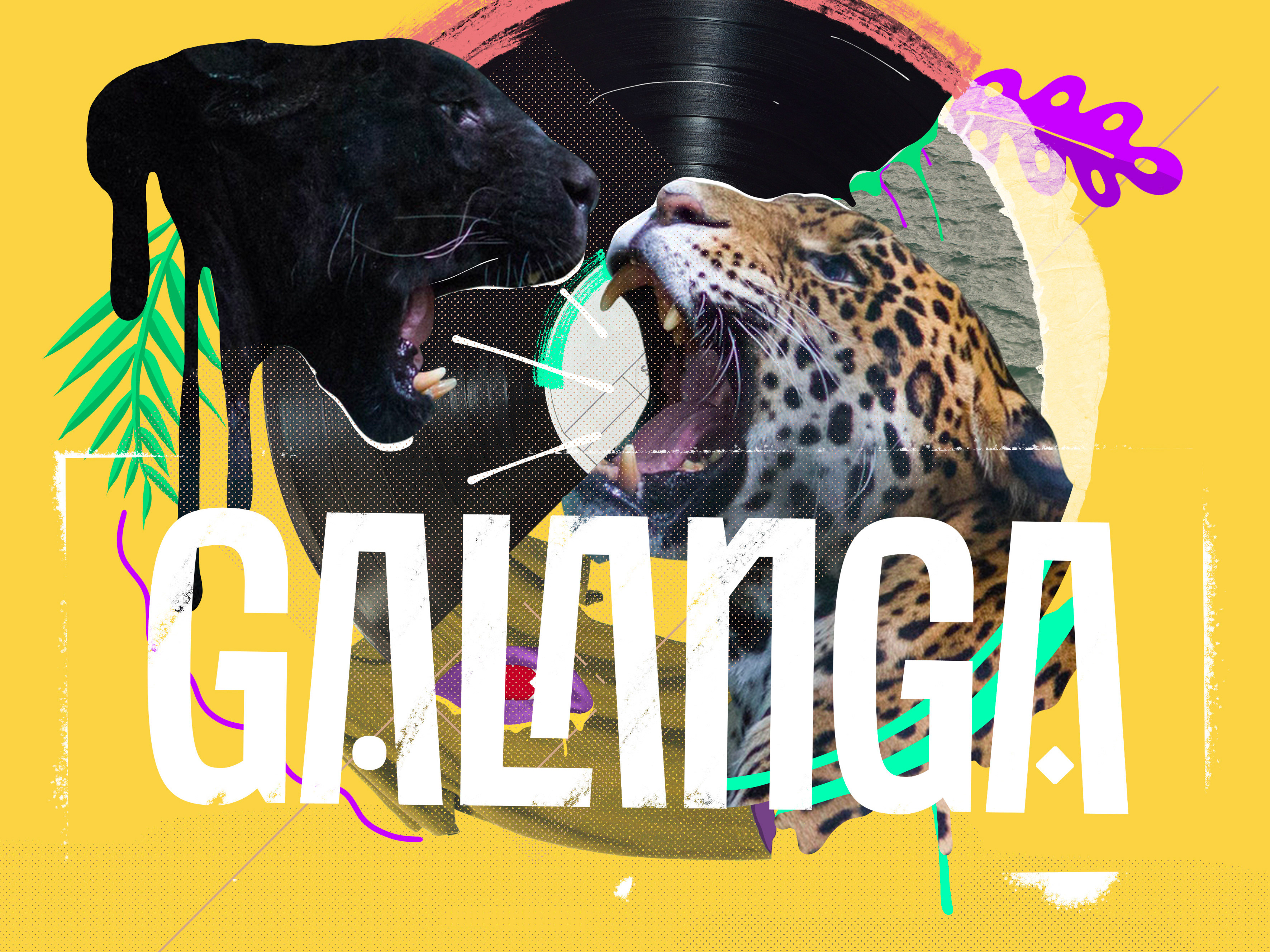
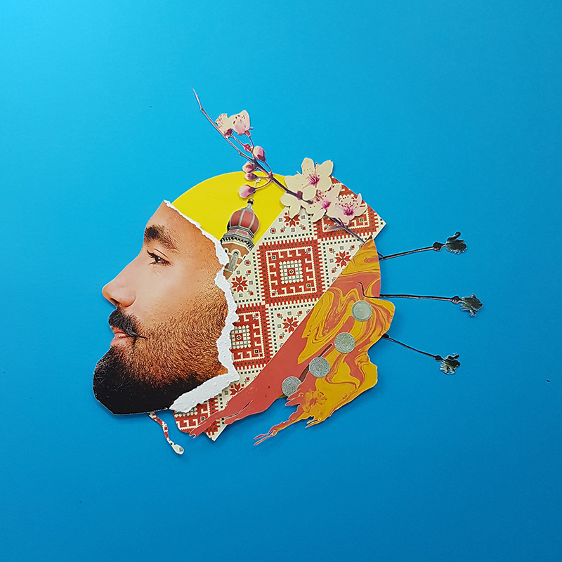
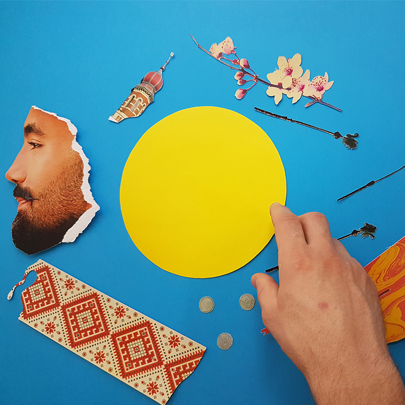
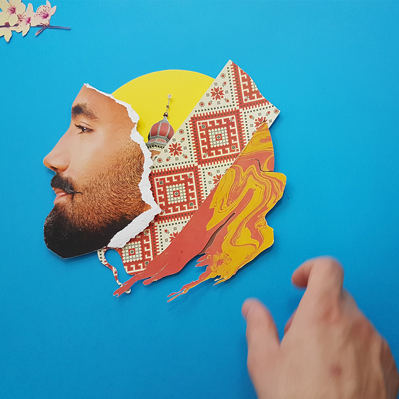
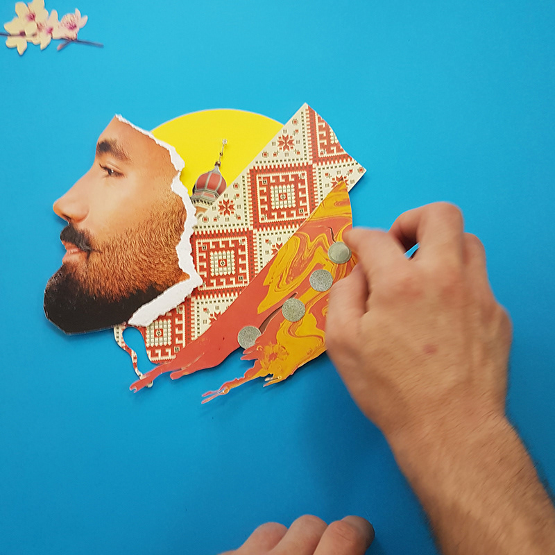
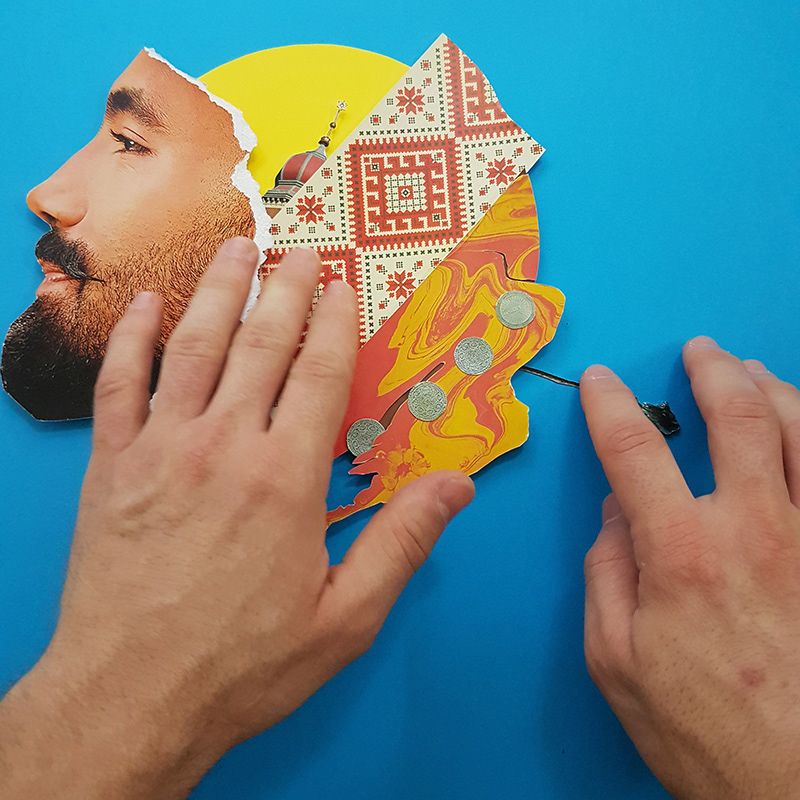
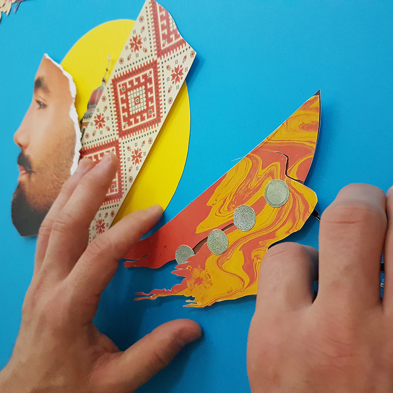
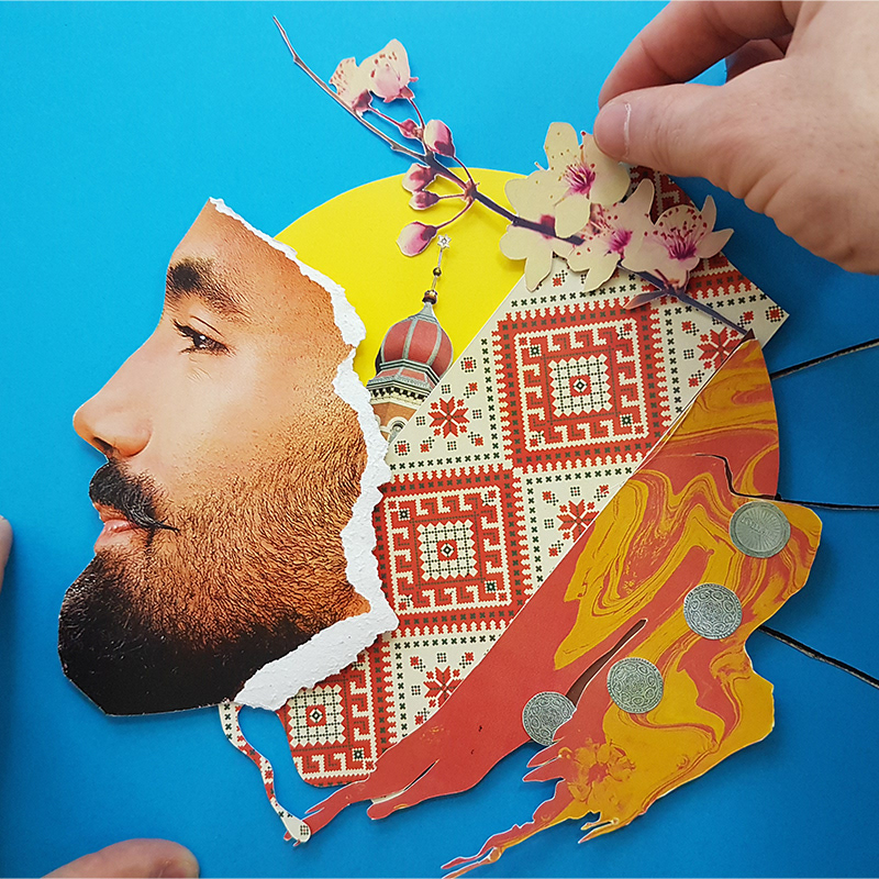
The visual solution tries to mirror what was done musically in the album, looking for references of the cultures that inspired each song in the album, such as Japanese cherry blossoms, Gypsy coins and coconut trees on Caribbean beaches. All of this mixes with the artist's face in a manual collage. Some isolated elements were used for marketing pieces.
COLAGEM

A técnica utilizada para este trabalho foi a colagem manual, as peças têm quadrados de papelão colados atrás para dar à imagem mais sombra e sensação de volume. O processo também se tornou um vídeo em stop motion.
COLLAGE

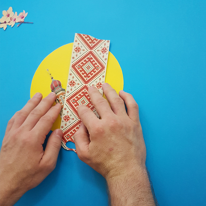
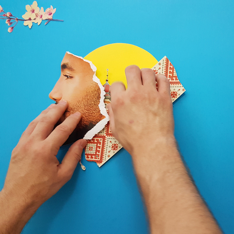
The technique used for this work was a handmade collage, the pieces have cardboard squares glued behind them to give the image more shadow and a sense of volume. The process became a stop motion video also.
Fotografia por @danielcampos.ard

You may also like

ALBUM COVER | Chora, Princesa!
2020
O álbum “Chora, Princesa! – Um Painel do Choro Contemporâneo de Juiz de Fora” é, sobretudo, um documento que registra, entre 1997 e 2019, um pouco do que se tem feito de Choro na cidade. Para a capa e seus desdobramentos, buscamos usar elementos reconhecidos como parte da identidade de Juiz de Fora. A paleta de cores é uma adaptação das cores da bandeira, e a ilustração faz referência ao estilo predominante em suas construções históricas, o Art Decó, além de representar partes desses prédios e até as luminárias de uma das principais ruas do centro.
LABEL | LOGOTYPE - Seiva da Mata
2017
This job required the creation of all 4 illustrations for the different kinds of beer. They had selected a free font to use as their logo. I offered this solution of a custom lettering and it was well appreciated by the client. Seiva da Mata is an artisanal brewery based in Minas Gerais, Brazil, that seeks to give its beers the freshness of life close to nature, which is common to the country side of the state. In order to communicate this, images have been chosen that refer to the worker of the field and his quiet in moments of the day when contemplation is like a reward for his work.
CALLIGRAPHY SKETCHBOOK 01 | Renan Torres
2019
omecei a treinar caligrafia como um exercício de fundamentos para o desenho de lettering e design de tipos, agora tenho como objetivo achar uma expressão artística na própria prática. Este é o primeiro de uma série de sketchbooks de caligrafia que pretendo fazer para buscar novas formas de criar letras à mão.
BRAND ID | Estúdio Curió
2022
BRAND ID | Organizar & Fluir
2018
Logotype and visual identity developed for "Organizar & Fluir" a Belo Horizonte based company that works with organization for residences, companies, files and documents. They also do home staging and sell products. The process to create the visual universe of the brand relied on common looks of organized and fluid homes, where everythings is found in its place and plants give a harmonious atmosphere to the place.
T-SHIRT PRINTS | Rn Torres
2018
T- shirt illustrations made for my stores at chicorei.com and also threadless. This first collection aimed mostly at type, and calligraphy references and use, including some pop culture elements.
ILLUSTRATION | BumpSide Brasil
2020
BumpSide Brasil is a group of Ford Trucks aficionados.  They gather in events to talk about this cars that many of them collect, restore or just love to be around. They have invited me to make two illustrations for their t-shirts, the following images show a bit of process and the results of digital illustrations portraying ford trucks and exclusive lettering as well as a representation of Mr. Clint Eastwood. For this job I used both vector and photoshop brushes. The final results are two artworks for t-shirts.
CALLIGRAPHY & LETTERING | O quase último Aum
2022
36 DAYS OF TYPE - 2018
2019
36 days of type 2018. For this edition I focused on training more of a general type design process.
VISUAL IDENTITY | Galanga
2018
Logotype and visual identity developed for the 10th aniversary party of the brazilian creative company, Chico Rei (www.chicorei.com).