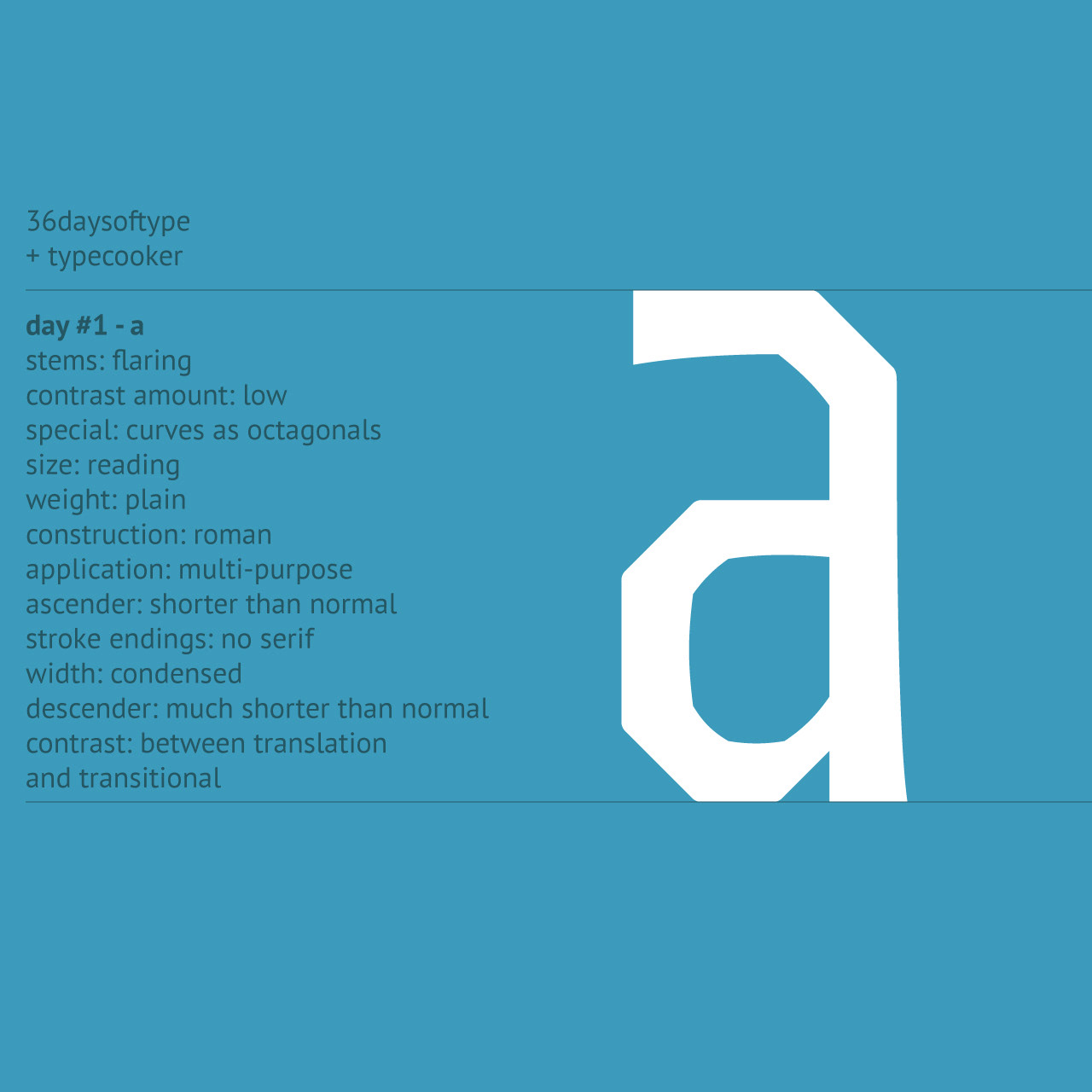
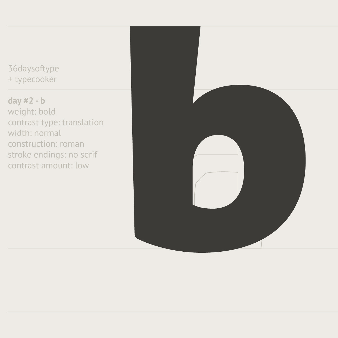
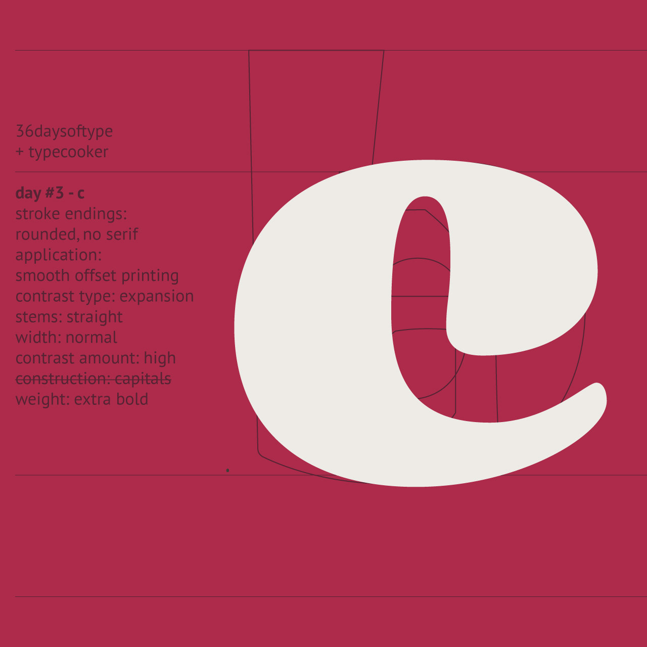
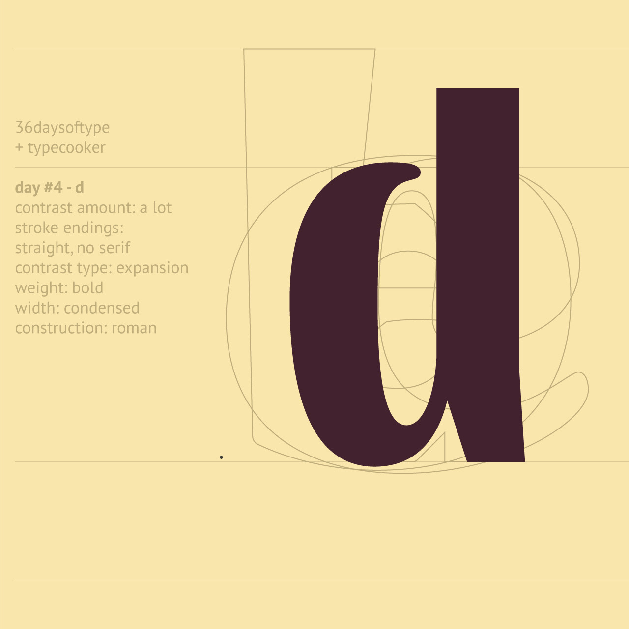
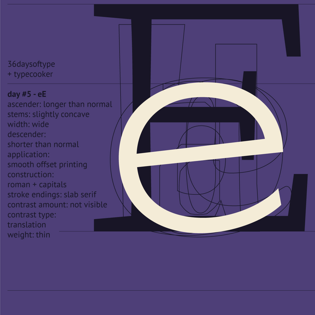
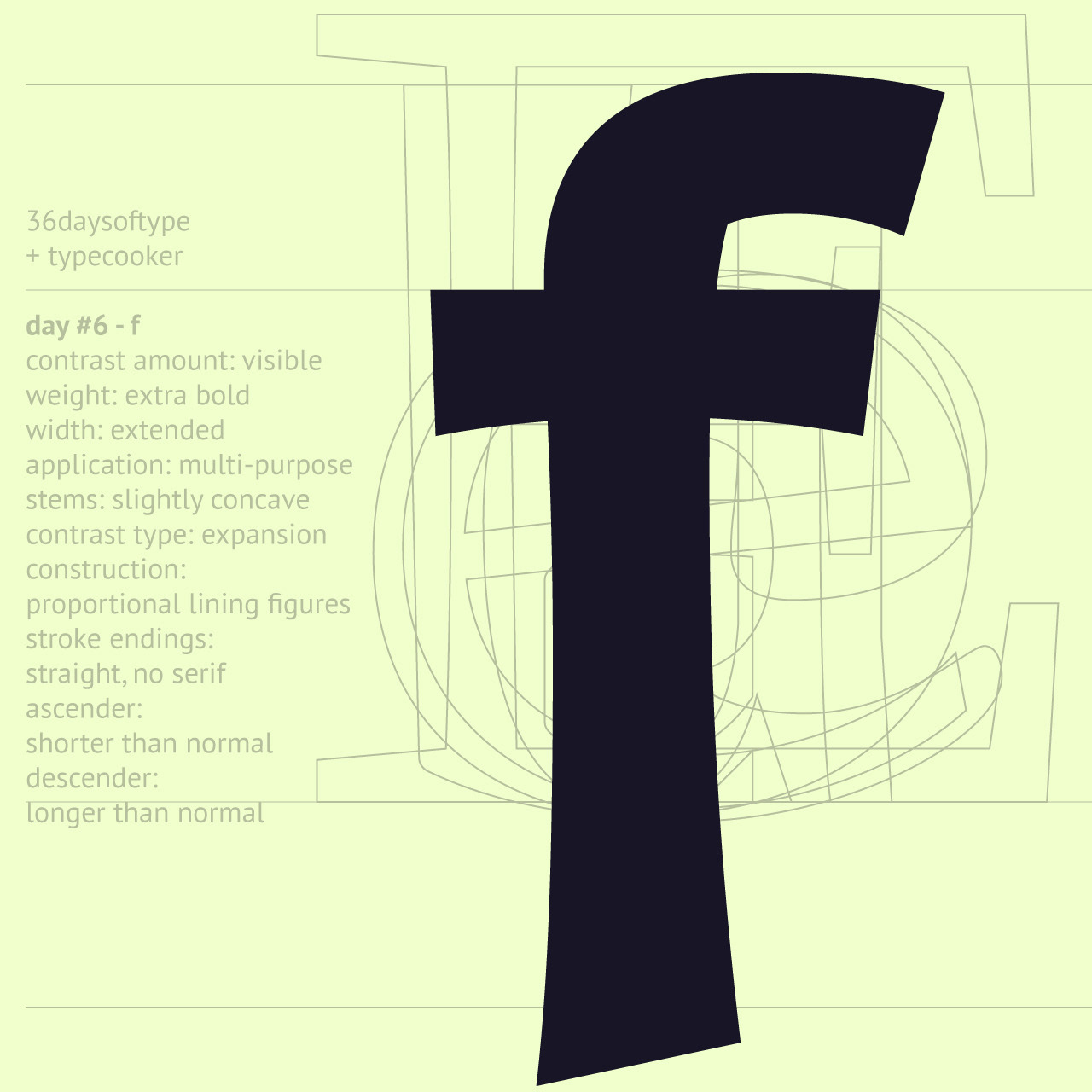
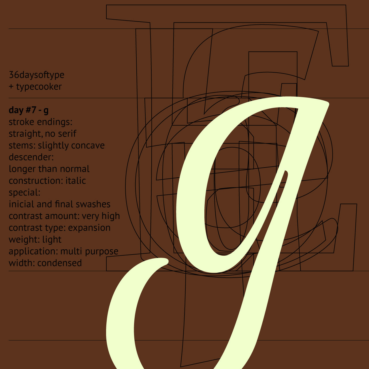
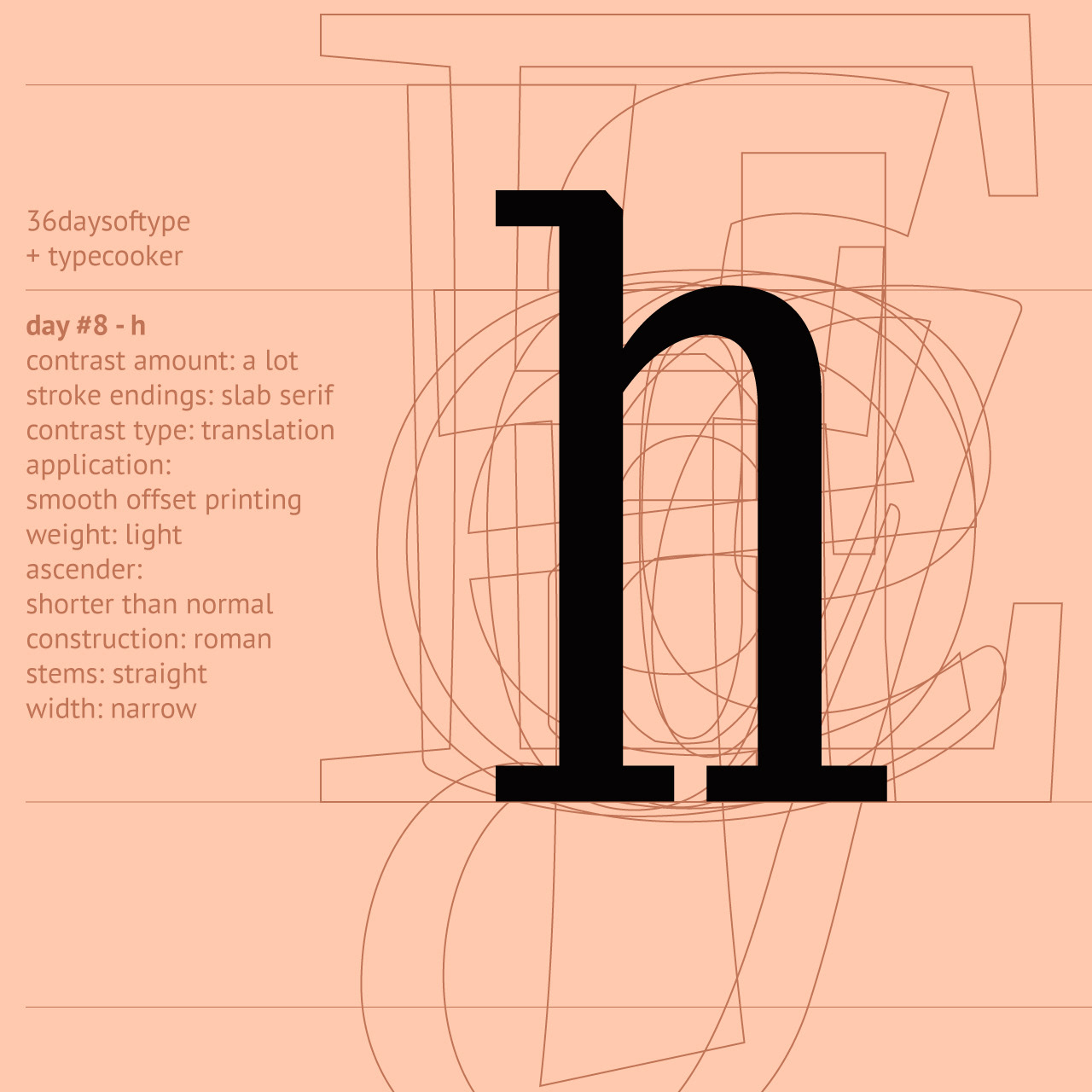
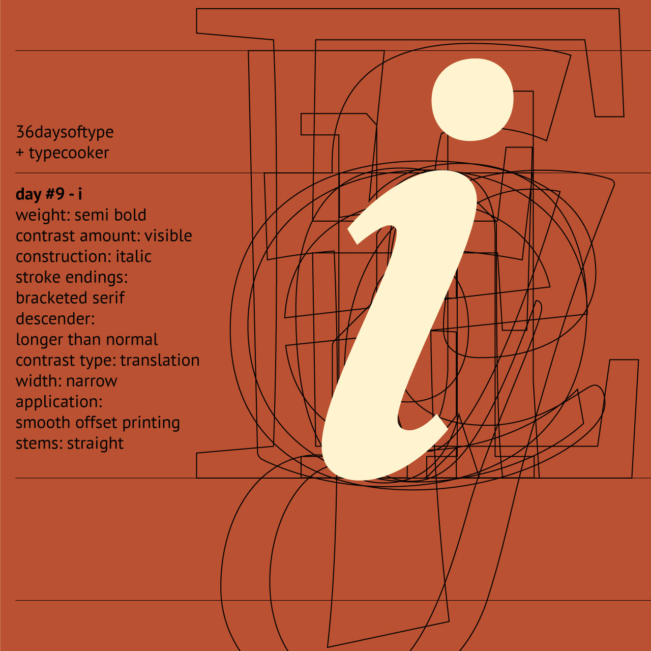
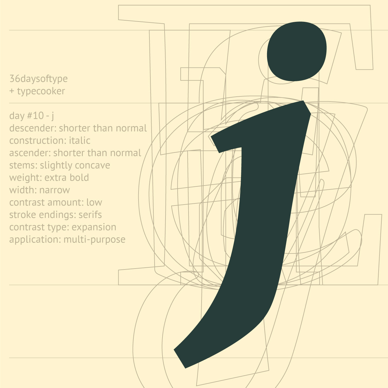
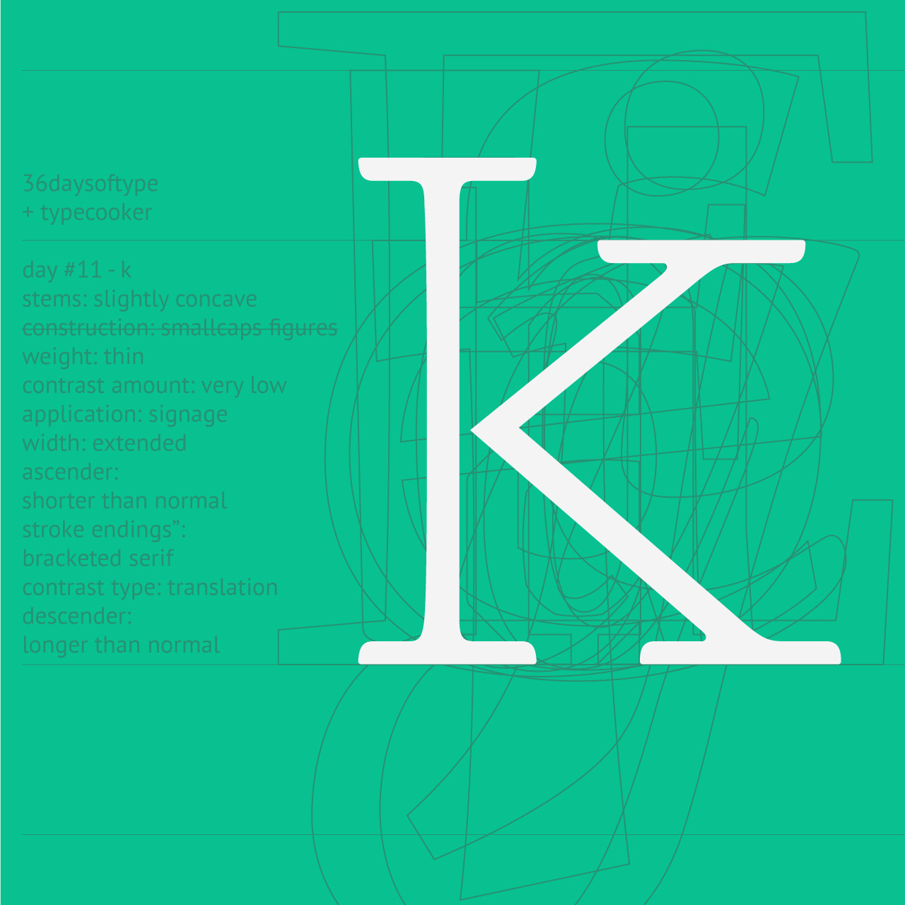
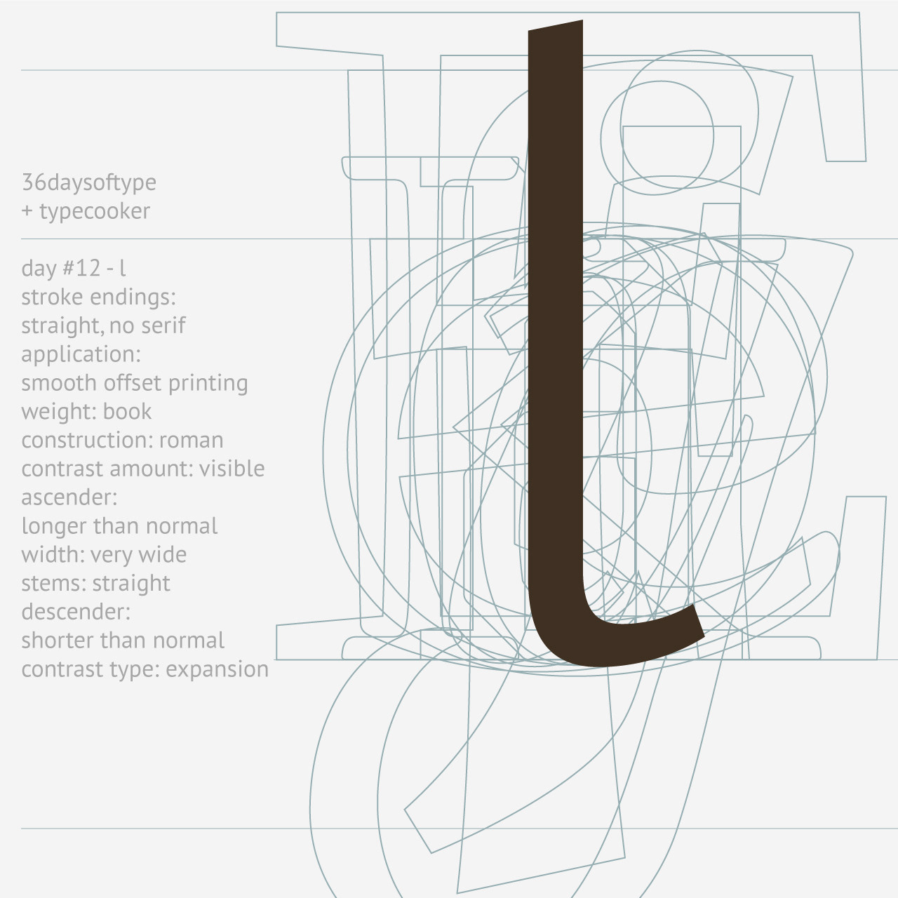
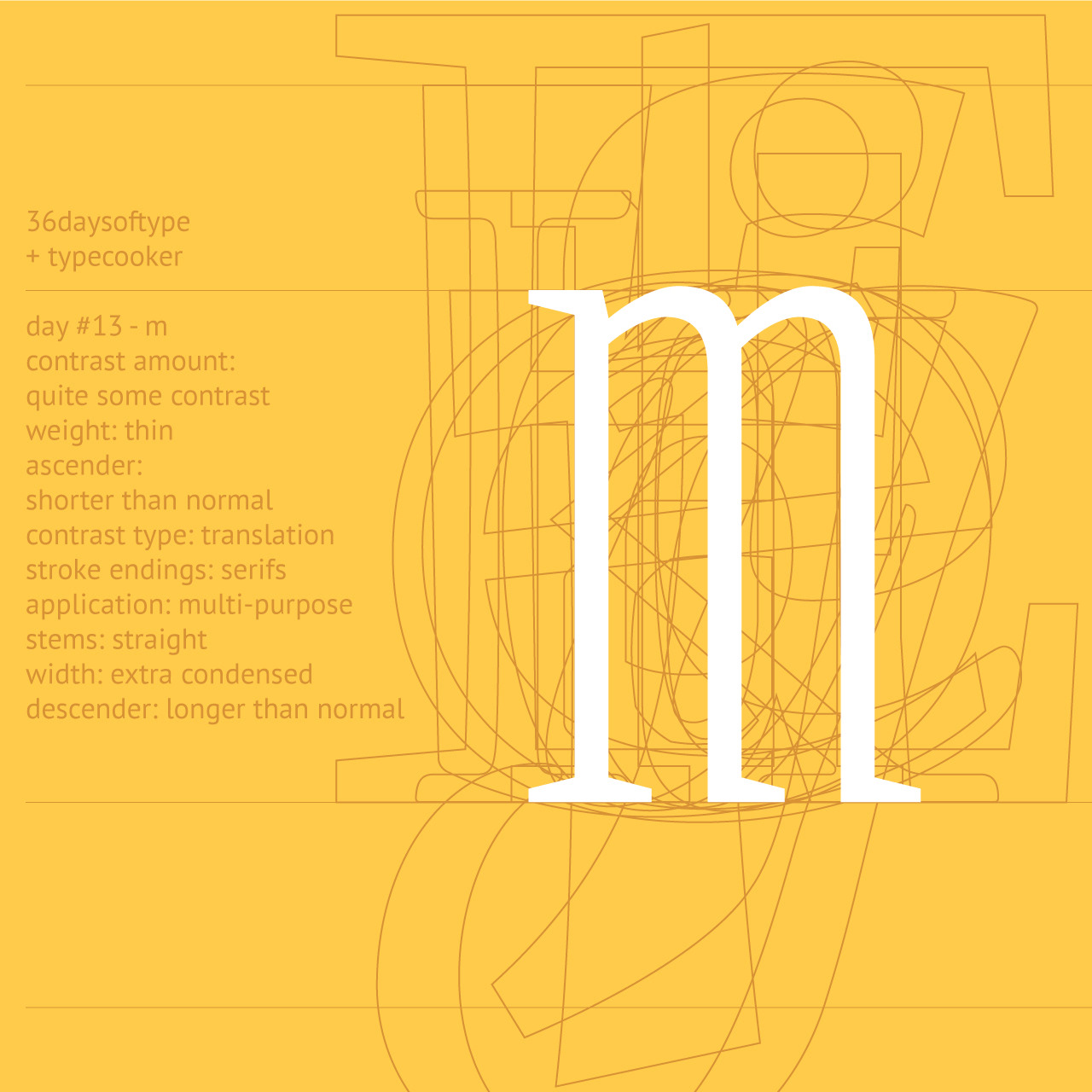
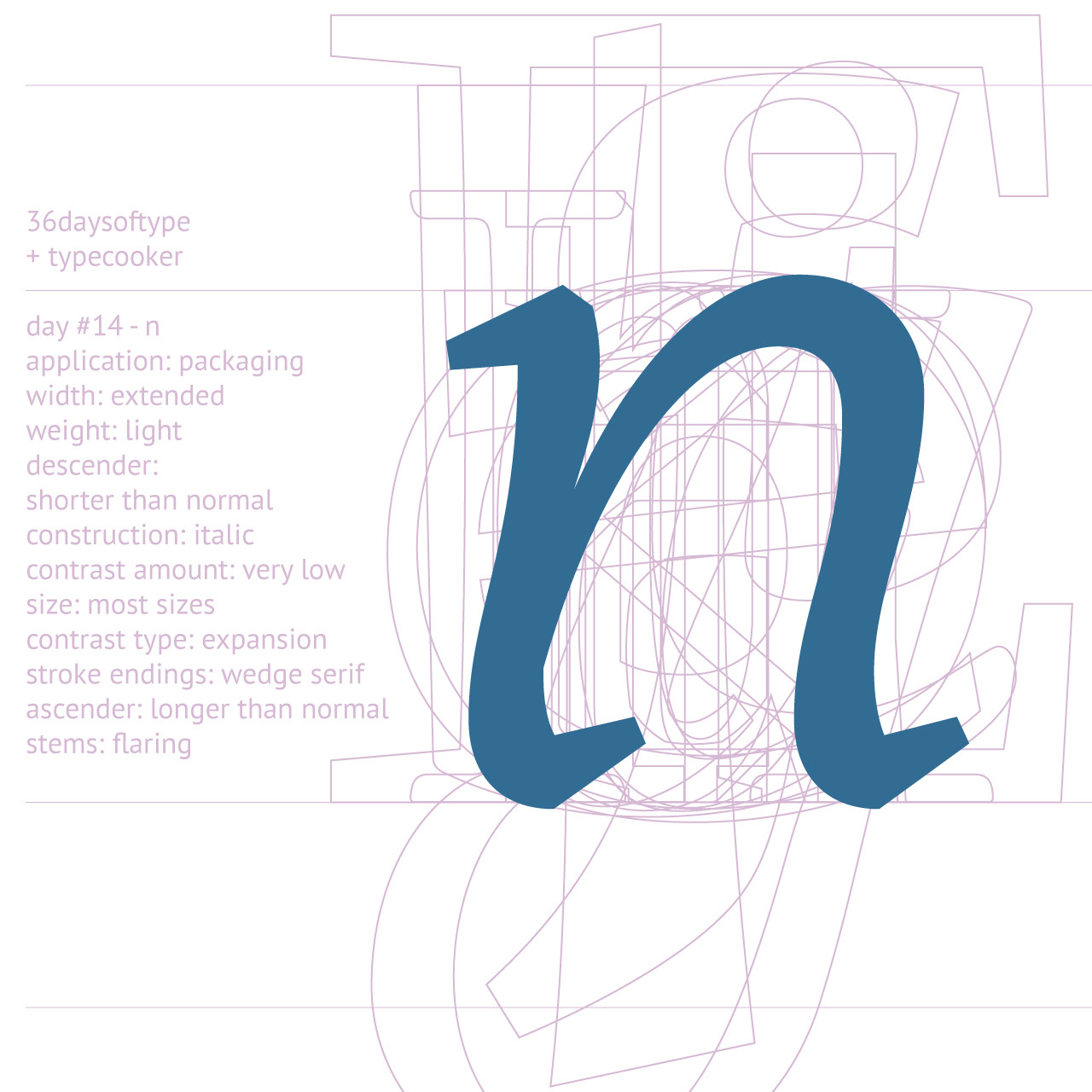
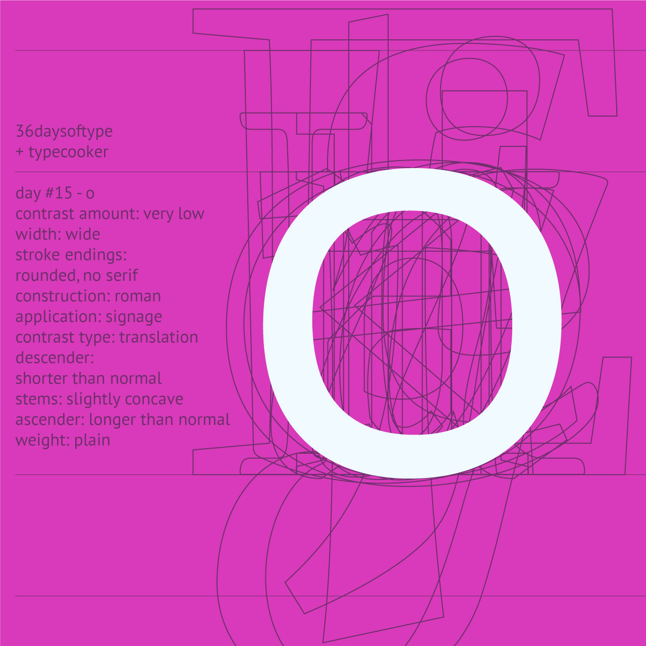
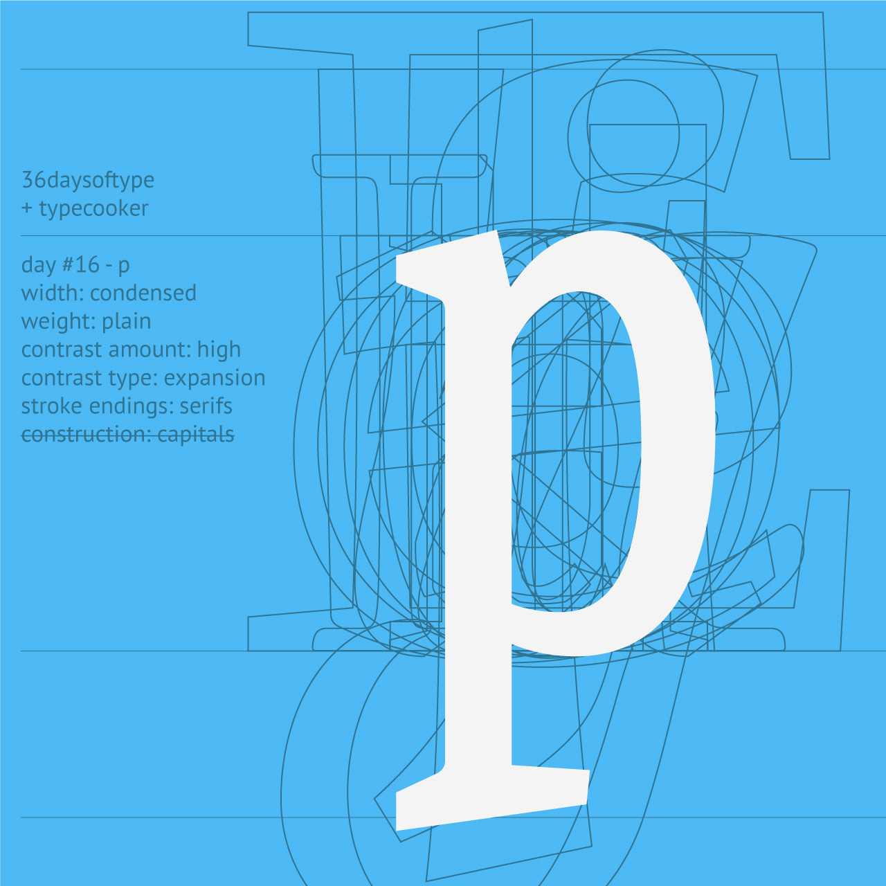
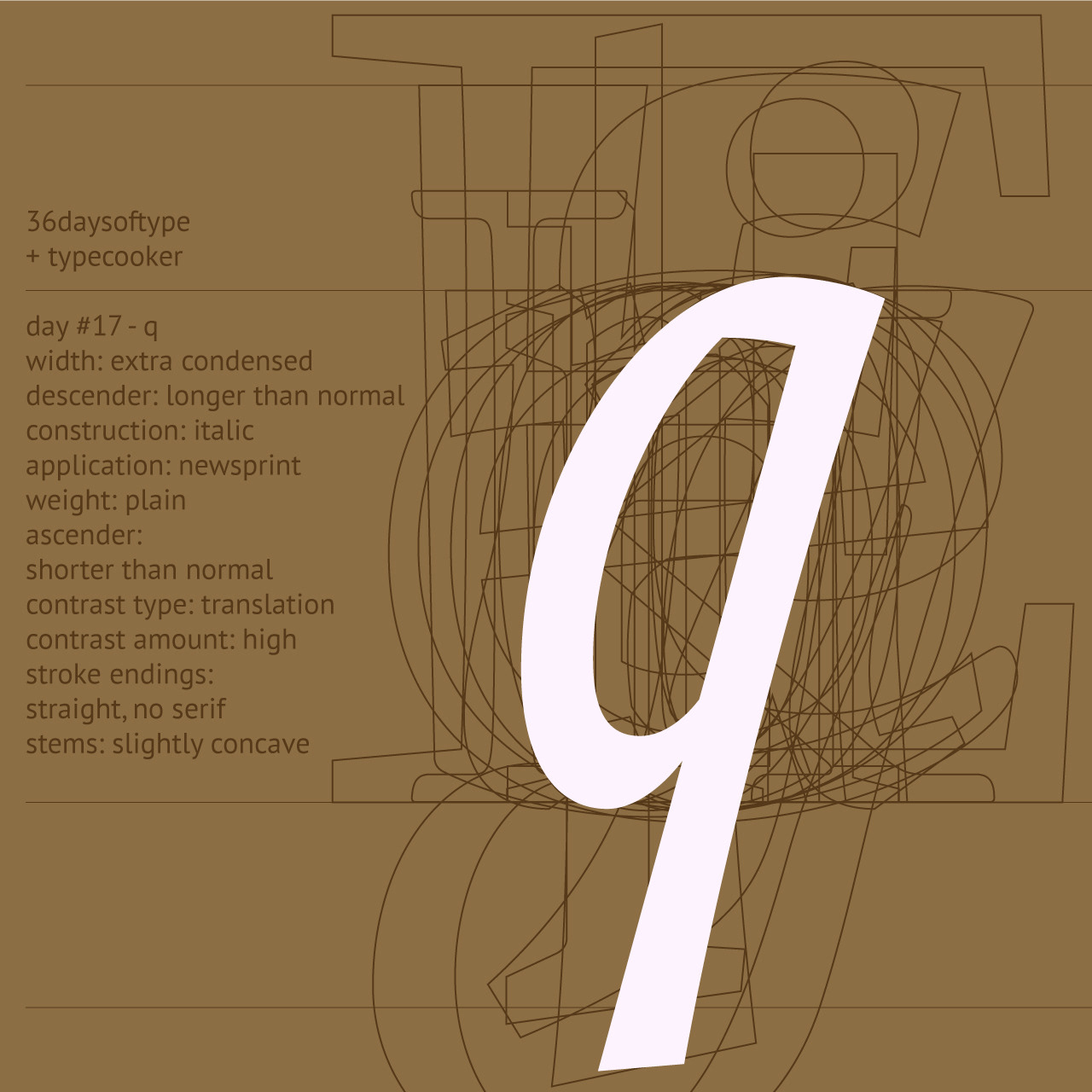
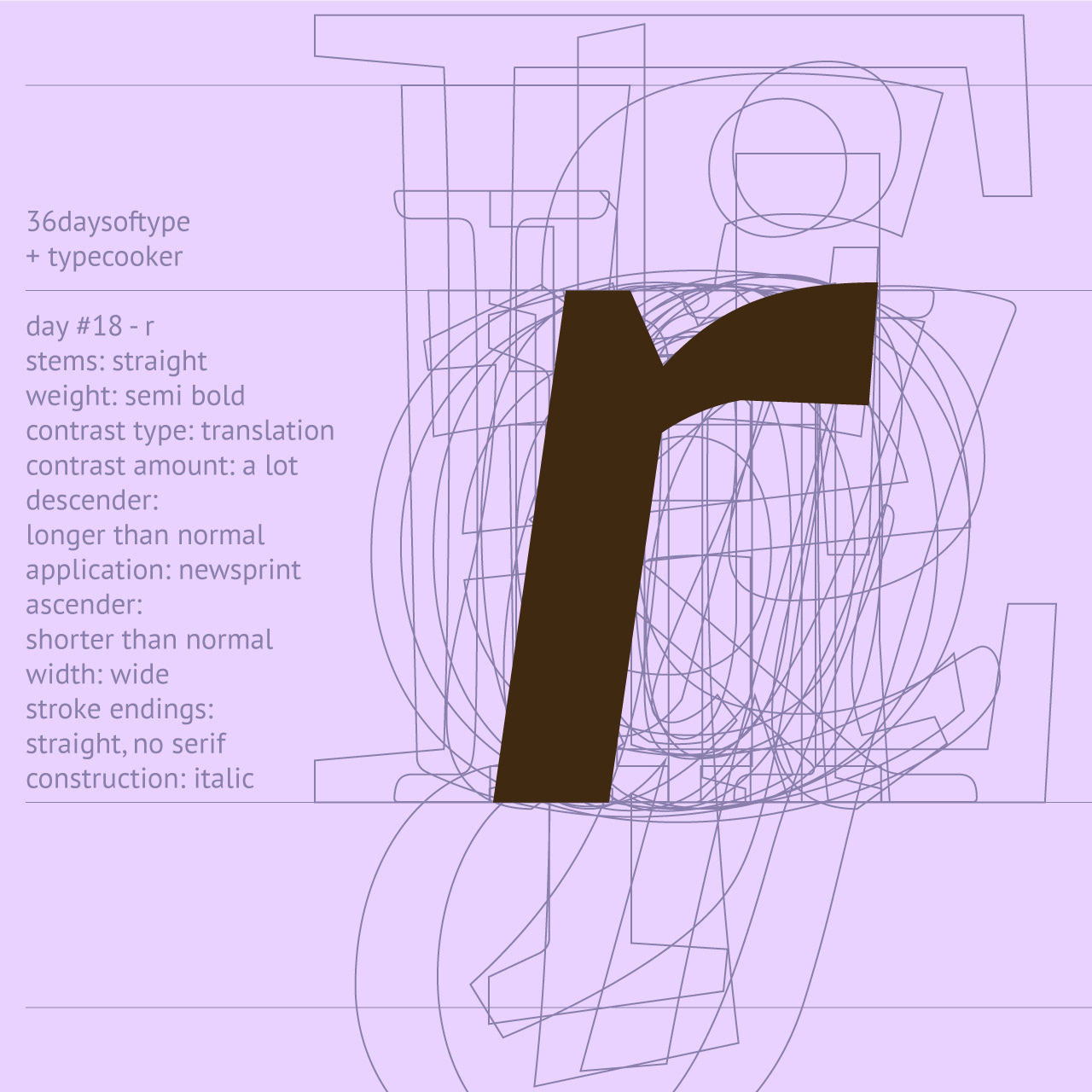
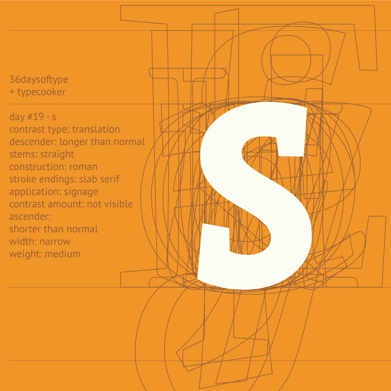
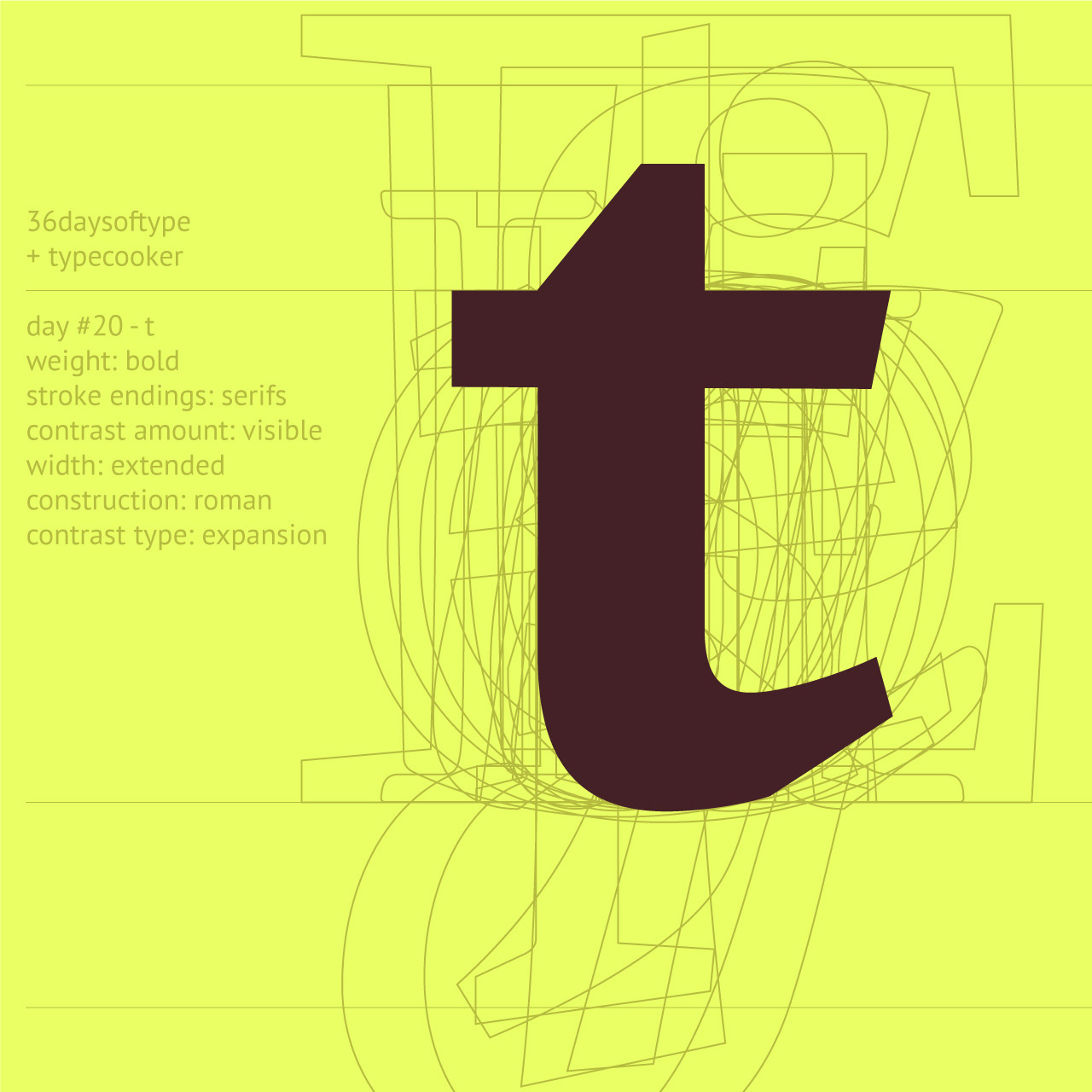
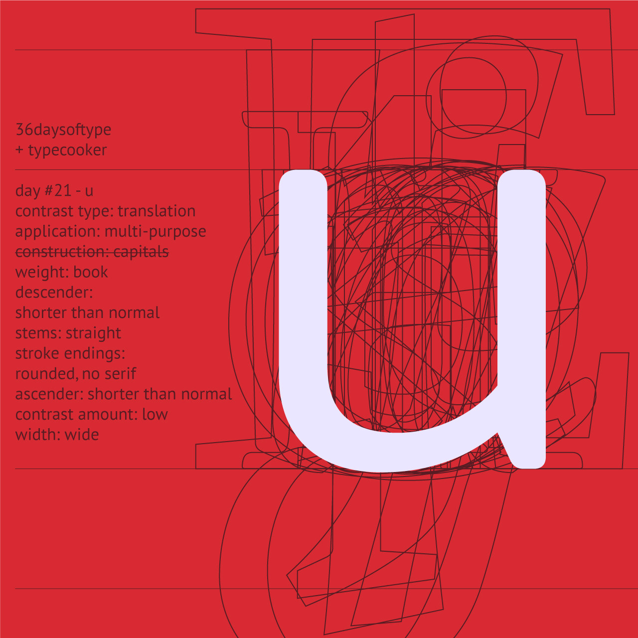
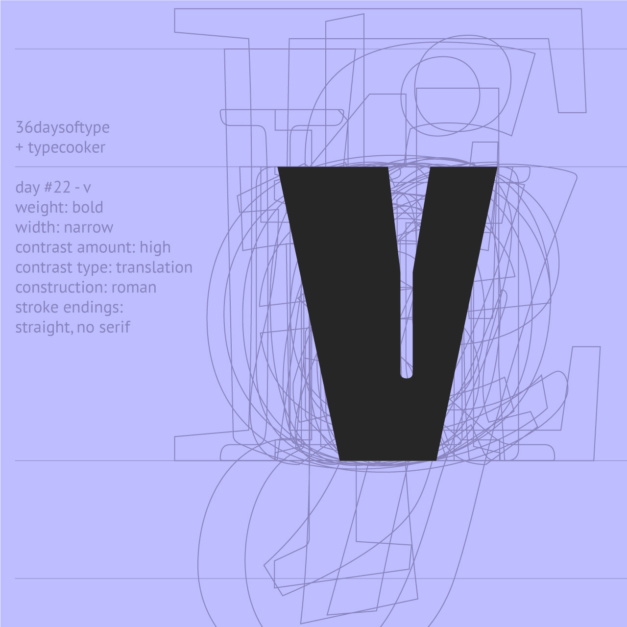
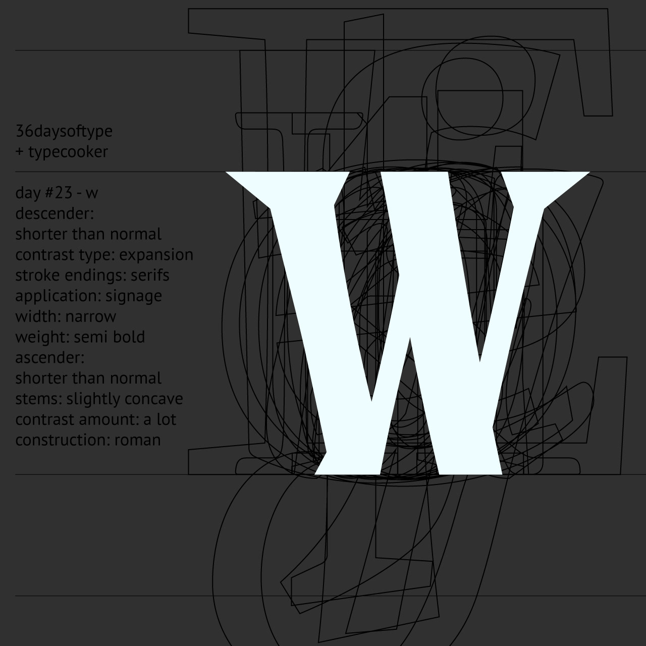
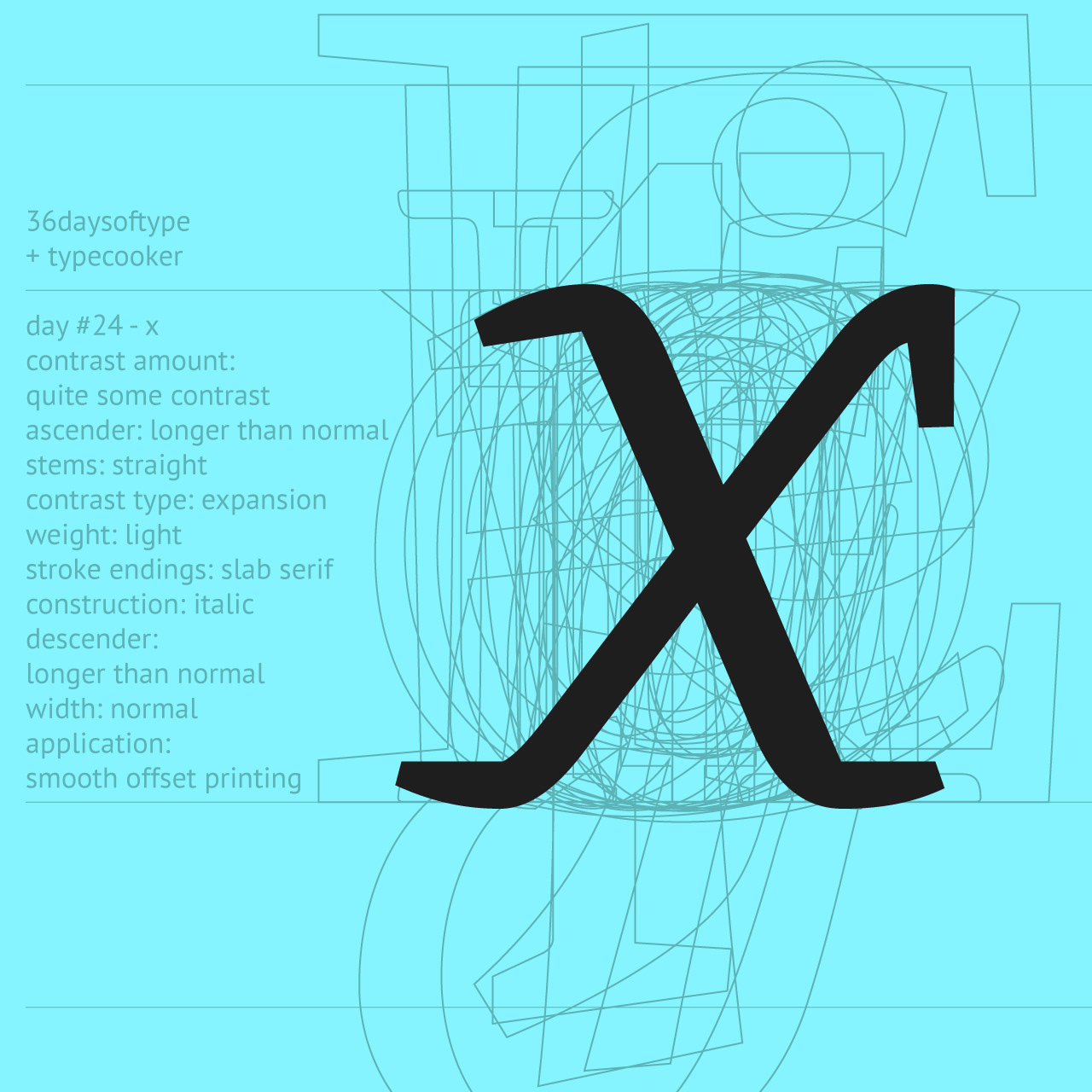
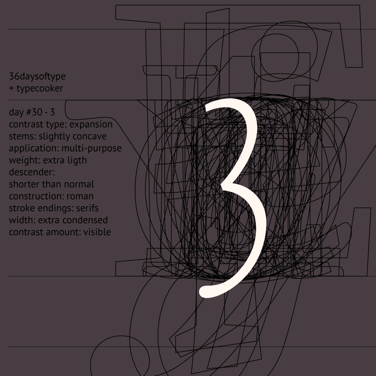
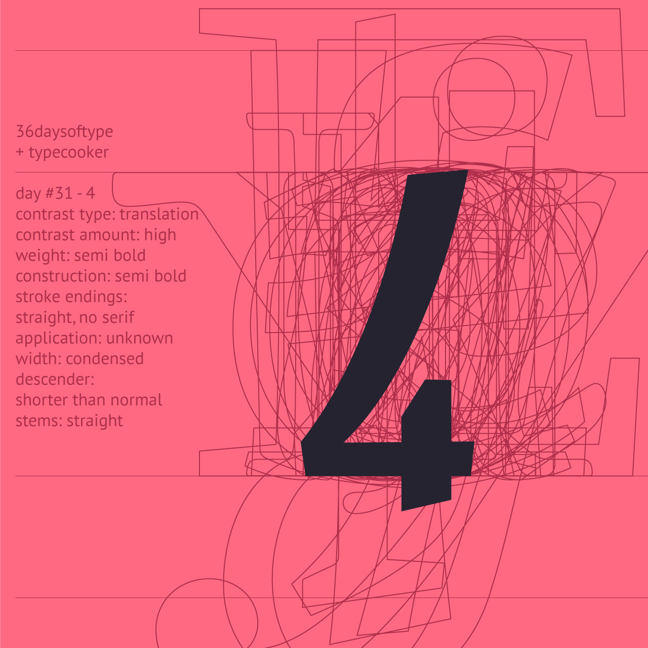
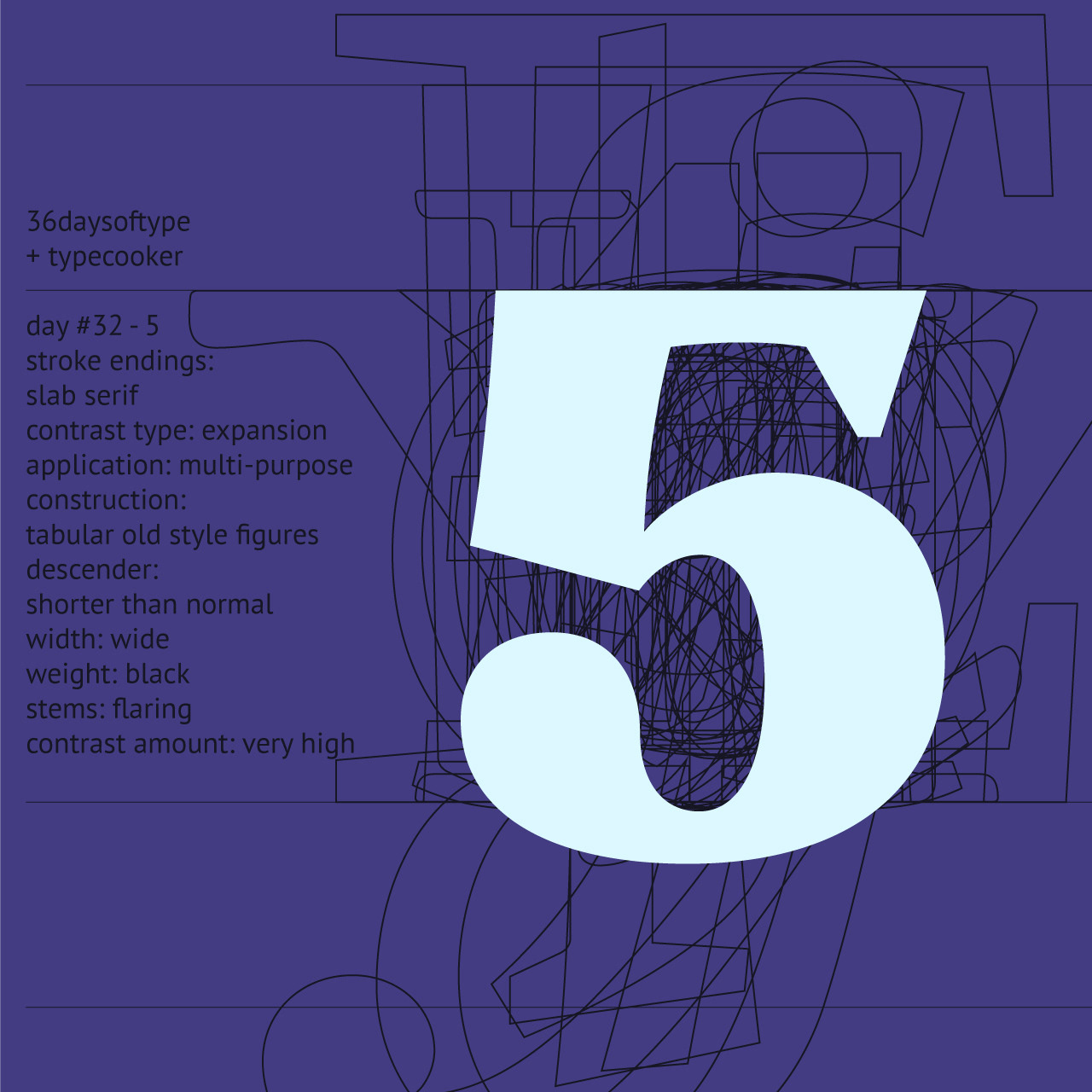
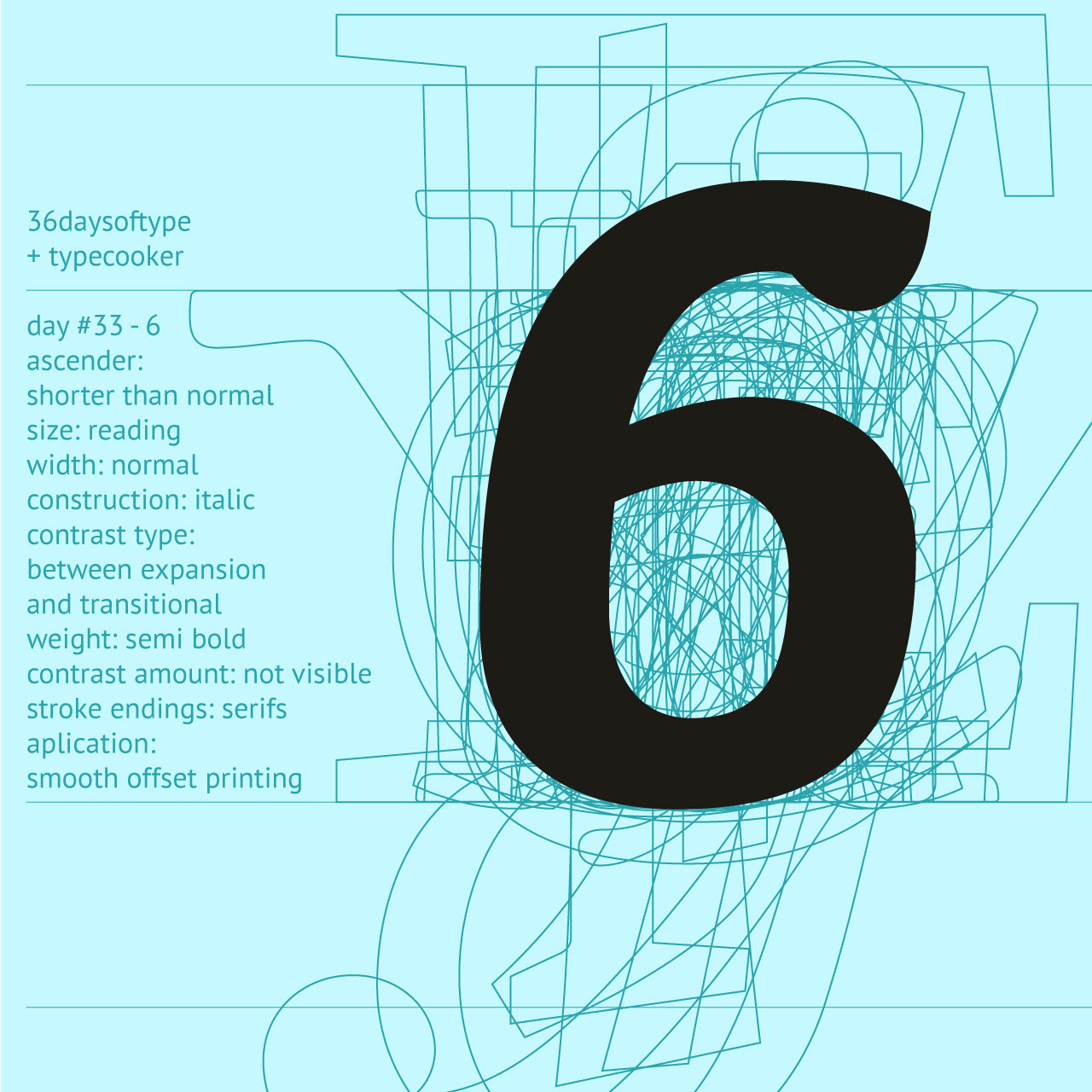
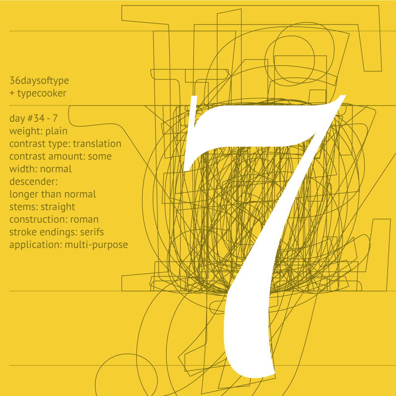
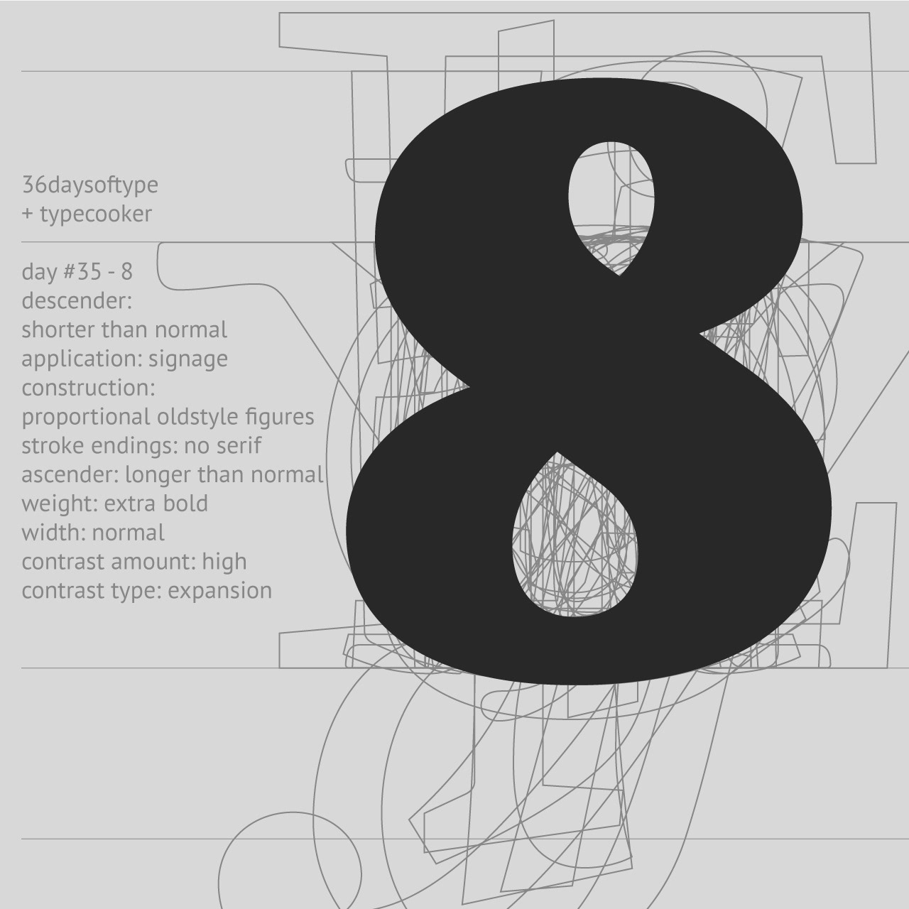
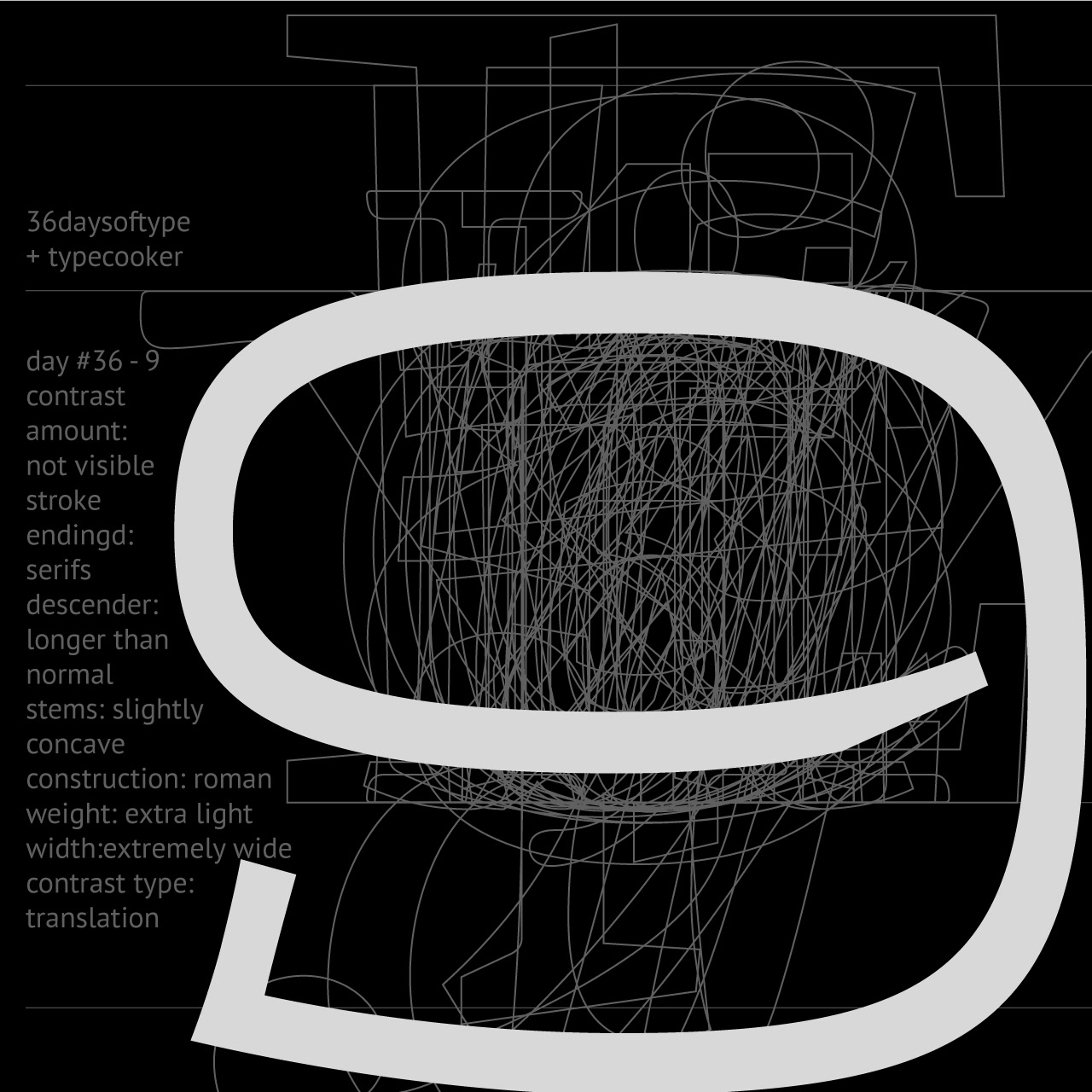
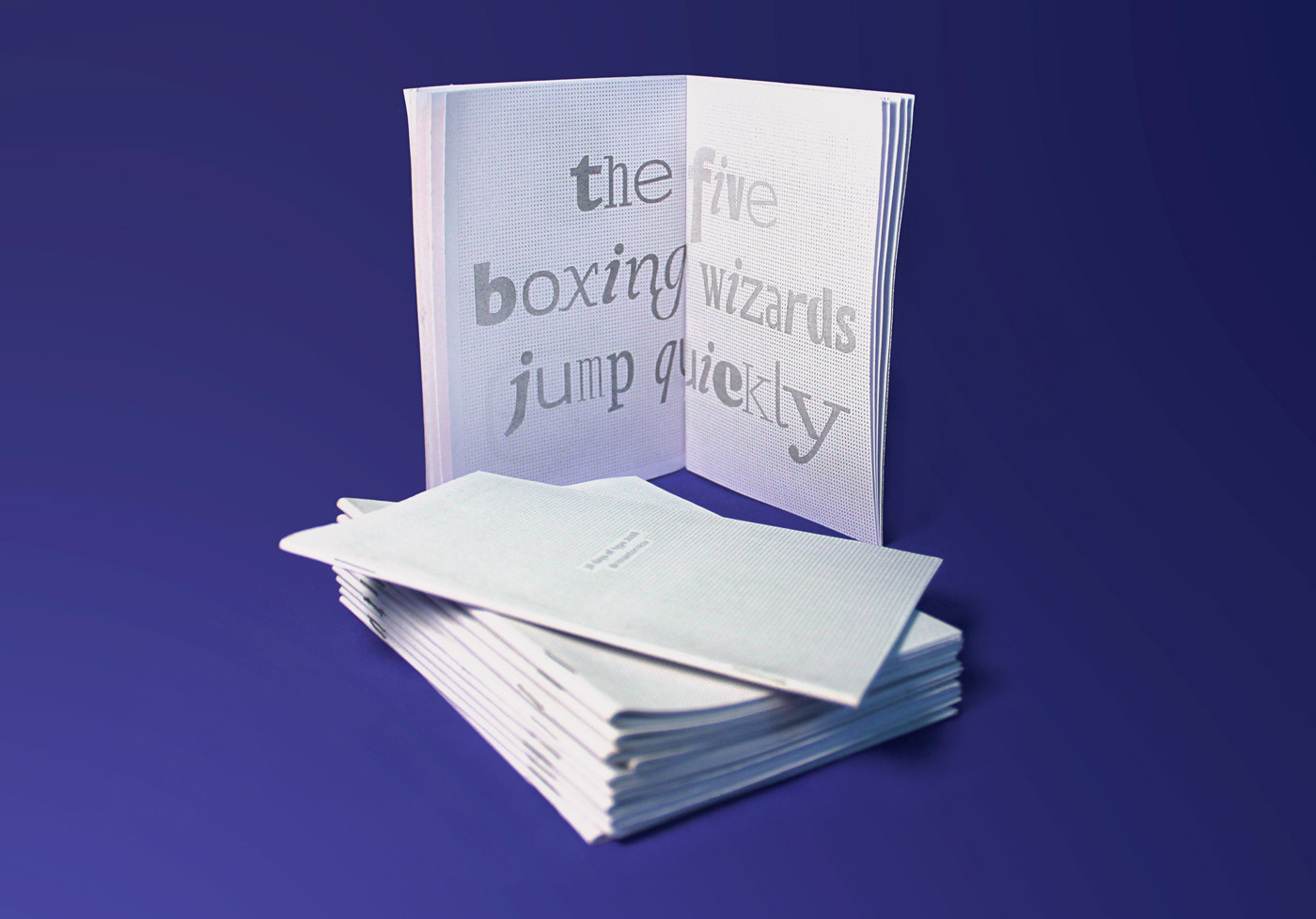
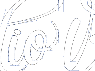
For the 2018's edition of 36 days of type, I used typecooker.com to generate briefings hence making the experience deeper on design matters, also in some of the days it was unfolded to a few more letters.
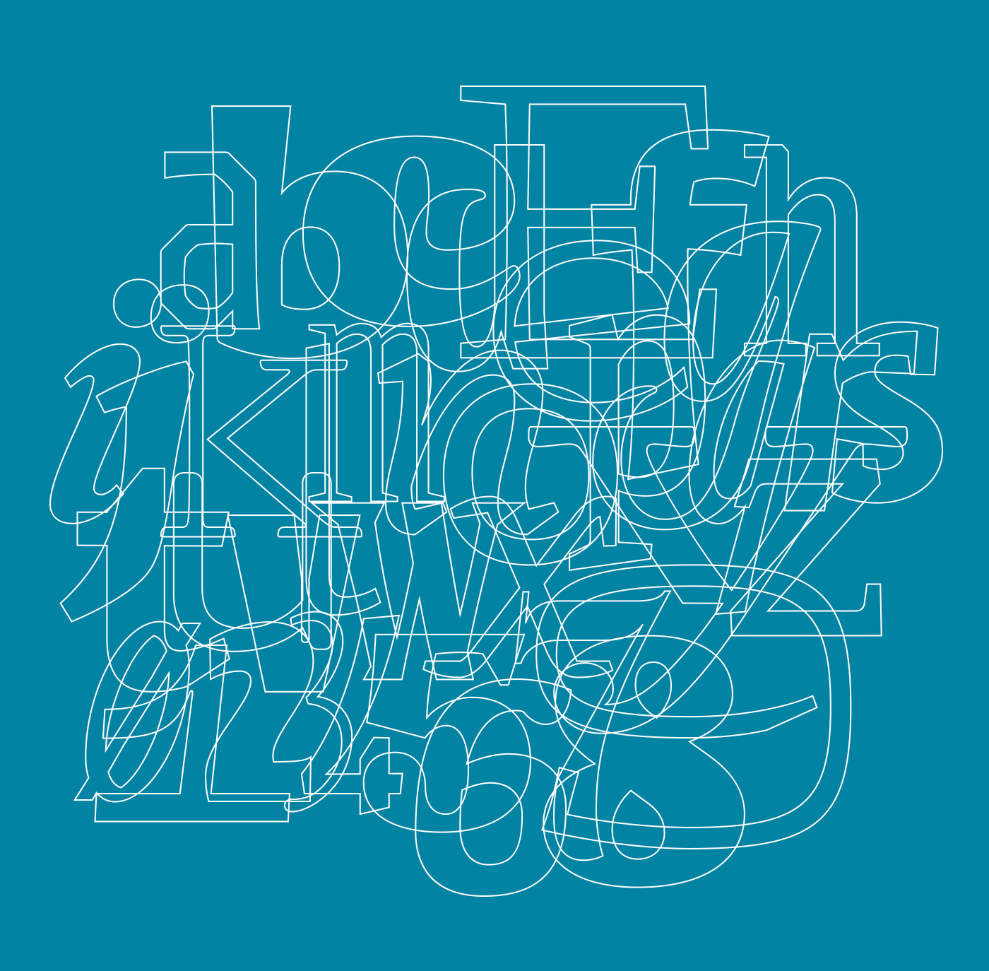
As in the end there was a few more to the project than the 36 characters, I made a little booklet to register the whole process.


You may also like

36 DAYS OF TYPE - 2015
2016
In 2015 as a part of the project 36 Days of Type, I decided to design each letter of the alphabet, all the 10 numbers and the ampersand in a lot of manners, so I could try different technics, ranging from the pure diital, to the mix of analogic items to add a special look to letters. Some of them use external elements to the letter, and some are very foccused in constructing a nice shape.
ILLUSTRATION | BumpSide Brasil
2020
BumpSide Brasil is a group of Ford Trucks aficionados.  They gather in events to talk about this cars that many of them collect, restore or just love to be around. They have invited me to make two illustrations for their t-shirts, the following images show a bit of process and the results of digital illustrations portraying ford trucks and exclusive lettering as well as a representation of Mr. Clint Eastwood. For this job I used both vector and photoshop brushes. The final results are two artworks for t-shirts.
LOGOTYPE | Tiago Sarmento
2018
This is a custom lettering logotype, it was made for a musician from Brazil. The style of the letters war conceived to convey the artist'sboho folk style.
BRAND ID | Inpulse
2018
INPULSE is a Pilates and physiotherapy studio, it uses an ecletic aproach, presenting other services as aesthetic treatment, auricle acupuncture, kinesiology tape and Global Posture Re-education. The Brand Identity was imagined to follow the owner`s flexibility on work techniques and personal impact made possible by Dani`s natural talent for it, and a small studio environment.
ILLUSTRATION | Buena Vista Café
2020
POSTER | Chicundum
2020
Chicundum is a poster/magazine, made by the clothing online store Chico Rei. The content is varied, always created by different writers with fresh perspectives about life and the possibilities of this amazing world we live in. For this edition, that focused a lot on personal journeys, projects and traveling, I was invited to created a poster and the illustrations that go with the content. The quote in the poster says “A journey of a thousand miles begins with a single step”, and the small letters are variations of it, as “A successful career starts with a single dream”.
Handlettered logotype-Studio Bardot
2013
2015 redesigned handlettered logotype for a local beauty salon inspired by the french former actress, Brigitte Bardot.
CALLIGRAPHY & LETTERING | Collection
2023
CALLIGRAPHY & LETTERING | O quase último Aum
2022
Chico Rei Coasters
2017
This is a series of coasters illustrations using the company`s logo in different fun contexts. The coasters are traditionally used as information tags that go with the t-shirts.