BumpSide Brasil é um grupo de aficionados por caminhonetes Ford.
Eles se reúnem em eventos para conversar sobre esses carros que muitos deles colecionam, restauram ou simplesmente amam.
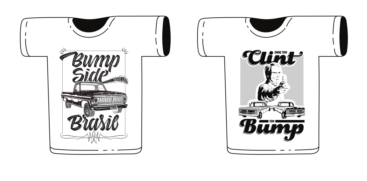
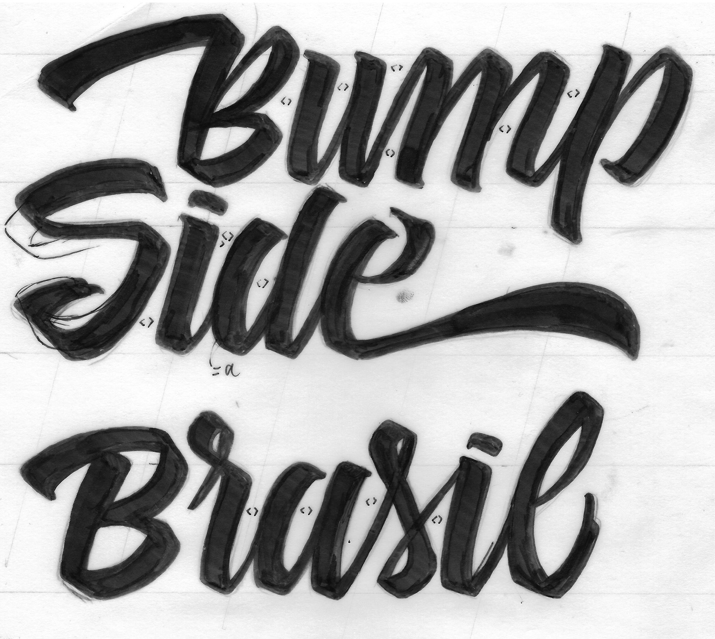
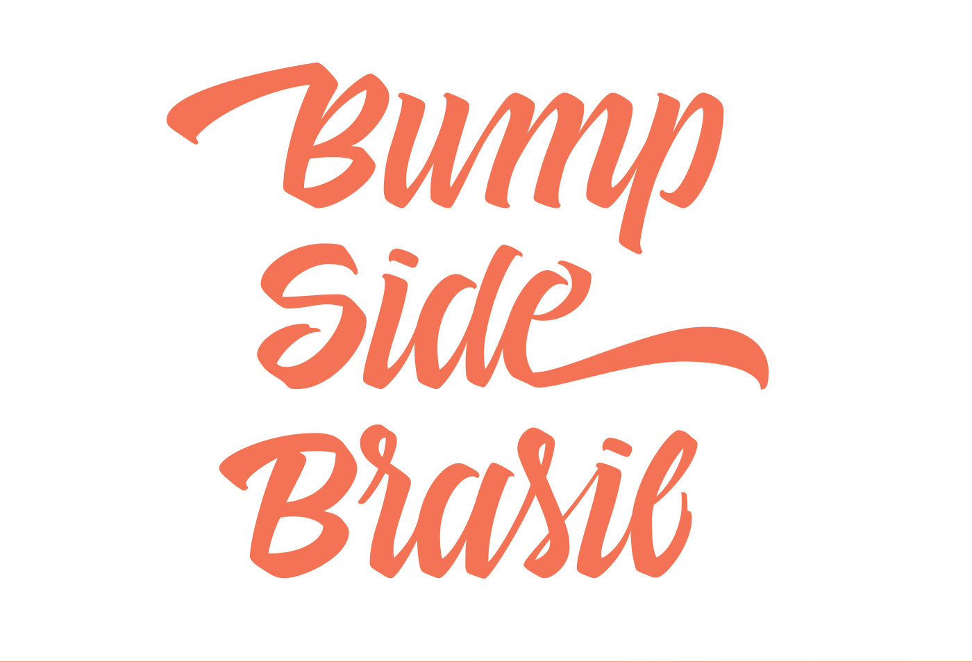
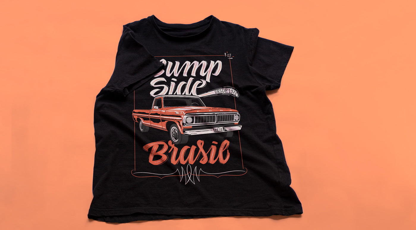
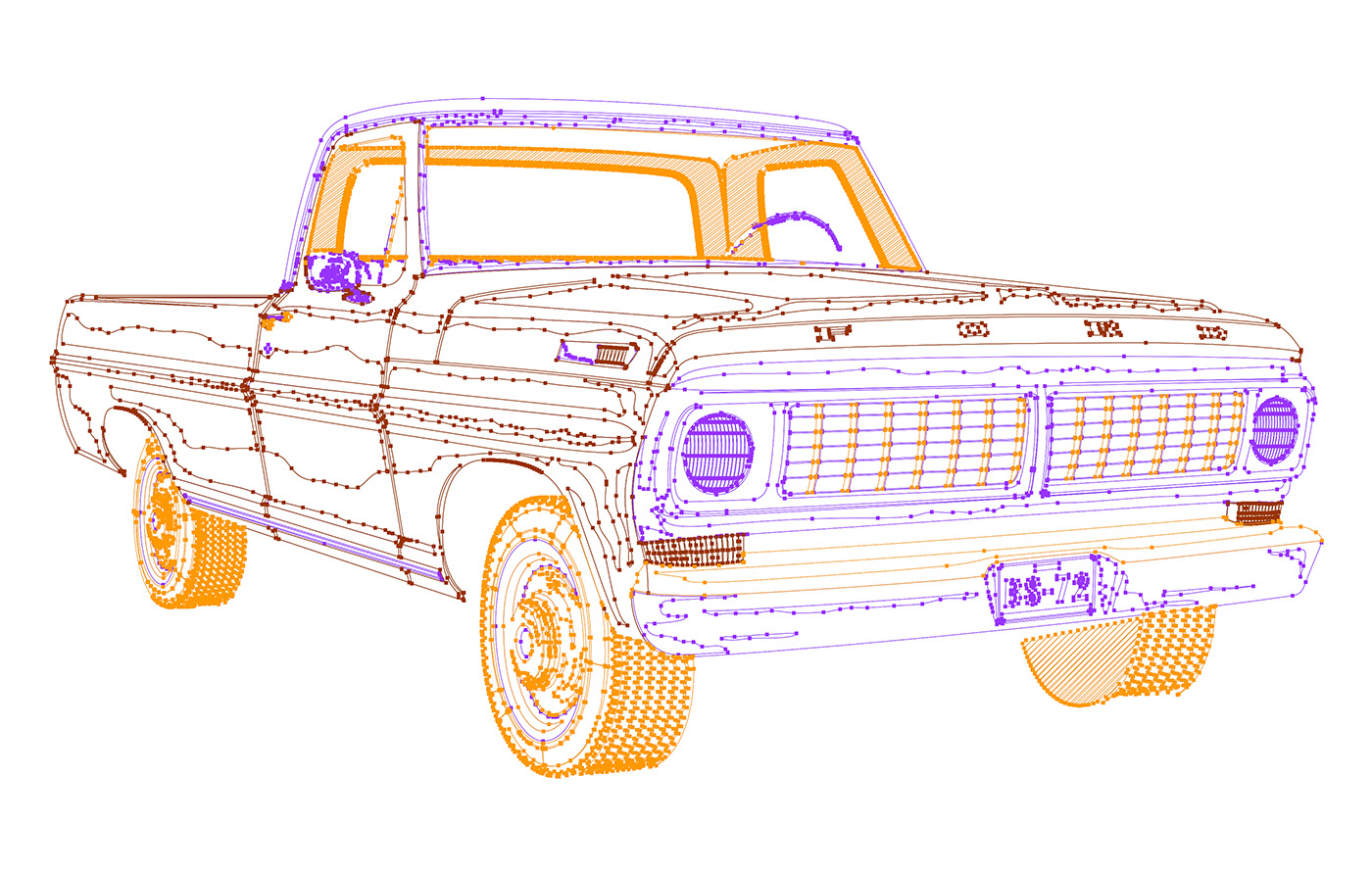
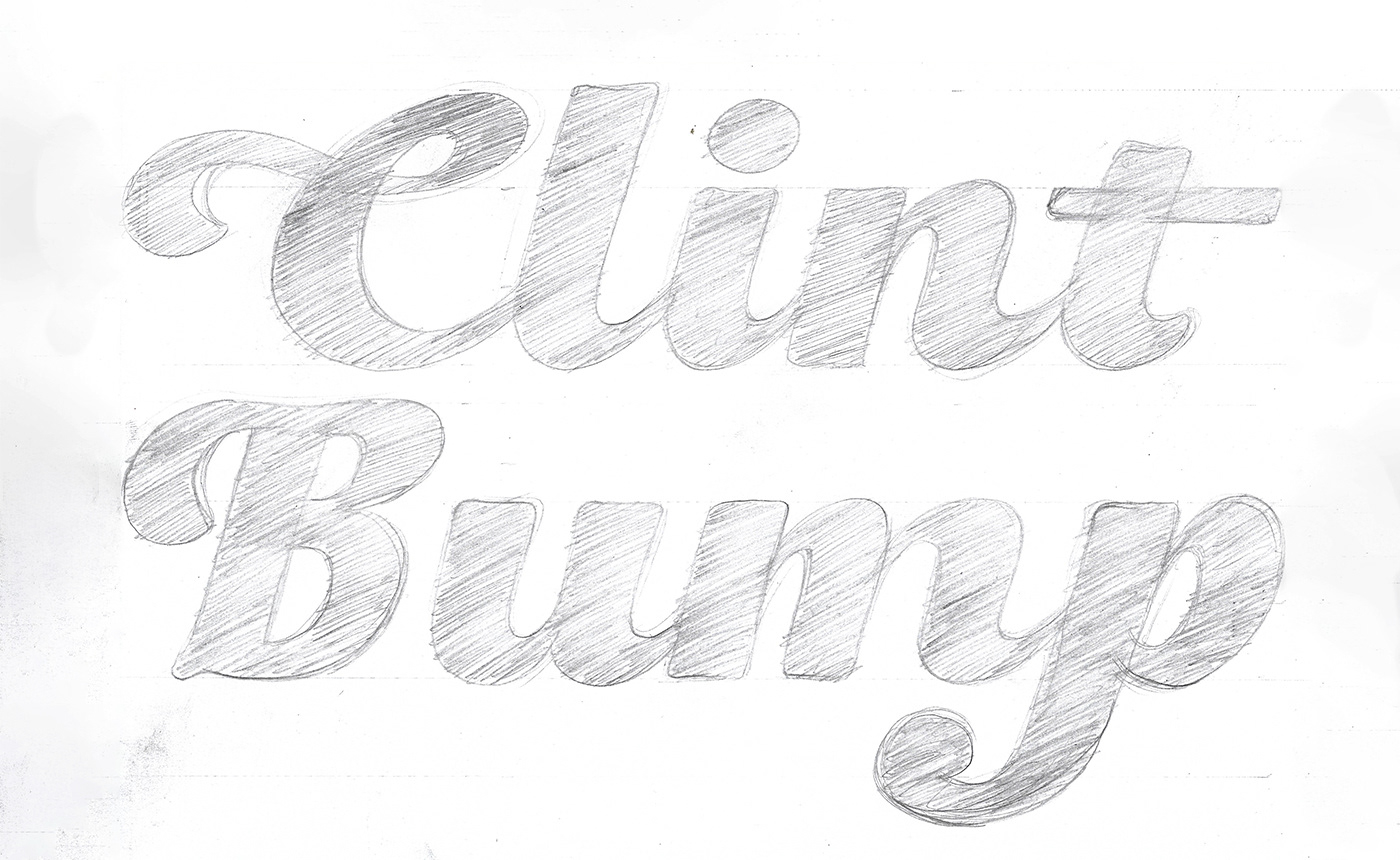
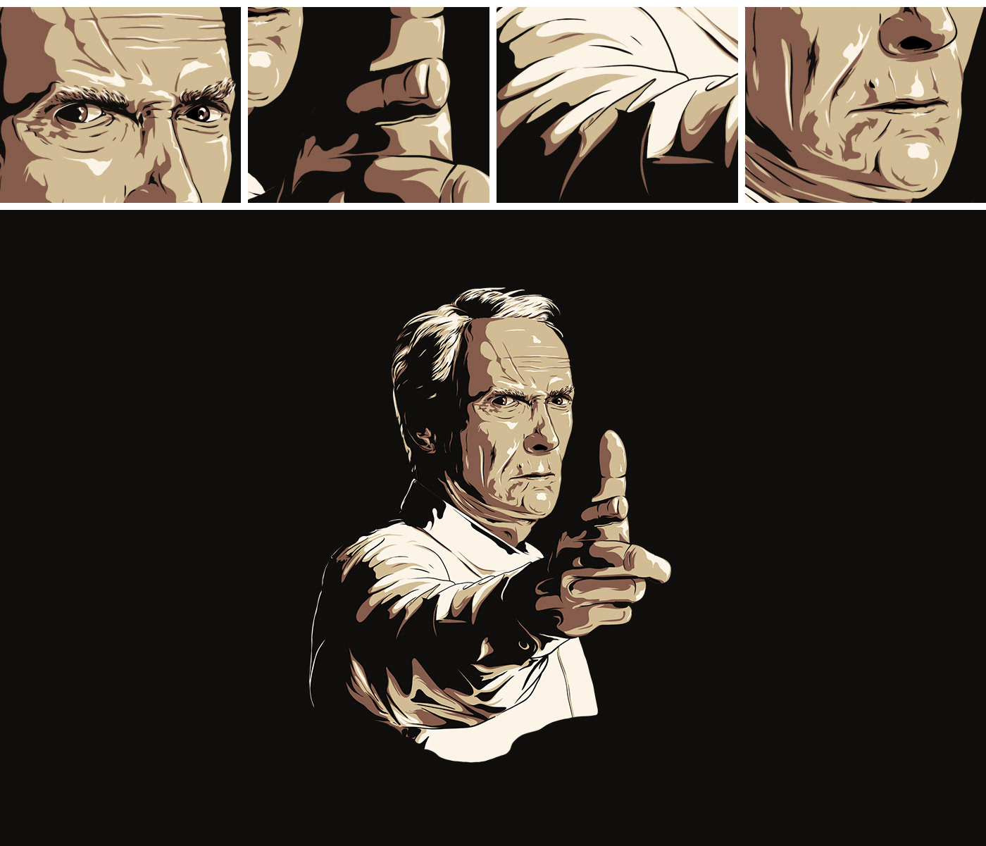
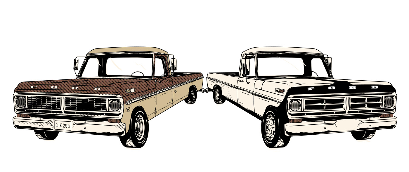
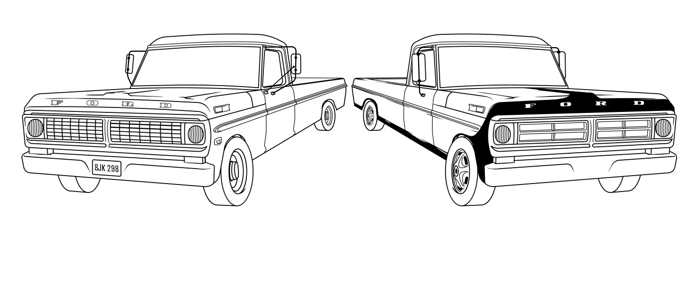
Eles me convidaram para fazer duas ilustrações para suas camisetas, as imagens a seguir mostram um pouco de processo e os resultados de ilustrações digitais retratando caminhões Ford e lettering exclusivo, além de uma representação de Clint Eastwood. Para esse trabalho, usei vetores e brushes do photoshop. Os resultados finais são duas estampas para camisetas.

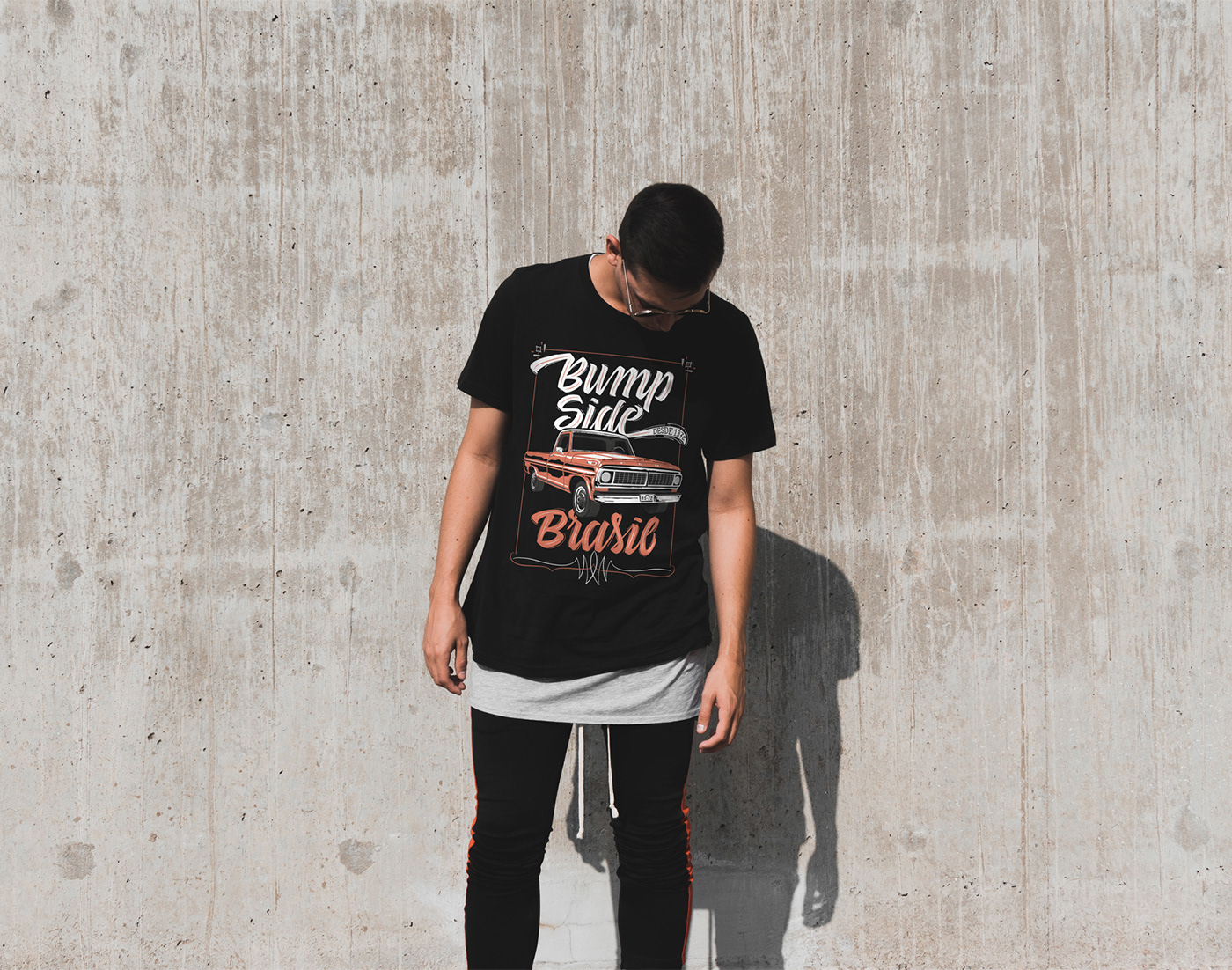
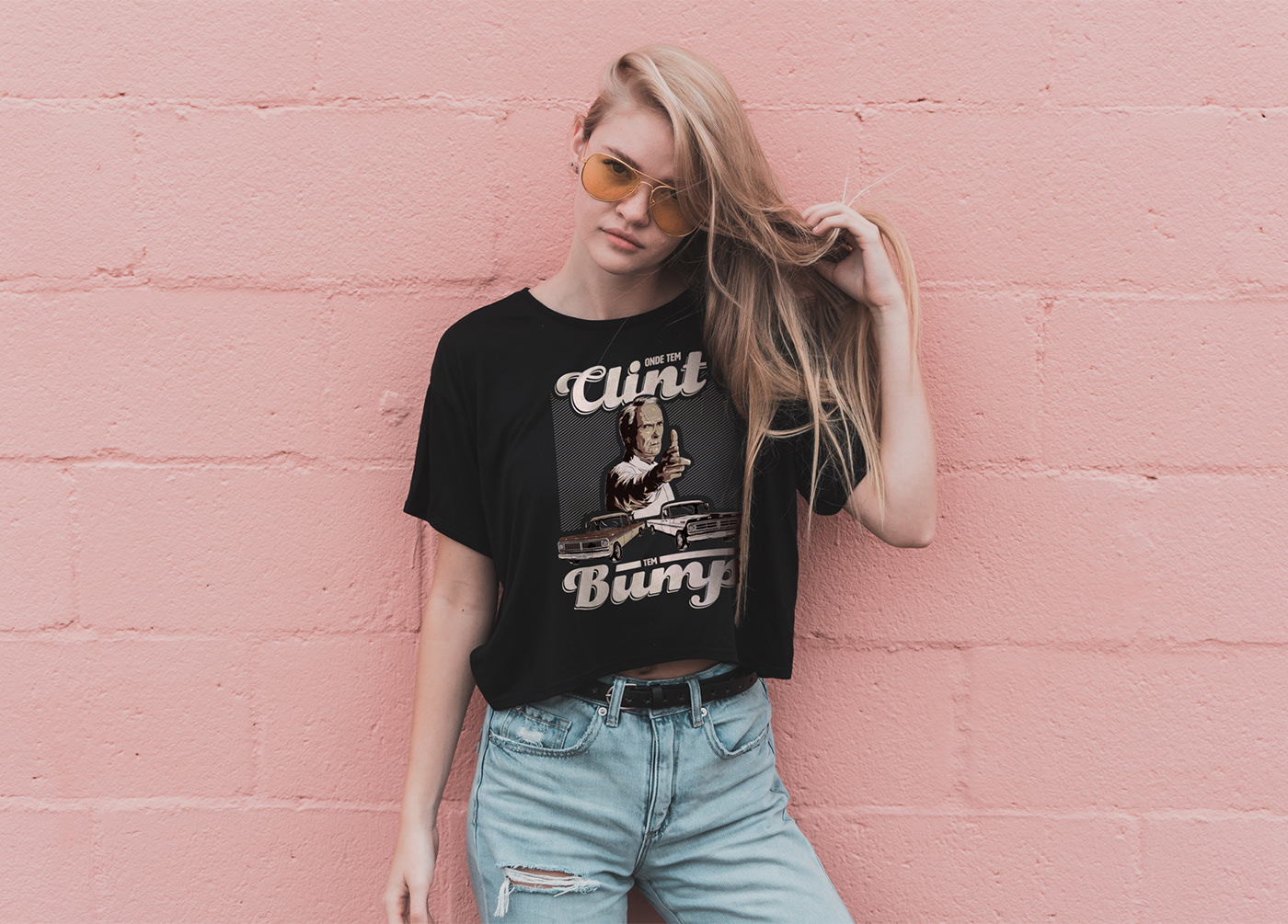
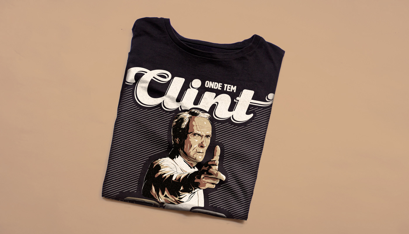
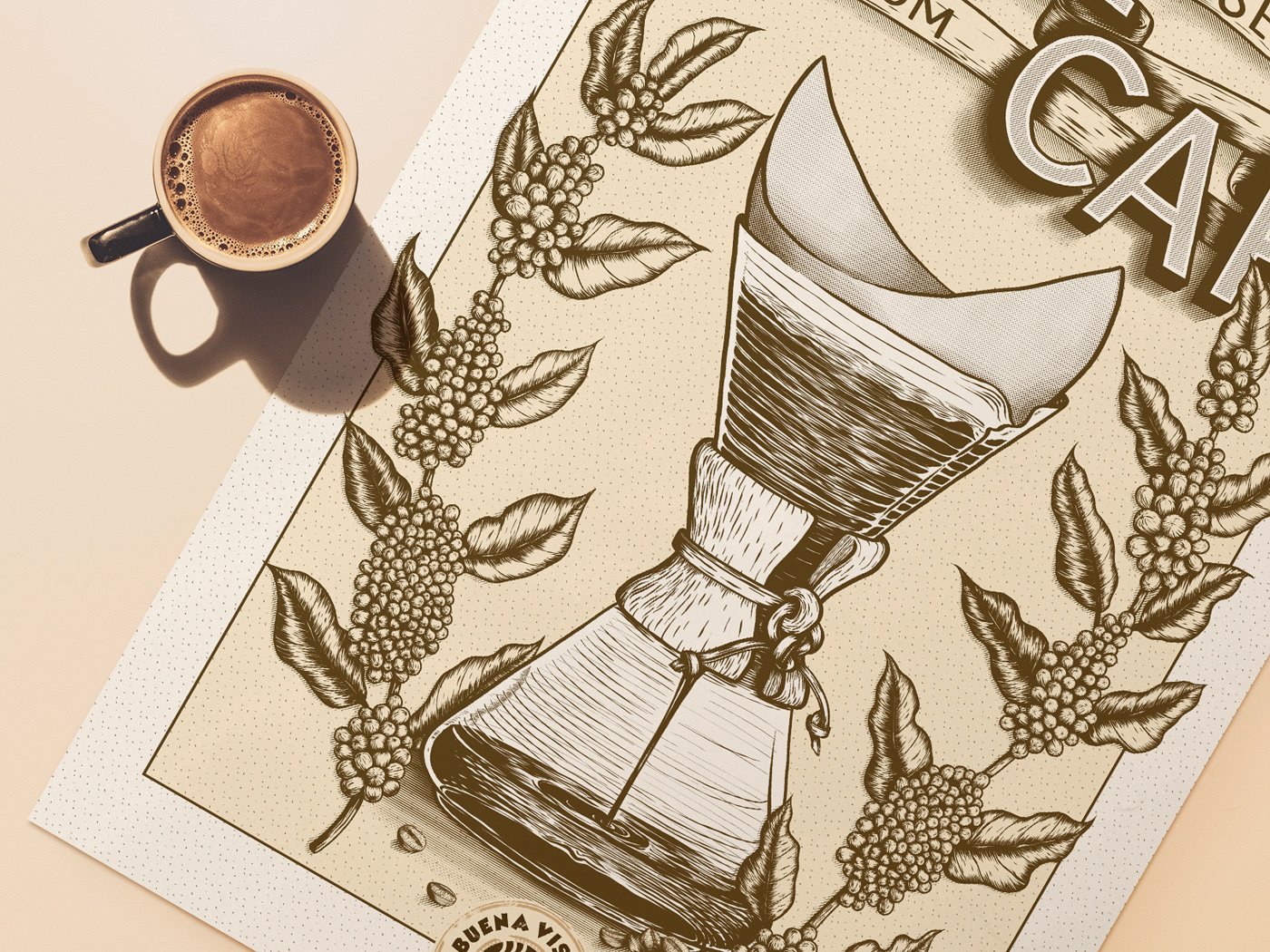
Photos with models used for mockups by photographer Ian Dooley.

You may also like

ILLUSTRATION | Buena Vista Café
2020
BRAND ID | Basic clothing Chico Rei
2019
Chico Rei is a brazilian t-shirt company specialized in creative artwork segment. This project had as an objective to make their basic products an inside brand, for that, as a part of their in-house communication team at the time we created the texts, and concept based on bauhaus/clean design. Raw materials where photographed and used as visual elements, And then the graphics came in to play giving it some unity.
LOGOTYPE | Casa da Gelada
2020
Casa da Gelada is a small neighborhood gocery store that specializes in alcooholic beverages delivery, its style comes mostly from what was given by the looks of the house itself. With the brick walls and rough wood doors, we thought it would be well represented by an old distilery look With that in mind I did some researching and sketching to create the custom type logo, and a few pieces we needed to get the business going. I also did the hand painted logos and number on the walls.
T-SHIRT PRINTS | Rn Torres
2018
T- shirt illustrations made for my stores at chicorei.com and also threadless. This first collection aimed mostly at type, and calligraphy references and use, including some pop culture elements.
CALLIGRAPHY SKETCHBOOK 01 | Renan Torres
2019
omecei a treinar caligrafia como um exercício de fundamentos para o desenho de lettering e design de tipos, agora tenho como objetivo achar uma expressão artística na própria prática. Este é o primeiro de uma série de sketchbooks de caligrafia que pretendo fazer para buscar novas formas de criar letras à mão.
Chico Rei Coasters
2017
This is a series of coasters illustrations using the company`s logo in different fun contexts. The coasters are traditionally used as information tags that go with the t-shirts.
BRAND ID | Alinhavado no Papel
2023
36 DAYS OF TYPE - 2018
2019
36 days of type 2018. For this edition I focused on training more of a general type design process.
POSTER | Chicundum
2020
Chicundum is a poster/magazine, made by the clothing online store Chico Rei. The content is varied, always created by different writers with fresh perspectives about life and the possibilities of this amazing world we live in. For this edition, that focused a lot on personal journeys, projects and traveling, I was invited to created a poster and the illustrations that go with the content. The quote in the poster says “A journey of a thousand miles begins with a single step”, and the small letters are variations of it, as “A successful career starts with a single dream”.
LOGOTYPE | Tiago Sarmento
2018
This is a custom lettering logotype, it was made for a musician from Brazil. The style of the letters war conceived to convey the artist'sboho folk style.