Handlettered logotype-Studio Bardot
2015 redesigned handlettered logotype for a local beauty salon inspired by the french former actress, Brigitte Bardot.
You may also like
POSTER | Chicundum
2020
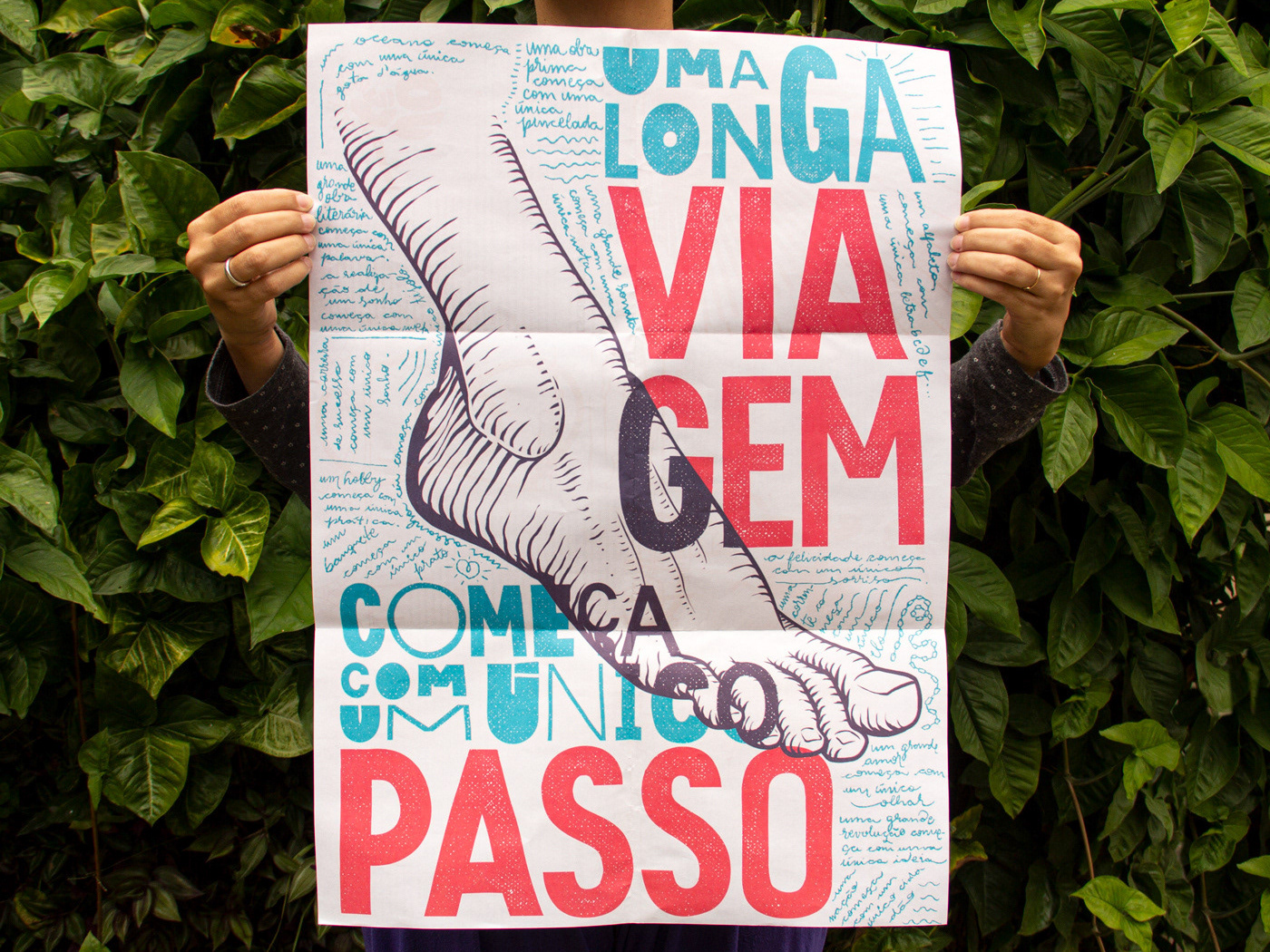
Chicundum is a poster/magazine, made by the clothing online store Chico Rei. The content is varied, always created by different writers with fresh perspectives about life and the possibilities of this amazing world we live in. For this edition, that focused a lot on personal journeys, projects and traveling, I was invited to created a poster and the illustrations that go with the content.
The quote in the poster says “A journey of a thousand miles begins with a single step”, and the small letters are variations of it, as “A successful career starts with a single dream”.
36 DAYS OF TYPE - 2018
2019
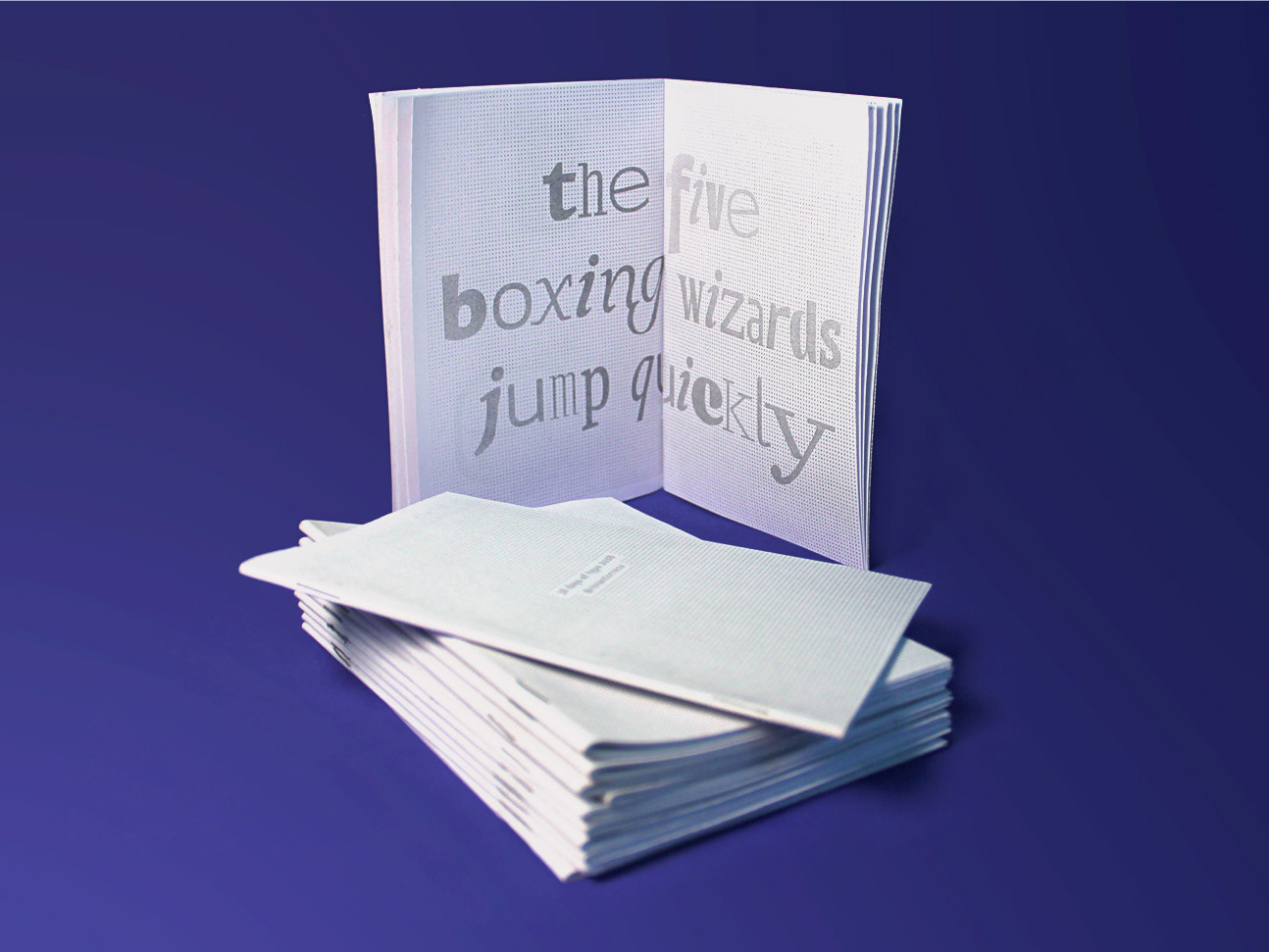
36 days of type 2018. For this edition I focused on training more of a general type design process.
ILLUSTRATION | Buena Vista Café
2020
T-SHIRT PRINTS | Rn Torres
2018
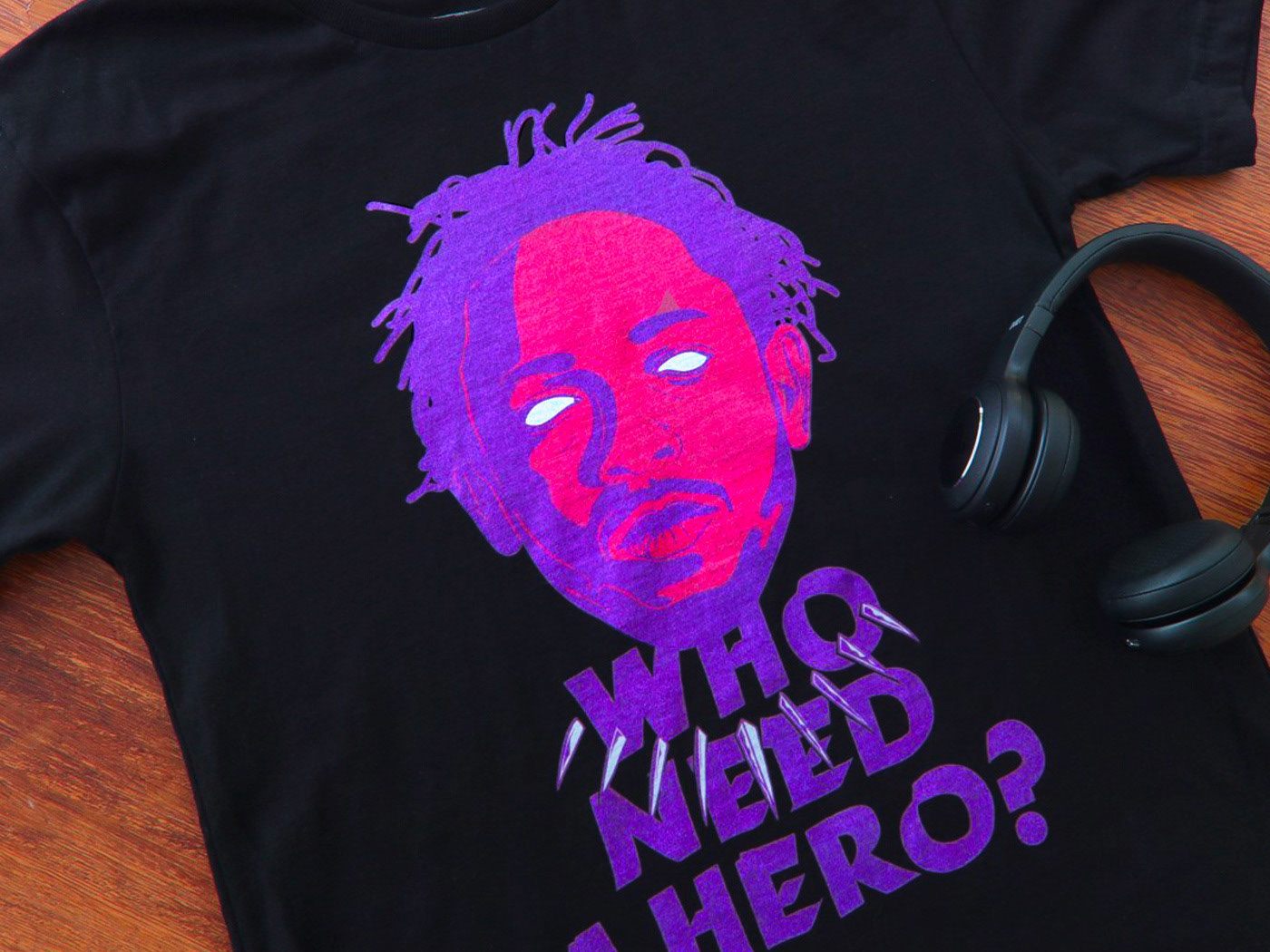
T- shirt illustrations made for my stores at chicorei.com and also threadless. This first collection aimed mostly at type, and calligraphy references and use, including some pop culture elements.
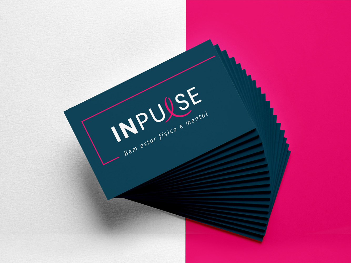
BRAND ID | Inpulse
2018
INPULSE is a Pilates and physiotherapy studio, it uses an ecletic aproach, presenting other services as aesthetic treatment, auricle acupuncture, kinesiology tape and Global Posture Re-education. The Brand Identity was imagined to follow the owner`s flexibility on work techniques and personal impact made possible by Dani`s natural talent for it, and a small studio environment.
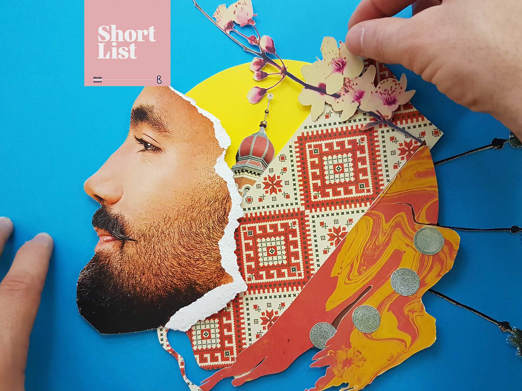
ALBUM COVER | Cartografias
2021
Cartografias é o segundo álbum completo do instrumentista e músico Caetano Brasil. A inspiração para as composições vem cada uma de um lugar diferente no mundo e, a cada faixa, características dessas culturas se misturam com a essência do Choro brasileiro, e as referências do artista.
Fui convidado para criar a capa e algumas peças de divulgação online para este lançamento.
A solução visual tenta espelhar o que foi feito musicalmente no álbum, busca referências das culturas que inspiraram cada música do álbum, como cerejeiras japonesas, moedas ciganas e coqueiros nas praias caribenhas. Tudo isso se mistura com o rosto do artista em uma colagem manual. Alguns elementos isolados foram usados para peças de redes sociais.
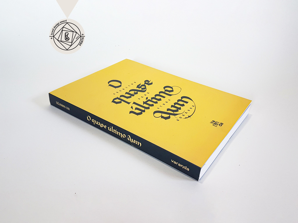
CALLIGRAPHY & LETTERING | O quase último Aum
2022

BRAND ID | Alinhavado no Papel
2023
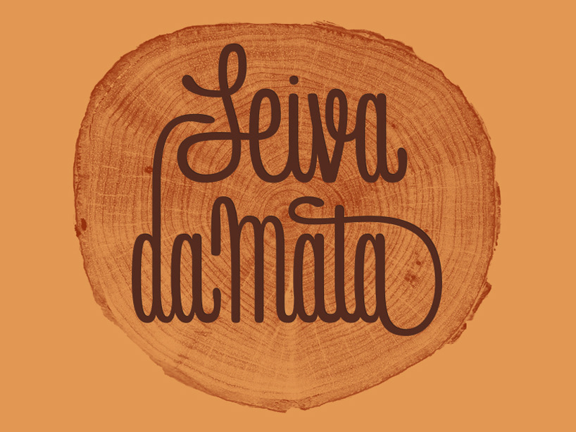
LABEL | LOGOTYPE - Seiva da Mata
2017
This job required the creation of all 4 illustrations for the different kinds of beer. They had selected a free font to use as their logo. I offered this solution of a custom lettering and it was well appreciated by the client.
Seiva da Mata is an artisanal brewery based in Minas Gerais, Brazil, that seeks to give its beers the freshness of life close to nature, which is common to the country side of the state. In order to communicate this, images have been chosen that refer to the worker of the field and his quiet in moments of the day when contemplation is like a reward for his work.
ALBUM COVER | Tiago Sarmento
2019
BOHO, a vocabulary abbreviation much in vogue lately,comes from the lifestyle of the gypsy culture, which French romantic artists very much admired, inspired and thus named their lifestyle of Bohemianism: nomadic, wandering, simple, passionate about life and unconventional. Extrapolating these words and finding their synonyms, we come to the vagabond, eccentric, exotic correlates; at last, free.
This is all present in Tiago Sarmento's 20 years career as a musician, as a celebration, nothing better than his 5th studio album being named BOHO.
Based on this information I was invited to create the album cover, with a research into the visual universe that involves the artist's creation we came up with an ornate lettering inspired by boho prints full of arabesques and floral patterns as the main element.
