Estúdio Curió is a home studio and online content platform that makes music videos and recordings with light, cheerful and spiritual aesthetics to help musicians and music lovers who want to listen to music with positive vibes, and connect with the community of musicians in their city.
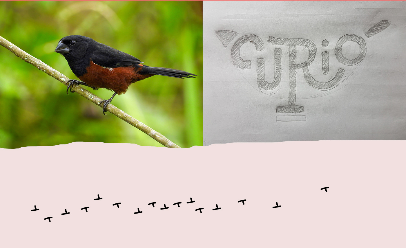
The project started with the brand platform, defining guidelines for the company such as archetypes, motivations, value proposition and "big idea", which gave us the slogan "Singing life" (Cantar a vida). Based on these parameters, we started to work on naming, with a long list in hand, we defined that bird names are a perfect fit for our concept of lightness and freedom through the association with flight, the simple beauty of nature, and of course, singing.
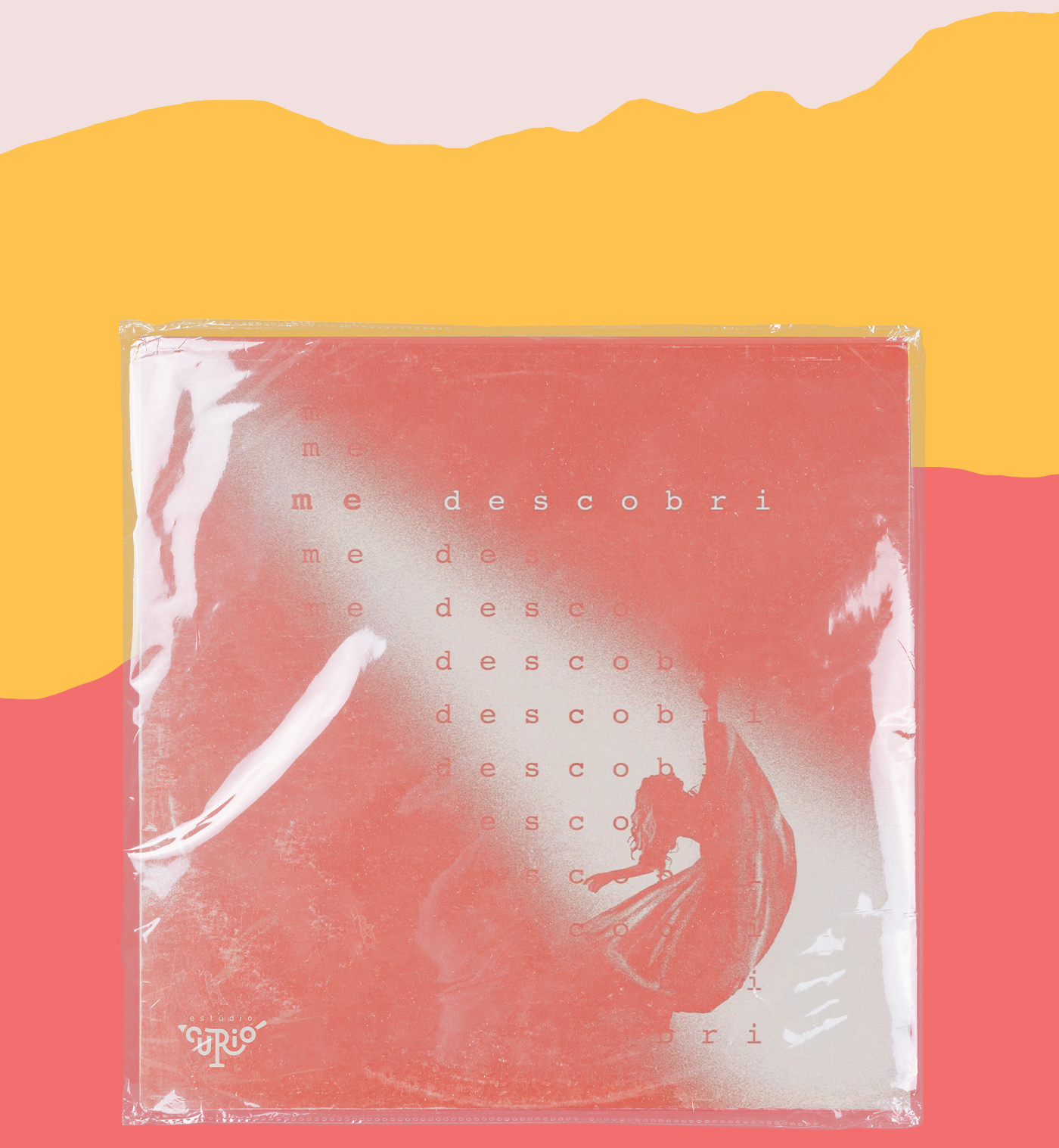
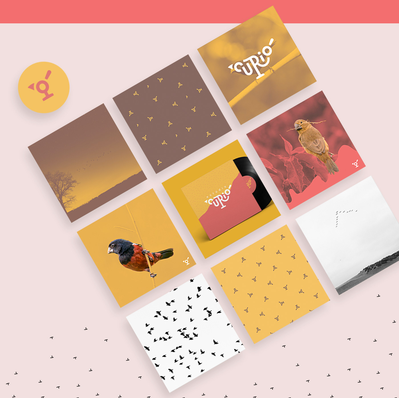
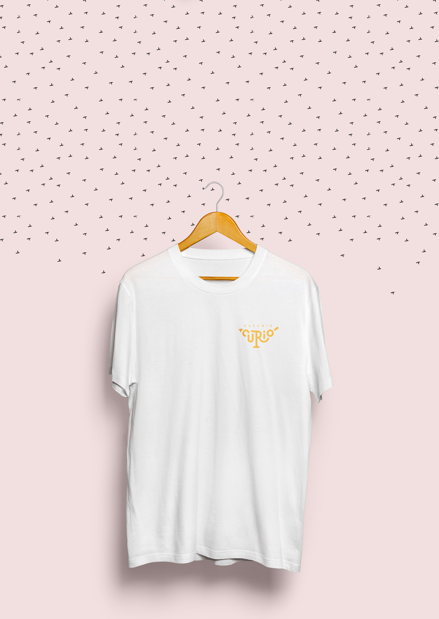
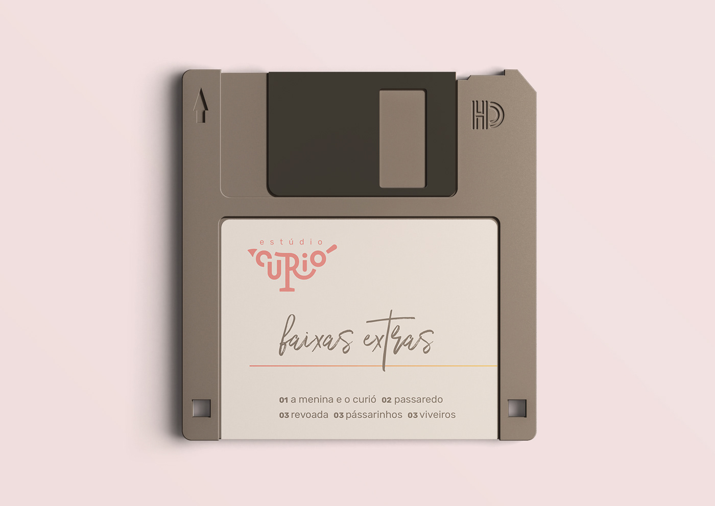
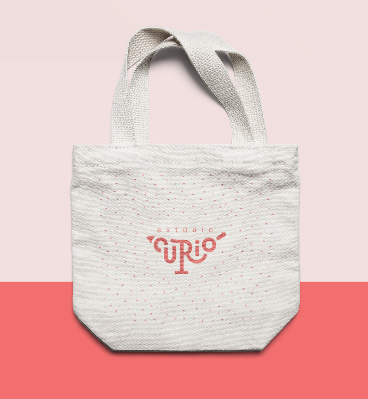
The visual identity started with a lettering shaped like the bird that gives the brand its name, the Bullfinch (curió). That gave the company's graphic representation the homely look we were looking for, to side with it we came up with a palette in warm tones that refer to sunsets or sunrises, balanced with earthy tones. The graphics and patterns we designed seek to visually represent the idea of horizon, mountains, the sky and birds flying.


You may also like

BOOK CONCEPT - The Metamorphosis
2015
Proposta de criação de um projeto completo de livro. O principal desafio foi a representação gráfica desta história sem recorrer às formas de barata. Proposal of a complete book project. The main challenge was to graphically represent this sttory without references to the cockroach forms.
LOGOTYPE | Tiago Sarmento
2018
This is a custom lettering logotype, it was made for a musician from Brazil. The style of the letters war conceived to convey the artist'sboho folk style.
36 DAYS OF TYPE - 2018
2019
36 days of type 2018. For this edition I focused on training more of a general type design process.
BRAND ID | Inpulse
2018
INPULSE is a Pilates and physiotherapy studio, it uses an ecletic aproach, presenting other services as aesthetic treatment, auricle acupuncture, kinesiology tape and Global Posture Re-education. The Brand Identity was imagined to follow the owner`s flexibility on work techniques and personal impact made possible by Dani`s natural talent for it, and a small studio environment.
NAMING & BRANDING - From Flow
2015
A FROM, para alguns, e FLOW, para outros, é uma empresa que tem o objetivo de resignificar o mercado de eventos no Brasil. Valorizamos a criação de sensações e as interações fluídas em todas as etapas do projeto, transformando pessoas a partir de novas e incríveis experiências. Trabalhamos com flexibilidade e complementaridade. Achamos sim que eventos tem que ser cool, diferentes e inusitados, mas acreditamos também em processos, métricas e resultados.
ILLUSTRATION | BumpSide Brasil
2020
BumpSide Brasil is a group of Ford Trucks aficionados.  They gather in events to talk about this cars that many of them collect, restore or just love to be around. They have invited me to make two illustrations for their t-shirts, the following images show a bit of process and the results of digital illustrations portraying ford trucks and exclusive lettering as well as a representation of Mr. Clint Eastwood. For this job I used both vector and photoshop brushes. The final results are two artworks for t-shirts.
CALLIGRAPHY & LETTERING | O quase último Aum
2022
36 DAYS OF TYPE - 2015
2016
In 2015 as a part of the project 36 Days of Type, I decided to design each letter of the alphabet, all the 10 numbers and the ampersand in a lot of manners, so I could try different technics, ranging from the pure diital, to the mix of analogic items to add a special look to letters. Some of them use external elements to the letter, and some are very foccused in constructing a nice shape.
BRAND ID | La Guapa
2018
Tamires contacted me to make a logotype and a basic development of a brand for her to sell her home made comfit. All very healthy and tasty. For this job I made an illustrated brand icon, many applications of the logo, a color palete, and determined a set of typefaces to give the right tone for her identity.
BRAND ID | Organizar & Fluir
2018
Logotype and visual identity developed for "Organizar & Fluir" a Belo Horizonte based company that works with organization for residences, companies, files and documents. They also do home staging and sell products. The process to create the visual universe of the brand relied on common looks of organized and fluid homes, where everythings is found in its place and plants give a harmonious atmosphere to the place.