In "ORGANIZAR & FLUIR", the space and the reality of the client is evaluated to present individual solutions. They organize residences, companies, files and documents. They also work with organization products and do home staging. Everything so that life can flow with lightness.
BRAND ID | Organizar & Fluir
Logotype and visual identity developed for "Organizar & Fluir" a Belo Horizonte based company that works with organization for residences, companies, files and documents. They also do home staging and sell products. The process to create the visual universe of the brand relied on common looks of organized and fluid homes, where everythings is found in its place and plants give a harmonious atmosphere to the place.
You may also like

BRAND ID | Alinhavado no Papel
2023
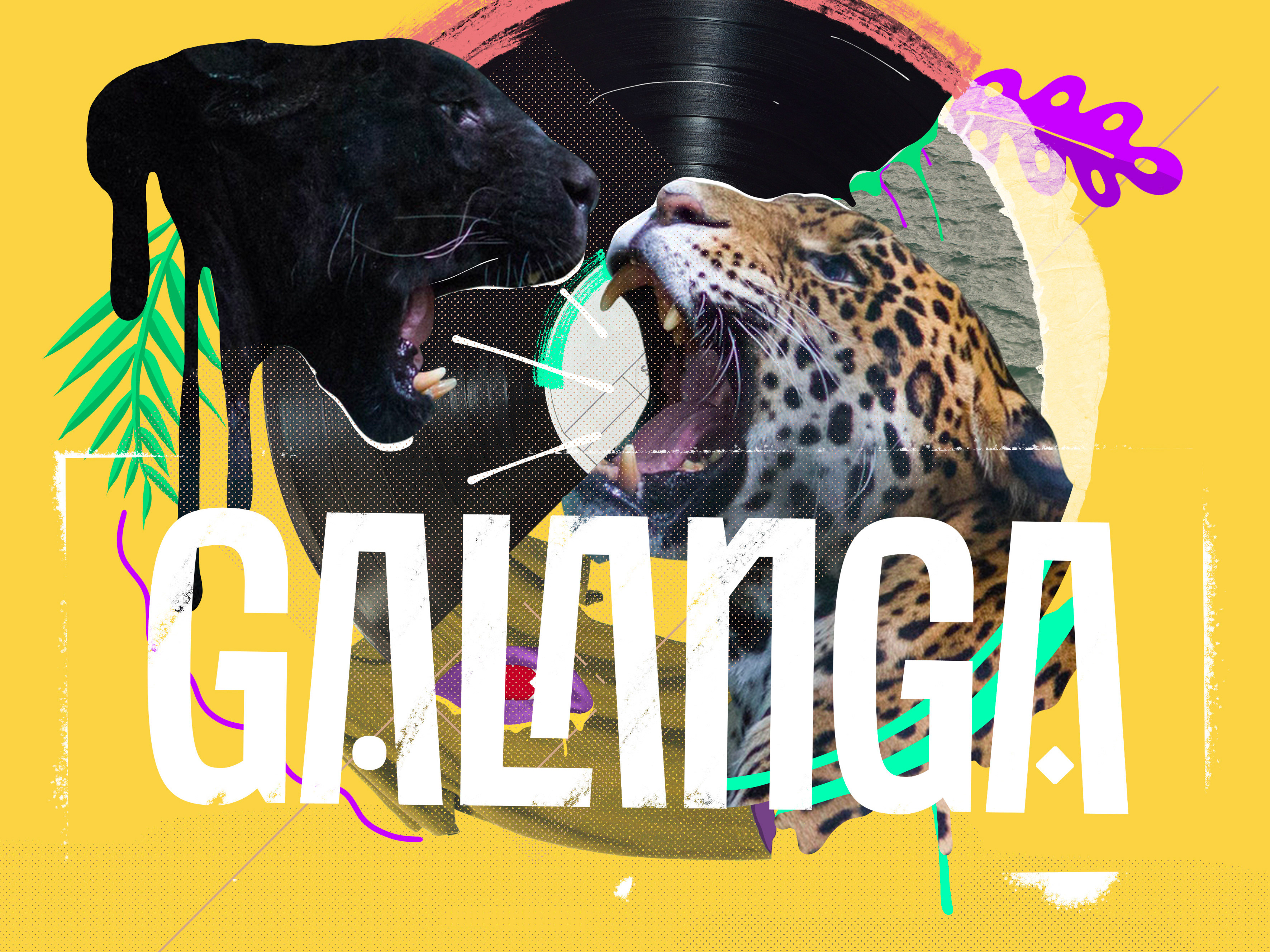
VISUAL IDENTITY | Galanga
2018
Logotype and visual identity developed for the 10th aniversary party of the brazilian creative company, Chico Rei (www.chicorei.com).
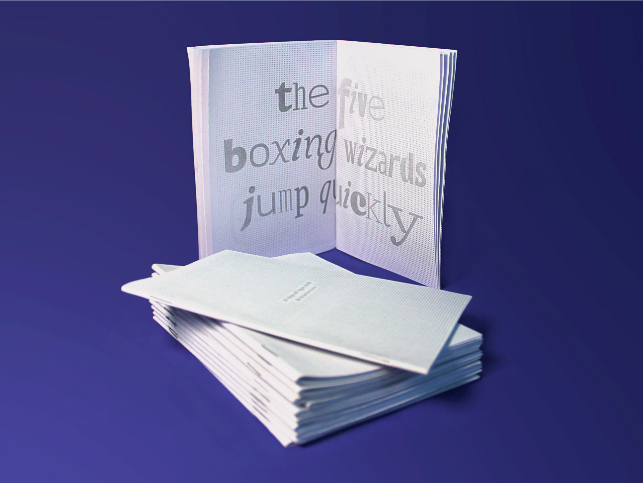
36 DAYS OF TYPE - 2018
2019
36 days of type 2018. For this edition I focused on training more of a general type design process.
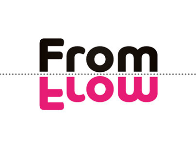
NAMING & BRANDING - From Flow
2015
A FROM, para alguns, e FLOW, para outros, é uma empresa que tem o objetivo de resignificar o mercado de eventos no Brasil. Valorizamos a criação de sensações e as interações fluídas em todas as etapas do projeto, transformando pessoas a partir de novas e incríveis experiências.
Trabalhamos com flexibilidade e complementaridade. Achamos sim que eventos tem que ser cool, diferentes e inusitados, mas acreditamos também em processos, métricas e resultados.
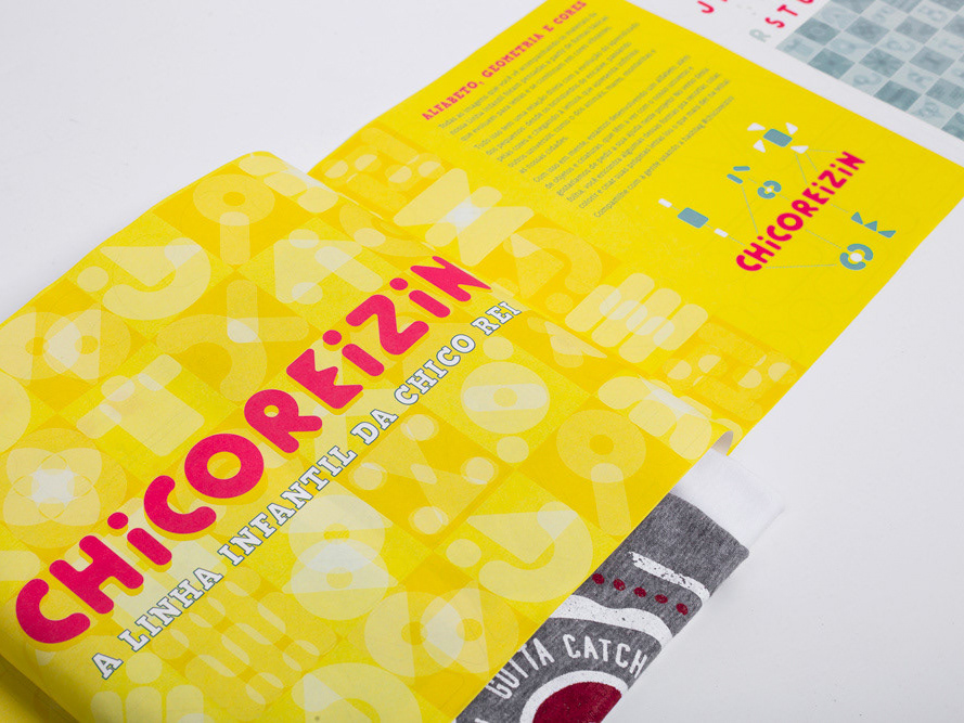
BRAND ID | Chicoreizin
2018
Logotype, a fontface derived from its forms and a brand visual identity system. Those were the deliverables in this project. It was made to represent a kid`s line for a t-shirts company (Chico Rei) as their work is all based on creativity and fun stories, the aim here was to take a little of this culture to the communication.
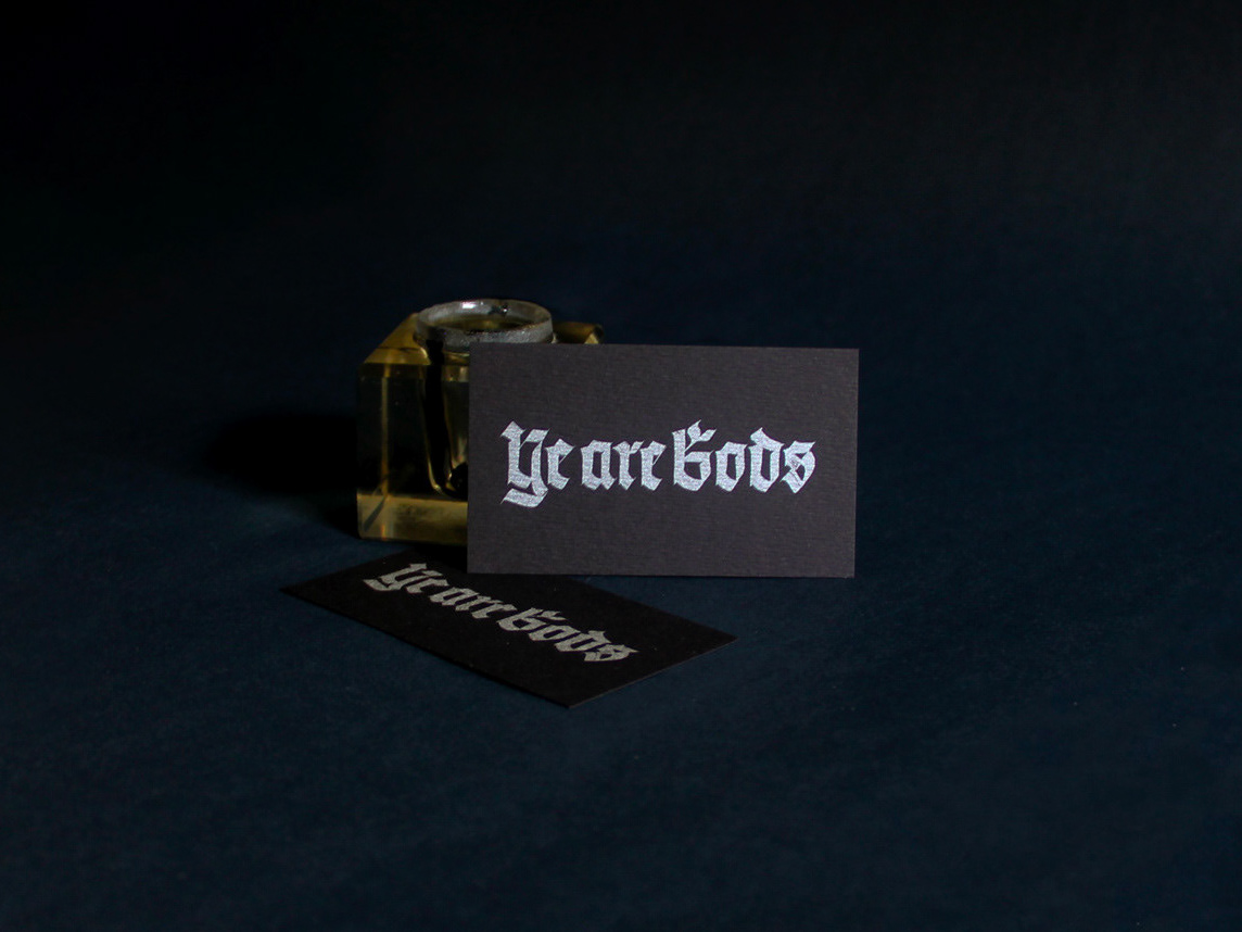
LETTERING | Ye are Gods
2018
vector and scan lettering for the project Ye are Gods. It is the name of Frederico Rabelo's second season of tattoo works.
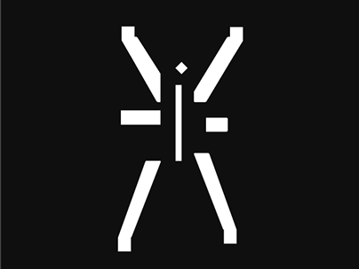
BOOK CONCEPT - The Metamorphosis
2015
Proposta de criação de um projeto completo de livro. O principal desafio foi a representação gráfica desta história sem recorrer às formas de barata.
Proposal of a complete book project. The main challenge was to graphically represent this sttory without references to the cockroach forms.
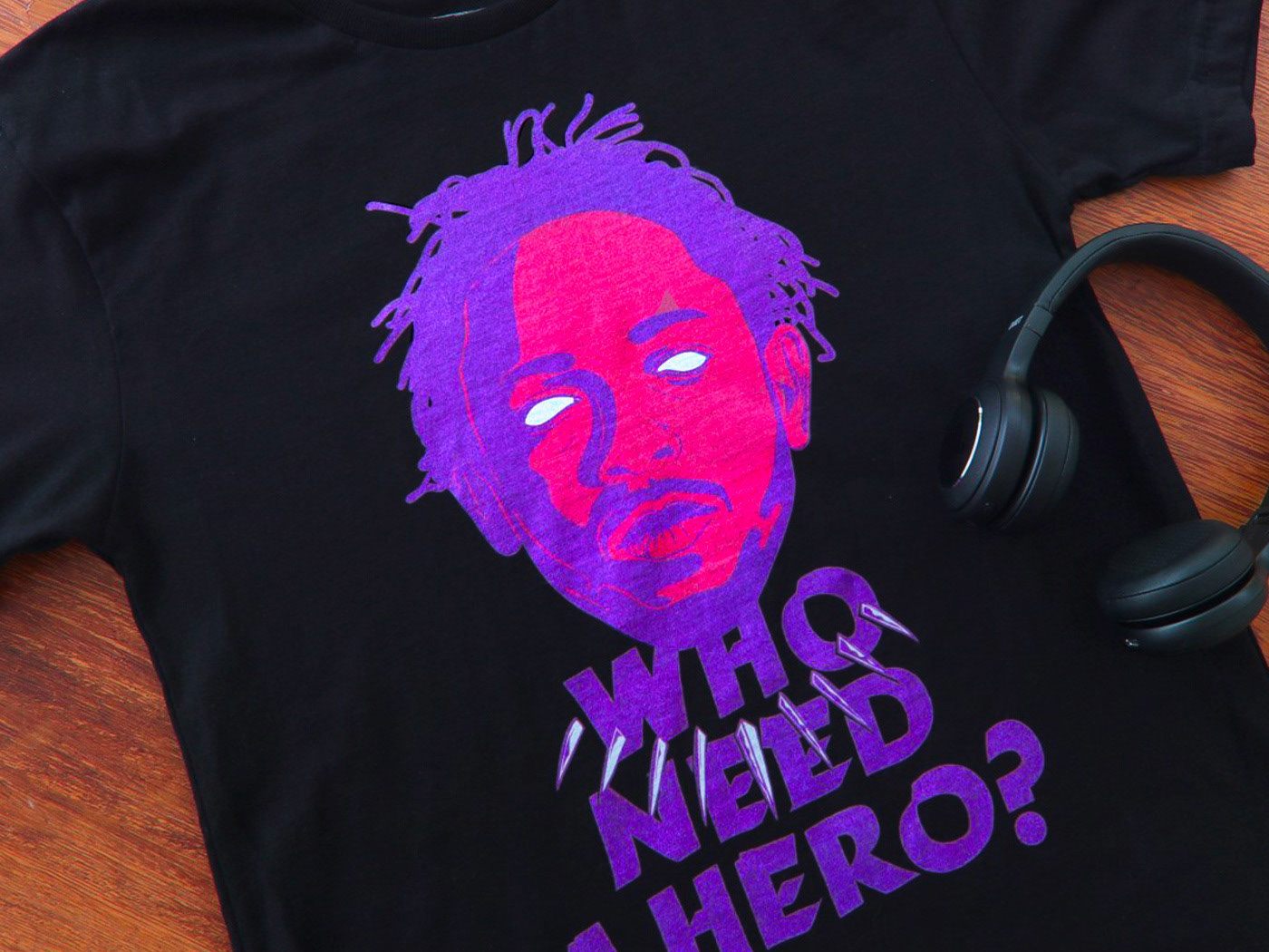
T-SHIRT PRINTS | Rn Torres
2018
T- shirt illustrations made for my stores at chicorei.com and also threadless. This first collection aimed mostly at type, and calligraphy references and use, including some pop culture elements.
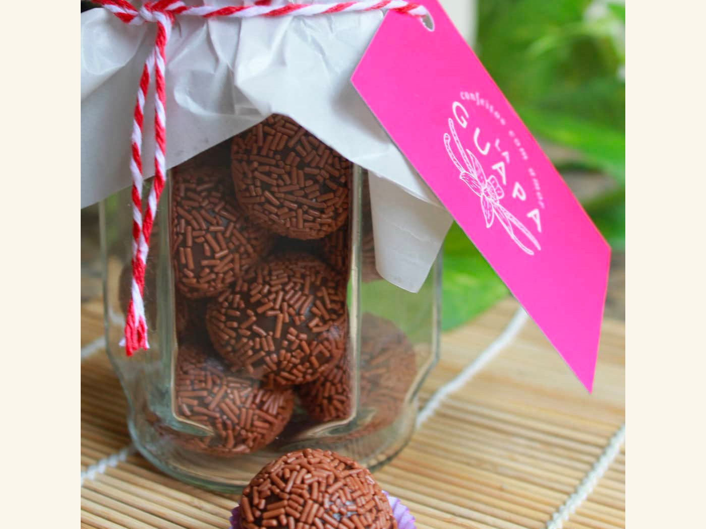
BRAND ID | La Guapa
2018
Tamires contacted me to make a logotype and a basic development of a brand for her to sell her home made comfit. All very healthy and tasty. For this job I made an illustrated brand icon, many applications of the logo, a color palete, and determined a set of typefaces to give the right tone for her identity.
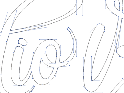
Handlettered logotype-Studio Bardot
2013
2015 redesigned handlettered logotype for a local beauty salon inspired by the french former actress, Brigitte Bardot.
