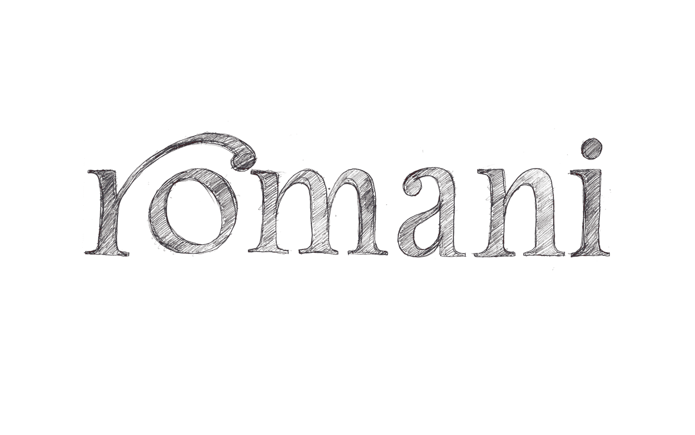
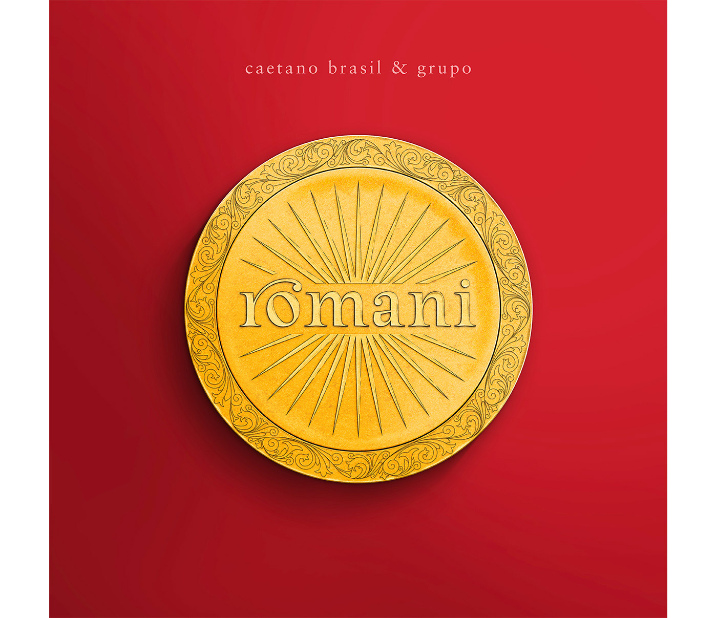
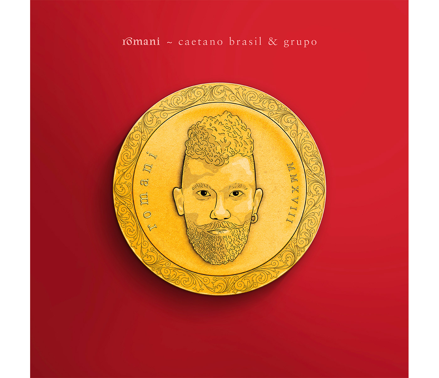
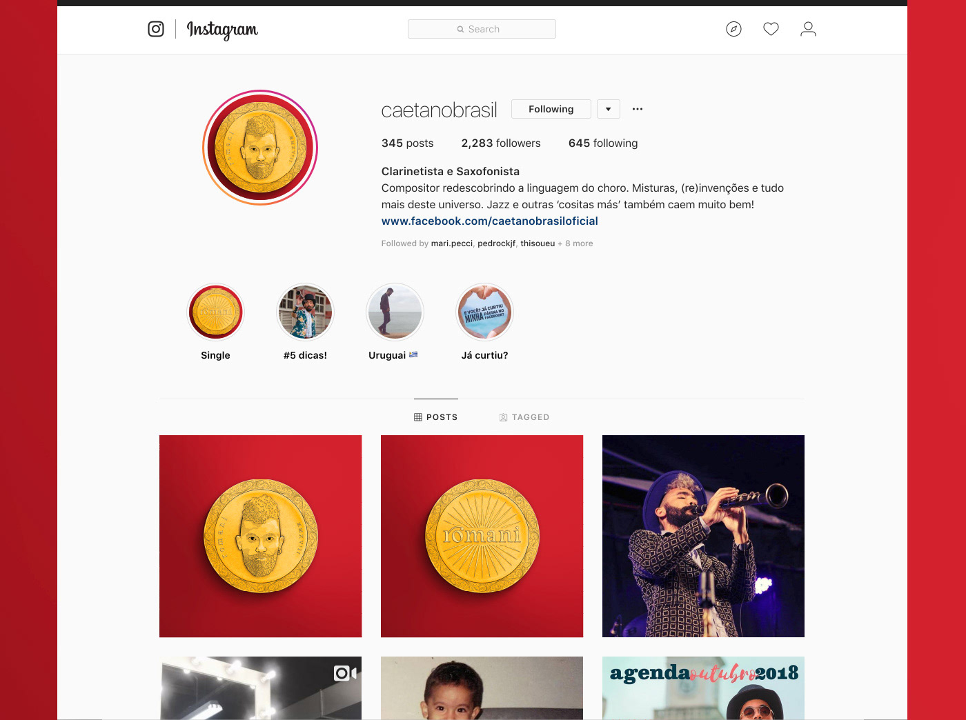
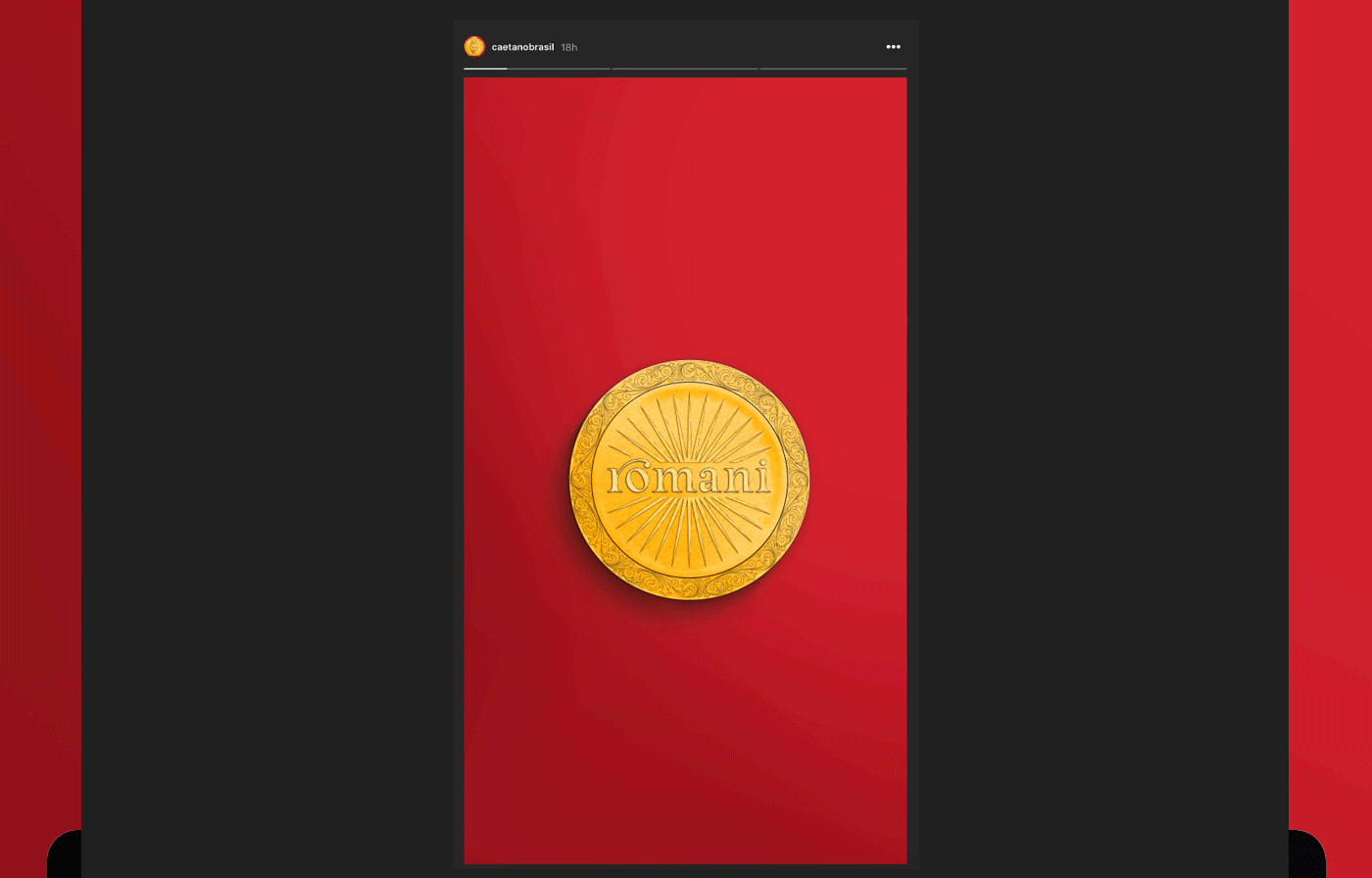
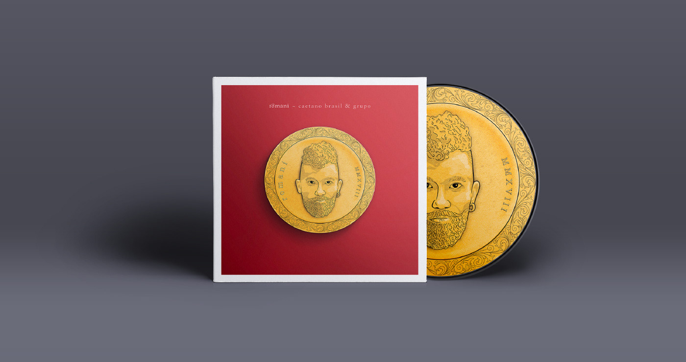
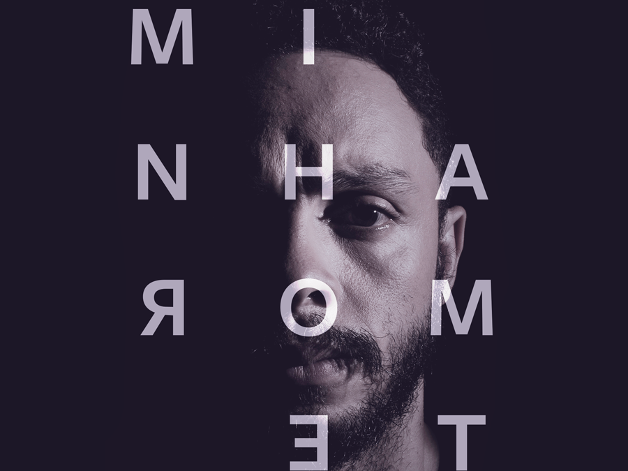
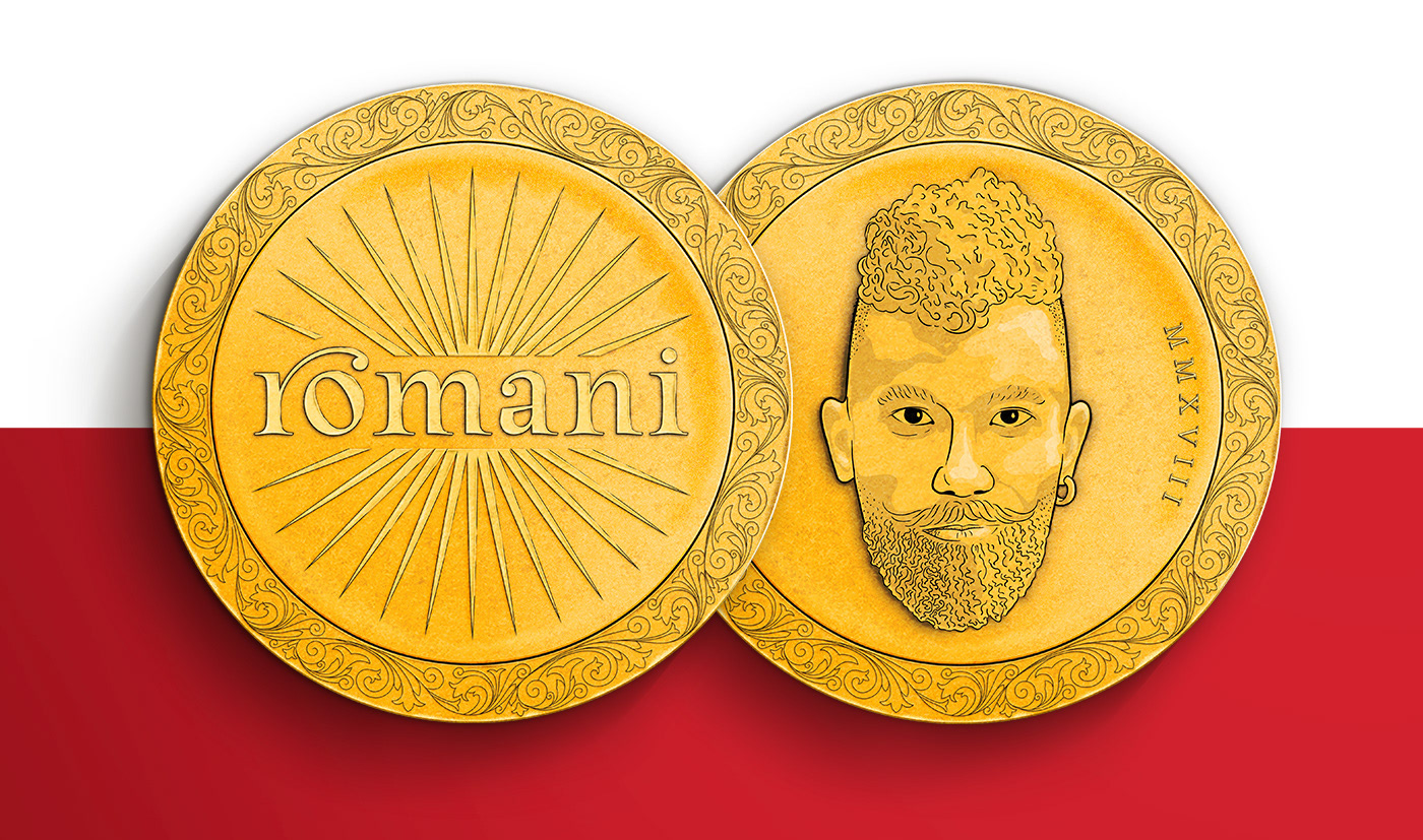
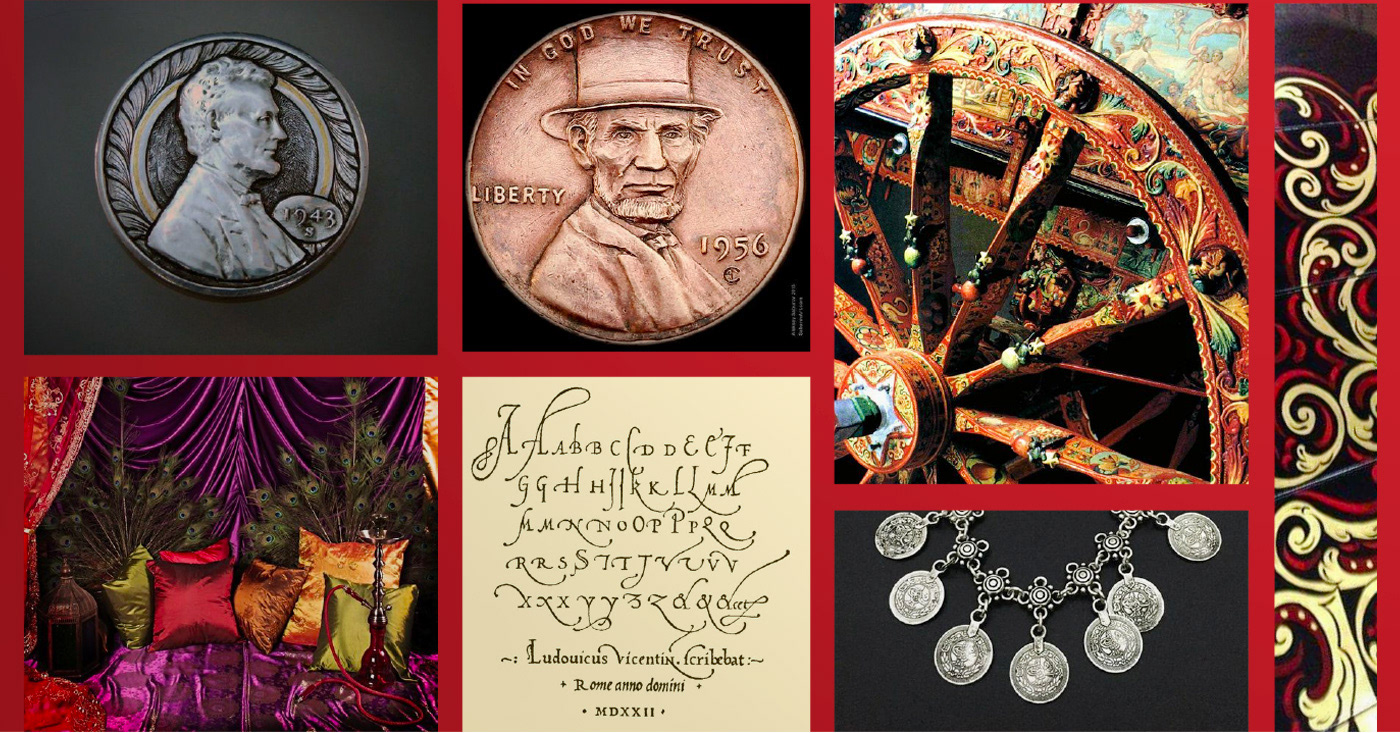
Caetano Brasil é um Compositor misturando choro, jazz e música folclórica do mundo todo. Ele me contratou para criar a identidade e uma imagem de capa para o lançamento de seu single “romani”, a música foi inspirada na cultura cigana, ou romani.
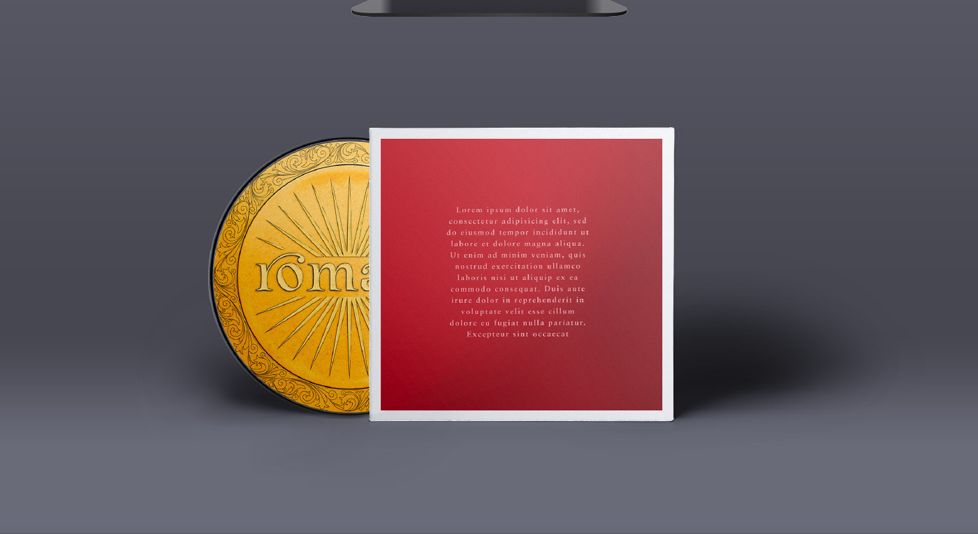
A pesquisa foi focada em encontrar elementos visuais dessa cultura para serem aplicados ao lettering e à ilustração. Para esta foi escolhida a moeda cigana, um ícone forte que carrega os significados de boa sorte e proteção.

You may also like

BOOK CONCEPT - The Metamorphosis
2015
Proposta de criação de um projeto completo de livro. O principal desafio foi a representação gráfica desta história sem recorrer às formas de barata. Proposal of a complete book project. The main challenge was to graphically represent this sttory without references to the cockroach forms.
ALBUM COVER | Chora, Princesa!
2020
O álbum “Chora, Princesa! – Um Painel do Choro Contemporâneo de Juiz de Fora” é, sobretudo, um documento que registra, entre 1997 e 2019, um pouco do que se tem feito de Choro na cidade. Para a capa e seus desdobramentos, buscamos usar elementos reconhecidos como parte da identidade de Juiz de Fora. A paleta de cores é uma adaptação das cores da bandeira, e a ilustração faz referência ao estilo predominante em suas construções históricas, o Art Decó, além de representar partes desses prédios e até as luminárias de uma das principais ruas do centro.
BRAND ID | Chicoreizin
2018
Logotype, a fontface derived from its forms and a brand visual identity system. Those were the deliverables in this project. It was made to represent a kid`s line for a t-shirts company (Chico Rei) as their work is all based on creativity and fun stories, the aim here was to take a little of this culture to the communication.
DESIGN - ART DIRECTION | Minha Morte
2018
This project shows the development of a logotype for the theater company SURTO, and its first play MINHA MORTE (My Death). The work was all based on logotype, use of type, art direction and photography. The results you can check on the images.
LABEL | LOGOTYPE - Seiva da Mata
2017
This job required the creation of all 4 illustrations for the different kinds of beer. They had selected a free font to use as their logo. I offered this solution of a custom lettering and it was well appreciated by the client. Seiva da Mata is an artisanal brewery based in Minas Gerais, Brazil, that seeks to give its beers the freshness of life close to nature, which is common to the country side of the state. In order to communicate this, images have been chosen that refer to the worker of the field and his quiet in moments of the day when contemplation is like a reward for his work.
CALLIGRAPHY SKETCHBOOK 01 | Renan Torres
2019
omecei a treinar caligrafia como um exercício de fundamentos para o desenho de lettering e design de tipos, agora tenho como objetivo achar uma expressão artística na própria prática. Este é o primeiro de uma série de sketchbooks de caligrafia que pretendo fazer para buscar novas formas de criar letras à mão.
BRAND ID | Organizar & Fluir
2018
Logotype and visual identity developed for "Organizar & Fluir" a Belo Horizonte based company that works with organization for residences, companies, files and documents. They also do home staging and sell products. The process to create the visual universe of the brand relied on common looks of organized and fluid homes, where everythings is found in its place and plants give a harmonious atmosphere to the place.
ALBUM COVER | Tiago Sarmento
2019
BOHO, a vocabulary abbreviation much in vogue lately,comes from the lifestyle of the gypsy culture, which French romantic artists very much admired, inspired and thus named their lifestyle of Bohemianism: nomadic, wandering, simple, passionate about life and unconventional. Extrapolating these words and finding their synonyms, we come to the vagabond, eccentric, exotic correlates; at last, free. This is all present in Tiago Sarmento's 20 years career as a musician, as a celebration, nothing better than his 5th studio album being named BOHO. Based on this information I was invited to create the album cover, with a research into the visual universe that involves the artist's creation we came up with an ornate lettering inspired by boho prints full of arabesques and floral patterns as the main element.
Handlettered logotype-Studio Bardot
2013
2015 redesigned handlettered logotype for a local beauty salon inspired by the french former actress, Brigitte Bardot.
POSTER | Chicundum
2020
Chicundum is a poster/magazine, made by the clothing online store Chico Rei. The content is varied, always created by different writers with fresh perspectives about life and the possibilities of this amazing world we live in. For this edition, that focused a lot on personal journeys, projects and traveling, I was invited to created a poster and the illustrations that go with the content. The quote in the poster says “A journey of a thousand miles begins with a single step”, and the small letters are variations of it, as “A successful career starts with a single dream”.