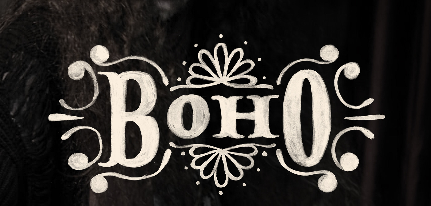
BOHO. Uma abreviação vocabular tão em voga ultimamente que não basta mais que uma simples busca na internet para encontrar suas raízes no estilo de vida da cultura cigana, a qual os artistas românticos franceses tanto admiravam, se inspiravam e batizaram seu estilo de vida de Bohemianismo: nômades, andantes, errantes, simples, apaixonados pela vida e não-convencionais. Extrapolando essas palavras e encontrando seus sinônimos, chegamos aos correlatos de vagabundo, ambulantes, excêntricos, exóticos; enfim, livres.
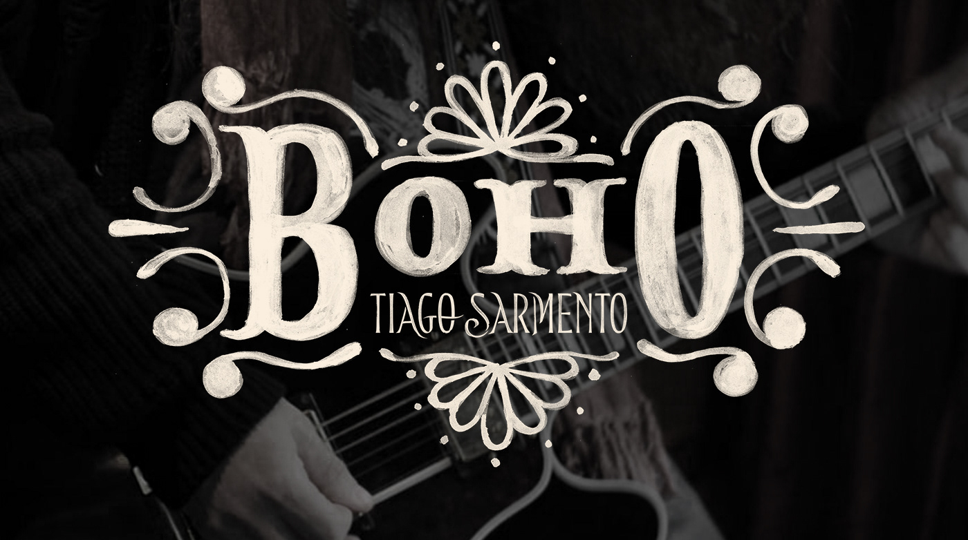
Isso tudo está muito presente nos 20 anos de carreira do Tiago Sarmento, pra celebrar nada melhor que seu 5º álbum de estúdio ser batizado BOHO. Com essas informações em mente, fui convidado a criar a capa do álbum. A partir de uma pesquisa sobre o universo visual boho e folk, surge a ideia para o elemento principal: um lettering baseado em estampas boho, cheias de arabescos e padronagens florais.


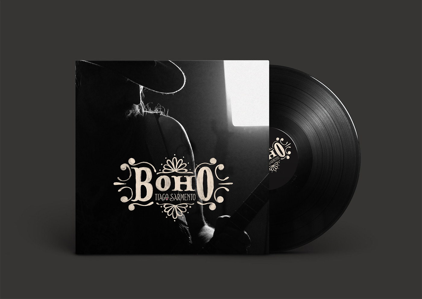
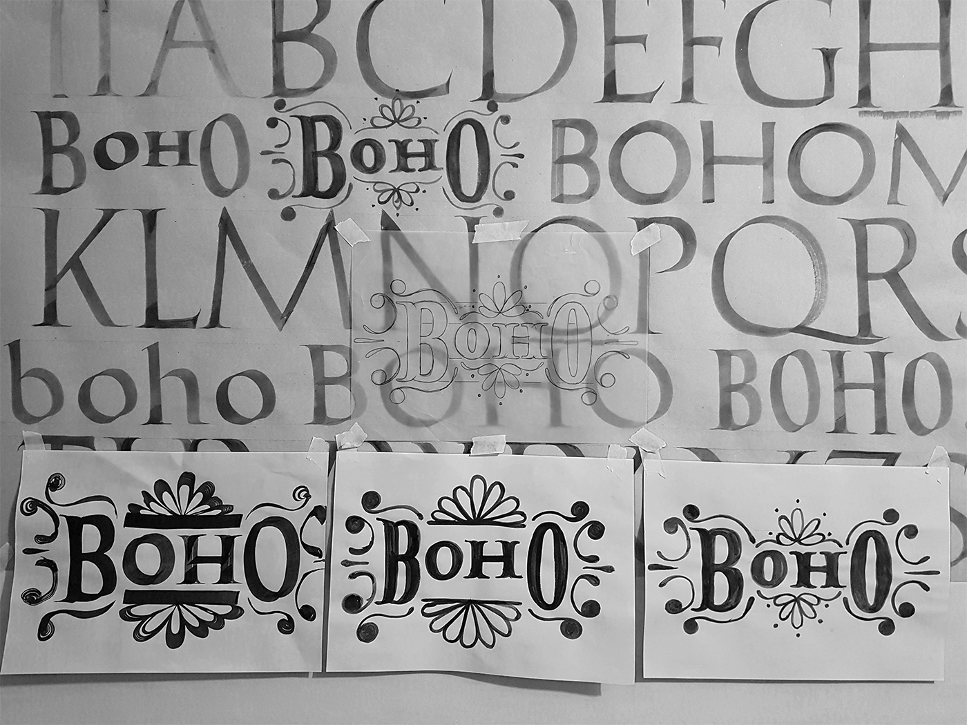
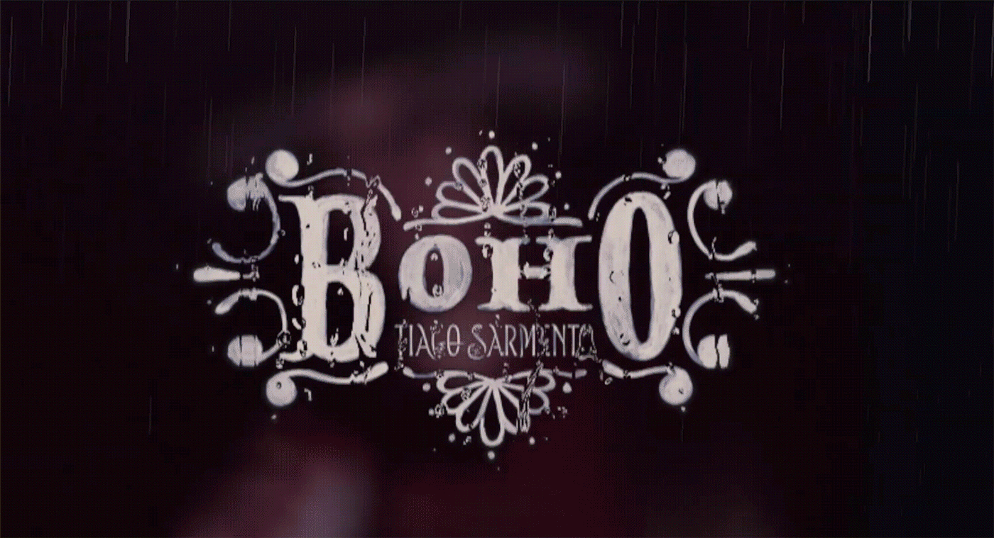
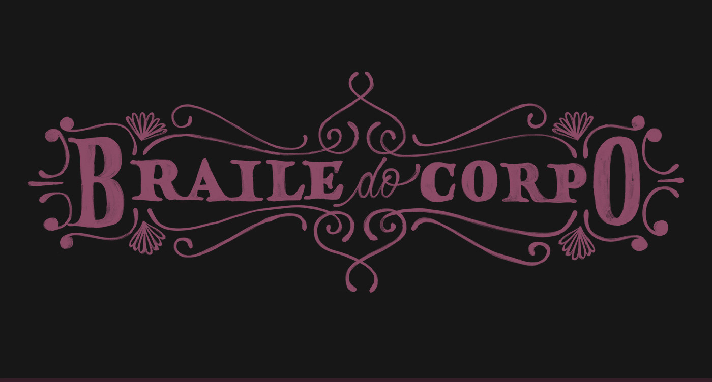
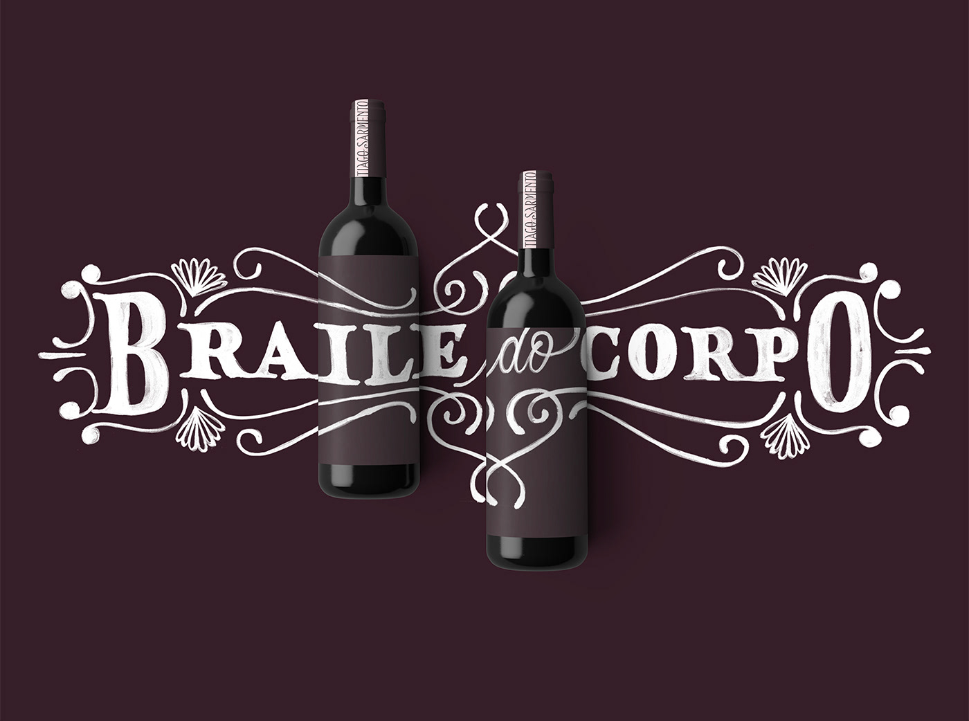
LETTERING FOR ONE OF THE MAIN ALBUM'S SONG

You may also like

ILLUSTRATION | Buena Vista Café
2020
LOGOTYPE | Casa da Gelada
2020
Casa da Gelada is a small neighborhood gocery store that specializes in alcooholic beverages delivery, its style comes mostly from what was given by the looks of the house itself. With the brick walls and rough wood doors, we thought it would be well represented by an old distilery look With that in mind I did some researching and sketching to create the custom type logo, and a few pieces we needed to get the business going. I also did the hand painted logos and number on the walls.
BRAND ID | Estúdio Curió
2022
T-SHIRT PRINTS | Rn Torres
2018
T- shirt illustrations made for my stores at chicorei.com and also threadless. This first collection aimed mostly at type, and calligraphy references and use, including some pop culture elements.
CALLIGRAPHY & LETTERING | O quase último Aum
2022
36 DAYS OF TYPE - 2018
2019
36 days of type 2018. For this edition I focused on training more of a general type design process.
LETTERING | Ye are Gods
2018
vector and scan lettering for the project Ye are Gods. It is the name of Frederico Rabelo's second season of tattoo works.
BOOK CONCEPT - The Metamorphosis
2015
Proposta de criação de um projeto completo de livro. O principal desafio foi a representação gráfica desta história sem recorrer às formas de barata. Proposal of a complete book project. The main challenge was to graphically represent this sttory without references to the cockroach forms.
Chico Rei Coasters
2017
This is a series of coasters illustrations using the company`s logo in different fun contexts. The coasters are traditionally used as information tags that go with the t-shirts.
36 DAYS OF TYPE - 2015
2016
In 2015 as a part of the project 36 Days of Type, I decided to design each letter of the alphabet, all the 10 numbers and the ampersand in a lot of manners, so I could try different technics, ranging from the pure diital, to the mix of analogic items to add a special look to letters. Some of them use external elements to the letter, and some are very foccused in constructing a nice shape.