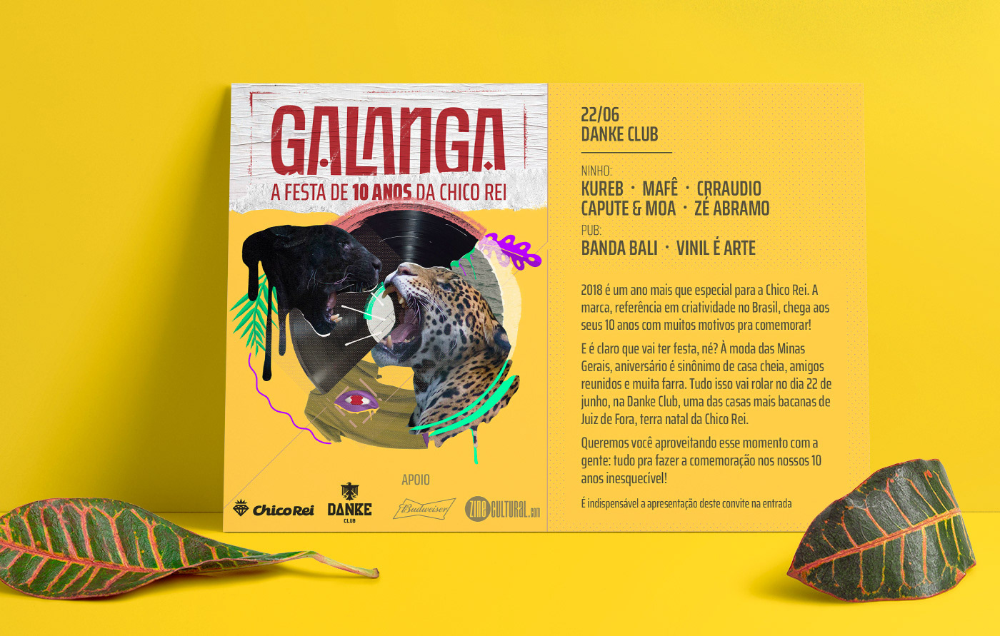
Chico Rei is a creative illustration company from Brazil whose work is specialized on t-shirts
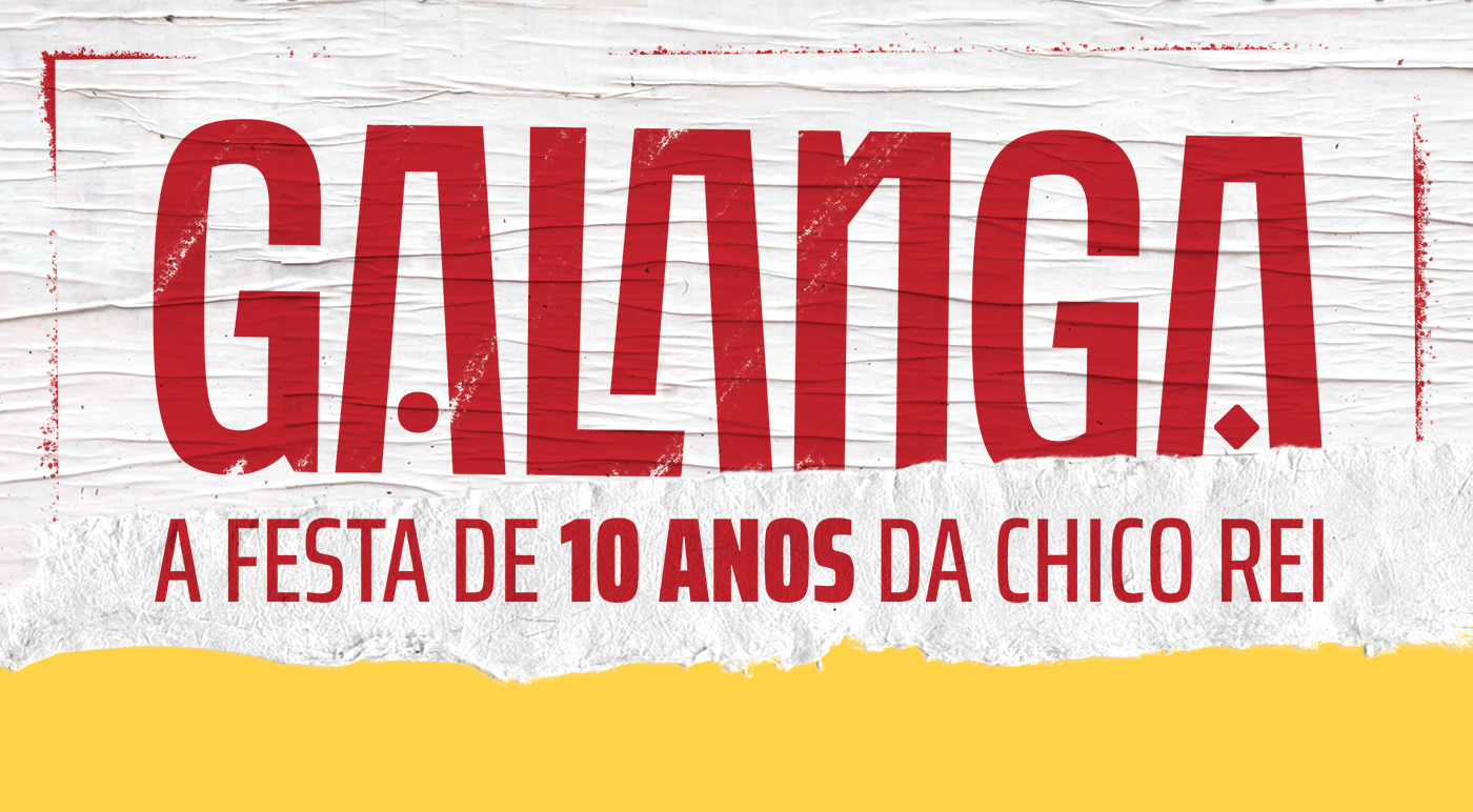
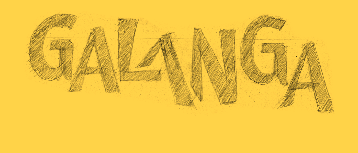
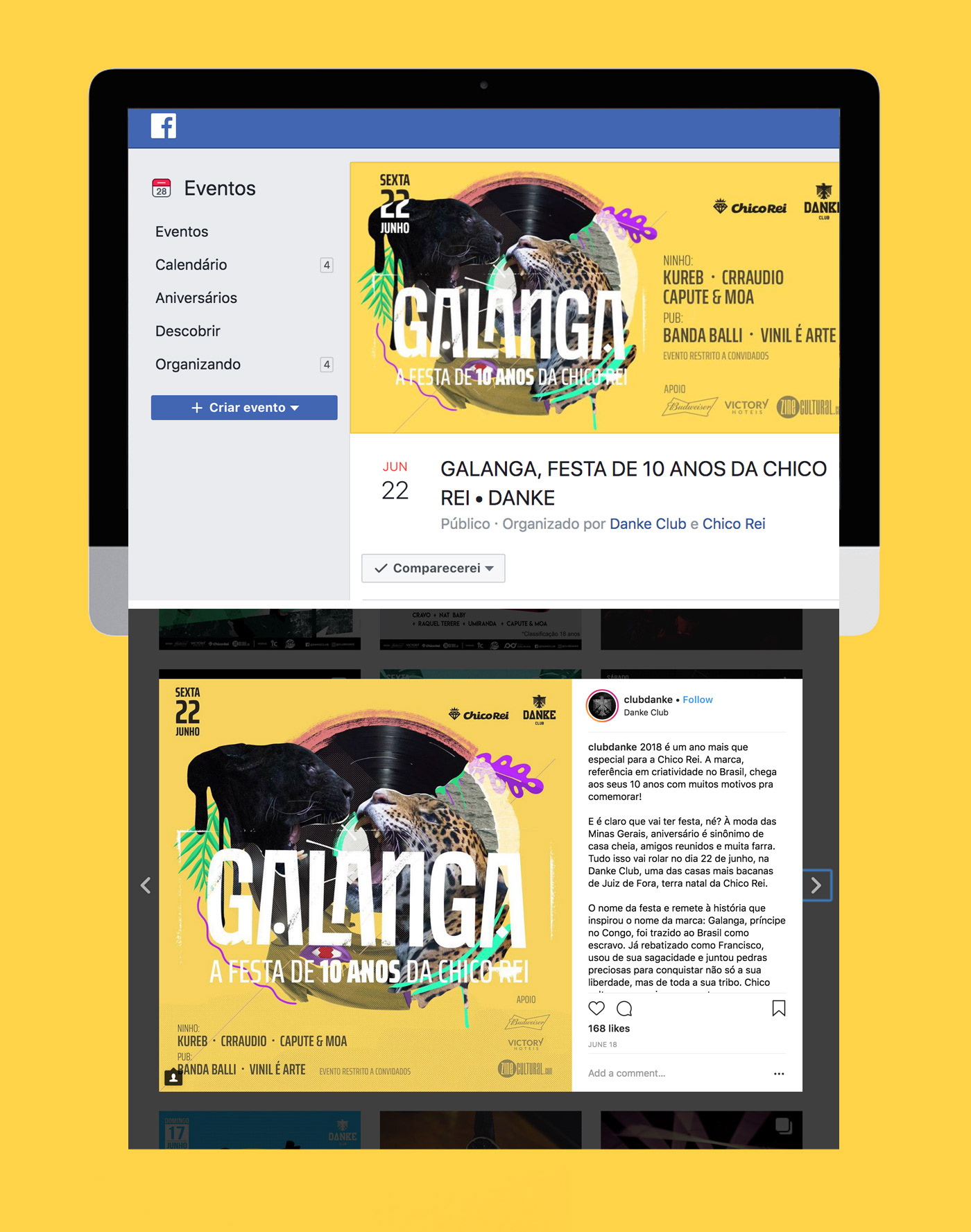
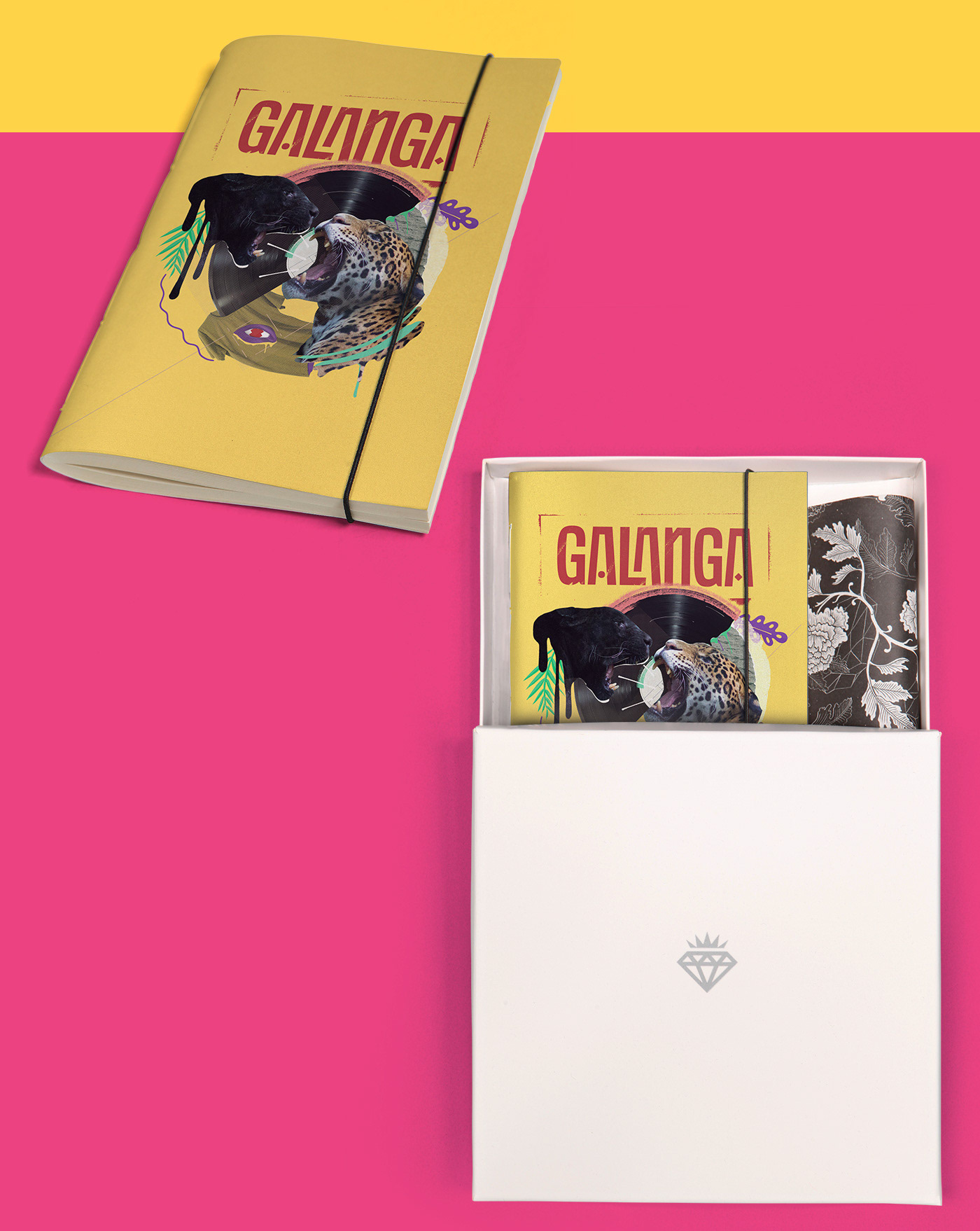
Here is presented the logo and visual identity for the company's 10th birthday party, the name of the party and refers to the story that inspired the name of the brand: Galanga, prince in the Congo, was brought to Brazil as a slave. Already renamed as Francis (Francisco / Chico), he used his wit and collected gems to conquer not only his freedom but his entire tribe. Chico returned to be king, now in Tupiniquins lands.

You may also like

ALBUM COVER | Tiago Sarmento
2019
BOHO, a vocabulary abbreviation much in vogue lately,comes from the lifestyle of the gypsy culture, which French romantic artists very much admired, inspired and thus named their lifestyle of Bohemianism: nomadic, wandering, simple, passionate about life and unconventional. Extrapolating these words and finding their synonyms, we come to the vagabond, eccentric, exotic correlates; at last, free. This is all present in Tiago Sarmento's 20 years career as a musician, as a celebration, nothing better than his 5th studio album being named BOHO. Based on this information I was invited to create the album cover, with a research into the visual universe that involves the artist's creation we came up with an ornate lettering inspired by boho prints full of arabesques and floral patterns as the main element.
CALLIGRAPHY & LETTERING | O quase último Aum
2022
POSTER | Chicundum
2020
Chicundum is a poster/magazine, made by the clothing online store Chico Rei. The content is varied, always created by different writers with fresh perspectives about life and the possibilities of this amazing world we live in. For this edition, that focused a lot on personal journeys, projects and traveling, I was invited to created a poster and the illustrations that go with the content. The quote in the poster says “A journey of a thousand miles begins with a single step”, and the small letters are variations of it, as “A successful career starts with a single dream”.
DESIGN - ART DIRECTION | Minha Morte
2018
This project shows the development of a logotype for the theater company SURTO, and its first play MINHA MORTE (My Death). The work was all based on logotype, use of type, art direction and photography. The results you can check on the images.
BRAND ID | Inpulse
2018
INPULSE is a Pilates and physiotherapy studio, it uses an ecletic aproach, presenting other services as aesthetic treatment, auricle acupuncture, kinesiology tape and Global Posture Re-education. The Brand Identity was imagined to follow the owner`s flexibility on work techniques and personal impact made possible by Dani`s natural talent for it, and a small studio environment.
ID ILUSTRAÇÃO | Caetano Brasil - romani
2019
Este projeto consiste da identidade visual para o single “romani” lançado pelo artista mineiro Caetano Brasil. O conceito foi baseado em suas inspirações para a composição, o povo cigano, ou romani. A partir delas foram definidos o lettering e a ilustração como base para todo o projeto.
BRAND ID | Organizar & Fluir
2018
Logotype and visual identity developed for "Organizar & Fluir" a Belo Horizonte based company that works with organization for residences, companies, files and documents. They also do home staging and sell products. The process to create the visual universe of the brand relied on common looks of organized and fluid homes, where everythings is found in its place and plants give a harmonious atmosphere to the place.
ALBUM COVER | Chora, Princesa!
2020
O álbum “Chora, Princesa! – Um Painel do Choro Contemporâneo de Juiz de Fora” é, sobretudo, um documento que registra, entre 1997 e 2019, um pouco do que se tem feito de Choro na cidade. Para a capa e seus desdobramentos, buscamos usar elementos reconhecidos como parte da identidade de Juiz de Fora. A paleta de cores é uma adaptação das cores da bandeira, e a ilustração faz referência ao estilo predominante em suas construções históricas, o Art Decó, além de representar partes desses prédios e até as luminárias de uma das principais ruas do centro.
T-SHIRT PRINTS | Rn Torres
2018
T- shirt illustrations made for my stores at chicorei.com and also threadless. This first collection aimed mostly at type, and calligraphy references and use, including some pop culture elements.
NAMING & BRANDING - From Flow
2015
A FROM, para alguns, e FLOW, para outros, é uma empresa que tem o objetivo de resignificar o mercado de eventos no Brasil. Valorizamos a criação de sensações e as interações fluídas em todas as etapas do projeto, transformando pessoas a partir de novas e incríveis experiências. Trabalhamos com flexibilidade e complementaridade. Achamos sim que eventos tem que ser cool, diferentes e inusitados, mas acreditamos também em processos, métricas e resultados.