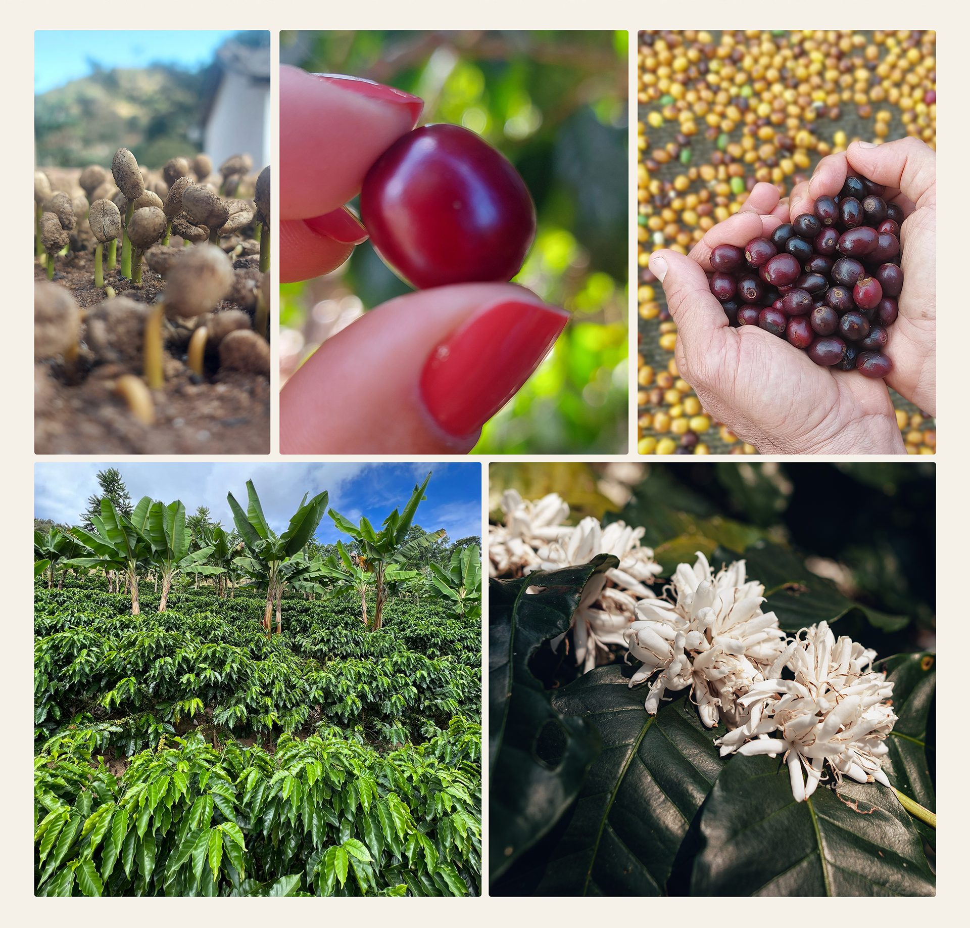
Matricá was born from Adressa's and Paulo Henrique's love of nature and coffee, their agroecologically grown coffee straight from the highlands of eastern Minas Gerais is crafted with great care at every stage of production until it reaches your cup.
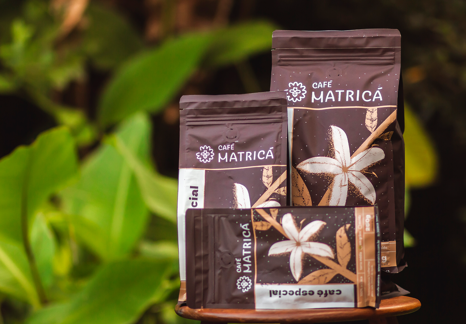
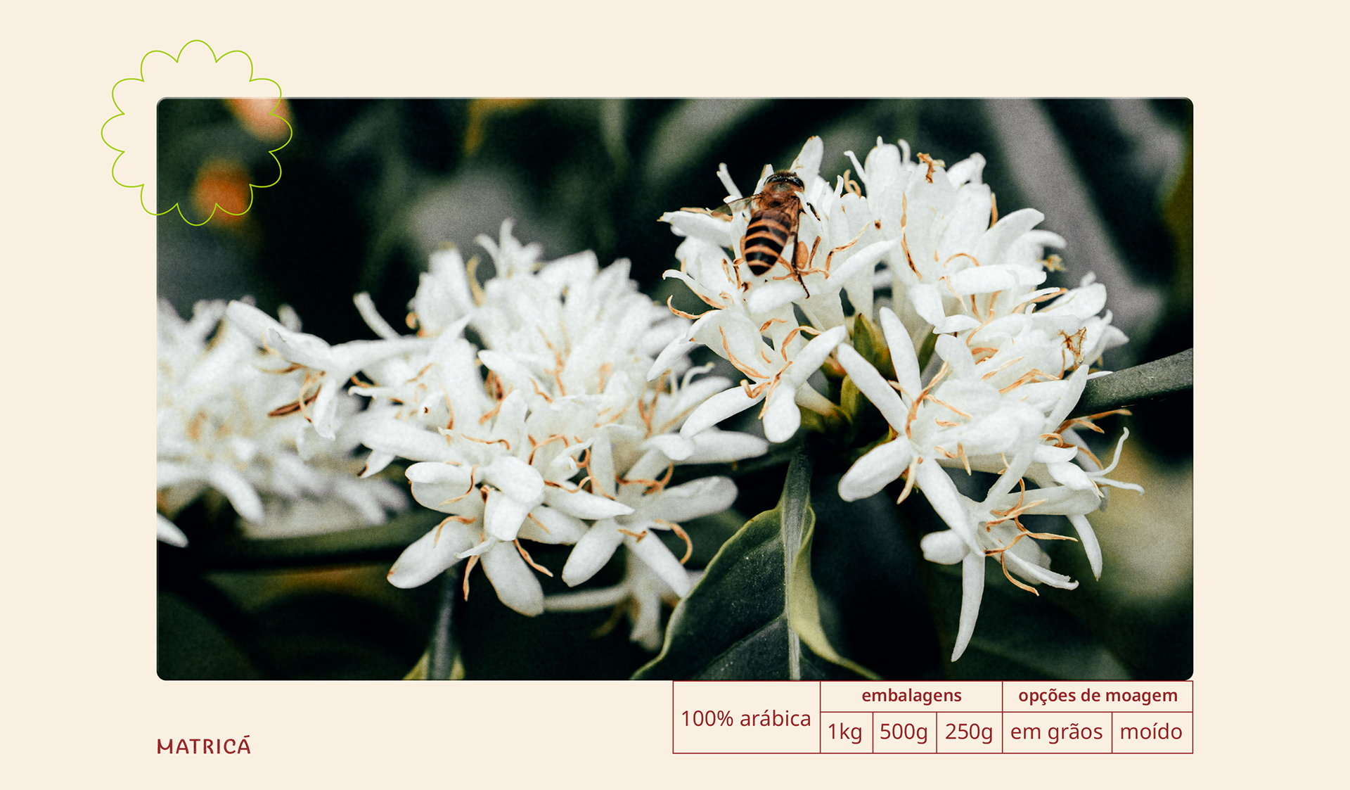
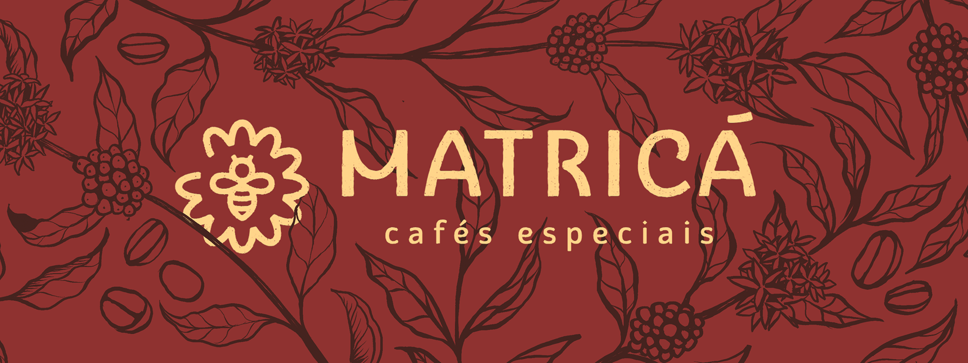
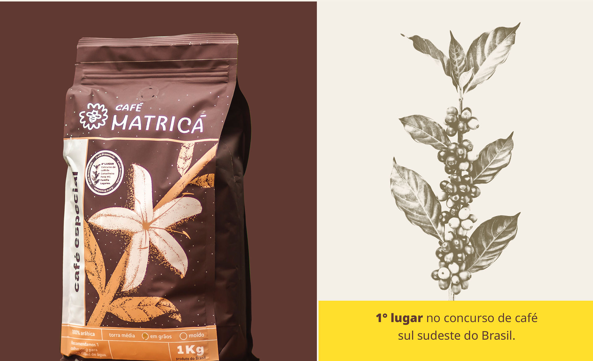
The flower represents the cycle of life and biodiversity, core values of Matricá and its unique tone in text and imagery among other specialty coffees.
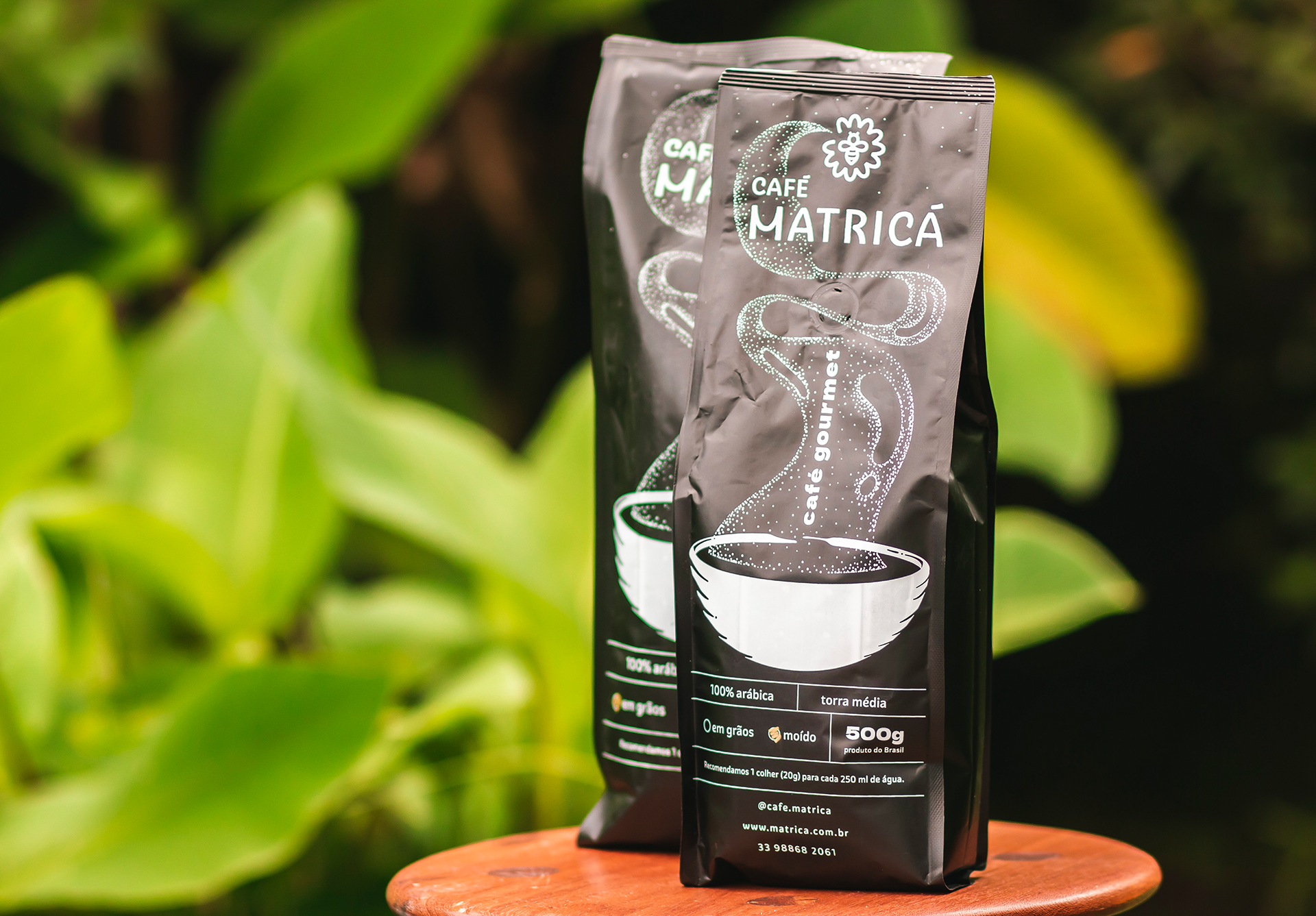

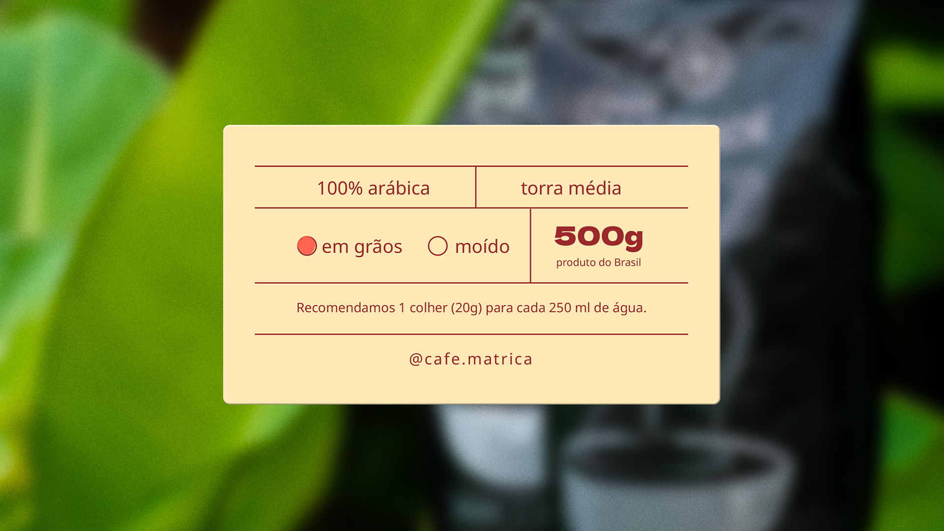
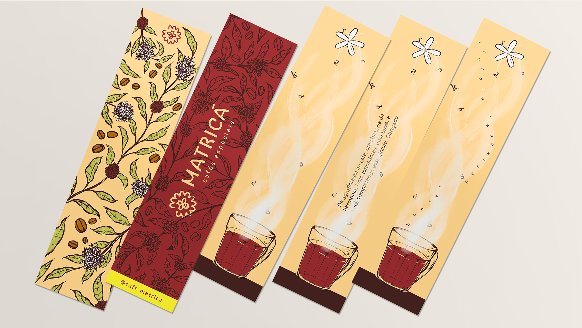
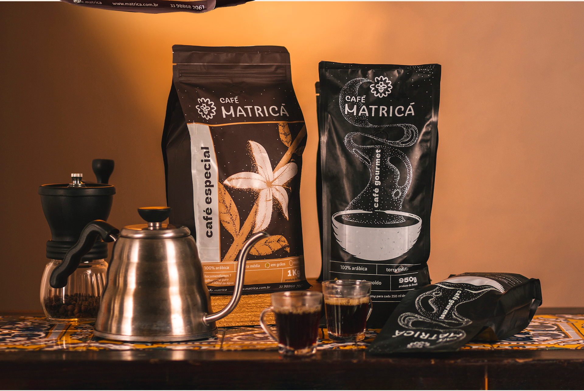
For the brands first set of packages we did two different illustrations, one for each coffee type: a prominent flower for the specialty coffees, and a steaming cup for the secondary line, both featuring a dot-style design that evokes pollen, one of the Matricá's strong visual elements.
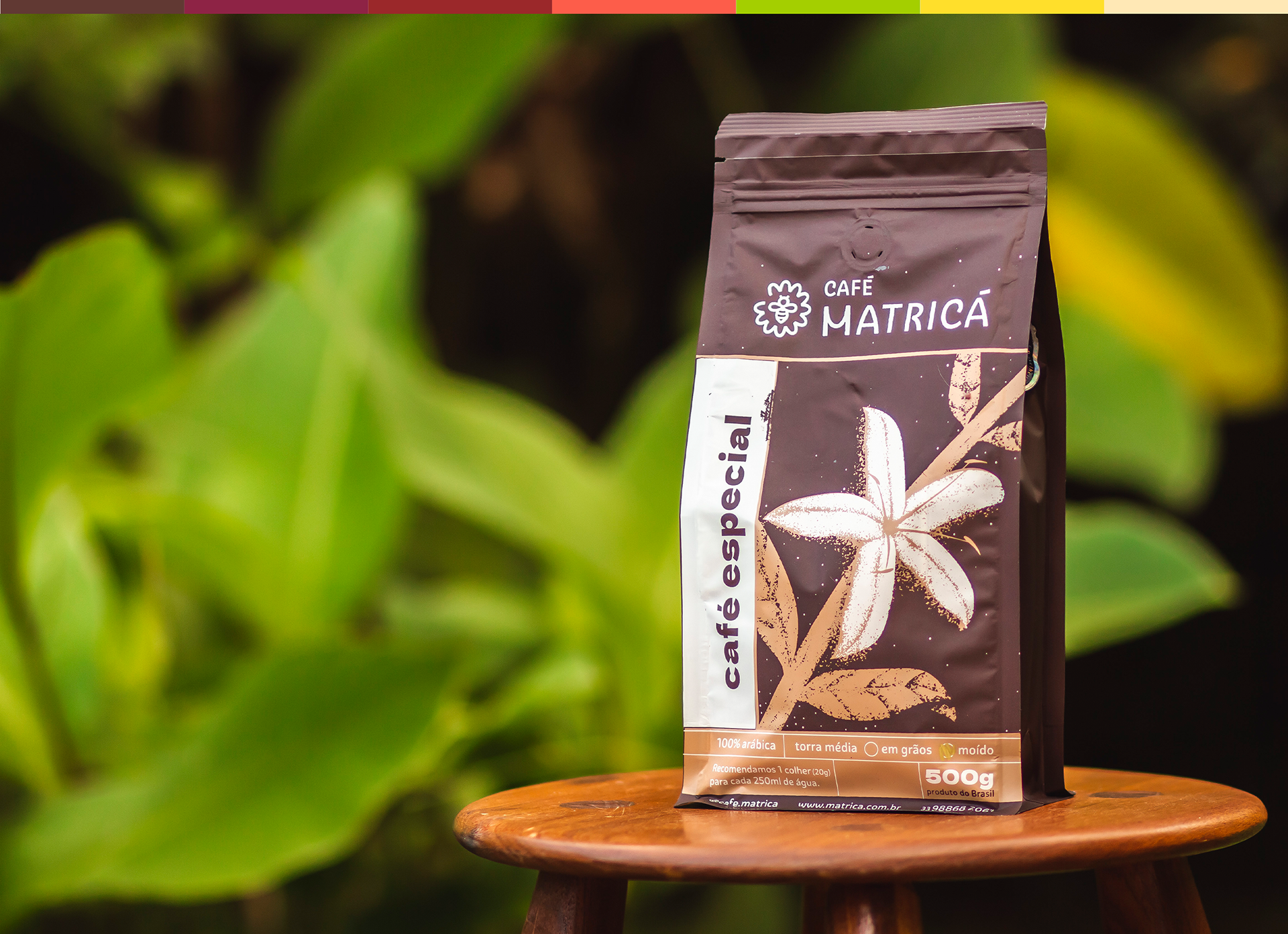
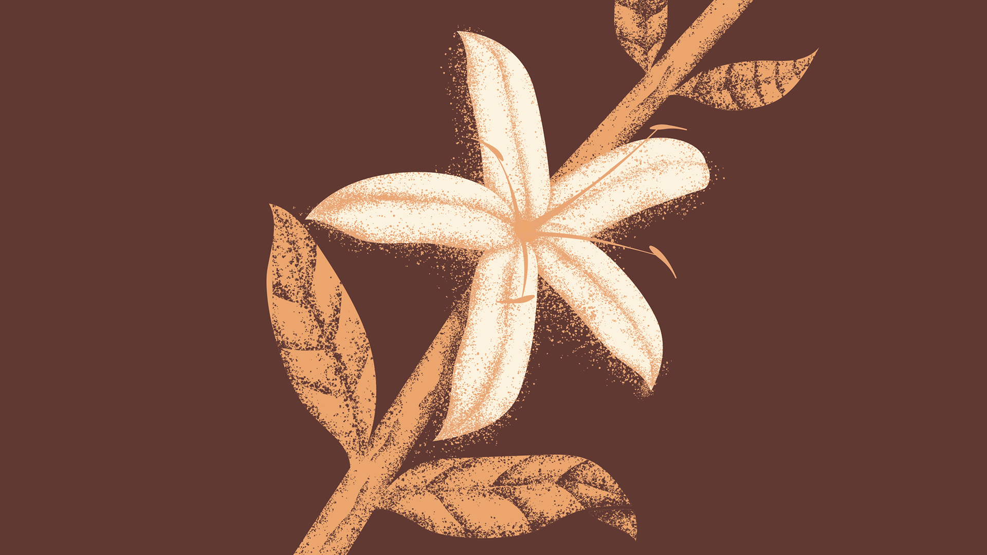
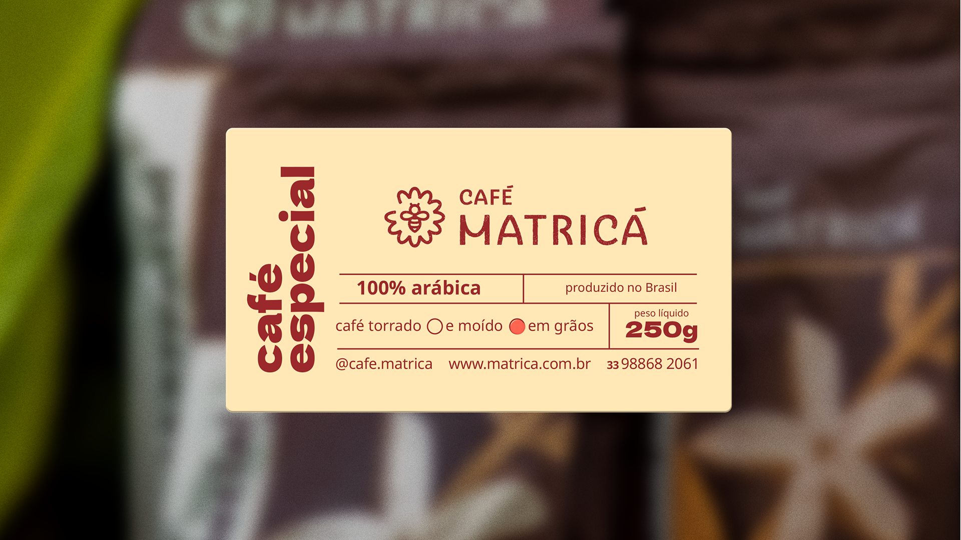
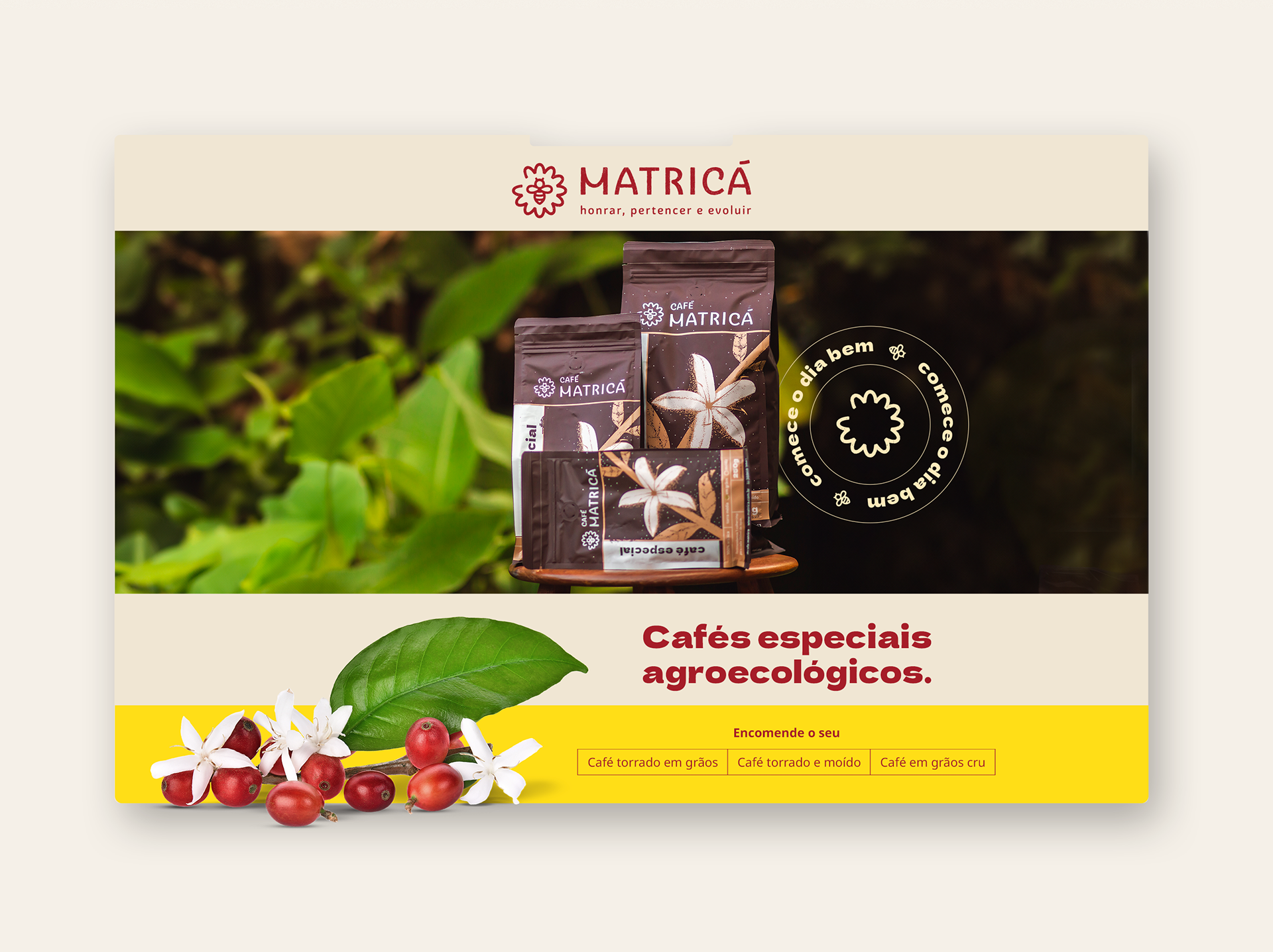
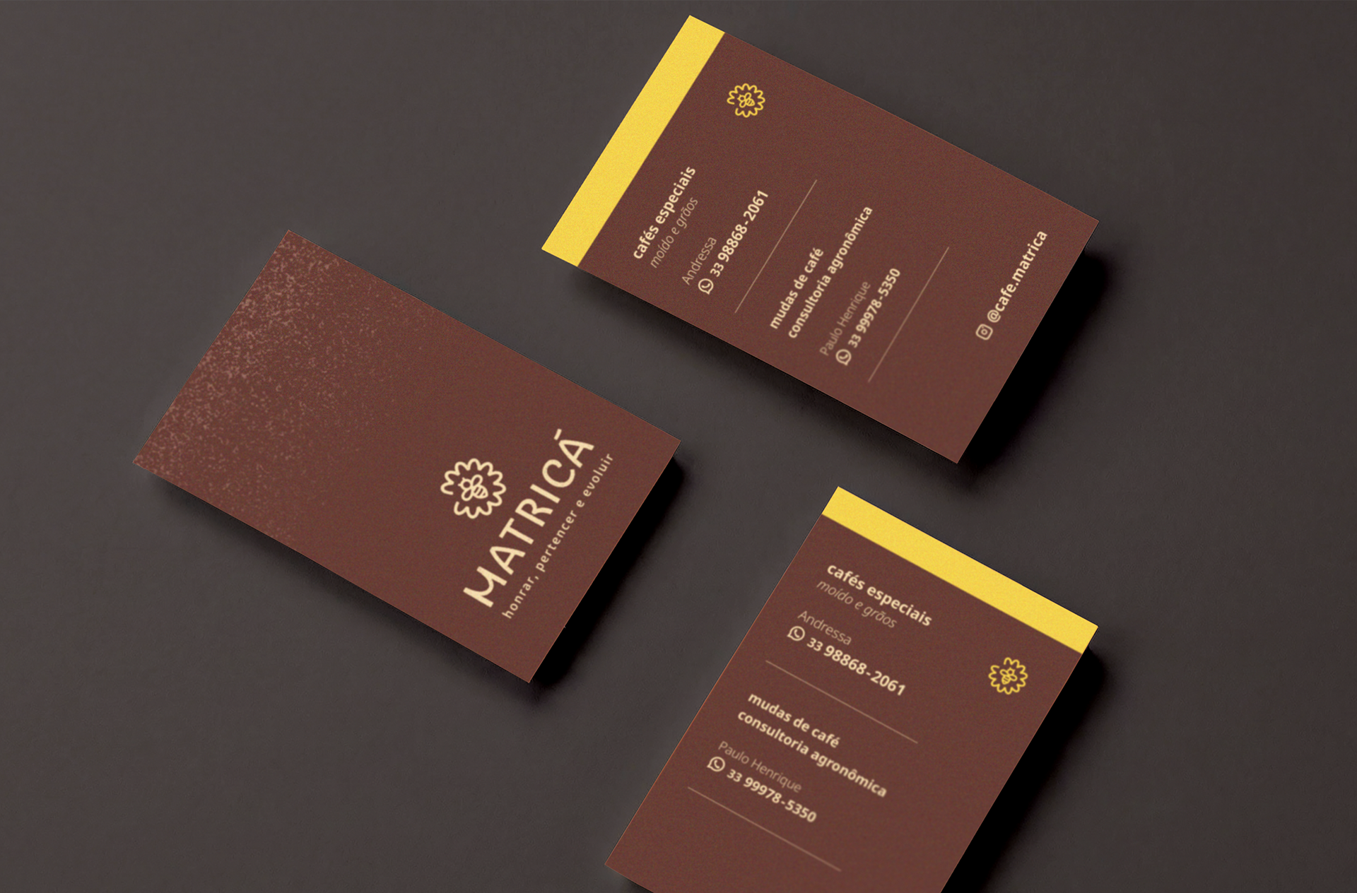
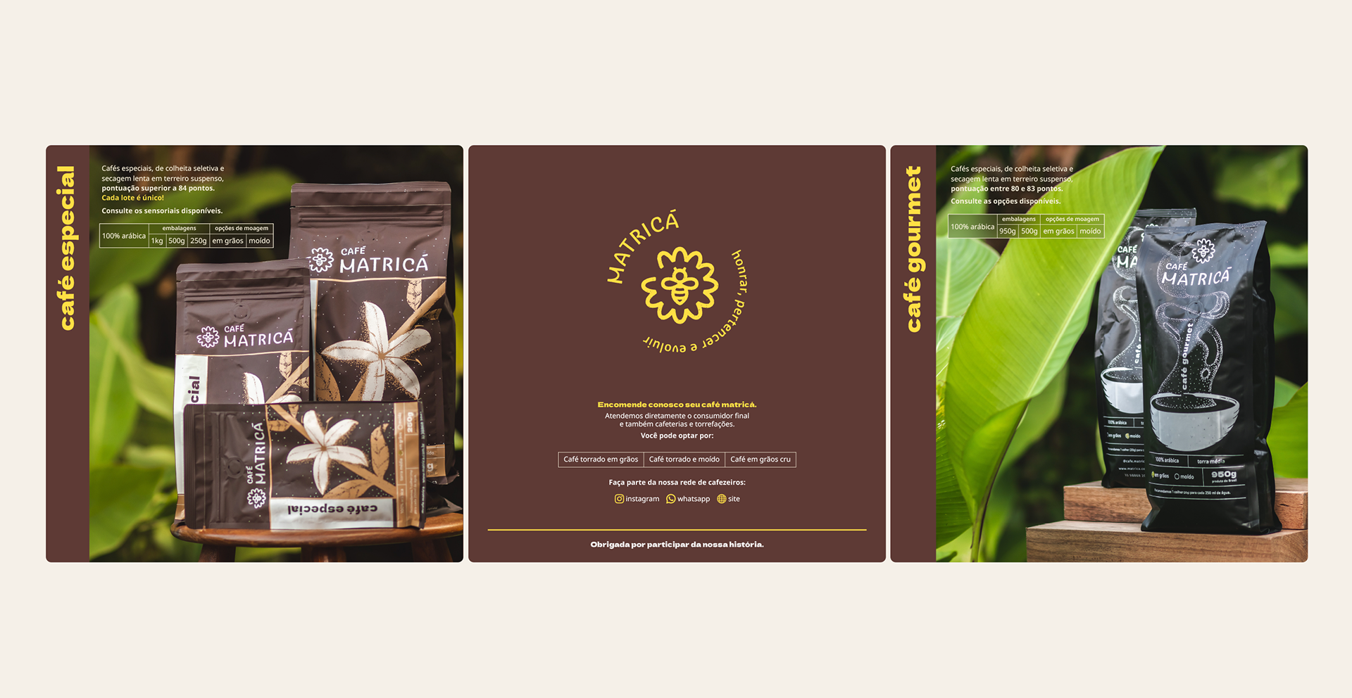
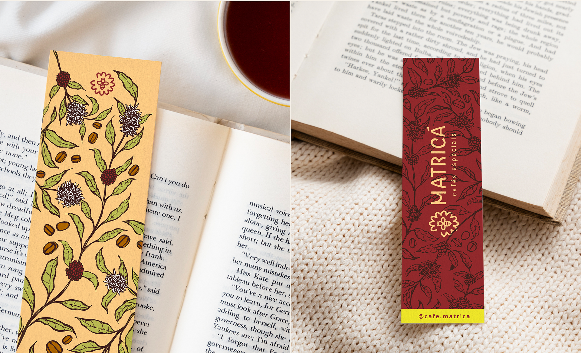
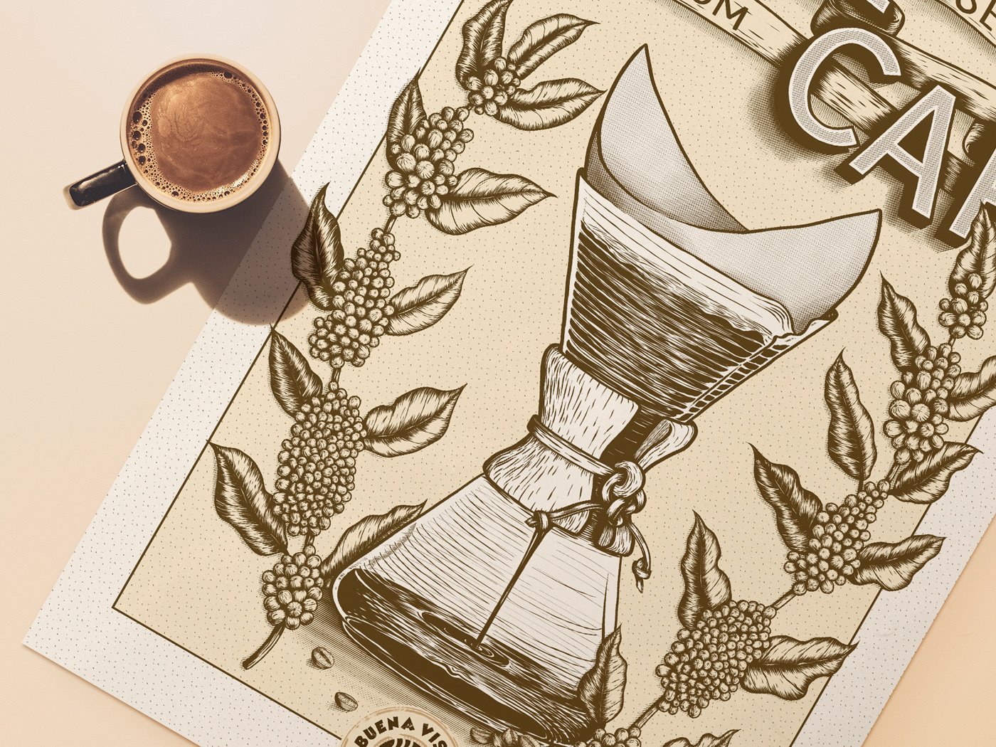
Other illustrations for various brand touchpoints bring nature and coffee branches with the flowers highlighted to set the brand's distinctive tone.